
【iOS】圖表實現-Charts(一)
前幾天把AAChartsKit的使用簡單寫了寫,官方使用說明已經寫的很詳細了。我也就不多說了,今天就講講Charts的使用。
0.簡介
近期專案需要使用到折線圖這樣的圖表功能,因此接觸到了Charts這個框架,不得不說這個圖表框架很強大,但是在GitHub上Charts的介紹也比較簡單的介紹(直說了和MPAndroidChart類似,大部分使用方法一致),就寫寫自己的一點心得供大家參考。
Charts使用swift編寫,它是仿照MPAndroidChart實現的。所以在安卓和iOS上可以實現一致的效果。如果你們的APP想在兩端實現統一的效果,就可以使用這個圖示庫。
廢話不多說了。開始講解使用方法吧。
1.匯入三方庫
charts支援cocoapods匯入,這就對大多數開發者比較方便了。但是就是使用cocoapdos也需要注意些地方。
由於charts使用swift編寫,在swift編寫的專案中使用比較方便,在這篇文章中就不詳細描述了。但是現如今還是有很多專案使用oc編寫,就如我的這個專案。這就需要了解一些oc和swift的橋接了。這就需要看別的文章了。迴歸正題,開始講cocoapdos的匯入吧。
(1)podfile的設定
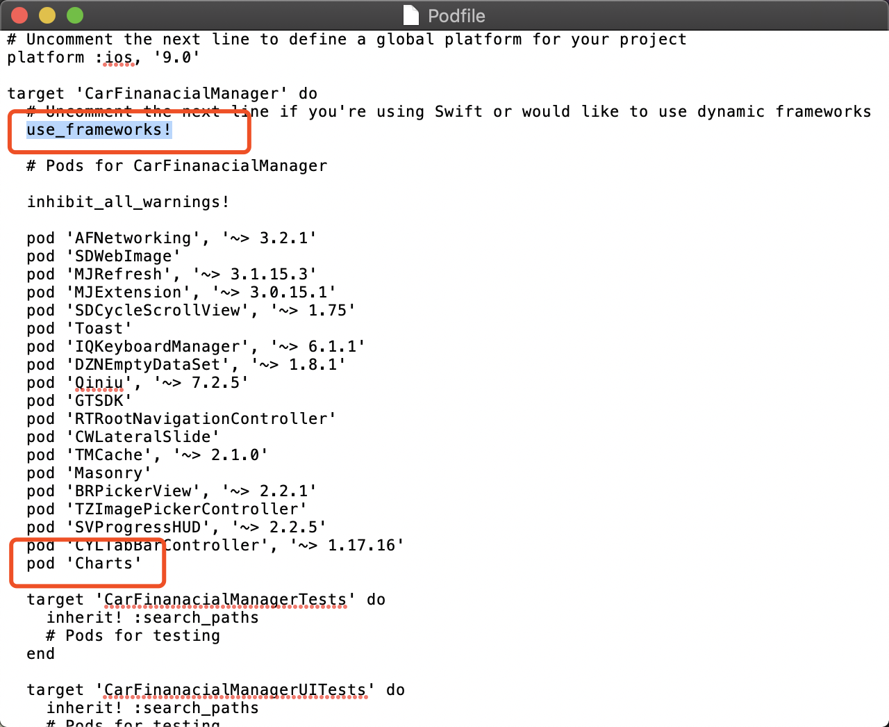
(2)將工程中Pods的編譯語言設定為SWIFT最新版本
build Settings ->Swift Language Version 改為最新版本
(3)將Chart.framework新增到新建的專案中
點選新建的專案->Build Phases->Link Binary With Libraries-> "+" -> 找到Charts.frame新增
(4)新增OC與Switf橋接
在工程中新建一個Swift檔案,名字隨便取,如"Chart-Bridging-Header.h",這時候會提示是否建立橋接檔案,直接選Create Bridging Header選項,名字無所謂,會自動建立一個橋接檔案。在橋接檔案裡寫入@import Charts;
到了這一步,匯入就完成了。你就可以在自己的專案使用。
2.使用
設定Chatview的屬性
(1)scale屬性
顧名思義,就是圖示是否支援拖拽,scaleYEnabled = YES即縱座標支援拖拽,scaleXEnabled = YES即橫座標支援拖拽。
(2)chartDescription屬性
開啟這個屬性,你的圖表上將會有關於你的圖示的描述。
(3)pinchZoomEnabled
是否支援X軸、Y軸同時縮放,如果是YES ,則代表支援同時縮放。
(4)maxVisibleCount
這個屬性是控制圖示上的數字展示的最大個數的,如果你的圖示不想顯示上面的數字,就可以把maxVisibleCount屬性設定為0。
(5)legend
這個Bool屬性是設定要不要顯示圖例的,看到上圖底部的"-- DataSet 1"了嗎,如果你不想要顯示這一欄,就把legend.enabled設定為NO。
(6)noDataText
沒有資料的時候ChartsView上需要顯示什麼文字。chartsView中有三個重要的屬性需要開發者去設定,那就是leftAxis(左軸),rightAxis(右軸),xAxis(X軸)。
(7)doubleTapToZoomEnabled
是否允許雙擊縮放。
(8)delegate
代理,大家都懂的。對應的protocal有4個,都是可選選項
//圖表中的數值被選中
- (void)chartValueSelected:(ChartViewBase * _Nonnull)chartView entry:(ChartDataEntry * _Nonnull)entry highlight:(ChartHighlight * _Nonnull)highlight;
//圖表中的空白區域被點選
- (void)chartValueNothingSelected:(ChartViewBase * _Nonnull)chartView;
//圖表縮放
- (void)chartScaled:(ChartViewBase * _Nonnull)chartView scaleX:(CGFloat)scaleX scaleY:(CGFloat)scaleY;
//圖示被移動
- (void)chartTranslated:(ChartViewBase * _Nonnull)chartView dX:(CGFloat)dX dY:(CGFloat)dY;
Axis屬性
(1)enabled
設定為NO的話,則對應的座標軸不顯示。
(2)labelPosition
表示左軸座標的位置,有2個選項:YAxisLabelPositionOutsideChart = 0,YAxisLabelPositionInsideChart = 1,座標顯示在軸內或者是軸外。
(3)labelCount
即在座標軸上最多顯示多少個座標點
(4)drawGridBackgroundEnabled
是否要畫網格線
(5)gridLineDashLengths
gridLineDashLengths = @[@2.f, @5.f]即線段寬為2.0f,空格寬為5.0f。
舉個例子:
LineChartView *lineChartView = [[LineChartView alloc] init];
    [self.view addSubview:lineChartView];
    self.lineChartView = lineChartView;

    lineChartView.doubleTapToZoomEnabled = NO;//禁止雙擊縮放 有需要可以設定為YES
    lineChartView.gridBackgroundColor = [UIColor clearColor];//表框以及表內線條的顏色以及隱藏設定 根據自己需要調整
    lineChartView.borderColor = [UIColor clearColor];
    lineChartView.drawGridBackgroundEnabled = NO;
    lineChartView.drawBordersEnabled = NO;
    lineChartView.descriptionText = @"XXX";//該表格的描述名稱
    lineChartView.descriptionTextColor = [UIColor whiteColor];//描述字型顏色
    lineChartView.legend.enabled = YES;//是否顯示折線的名稱以及對應顏色 多條折線時必須開啟 否則無法分辨
    lineChartView.legend.textColor = [UIColor whiteColor];//折線名稱字型顏色

    //設定動畫時間
    [lineChartView animateWithXAxisDuration:1];

    //設定縱軸座標顯示在左邊而非右邊
    rightAxis = lineChartView.rightAxis;
    rightAxis.drawGridLinesEnabled = NO;

    leftAxis = lineChartView.leftAxis;
    leftAxis.drawGridLinesEnabled = NO;
    leftAxis.labelTextColor = [UIColor whiteColor];

    //設定橫軸座標顯示在下方 預設顯示是在頂部
    xAxis = lineChartView.xAxis;
    xAxis.labelPosition = XAxisLabelPositionBottom;
    xAxis.labelTextColor = [UIColor whiteColor];
    xAxis.labelCount = 3;
3.設定完屬性後,就是填充資料了
在這裡我僅以折線圖表為例。
我們先介紹兩個概念:set和data,LineChartData就是折線圖的data類,它可以由很多組set組成,一組就是一條折線。因此我們可以定義set的屬性,從而繪製各種各樣的折線。示例如下:
//是否繪製圖標
set1.drawIconsEnabled = NO;
//折線顏色
[set1 setColor:UIColor.blackColor];
//折線點的顏色
[set1 setCircleColor:UIColor.blackColor];
//折線的寬度
set1.lineWidth = 1.0;
//折線點的寬度
set1.circleRadius = 3.0;
//是否畫空心圓
set1.drawCircleHoleEnabled = NO;
//折線點的值的大小
set1.valueFont = [UIFont systemFontOfSize:9.f];
//圖例的線寬
set1.formLineWidth = 1.0;
//圖例的字型大小
set1.formSize = 15.0;
開始填充
//定義一個數組承接資料
//對應Y軸上面需要顯示的資料
    NSMutableArray *yVals = [[NSMutableArray alloc] init];
    for (int i = 0; i < self.financeLineDotDataList.count; i++) {

        BTCTrenddata *dotData = (BTCTrenddata *)[self.financeLineDotDataList objectAtIndex:i];
        //將橫縱座標以ChartDataEntry的形式儲存下來,注意橫座標值一般是i的值,而不是你的資料    //裡面具體的值,如何將具體資料展示在X軸上我們下面將會說到。
        ChartDataEntry *entry = [[ChartDataEntry alloc] initWithX:i y:dotData.price];
        [yVals addObject:entry];
    }

    LineChartDataSet *set1 = nil;
    //請注意這裡,如果你的圖表以前繪製過,那麼這裡直接重新給data賦值就行了。
    //如果沒有,那麼要先定義set的屬性。
    if (self.financeLineChartsView.data.dataSetCount > 0) {
        LineChartData *data = (LineChartData *)self.financeLineChartsView.data;
        set1 = (LineChartDataSet *)data.dataSets[0];
        //        set1.yVals = yVals;

        set1 = (LineChartDataSet *)self.financeLineChartsView.data.dataSets[0];
        set1.values = yVals;
        //通知data去更新
        [self.financeLineChartsView.data notifyDataChanged];
        //通知圖表去更新
        [self.financeLineChartsView notifyDataSetChanged];

    }else{


        //建立LineChartDataSet物件
        set1 = [[LineChartDataSet alloc] initWithValues:yVals];
        //自定義set的各種屬性
        //設定折線的樣式
        set1.drawIconsEnabled = NO;
        set1.formLineWidth = 1.1;//折線寬度
        set1.formSize = 15.0;
        set1.drawValuesEnabled = YES;//是否在拐點處顯示資料
        set1.valueColors = @[[UIColor whiteColor]];//折線拐點處顯示資料的顏色
        [set1 setColor:RGBCOLOR(248, 144, 28)];//折線顏色
        //折線拐點樣式
        set1.drawCirclesEnabled = NO;//是否繪製拐點
        //第二種填充樣式:漸變填充
        set1.drawFilledEnabled = YES;//是否填充顏色
        NSArray *gradientColors = @[(id)RGBACOLOR(218,168,42,0).CGColor,
                                    (id)RGBACOLOR(248,223,91,1).CGColor];
        CGGradientRef gradientRef = CGGradientCreateWithColors(nil, (CFArrayRef)gradientColors, nil);
        set1.fillAlpha = 1.0f;//透明度
        set1.fill = [ChartFill fillWithLinearGradient:gradientRef angle:90.0f];//賦值填充顏色物件
        CGGradientRelease(gradientRef);//釋放gradientRef

        //點選選中拐點的互動樣式
        set1.highlightEnabled = YES;//選中拐點,是否開啟高亮效果(顯示十字線)
        set1.highlightColor = RGBCOLOR(125, 125, 125);//點選選中拐點的十字線的顏色
        set1.highlightLineWidth = 1.1/[UIScreen mainScreen].scale;//十字線寬度
        set1.highlightLineDashLengths = @[@5, @5];//十字線的虛線樣式

        //將 LineChartDataSet 物件放入陣列中
        NSMutableArray *dataSets = [[NSMutableArray alloc] init];
        [dataSets addObject:set1];

        //建立 LineChartData 物件, 此物件就是lineChartView需要最終資料物件
        LineChartData *data = [[LineChartData alloc] initWithDataSets:dataSets];
        [data setValueFont:[UIFont systemFontOfSize:8.f]];//文字字型
        [data setValueTextColor:[UIColor whiteColor]];//文字顏色

        self.financeLineChartsView.data = data;
        //這裡可以呼叫一個載入動畫即1s出來一個繪製點
        [self.financeLineChartsView animateWithXAxisDuration:1.0f];

    }
到了這一步,就基本結束了資料填充。我們也就完成了基本圖表操作。
補充:masnory新增圖表、k線圖
寫到這裡就基本完成了基礎操作,下一篇文章我會把我遇到的一些問題寫出來。