
Clustering Energy Data from Smart Meters
Clustering Energy Data from Smart Meters

So you are interested in smart meter data analysis? One of the essential analysis that you can do is consumer segmentation with demand time series clustering. This can be further used for grid planning, detailed targeting of consumers in demand response or energy efficiency programs, performing probabilistic load flow analysis etc.
What is clustering?
Clustering is an unsupervised machine learning technique that enables grouping (clustering) similar observations together.
The main goal is grouping similar observations together in order to easier look at the data.
Data Preparation
First, let’s try to understand the data we are dealing with. In further analysis, we will use one year of smart metering data with a 15-min resolution for approx. 20.000 consumers.
How does households’ behavior look like on a daily basis?
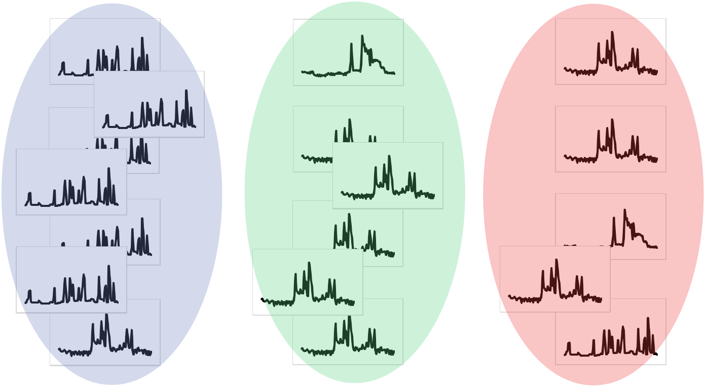
At first, it seems that individual LV consumers behave randomly on a daily basis.
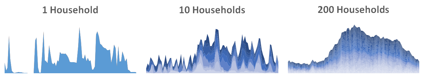
By analyzing multiple consumers at the level of the transformer station or at some other higher level in the network the shape of typical daily load profiles can be identified. The figure below shows the daily load profile for one household, followed by daily load profiles for 10 and 200 households. We can see that by adding the load profiles the shapes become smoother.

Since we want to examine the habits of individual consumer groups, we need to combine only their load profiles. For example, we may want to combine the daily load profiles of only one certain type of 1-phase households.
Division of input data
Consumers were divided into two groups: 1-phase & 3-phase households. Since loads are highly dependent on temperatures, load profiles were further divided according to three seasons: winter, inter-season, and summer. So, in the end, this provides us with 6 matrices (2 types of consumers in 3 seasons). Clustering has to be performed for every matrix separately.
How do we perform clustering?
We used the well known k-means algorithm, but with one modification. A typical k-means implementation which is accessible in the popular machine learning libraries uses Euclidian distances as a distance measure between observations. But this is not appropriate for time series clustering, thus we used dynamic time warping distance measure.
For example, imagine a random daily load profile with 15-min resolution as presented on the left subplot of the preceding graph. If we want to group a lot of daily load profiles in a few groups we have to allow grouping of the load profiles that are similar in near time intervals. Which seems reasonable, since if one daily load profile has evening peak, for example, 15-min later than the other one, this still represents similar behavior. This is where dynamic time warping comes in place. A great explanation of why dynamic time warping is an appropriate distance measure for time series data is available here. For mathematical explanation see this paper.
How the input matrix (features) looks like?
Since we have 15-min resolution data, every 15-min time interval represents one feature, therefore there are 96 features (since there are 96 measurements per day).
What are observations (rows) in our case?
Daily load profiles for all selected consumers. E.g. for 1-phase household during winter time: if we have 100 winter days and 10.000 1-phase households, this provides us with 1.000.000 rows. So the input matrix is of shape 96 x 1.000.000.
Clustering Results
Clustering results provide a label of the corresponding cluster for every daily load profile.
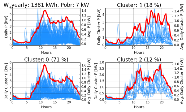
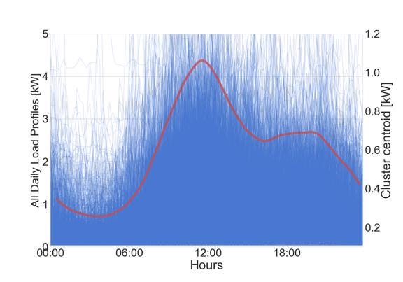
The figure below shows the results for one household. The top left corner shows all the daily load profiles for a selected consumer during winter time with mean load profile plotted on the secondary y-axis. Other subplots show the profiles that correspond to each of the clusters. This consumer mainly behaves according to cluster 0 (in approx. 70 % of the cases), thus the mean winter profile in the top left corner is very similar to the one in the bottom left.

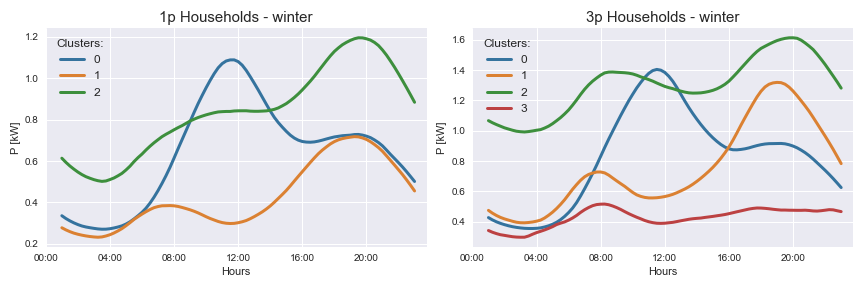
After computing final cluster centroids for 1-phase and 3-phase households separately we can plot the results. The figure below shows the results. The number of clusters was determined manually. If we take a look at the result for 1-phase households on the left side of the figure, we see that blue cluster centroid represents probably the behavior of elderly people who are most activate at noon, when they have lunch. The orange one represents the behavior of people that have a typical 8-hour work schedule. When they wake up demand increases, then decreases throughout the middle of the day and finally increases in the afternoon when they come back home. The last one plotted with a green color probably represents the behavior of students (non-working people) whose activity progresses throughout the day. The cluster centroids for 3-phase households on the right side of the figure are quite similar but with more profiles that are less fluctuating throughout the day, which is probably due to the fact that in some cases small commercial consumers or small farms are registered as 3-phase households.

If we take a look at how all the daily load profiles in cluster 0 look like we see the graph below. Here I plotted all the profiles with thin and little transparent lines in order to see outlines of typical behaviors.

Do you want to see more cool plots?
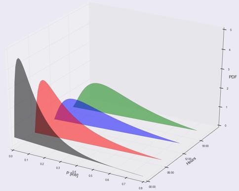
Assuming you love cool data visualizations see another awesome graph below. After computing clusters, load probability density functions (PDFs) can be examined for every cluster in order to use this in further probabilistic load flow analyses. Here you can see results for 1-phase households during winter time — cluster 0. The x-axis represents load in kW, y-axis hours of the day and z-axis load probability density. If you take a look at the black PDF at midnight, it can be seen that there are greater load probabilities near zero, since people are sleeping. Red PDF represents loads at 6 am, it can be seen that loads become higher since people start waking up. Blue and green ones represent PDFs at 12:00 and 18:00.

Conclusion
Using machine learning methods of grouping (clustering), the typical daily load profiles can be determined from a large amount of input data. This allows distinguishing between different types of households and other consumers.
The analyses of metering data from smart meters allow a better understanding of the consumer behaviors. The results can be further used for various analysis.
Do you have any suggestions for performing time series clustering or any other comments that you wish to add? Please leave the comment below.
If you are interested in this topic you can also join a LinkedIn group called Data Analytics & Machine Learning in Smart Grids where I post about this topic.
For more details about time series clustering you can see my two papers where I used clustering:
M. Grabner et al., Statistical Load Time Series Analysis for the Demand Side Managment, (will be) presented on IEEE ISGT conference in Sarajevo, 2018.