
In recent times, illustration has become the core component to create the identity of any product…


Illustration Style Guide
In recent times, illustration has become the core component to create the identity of any product or brand. It works like magic; blending into the soul of the product it represents the value to the world strongly but silently. A good illustration also has the power or capability to represent any complex situation or content in a simplified and easily comprehensible way. It helps the brand to tell their stories in a cohesive, recognizable and enduring manner.
The reason I am writing this article because I have faced this issue a lot that for every project we need to create a proper style guide for illustrations before jumping into the final project. I’ve noticed that for visual or interaction design we maintain a style guide but as most of the time for each project, one illustrator only gets allocated so we don’t feel the need for creating the style guide for illustrations.
Why do we create Illustration Style Guide:
I am sure there may be a hundred different reasons for creating a style guide for illustrations but here I am projecting the three most profound reasons that I think are most important in this scenario.
An illustration style guide is nothing but the primary visual DNA or the manual detailed guidelines of a particular illustration style to follow.
● Maintaining the brand identity is one of the most important reasons behind creating this type of style guide. Without a proper style guide, it will be really tough for the illustrator to maintain the rationals, efficacy, and consistency throughout the project.
● Even this manual guideline helps the illustrator to give the remainder of the basic keynotes while working after a time gap.
● A proper style guide also helps the other illustrators to perpetuate the style while working for the same project. It allows their work to remain under the same family.


Plan before execution:
After getting a project don’t start creating illustrations immediately. Before starting, the illustrator should follow a few mandatory things that I believe will help a lot in future.
● The Purpose for Illustration: The first and foremost thing is to understand the necessity of illustration in any project. The designer also needs to understand what the client or the stakeholder wants to achieve from the project; will any type of illustration be of help in that process or not.
● Target Audience: The illustrator also should be clear about the target audience. Without this clarity, it will be quite impossible to build the mood for illustrations.
● Value: It is the illustrator’s responsibility to know what value the illustration will add to the project. So it should be clear how the illustrations will work within the interface to help better interaction. The illustrator also should be clear whether the illustrations will be used to interact with the users or simply just for visual representation.
● Moodboards: As soon as the above-mentioned points will be cleared the illustrator should start working for mood boards. This works as a bridge or communicator between the illustrator and the client. With the help of the mood board, it will be easy to know the client’s taste and then adopt the proper style. Even one can blend easily his/her own style along with this.
● Explore: For each project, I always keep a folder, named “Reference”. There I dump all my explorations. I try to explore as much as possible before creating the mood board. This exploration can be random. Before fixing any particular style your thought can travel through various styles. This will help to merge two or more different styles to develop an entirely new style. Exploration also helps to grow your knowledge in the illustration field about the current trends and style.
Language for Illustrations:
Once the client gives the confirmation, It’s time to start creating the illustrations. But as for any project, there will be a requirement for multiple illustrations and you may have to work collaboratively with other illustrators or in future in your absence any other illustrator need to work on; for all these reasons you should work on to fix the final design language before starting the project. It will be better to adopt a style that everyone is comfortable with. It should not be too detailed but there should be some tricks or elements that generate a “wow effect” in the illustrations.
After fixing the final style the illustrator also should show all the different sectors or situations into that particular style of illustration into one single sheet.
The illustrator should share that sheet with the client as well. So that the client also can have a clear idea of how the product representation will come out as the final outcome.
The Illustration Categories: For a better understanding here I’ve taken examples from one of our projects. We have created the marketing website for that. I have taken care of the illustration and animation part of it.
In this particular project, I’ve adopted a style which is little casual but corporate enough to show the seriousness of the product. Also, the style is very simple and easily recognizable. So that viewer can get the story easily.
The categories pointed below are the main and common sectors for any project:
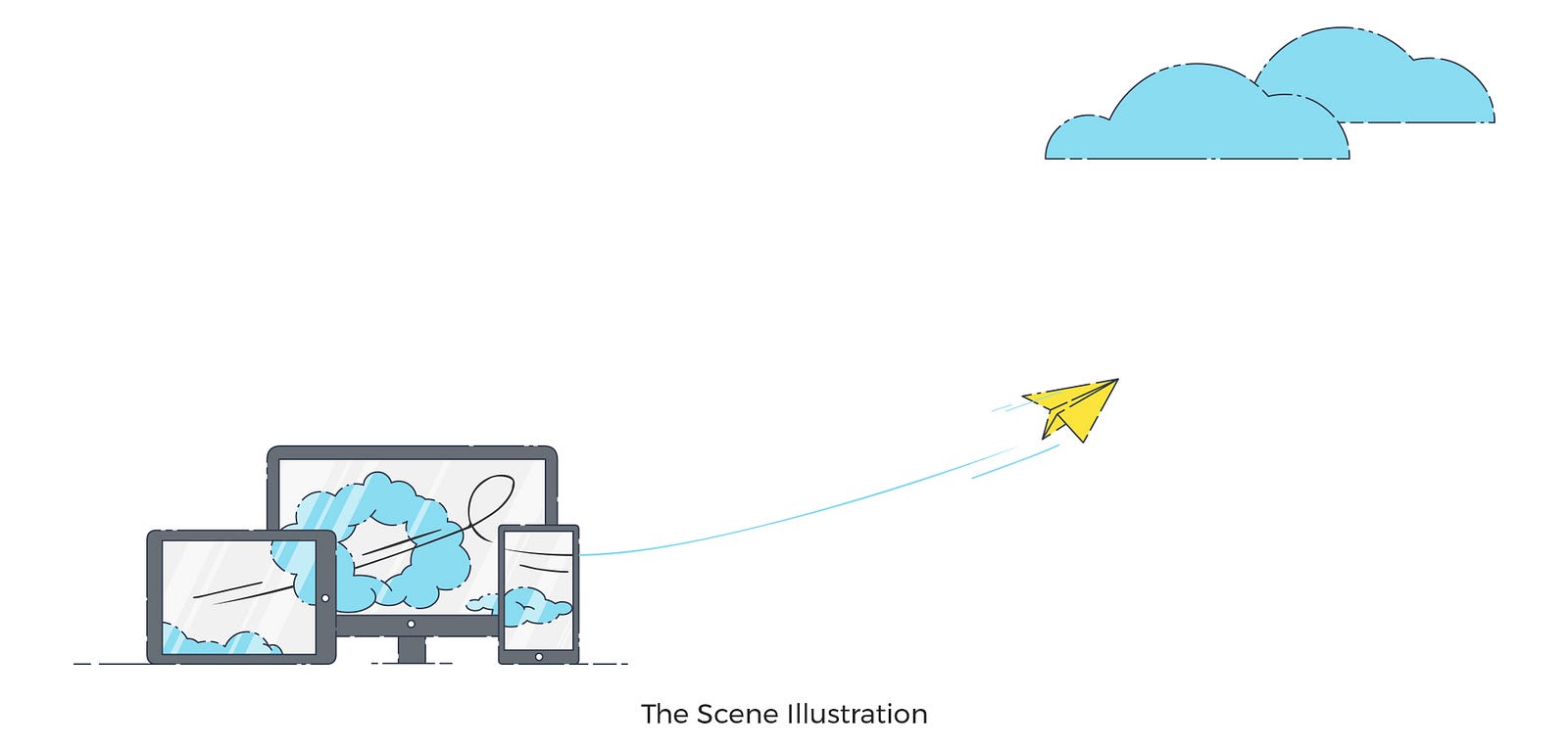
● The Scene Illustrations: The scene illustration appears on a large scene mainly on banners. Most of the time they don’t have any supportive text. They express the story either directly or indirectly. But on the hierarchy, these are on top. So you have to give some extra thought while creating these. Here is my scenario, I have taken a bit of an indirect approach.

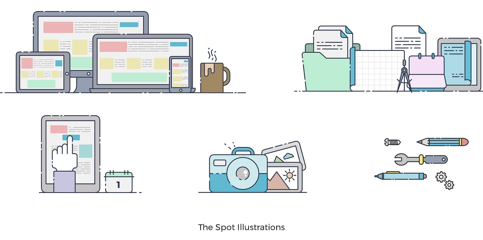
● The Spot Illustrations: These are used to demonstrate certain attributes or features. These are also used as an explanatory illustration for better clarity in case of confusion or lifelessness. These should be crisp and clear and to the point. The level of detailing should be at a certain level; so that without making it too busy or complicated there will be a depth in the composition.

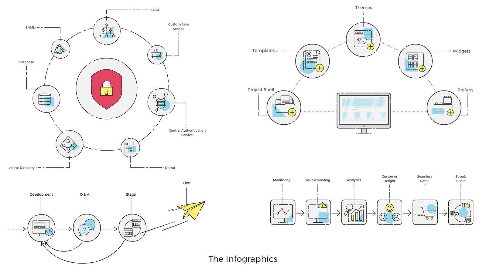
● The Infographics: Infographics are the visual representation of information in a chart or diagram format. Here in this particular project, we have used a number of infographics to convey the different aspects and scenario of the product in a simple but interesting way. To do this I have depicted each element through an icon. This is based on the common human psychology i:e we get any story more easily through illustrations than text.

● The Icons: The icons are used to display a snapshot of the surrounding content’s theme or main idea. These should be drawn in the simplest way so that it will be easily identified by the users. Here I’ve tried to express through very common idioms. The icon size may vary from 10px to 60px. Keeping that in mind I have detailed out the icons. They are sleek but prominent and easily accessible.


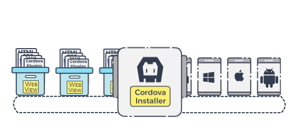
● The Animation: During the situations where it turned out to be a little complicated to express through infographics, I’ve taken help of simple animation. Through animation sometimes it’s very easy to explain the complicated story. But in the animation also I kept the same styling.

Our Approach:
Illustration played a very important role in this project. Our main aim or moto was to create illustrations in a friendly informal way but still, they should have a weight or gravity. They are used to guide users for better interactions and also to draw their attention to show specific features across the platform.
● Mood: While creating the website for our the product we kept the theme simple, clean and clear. We followed the same mood in the illustration as well.
● Colour Palette: We have created the colour palette very carefully keeping the brand identity in mind.

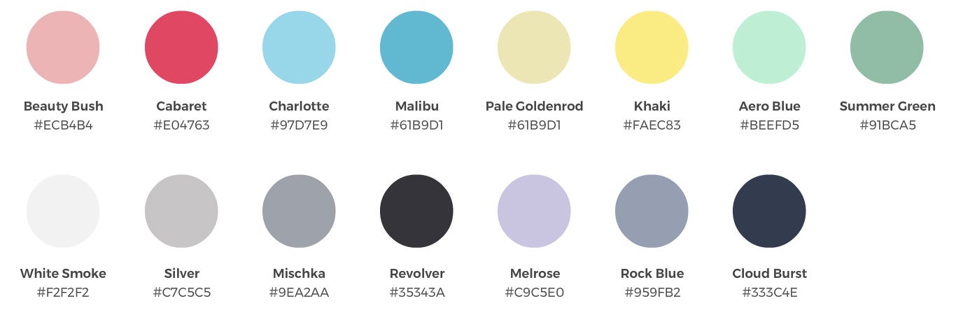
● Colour Balance: The target was not to use a lot of colours. As the logo is of a blue shade, so we have chosen a very light shade of blue along with a bright yellow for contrast. And dark grey for stroke.

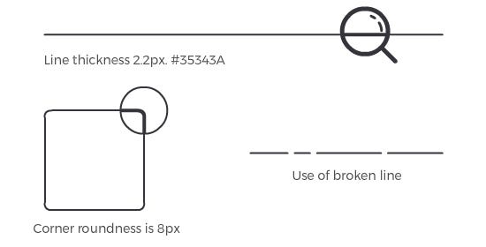
● Stroke: Here in these illustrations strokes are the most important elements. Strokes are used to create the main structure of each illustration. To break the monotony I have used broken strokes. This style also helps to express the casual informal look. The stroke thickness is 2.2px and the corner roundness is 8px.

Conclusion:
More and more illustrators and modern day are increasingly referring to well made Illustration style guides. These style guides are like the bluebook of success — to deliver exactly what your customers want and create world-class design outputs.