
盒子垂直居中css
前言
我們都知道,固定高寬的div在網頁中垂直居中很簡單,相信大家也很容易的寫出來,但是不是固定高寬的div如何垂直居中呢?我們在網頁佈局,特別是手機等web端網頁經常是不固定高寬的div,那麼這些div如何垂直居中呢?這篇文章,我總結一下。
固定高寬div垂直居中
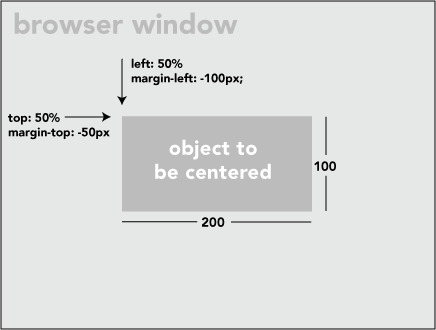
如上圖,固定高寬的很簡單,寫法如下:
 position: absolute;
 left:50%;
 top:50%;
width:200px;
height:100px;
margin-left:-100px;
margin-top:-50px;
不固定高寬div垂直居中的方法
方法一:
用一個“ghost”偽元素(看不見的偽元素)和 inline-block / vertical-align 可以搞定居中,非常巧妙。但是這個方法要求待居中的元素是 inline-block,不是一個真正通用的方案。
html如下:
<divclass="block"style="height:300px;"><divclass="centered"><h1>haorooms案例題目</h1><p>haorooms案例內容,haorooms案例內容haorooms案例內容haorooms案例內容haorooms案例內容haorooms案例內容haorooms案例內容haorooms案例內容haorooms案例內容</p></div></div>css如下:
/* This parent can be any width and height */ 方法二:
可以用table佈局方法,但是這種方法也有侷限性!
寫法如下:
<tablestyle="width:100%;"><tr><tdstyle="text-align: center; vertical-align: middle;">
          Unknown stuff to be centered.
     </td></tr></table>
由於table寫法比較費時,你也可以用div代替table,寫法如下:
html:
<divclass="something-semantic"><divclass="something-else-semantic">
       Unknown stuff to be centered.
   </div></div>
css:
.something-semantic {
   display: table;
   width:100%;}.something-else-semantic {
   display: table-cell;
   text-align: center;
   vertical-align: middle;}
方法三,終極解決方法:
以上2中方法可能都有其侷限性,我介紹的第三中方法是比較成熟的不是固定高寬div的垂直居中的方法!但是方法是css3的寫法,想相容IE8的童鞋們,建議用上面的方法!
方法和我們固定高寬的差不多,但是不用margin我們用的是 translate()
demo如下:
<!DOCTYPE html PUBLIC "-//W3C//DTD XHTML 1.0 Strict//EN" "http://www.w3.org/TR/xhtml1/DTD/xhtml1-strict.dtd"><htmlxmlns="http://www.w3.org/1999/xhtml"xml:lang="en"><head><metahttp-equiv="Content-Type"content="text/html;charset=UTF-8"><title>haorooms不固定高度div寫法</title><style>.center {
  position:fixed;
  top:50%;
  left:50%;
  background-color:#000;
  width:50%;
  height:50%;-webkit-transform: translateX(-50%) translateY(-50%);}</style></head><body><divclass="center"></div></body></html>
我上面的css只是針對webkit核心的瀏覽器,其他核心瀏覽器寫法如下:
-webkit-transform: translateX(-50%) translateY(-50%);-moz-transform: translateX(-50%) translateY(-50%);-ms-transform: translateX(-50%) translateY(-50%);
transform: translateX(-50%) translateY(-50%);
有些彈出層的樣式,也可以用這個方法居中
position:fixed;
top:50%;
left:50%;
width:50%;
max-width:630px;
min-width:320px;
height:auto;
z-index:2000;
visibility: hidden;-webkit-backface-visibility: hidden;-moz-backface-visibility: hidden;
backface-visibility: hidden;-webkit-transform: translateX(-50%) translateY(-50%);-moz-transform: translateX(-50%) translateY(-50%);-ms-transform: translateX(-50%) translateY(-50%);
transform: translateX(-50%) translateY(-50%);
css3不定寬高水平垂直居中
只要三句話就可以實現不定寬高水平垂直居中。
justify-content:center;//子元素水平居中
align-items:center;//子元素垂直居中
display:-webkit-flex;
在父級元素上面加上上面3句話,就可以實現子元素水平垂直居中。
運用margin:auto進行垂直居中
margin的值設定為auto,可以讓我們對剩餘空間進行分配!我們知道,塊級元素設定為margin:0 auto;可以左右居中顯示!那有沒有辦法讓margin設定為margin:auto之後,上下左右都居中呢?上下左右都居中,就可以實現我們的垂直居中了!
答案是有的,只要我們讓上下有足夠的空間,就可以讓margin的auto來分配上下空間。
我們可以利用定位的方式,讓margin上下左右都有足夠的空間!那麼就可以用margin:auto來實現垂直居中了!
實現html如下:(做一個簡單的垂直彈框)
<divclass="father"><divclass="son"></div></div>css程式碼如下,很簡單,相容性也蠻好,支援IE8+
.father{position:fixed;width:100%;height:100%;top;0;left:0;background-color:rgba(0,0,0,.7);}.son{position: absolute;top:0;left:0;bottom:0;right:0;width:50%;height:50%;margin:auto;background-color:red;}這樣就可以實現垂直居中了,是不是很簡單?!!