
android的shape屬性
阿新 • • 發佈:2019-01-09
一、簡單使用
剛開始,就先不講一堆標籤的意義及用法,先簡單看看shape標籤怎麼用。
1、新建shape檔案
首先在res/drawable資料夾下,新建一個檔案,命名為:shape_radius.xml
內容是這樣的:(先不需要理解,先看shape怎麼用)
[html] view plain copy print ?
- <?xml version="1.0" encoding="utf-8"?>
- <shape xmlns:android="http://schemas.android.com/apk/res/android" >
- <corners android:radius="20dip"/>
- <solid android:color="#ff00ff"/>
- </shape>
<?xml version="1.0" encoding="utf-8"?>
<shape xmlns:android="http://schemas.android.com/apk/res/android" >
    <corners android:radius="20dip"/>
    <solid android:color="#ff00ff"/>

</shape>
2、新增到控制元件中
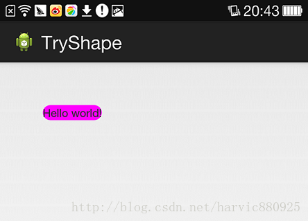
在定義好shape檔案後,下一步就是將其新增到控制元件中,新增到控制元件中,一般是使用設定background屬性,將其為控制元件背景,下面,我們將其設定為MainActivity對應的佈局中(activity_main.xml),將其設為TextView的背景,看顯示出來 是什麼樣子的。
[html] view plain copy print ?
- <RelativeLayout xmlns:android="http://schemas.android.com/apk/res/android"
- xmlns:tools="http://schemas.android.com/tools"
- android:layout_width="match_parent"
- android:layout_height="match_parent"
- tools:context="com.harvic.tryshape.MainActivity" >
- <TextView
- android:layout_width="wrap_content"
- android:layout_height="wrap_content"
- android:layout_margin="50dip"
- android:text="@string/hello_world"
- android:background="@drawable/shape_radius"/>
- </RelativeLayout>
<RelativeLayout xmlns:android="http://schemas.android.com/apk/res/android"
    xmlns:tools="http://schemas.android.com/tools"
    android:layout_width="match_parent"
    android:layout_height="match_parent"
    tools:context="com.harvic.tryshape.MainActivity" >

    <TextView
        android:layout_width="wrap_content"
        android:layout_height="wrap_content"
        android:layout_margin="50dip"
        android:text="@string/hello_world"
        android:background="@drawable/shape_radius"/>

</RelativeLayout>
顯示出來的結果是這樣的:
二、基本屬性(corners、gradient、padding、size、solid、stroke)
上面給大家簡單的講了下shape標籤組的簡單使用方法,下面就具體講講shape標籤裡所具有的幾個子標籤及所具有的屬性。
1、Corners
[html] view plain copy print ?
- <corners //定義圓角
- android:radius="dimension" //全部的圓角半徑
- android:topLeftRadius="dimension" //左上角的圓角半徑
- android:topRightRadius="dimension" //右上角的圓角半徑
- android:bottomLeftRadius="dimension" //左下角的圓角半徑
- android:bottomRightRadius="dimension" /> //右下角的圓角半徑
<corners    //定義圓角
    android:radius="dimension"      //全部的圓角半徑
    android:topLeftRadius="dimension"   //左上角的圓角半徑
    android:topRightRadius="dimension"  //右上角的圓角半徑
    android:bottomLeftRadius="dimension"    //左下角的圓角半徑
    android:bottomRightRadius="dimension" />    //右下角的圓角半徑
Corners標籤是用來字義圓角的,其中radius與其它四個並不能共同使用。
android:radius:定義四個角的的圓角半徑。
其它四個是逐個字義每個角的圓角半徑。
使用:
控制元件佈局:
[html] view plain copy print ?
- <RelativeLayout xmlns:android="http://schemas.android.com/apk/res/android"
- android:layout_width="match_parent"
- android:layout_height="match_parent" >
- <TextView
- android:layout_width="100dp"
- android:layout_height="100dp"
- android:layout_margin="50dip"
- android:text="@string/hello_world"
- android:background="@drawable/shape_radius"/>
- </RelativeLayout>
<RelativeLayout xmlns:android="http://schemas.android.com/apk/res/android"
android:layout_width="match_parent"
android:layout_height="match_parent" >
<TextView
android:layout_width="100dp"
android:layout_height="100dp"
android:layout_margin="50dip"
android:text="@string/hello_world"
android:background="@drawable/shape_radius"/>
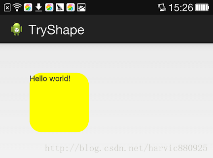
</RelativeLayout>shape定義:
[html] view plain copy print ?
- <?xml version="1.0" encoding="utf-8"?>
- <shape xmlns:android="http://schemas.android.com/apk/res/android" >
- <corners android:radius="20dip"/>
- <solid android:color="#ffff00"/>
- </shape>
<?xml version="1.0" encoding="utf-8"?>
<shape xmlns:android="http://schemas.android.com/apk/res/android" >
    <corners android:radius="20dip"/>
    <solid android:color="#ffff00"/>
</shape>
效果:
2、solid
solid用以指定內部填充色
只有一個屬性:
[html] view plain copy print ?
- <solid android:color="color" />
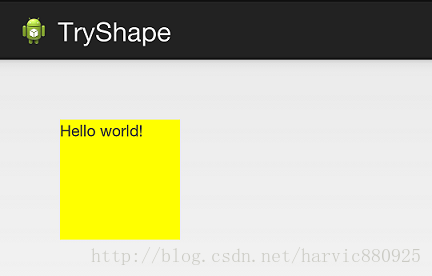
<solid android:color="color" /> 在上面的例子中,我們就將填充色指定為#ffff00了,如果我們不加圓角,只使用填充色,即將shape變成這樣子:
[html] view plain copy print ?
- <?xml version="1.0" encoding="utf-8"?>
- <shape xmlns:android="http://schemas.android.com/apk/res/android" >
- <solid android:color="#ffff00"/>
- </shape>
<?xml version="1.0" encoding="utf-8"?>
<shape xmlns:android="http://schemas.android.com/apk/res/android" >
    <solid android:color="#ffff00"/>
</shape>
那效果就是這樣的:
3、gradient
gradient用以定義漸變色,可以定義兩色漸變和三色漸變,及漸變樣式,它的屬性有下面幾個: