
CSS/HTML 一個漂亮的使用者註冊(使用者登入)頁面 動態效果
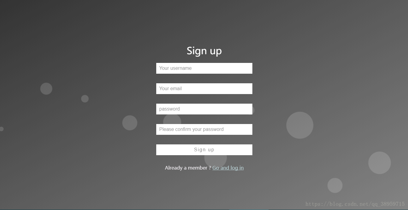
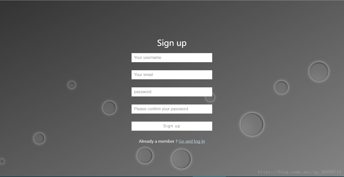
先上效果圖吧
平面泡沫
立體泡沫
之前想做動態泡泡的效果,在網上沒有搜到類似的樣式。所以自己做了一個發上來,給有需要的人蔘考參考。程式碼部分有疑問或者有錯請在評論指出,儘量快點回復。
程式碼部分:(無奈,發程式碼格式一直亂碼)
<!DOCTYPE html>
<html>
<head lang="en">
<meta charset="UTF-8">
<title>register</title>
<style type="text/css">
* {
box-sizing: border-box;
}
body {
margin: 0;
padding: 0;
font: 16px/20px microsft yahei;
}
.wrap {
width: 100%;
height: 100%;
padding: 10% 0;
position: fixed;
opacity: 0.8;
background: linear-gradient(to bottom right,#000000, #656565);
background: -webkit-linear-gradient(to bottom right,#50a3a2,#53e3a6);
}
.container {
width: 60%;
margin: 0 auto;
}
.container h1 {
text-align: center;
color: #FFFFFF;
font-weight: 500;
}
.container input {
width: 320px;
display: block;
height: 36px;
border: 0;
outline: 0;
padding: 6px 10px;
line-height: 24px;
margin: 32px auto;
-webkit-transition: all 0s ease-in 0.1ms;
-moz-transition: all 0s ease-in 0.1ms;
transition: all 0s ease-in 0.1ms;
}
.container input[type="text"] , .container input[type="password"] {
background-color: #FFFFFF;
font-size: 16px;
color: #50a3a2;
}
.container input[type='submit'] {
font-size: 16px;
letter-spacing: 2px;
color: #666666;
background-color: #FFFFFF;
}
.container input:focus {
width: 400px;
}
.container input[type='submit']:hover {
cursor: pointer;
width: 400px;
}
.to_login{
color: #a7c4c9;
}
.text{
color: #e2dfe4;
}
.wrap ul {
position: absolute;
top: 0;
left: 0;
width: 100%;
height: 100%;
z-index: -20;
}
.wrap ul li {
list-style-type: none;
display: block;
position: absolute;
bottom: -120px;
width: 15px;
height: 15px;
z-index: -8;
border-radius: 50%;
background-color:rgba(255, 255, 255, 0.15);
animotion: square 25s infinite;
-webkit-animation: square 25s infinite;
}
.wrap ul li:nth-child(1) {
left: 0;
animation-duration: 10s;
-moz-animation-duration: 10s;
-o-animation-duration: 10s;
-webkit-animation-duration: 10s;
}
.wrap ul li:nth-child(2) {
width: 40px;
height: 40px;
left: 10%;
animation-duration: 15s;
-moz-animation-duration: 15s;
-o-animation-duration: 15s;
-webkit-animation-duration: 11s;
}
.wrap ul li:nth-child(3) {
left: 20%;
width: 25px;
height: 25px;
animation-duration: 12s;
-moz-animation-duration: 12s;
-o-animation-duration: 12s;
-webkit-animation-duration: 12s;
}
.wrap ul li:nth-child(4) {
width: 50px;
height: 50px;
left: 30%;
-webkit-animation-delay: 3s;
-moz-animation-delay: 3s;
-o-animation-delay: 3s;
animation-delay: 3s;
animation-duration: 12s;
-moz-animation-duration: 12s;
-o-animation-duration: 12s;
-webkit-animation-duration: 12s;
}
.wrap ul li:nth-child(5) {
width: 60px;
height: 60px;
left: 40%;
animation-duration: 10s;
-moz-animation-duration: 10s;
-o-animation-duration: 10s;
-webkit-animation-duration: 10s;
}
.wrap ul li:nth-child(6) {
width: 75px;
height: 75px;
left: 50%;
-webkit-animation-delay: 7s;
-moz-animation-delay: 7s;
-o-animation-delay: 7s;
animation-delay: 7s;
}
.wrap ul li:nth-child(7) {
left: 60%;
width: 30px;
height: 30px;
animation-duration: 8s;
-moz-animation-duration: 8s;
-o-animation-duration: 8s;
-webkit-animation-duration: 8s;
}
.wrap ul li:nth-child(8) {
width: 90px;
height: 90px;
left: 70%;
-webkit-animation-delay: 4s;
-moz-animation-delay: 4s;
-o-animation-delay: 4s;
animation-delay: 4s;
}
.wrap ul li:nth-child(9) {
width: 50px;
height: 50px;
left: 80%;
animation-duration: 20s;
-moz-animation-duration: 20s;
-o-animation-duration: 20s;
-webkit-animation-duration: 20s;
}
.wrap ul li:nth-child(10) {
width: 75px;
height: 75px;
left: 90%;
-webkit-animation-delay: 6s;
-moz-animation-delay: 6s;
-o-animation-delay: 6s;
animation-delay: 6s;
animation-duration: 30s;
-moz-animation-duration: 30s;
-o-animation-duration: 30s;
-webkit-animation-duration: 30s;
}
@keyframes square {
0% {
-webkit-transform: translateY(0);
transform: translateY(0)
}
100% {
bottom: 400px;
-webkit-transform: translateY(-500);
transform: translateY(-500)
}
}
@-webkit-keyframes square {
0% {
-webkit-transform: translateY(0);
transform: translateY(0)
}
100% {
bottom: 400px;
-webkit-transform: translateY(-500);
transform: translateY(-500)
}
}
</style>
</head>
<body>
<div class="wrap">
<div class="container">
<h1>Sign up</h1>
<form>
<input type="text" placeholder="Your username"/>
<input type="text" placeholder="Your email"/>
<input type="password" placeholder="password" />
<input type="password" placeholder="Please confirm your password" />
<input type="submit" value="Sign up"/>
<p class="change_link" align="center">
<span class="text">Already a member ?</span>
<a href="login.html" class="to_login"> Go and log in </a>
</p>
</form>
</div>
<ul>
<li></li>
<li></li>
<li></li>
<li></li>
<li></li>
<li></li>
<li></li>
<li></li>
<li></li>
<li></li>
</ul>
</div>
</body>
</html>
立體效果的話,在無序列表li增加box-shadow屬性,根據自己需求調整即可。
我把我的發出來
.wrap ul li {list-style-type: none;
display: block;
position: absolute;
bottom: -120px;
width: 15px;
height: 15px;
z-index: -8;
border-radius: 50%;
box-shadow: inset -30px -30px 75px rgba(0, 0, 0, .2),
inset 0px 0px 5px rgba(0, 0, 0, .5),
inset -3px -3px 5px rgba(0, 0, 0, .5),
0 0 20px rgba(255, 255, 255, .75);
background-color:rgba(255, 255, 255, 0.15);
animotion: square 25s infinite;
-webkit-animation: square 25s infinite;
}
相關推薦
CSS/HTML 一個漂亮的使用者註冊(使用者登入)頁面 動態效果
先上效果圖吧平面泡沫立體泡沫之前想做動態泡泡的效果,在網上沒有搜到類似的樣式。所以自己做了一個發上來,給有需要的人蔘考參考。程式碼部分有疑問或者有錯請在評論指出,儘量快點回復。程式碼部分:(無奈,發程式碼格式一直亂碼)<!DOCTYPE html><html
js學習入門教程筆記:css+html+js使用者註冊程式碼實現
執行截圖:如下: 使用者註冊:結構層:html;表現層:css;行為層:javascript; html利用ul,li來構造: 注意事項:1、每個Input都要有相應的id,這是在js中去呼叫的。 2、<a href
2017.05.12-3 SpringBoot簡單登入註冊-註冊(附原始碼)
並非是那種傳授並分享知識的,只想在個人部落格上把自己學的東西記錄下來,也希望我記錄的東西對各位看官有幫助。 下面是大致的結構目錄跟效果圖 要解釋起來一時半會說不清楚,乾脆就直接偷懶上註冊的程式碼跟原始碼 其實程式碼很少,也很容易理解 pro.xm <pa
SpringBoot簡單登入註冊-註冊(附原始碼)
並非是那種傳授並分享知識的,只想在個人部落格上把自己學的東西記錄下來,也希望我記錄的東西對各位看官有幫助。 下面是大致的結構目錄跟效果圖 要解釋起來一時半會說不清楚,乾脆就直接偷懶上註冊的程式碼跟原始碼 其實程式碼很少,也很容易理解 pro.xm
html特殊字符(css3 content)
字符 class lan ron ffd display lock ont round 由於偶爾用到,又經常忘記,所以把網上的資料考下來記錄一下。 <!DOCTYPE html> <html lang="en"> <head> <
利用jdbc簡單封裝一個小框架(類似DBUtils)
add string url lar conn () 列名 lang con 利用jdbc寫的一個類似DBUtils的框架 package com.jdbc.orm.dbutils; import java.io.IOException; import java.io.
css之flex布局 (靈活盒子)
itl lee header pbo 靈活 翻譯 ref .html lex 這裏純當自己的筆記,相看解釋的還是去鏈接吧 打開了新世界的大門 標記一下: 中文,阮一峰的博客,語法:http://www.ruanyifeng.com/blog/2015/07/flex-gra
Zabbix 3.0.X 配置客戶端自動註冊(Auto-Registration)
zabbix auto_registration 自動註冊 一、客戶端配置 1、配置zabbix官方源 [root@node11 ~]# rpm -iUh http://repo.zabbix.com/zabbix/3.0/rhel/7/x86_64/zabbix-release-3.0-1.el
用裝飾器做一個登陸功能(進階):
read AD OS pos 商城 *args readline wrapper 改變 1 dic = { 2 ‘username‘:None, 3 ‘status‘:False 4 } 5 def login(flag): # 傳入
css多列布局(實例)
text oct spa height back 中間 red 自適應 har 前言 一列布局 二列布局 三列布局 1 一列布局 一列布局: HTML部分 <!DOCTYPE html> <html> <head> <m
enum的一個疑問?(待解決)
sys nbsp com 使用 特點 一行 inf CA 遇到的問題 1、枚舉類介紹 如果一個類的實例是有限且確定的,那麽可以使用枚舉類。比如:季節類,只有春夏秋冬四個實例。 枚舉類使用enum進行創建,其實例必須從”第一行“開始顯示寫出。 enum Season{
從零開始的全棧工程師——html篇1.9(js開篇)
== 客戶端 後臺語言 漢字 .com var 理解 客戶 頁遊 JS開篇 一、js介紹 全稱 javascript 但不是java 他是一門前臺語言 而java是後臺語言js作者 布蘭登·艾奇 前臺語言:運行在客戶端的後臺語言:跟數據庫有關的 能幹什麽? 頁面特效
css-css的基本選擇器(三種)
** 要對哪個標籤裡面的資料進行操作 (1)標籤選擇器 div { background-color:red; color:blue; } (2)class選擇器 * 每個HTML標籤中都有一個屬性 class <div class="h
小白的《CSS權威指南》筆記(下部分)
顏色和背景 顏色 color設定前景色。 前景色 color:<color> | inherit 通過給元素新增class值,然後再通過class選擇器來改變它的顏色。 替換屬性 HTML3.2的BODY屬性:TEXT、LINK、ALINK和VLINK。
小白的《CSS權威指南》筆記(上部分)
前言 書中言道,本書只涉及CSS2.0和CSS2.1的知識(PS:我是想學CSS3才買的書,看來買錯了,沒事,當作複習) CSS的優點 1.豐富的樣式 2.易於使用 3.在多個頁面上使用樣式 4.層疊(也就是選擇器有權重的作用) 5.縮減檔案大小 6.為將來做準備 元素
一個關於對比(參考基因組)的弱智錯誤
一個關於對比(參考基因組)的弱智錯誤 2018年10月25日 23:55:04 生信小白白 閱讀數:19 在重複文章:AKAP95 regulates
css的再深入9(更新中···)
一 單位 1.px 就是一個基本的單位 畫素 2.em 也是一個單位 用父級元素的字型大小乘以em前面的數字。如果父級沒有就繼承上一個父級直到body,如果body沒有那就預設是16px。 3.rem 也是一個單位,只跟根節點<html>的字型大小有關,如果沒有預設是16px。 4.l
CSS中常用中文字型(font-family)的英文名稱
宋體 SimSun 黑體 SimHei 微軟雅黑
純CSS實現立體感圓盤(立體化按鈕),點選有圖
線上編輯:https://codepen.io/sunnercms/ <div class="inner"> <div class="disc"> </div> </div> .inner{ position:relative;
Django 專案總結(3)- 第三方登入(QQ登入)
第三方登入(QQ 登入) 根據 qq 開發文件 oauth2.0 QQ 登入流程: 前端頁面點選 QQ 登入,需要跳轉到 QQ 的登入頁面,但是前端不知道 QQ 的登入連結,所以先想後端傳送請求,由伺服器生成 QQ 登入頁地址,返回給前端; 使用者在