ReactNative基礎(六)使用react-navigation實現頁面導航佈局效果(TabNavigator)
阿新 • • 發佈:2019-02-16
此部落格基於react-native-0.49.3
上一篇介紹了一下react-navigation依賴庫中的StackNavigator 這篇文章就接著上一篇繼續往下說也就是依賴庫中的第二個導航欄TabNavigator相當於Android中的TabLayout
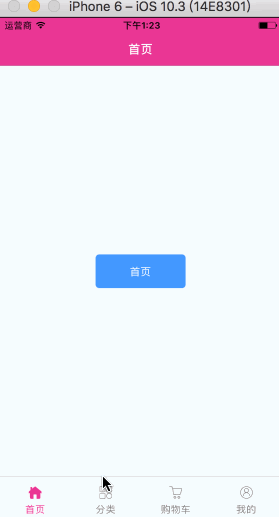
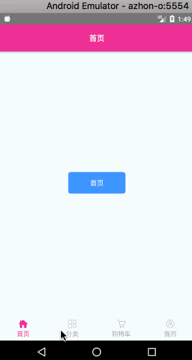
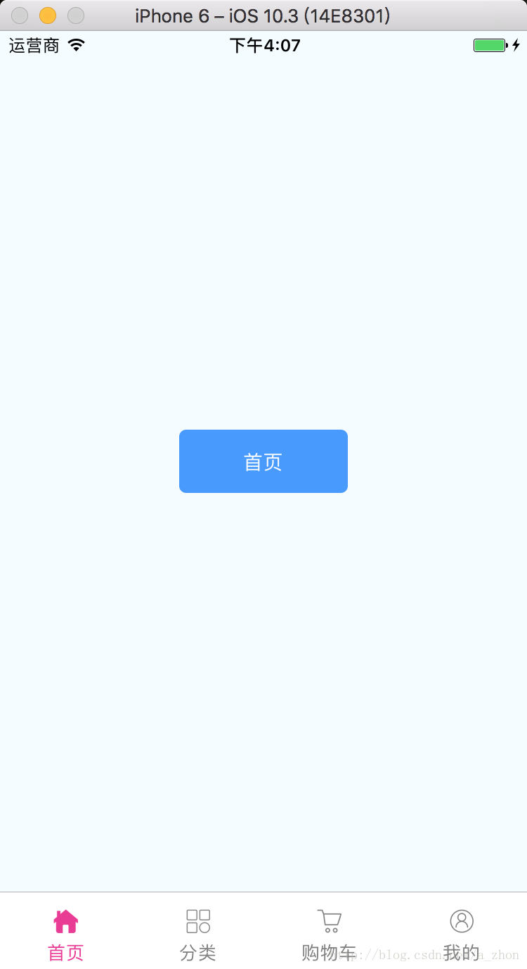
TabNavigator:
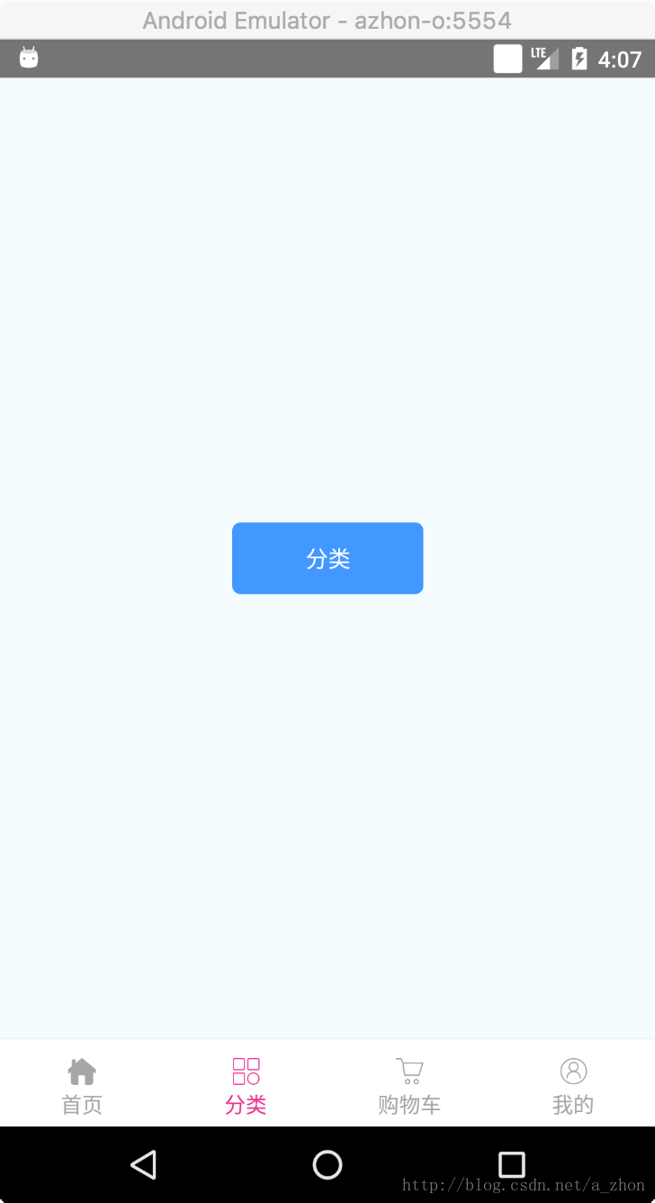
效果圖:
使用的第一步當然是下載react-navigation這個依賴庫了
- 既然使用的是第三方庫,如果在你專案的
node_modules資料夾中沒有react-navigation那麼你需要執行如下命令
//進入你專案的根目錄下執行
npm install -- 由於react-native-0.49.3這個版本直接將index.android.js和index.ios.js這兩個入口檔案直接合併為了一個index.js檔案並建立一了一個App.js檔案,那我們現在就只需要來修改我們這個檔案就可以達到我們的效果了。
直接配置導航欄
import React, {Component} from 'react';
import {
Image,
} from 'react-native';
//引入react-navigation依賴庫
import {
TabNavigator,
} from 'react-navigation' - 解釋一下上面的程式碼
//每一個頁面的配置
Home: {
    screen: Home,//當前選項卡載入的頁面
    //配置每一個選項卡的樣式
    navigationOptions: {
        tabBarLabel: '首頁',//顯示的標籤文字
        //顯示的圖片
        tabBarIcon: ({tintColor}) => (
            <Image
                source={require('./images/ic_home.png')}
                style={[{height: 24, width: 24}, {tintColor: tintColor}]}
            />
        ),
    },
},- 後半部分則是配置整個TabNavigator的樣式了;重要的東西都在上面標好了註釋認真閱讀哦!
- 更多的屬性介紹詳見文章頂部給出的官網地址
接下來就是編寫那四個頁面的佈局了,都是一樣的改幾個字就好了。
Home.js
import React, {Component} from 'react';
import {
    View,
    Text,
    StyleSheet,
    TouchableOpacity,
} from 'react-native';

export default class Home extends Component {

    render() {
        return (
            <View style={styles.container}>
                <TouchableOpacity style={styles.button} activeOpacity={0.5}>
                    <Text style={{color: 'white'}}>首頁</Text>
                </TouchableOpacity>
            </View>
        );
    }
}

const styles = StyleSheet.create({
    container: {
        flex: 1,
        justifyContent: 'center',
        alignItems: 'center',
        backgroundColor: '#F5FCFF',
    },
    button: {
        width: 120,
        height: 45,
        borderRadius: 5,
        alignItems: 'center',
        justifyContent: 'center',
        backgroundColor: '#4398ff',
    }
});
這篇文章到這就over了,TabNavigator使用起來還是很簡單的。接下來就可以寫一個將
StackNavigator、TabNavigator結合起來使用的Demo了。
將StackNavigator和TabNavigator結合使用案例下載地址