
TabLayout基本屬性全解
代碼地址如下:
http://www.demodashi.com/demo/14659.html
前言
之前講過一篇TabLayout實現頂部導航的文章,這篇文章,來詳細介紹下TabLayout的一些基本使用,讓大家以後更加方便的使用。
這篇文章涉及的內容有:
- 控件庫的導入
- TabLayout導航UI的快速實現
- TabLayout均分顯示的問題
- 和ViewPager的聯動
- 加入Padding
- Tab的寬度限制
- Tab的“Margin”
- 設置TabLayout選中和沒選中時字體顏色
- 改變指示器下標的顏色
- 改變整個TabLayout的顏色
- 改變TabLayout內部字體大小
- 改變指示器下標的高度
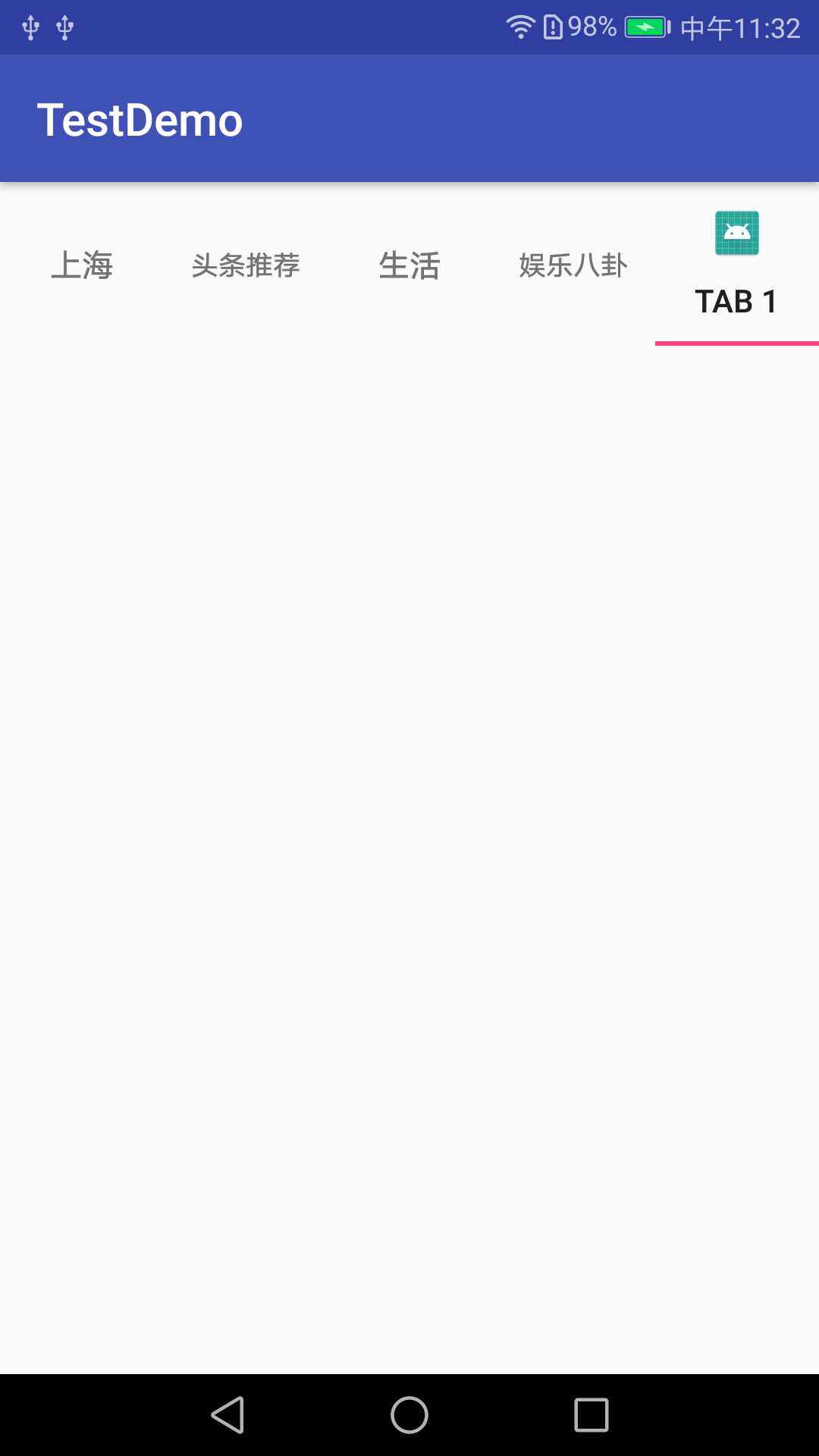
- 添加圖標
- 默認選中某項
- 監聽事件
- TabLayout點擊事件
項目截圖及效果圖
一.控件庫的導入
TabLayout屬於android的Design庫中的控件,所以需要在使用之前在項目的app對應的buildle.gradle中導入該庫:
    //TabLayout
    implementation 'com.android.support:design:27.1.1'
    implementation 'com.android.support:support-v4:27.1.1'
二.TabLayout導航UI的快速實現
TabLayout導航ui的實現有兩種方式,xml的實現和代碼的實現。
1.1 xml實現TabLayout導航欄
直接在TabLayout內部加入TabItem即可,
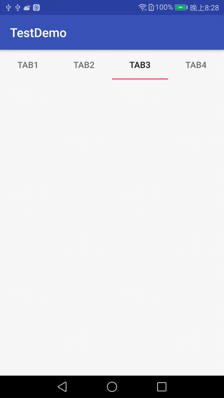
<?xml version="1.0" encoding="utf-8"?>
<android.support.constraint.ConstraintLayout xmlns:android="http://schemas.android.com/apk/res/android"
    xmlns:app="http://schemas.android.com/apk/res-auto"
    xmlns:tools="http://schemas.android.com/tools"
    android:layout_width="match_parent"
    android:layout_height="match_parent"
    tools:context="com.android.testdemo.main.MainActivity">

    <android.support.design.widget.TabLayout
        android:id="@+id/tablayout"
        android:layout_width="0dp"
        android:layout_height="wrap_content"
        app:layout_constraintEnd_toEndOf="parent"
        app:layout_constraintStart_toStartOf="parent">

        <android.support.design.widget.TabItem
            android:layout_width="wrap_content"
            android:layout_height="wrap_content"
            android:text="Tab1"/>
        <android.support.design.widget.TabItem
            android:layout_width="wrap_content"
            android:layout_height="wrap_content"
            android:text="Tab2"/>
        <android.support.design.widget.TabItem
            android:layout_width="wrap_content"
            android:layout_height="wrap_content"
            android:text="Tab3"/>
        <android.support.design.widget.TabItem
            android:layout_width="wrap_content"
            android:layout_height="wrap_content"
            android:text="Tab4"/>
    </android.support.design.widget.TabLayout>
</android.support.constraint.ConstraintLayout>
1.2 代碼實現TabLayout導航欄
先聲明一個導航 代碼實現如下:
@BindView(R.id.tablayout)
TabLayout mTabLayout;
private String mTitles[] = {
"上海", "頭條推薦", "生活", "娛樂八卦", "體育",
"段子", "美食", "電影", "科技", "搞笑",
"社會", "財經", "時尚", "汽車", "軍事",
"小說", "育兒", "職場", "萌寵", "遊戲",
"健康", "動漫", "互聯網"};
//TabLayout的基本使用
for(int i=0;i<4;i++){
TabLayout.Tab tab=mTabLayout.newTab();
tab.setTag(i);
tab.setText(mTitles[i]);
mTabLayout.addTab(tab);
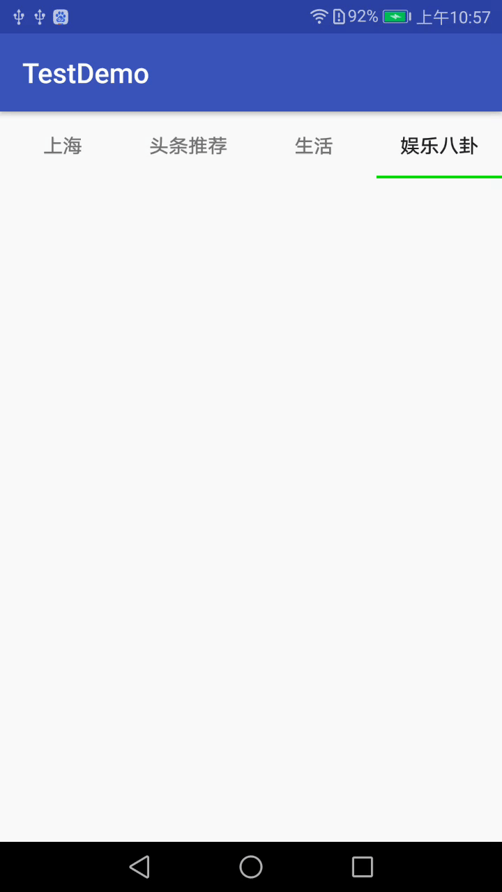
}這兩種方法的區別是xml添加的只能是固定的幾個item,若item的個數超過一屏寬度則不能使用這種方式布局,而代碼布局則能實現item的個數超過一屏寬度的布局。
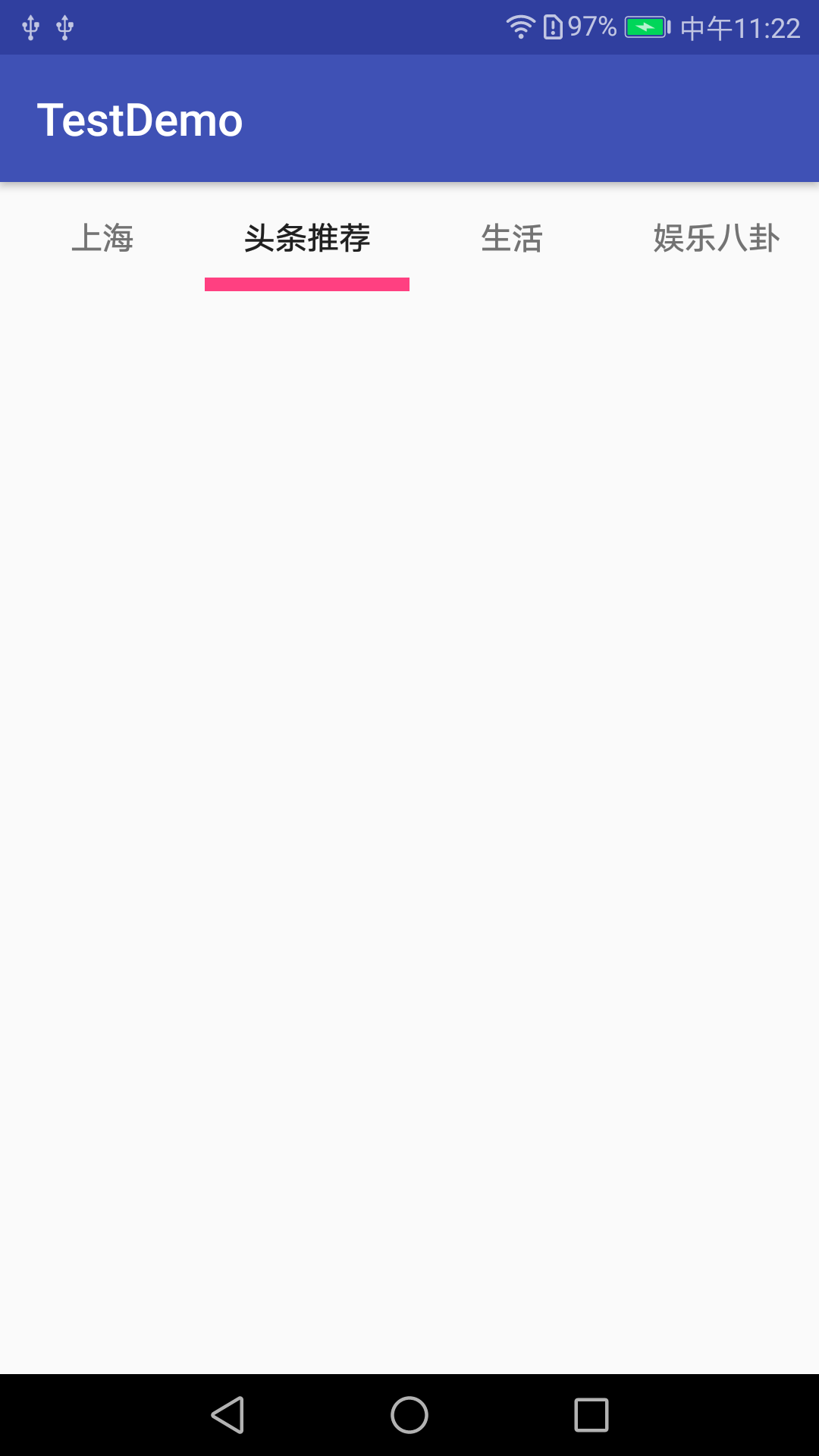
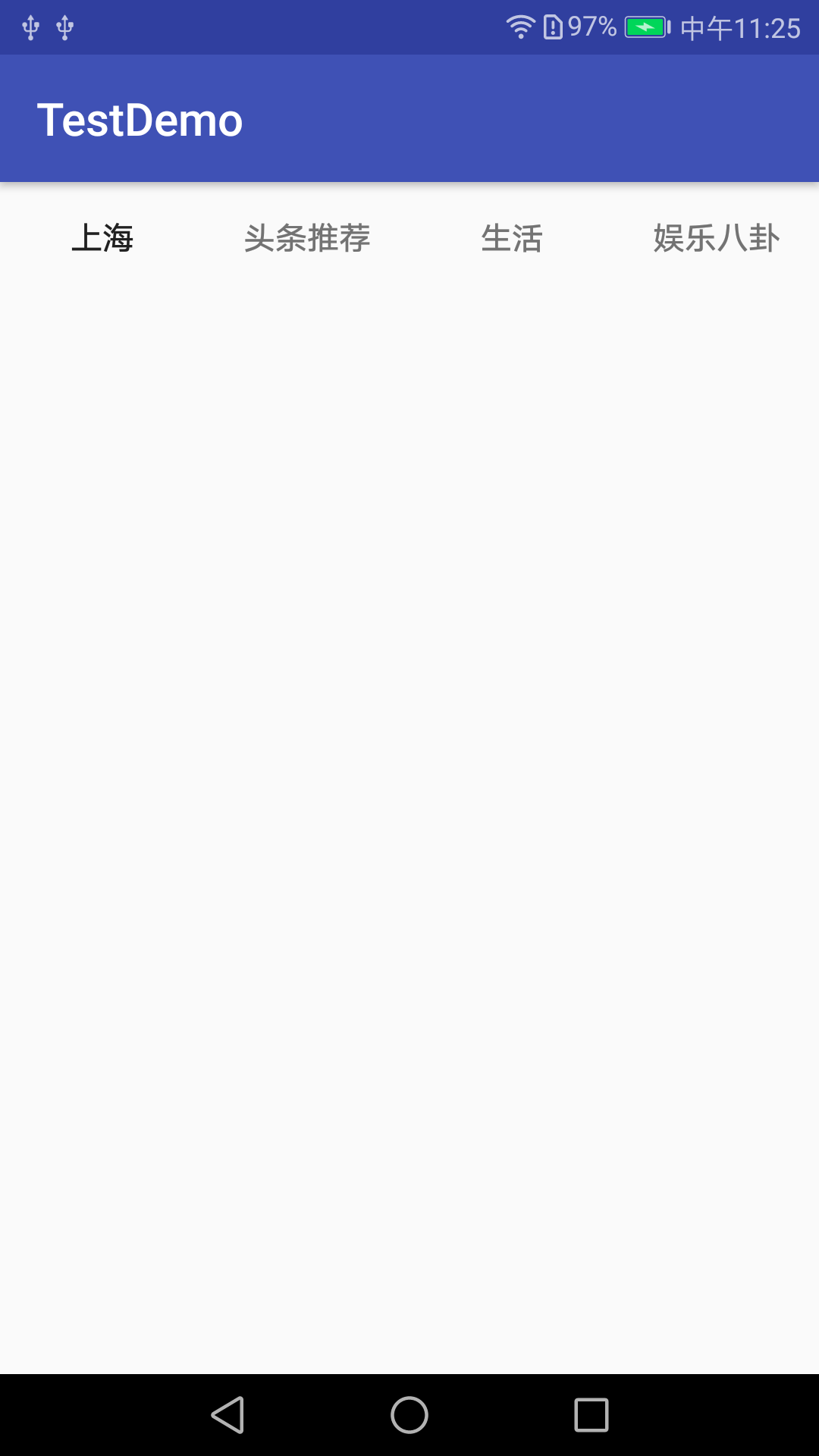
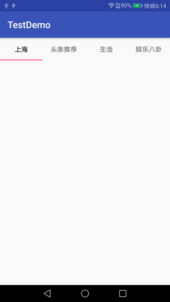
下面給出效果圖
三.TabLayout均分顯示的問題
當導航過多的時候,使用app:tabMode="scrollable"屬性,能實現滑動均分,當導航不足一屏的時候,去掉app:tabMode="scrollable"才能實現均分展示.
xml中顯示如下:
<?xml version="1.0" encoding="utf-8"?>
<android.support.constraint.ConstraintLayout xmlns:android="http://schemas.android.com/apk/res/android"
    xmlns:app="http://schemas.android.com/apk/res-auto"
    xmlns:tools="http://schemas.android.com/tools"
    android:layout_width="match_parent"
    android:layout_height="match_parent"
    tools:context="com.android.testdemo.main.MainActivity">

    <android.support.design.widget.TabLayout
        android:id="@+id/tablayout"
        android:layout_width="0dp"
        android:layout_height="wrap_content"
        app:layout_constraintEnd_toEndOf="parent"
        app:layout_constraintStart_toStartOf="parent">
    </android.support.design.widget.TabLayout>
</android.support.constraint.ConstraintLayout>
代碼如下:
        for(int i=0;i<4;i++){
            TabLayout.Tab tab=mTabLayout.newTab();
            tab.setTag(i);
            tab.setText(mTitles[i]);
            mTabLayout.addTab(tab);
        }
效果圖:
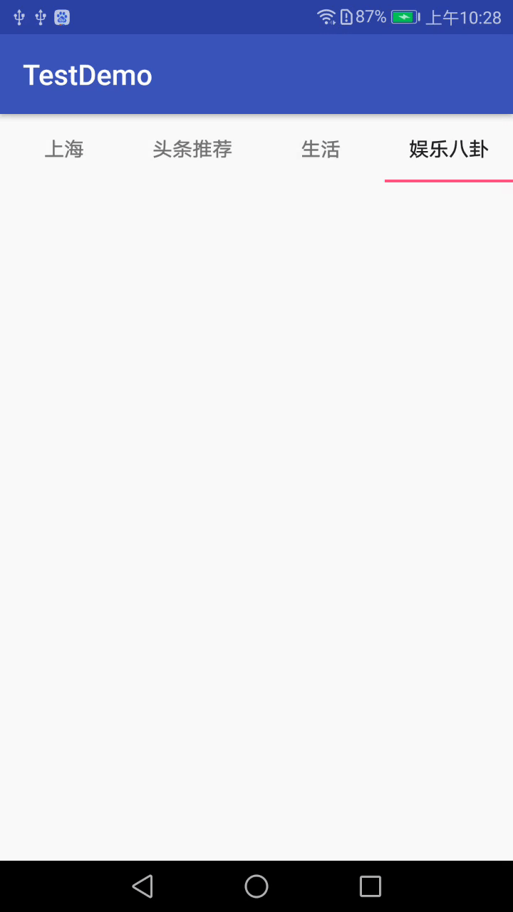
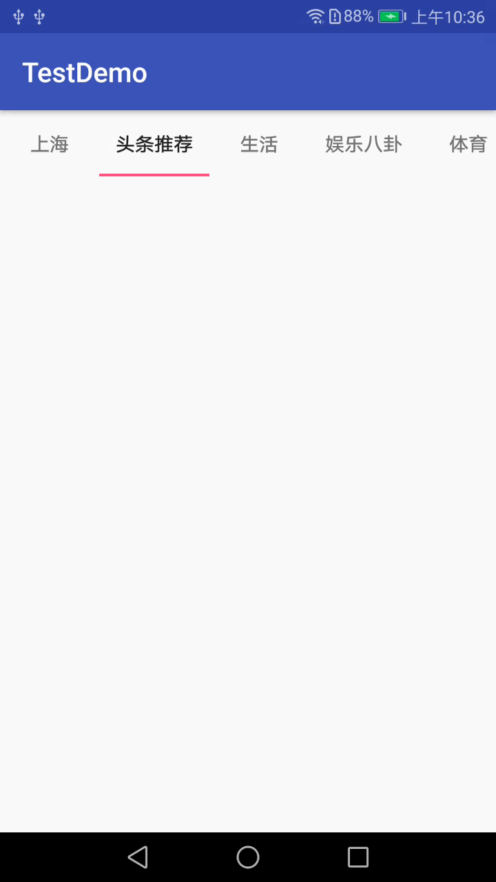
當item個數很多的時候,xml代碼如下:
<?xml version="1.0" encoding="utf-8"?>
<android.support.constraint.ConstraintLayout xmlns:android="http://schemas.android.com/apk/res/android"
    xmlns:app="http://schemas.android.com/apk/res-auto"
    xmlns:tools="http://schemas.android.com/tools"
    android:layout_width="match_parent"
    android:layout_height="match_parent"
    tools:context="com.android.testdemo.main.MainActivity">

    <android.support.design.widget.TabLayout
        android:id="@+id/tablayout"
        android:layout_width="0dp"
        android:layout_height="wrap_content"
        app:tabMode="scrollable"
        app:layout_constraintEnd_toEndOf="parent"
        app:layout_constraintStart_toStartOf="parent">
    </android.support.design.widget.TabLayout>
</android.support.constraint.ConstraintLayout>
代碼如下:
  //TabLayout的基本使用
        for(int i=0;i<mTitles.length;i++){
            TabLayout.Tab tab=mTabLayout.newTab();
            tab.setTag(i);
            tab.setText(mTitles[i]);
            mTabLayout.addTab(tab);
        }
效果圖如下:
四.和ViewPager的聯動
之前已經講過TabLayout和ViewPager聯動的知識了,有興趣的可以了解下TabLayout實現頂部導航(一)這篇文章,這裏就不做詳細講解了。
五.加入Padding
設置Tab內部的子控件的Padding:
app:tabPadding="xxdp"
app:tabPaddingTop="xxdp"
app:tabPaddingStart="xxdp"
app:tabPaddingEnd="xxdp"
app:tabPaddingBottom="xxdp"
設置整個TabLayout的Padding:
app:paddingEnd="xxdp"
app:paddingStart="xxdp"
六.Tab的寬度限制
設置最大的tab寬度:
app:tabMaxWidth="xxdp"設置最小的tab寬度:
app:tabMinWidth="xxdp"七.Tab的“Margin”
TabLayout開始位置的偏移量:
app:tabContentStart="50dp"八.設置TabLayout選中和沒選中時字體顏色
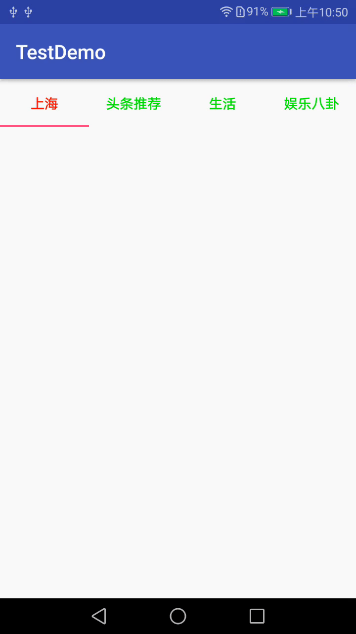
設置選中和沒選中的顏色可以在xml中設置,也可以在代碼中設置
8.1xml中設置
<?xml version="1.0" encoding="utf-8"?>
<android.support.constraint.ConstraintLayout xmlns:android="http://schemas.android.com/apk/res/android"
    xmlns:app="http://schemas.android.com/apk/res-auto"
    xmlns:tools="http://schemas.android.com/tools"
    android:layout_width="match_parent"
    android:layout_height="match_parent"
    tools:context="com.android.testdemo.main.MainActivity">

    <!--app:tabSelectedTextColor="@color/red"//選中色-->
    <!--tabTextColor="@color/blue"//未選中色-->
    <android.support.design.widget.TabLayout
        android:id="@+id/tablayout"
        android:layout_width="0dp"
        android:layout_height="wrap_content"
        app:tabSelectedTextColor="@color/red"
        app:tabTextColor="@color/blue"
        app:layout_constraintEnd_toEndOf="parent"
        app:layout_constraintStart_toStartOf="parent">
    </android.support.design.widget.TabLayout>
</android.support.constraint.ConstraintLayout>
8.2代碼中設置
代碼中設置的時候,xml不需要做相關設置:
<?xml version="1.0" encoding="utf-8"?>
<android.support.constraint.ConstraintLayout xmlns:android="http://schemas.android.com/apk/res/android"
    xmlns:app="http://schemas.android.com/apk/res-auto"
    xmlns:tools="http://schemas.android.com/tools"
    android:layout_width="match_parent"
    android:layout_height="match_parent"
    tools:context="com.android.testdemo.main.MainActivity">

    <android.support.design.widget.TabLayout
        android:id="@+id/tablayout"
        android:layout_width="0dp"
        android:layout_height="wrap_content"
        app:layout_constraintEnd_toEndOf="parent"
        app:layout_constraintStart_toStartOf="parent">
    </android.support.design.widget.TabLayout>
</android.support.constraint.ConstraintLayout>
代碼設置如下:
      //設置tab文本的沒有選中(第一個參數)和選中(第二個參數)的顏色
      mTabLayout.setTabTextColors(Color.GREEN, Color.RED);
效果圖如下:
由於篇幅原因,後面幾個知識點就不做詳細介紹了,文末會給出相關知識點的效果圖,具體的大家可以看demo中的介紹,這裏我主要強調幾點:
- 在"12.改變指示器下標的高度"中需要註意的是:
當設置指示器的高度為0dp,或者設置指示器顏色透明,即可實現沒有下標指示器的效果。 - 在"15. 監聽事件"中需要註意的是:
初始化進入的時候,監聽事件的三個方法都不會執行,假設此時你的item選中的是index=0,當你點擊index=1的那項時,onTabUnselected(TabLayout.Tab tab)執行的是index=0的tab,onTabSelected(TabLayout.Tab tab)會執行index=1的Tab,此時onTabReselected(TabLayout.Tab tab)不會執行。當item已經選中的是index=1的時候,你再點擊這個index=1的item的時候,onTabSelected(TabLayout.Tab tab)和onTabUnselected(TabLayout.Tab tab)不會執行,onTabReselected(TabLayout.Tab tab)會執行,tab為你當前點擊的tab。 - 在""中需要註意的是:
其中switch-case中即是你要處理的點擊事件的邏輯,這裏需要註意的是
 if(!mTabLayout.getTabAt(position).isSelected()){
                            return;
                        }
這段代碼即表示只有當前item被選中的情況下,點擊事件才生效。這個方法可以用來處理TabLayout和ViewPager聯動的情況下,仍需要在item上添加處理事件的情況。
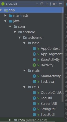
十七.項目截圖及效果圖
17.1 項目截圖
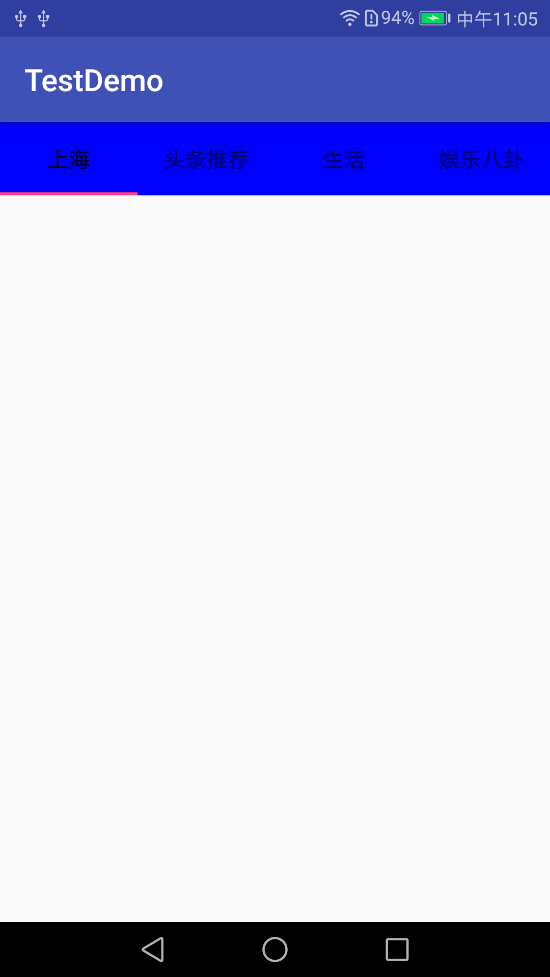
17.2 改變指示器下標的顏色效果圖
17.3 改變整個TabLayout的顏色效果圖
17.4 改變TabLayout內部字體大小效果圖
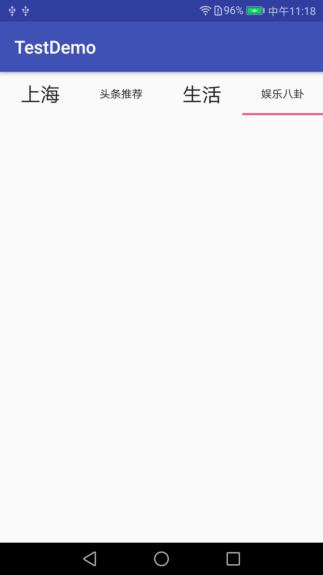
17.5 改變指示器下標的高度效果圖
17.6 添加圖標效果圖
17.7 TabLayout點擊事件效果圖
ok,今天關於TabLayout相關知識就講到這裏了。
TabLayout基本屬性全解
代碼地址如下:
http://www.demodashi.com/demo/14659.html
註:本文著作權歸作者,由demo大師代發,拒絕轉載,轉載需要作者授權
TabLayout基本屬性全解