
delphi 10.4 新知識
https://theroadtodelphi.com/?tdsourcetag=s_pctim_aiomsg
Delphi – Free Pascal – Oxygene
Delphi IDE theme Editor Now supports RAD Studio10.4
Hi guys, I just uploadeda new version ofDITEwith support for RAD Studio 10.4Sydney
The themes now are imported into the RAD Studio registry and recognized by the IDE.
Looking for the installer? Check theGithub Release Area
VCL Styles Utils – New versionreleased
Hello Guys, a new version of theVCL Styles Utilswas released, the main changes for this update are :
- Improved Modern Dialogs support
- Support for Windows 10 build 1809 (Dark Mode Explorer)
- High-DPI support
Thank you very much for all the contributors especially toRickard Johansson (rickard67),salvadordfandluebbe
Rodrigo.
VCL Styles Utils – Newversion
Hello, I just uploaded a new version of the
- First a very nice contribution from gandfwhich fix the draw for long popup-menus.
- Also the support for theSubMenuImagesproperty has been improved.
Rodrigo.
New VCL Styles from DelphiStyles.com
A few days agoKSDevlaunched a new site,DelphiStyles.com, this new placeoffers newFMXandVCL Styles. I tested theVCL Styles bundle and are just great, the themes looks modern, sleek and polished.
So if you are looking for a professional lookingFMX/VCL styles for you application this is the place to go.
Check out the TOpenDialogcomponent styled using theVCL Style Utilsand the DelphiStylesthemes.
Material Black Pearl
Material Oxford Blue
Windows 10 Black Pearl
Windows 10 Oxford Blue
Thanks very much to the guys fromDelphiStyle(KSDev) which kindly donated a VCL Styles bundle toThe Road to Delphi.
Rodrigo.
Categories:Delphi,VCL Styles| Tags:Delphi,Vcl Styles,VCL Styles Utils|Permalink.
DITE and DIC now supports RAD Studio 10.2Tokyo
Hi, I just uploaded a new version of DIC(Delphi IDE Colorizer) with support forRAD Studio 10.2 Tokyo.
Check the next screenshot of the Delphi IDE styled with theGlossyVCL Style.
(click to enlarge)
Also since some days ago a new version ofDITEis available with support forRAD Studio 10.2 Tokyo.
Happyweekend.
Rodrigo.-
TSMBIOS now supports Linux via Delphi 10.2Tokyo.
Ijust uploaded a new version of theTSMBIOSlibrary with support for Linux via Delphi 10.2 Tokyo. You can found a full description of the project in theGithubsite.
Check these screenshots of the demo applications running underubuntu 16.04 LTS
Now just a small note, theTSMBIOS library access to the SMBIOS data readingthe/dev/memdevice file (which provides direct access to system physical memory).So the applications which uses this library require being executed by an user with access to such file, typically a superuser.
Rodrigo.
Categories:Delphi,Linux| Tags:Delphi,Linux,SMBIOS|Permalink.
VCL Styles Utils supports RAD Studio 10.2Tokyo
The new release of theVCL Styles Utilsproject now is compatible withRAD Studio 10.2 Tokyo .
This new version also improve the support for theWindows10 custom Styles.
Check thisTOpenDialogstyled with theWindows 10 BlackVCL Style.
Rodrigo.
TListView OwnerDraw compat with Windows UI & VCLStyles
There is a lot of resources of howownerdraw aDelphi TListView, but most of them are deprecated and don’t take into account theVCL Stylesand theStyleServices.
So onthis post I will show you how you can ownerdraw aTListViewto be compatible with the nativeWindowsLook and feel and theVCL Styles.
First, there is lot of ways to ownerdraw aTListView, but on this post we will focus only in theOnDrawItemevent, because offers more flexibility than theOnCustomDrawXXXevents handlers.
TheOnDrawItemis an event handler of typeVcl.ComCtrls.TLVDrawItemEvent
This is the definition of such event
TLVDrawItemEvent = procedure(Sender: TCustomListView;
Item: TListItem; Rect: TRect; State: TOwnerDrawState) of object;
Parameters
- Sender: TheListViewwhich is raising the event.
- Item : The list item which need to be drawn. (you can use this object to read the data of theListView).
- Rect: The bounds of the item (including the subitems).
- State: The current state of item.
Note: Before to use theOnDrawItemevent you must set the value of the propertyTListView.ownerdrawtoTrue.
Ok, So I’m planning create aTListviewin report mode and draw some controls like a checkbox and progressbar. These controls must looks perfect under theWindows UIand theVCL Styles.
I will start creating the columns of theTListviewin runtime (just for personal preference.). I’m using aTDictionaryto hold the columns reference in that way I prevent create one variable per column and also I can access the columns by a Name.
procedure TFrmMain.AddColumns;

  Procedure AddColumn(const AColumnName : String; AWidth : Integer; AColumnType : TColumnType);
  begin
   FColumns.Add(AColumnName, LvSampleData.Columns.Add());
   FColumns[AColumnName].Caption := AColumnName;
   FColumns[AColumnName].Width   := AWidth;
   FColumns[AColumnName].Tag     := Integer(AColumnType);
  end;

begin
   FColumns  := TDictionary<string, TListColumn>.Create();
   AddColumn('Text', 150, ctText);
   AddColumn('Porc', 100, ctProgress);
   AddColumn('Text2', 150, ctText);
   AddColumn('Enabled', 100, ctCheck);
end;
Please pay attention to the Tag property of the Columns, I’m using this to store the type of the column (TColumnTypeis a custom type).
TColumnType = (ctText, ctCheck, ctProgress);
Next we need fill the listview with some sample data (This doesn’t requires much explanation right?).
const
 MaxItems = 100;
var
 LItem : TListItem;
 i : Integer;
begin
  Randomize;
  LvSampleData.Items.BeginUpdate;
  try
    for i := 0 to MaxItems - 1 do
    begin
      LItem := LvSampleData.Items.Add;
      LItem.Caption:= Format('Sample text', []);
      LItem.SubItems.Add(IntToStr(Random(101)));
      LItem.SubItems.Add(Format('Sample text 2', []));
      LItem.SubItems.Add(IntToStr(Random(2)));
    end;
  finally
    LvSampleData.Items.EndUpdate;
  end;
end;
And now I can start to draw theTListViewitems using thetheOnDrawItemevent.
First I will store a reference to theStyleServicesfunction (In this way I’m avoiding call the same function again and again).
Note : TheStyleServicesmethodreturns an instance of aTCustomStyleServicestype, which allow to gain access to all the styling functionality of the current active style (WindowsorVCL Style).
Next I will erase any previous content of the current row by filling with the currentclWindowcolor.
Check how theclWindowconst is used in theTCustomStyleServices.GetSystemColorfunction to return the currentWindow Backgroundcolor.
procedure TFrmMain.LvSampleDataDrawItem(Sender: TCustomListView; Item: TListItem; Rect: TRect; State: TOwnerDrawState);
...
...
begin
  LStyleService  := StyleServices;
  if not LStyleService.Enabled then exit;

  Sender.Canvas.Brush.Style := bsSolid;
  Sender.Canvas.Brush.Color := LStyleService.GetSystemColor(clWindow);
  Sender.Canvas.FillRect(Rect);

  LRect := Rect;
Now I will iterate over all the columns of the Listview resolving the current column type, the text stored in the current item and calculating the bounds of the current item.
...
...
  for i := 0 to TListView(Sender).Columns.Count - 1 do
  begin
    LColummnType := TColumnType(TListView(Sender).Columns[i].Tag);
    LRect.Right  := LRect.Left + Sender.Column[i].Width;

    LText := '';
    if i = 0 then
      LText := Item.Caption
    else
    if (i - 1) <= Item.SubItems.Count - 1 then
      LText := Item.SubItems[i - 1];
....
....
Note : The OnDrawItem event is raised once per each row of the ListView, So you must draw all the items and subitems yourself).
Now depending of the column type (Text, CheckBox or ProgressBar) I will draw the item.
Text
For the columns of type text (ctText), I check if theStateof the item isSelectedorHotand Draw the highlight bar(using the TCustomStyleServices.DrawElementmethod) and finally the text is rendered using theTCustomStyleServices.DrawTextfunction.
Check how the color of the text is selected depending of the state of the item.
      ctText:  begin

                  LDetails := LStyleService.GetElementDetails(tgCellNormal);
                  LColor := LStyleService.GetSystemColor(clWindowText);
                  if ([odSelected, odHotLight] * State <> []) then
                  begin
                     LDetails := LStyleService.GetElementDetails(tgCellSelected);
                     LColor := LStyleService.GetSystemColor(clHighlightText);
                     LStyleService.DrawElement(Sender.Canvas.Handle, LDetails, LRect);
                  end;

                  LRect2 := LRect;
                  LRect2.Left := LRect2.Left + ListView_Padding;

                  LTextFormat := TTextFormatFlags(DT_SINGLELINE or DT_VCENTER or DT_LEFT or DT_END_ELLIPSIS);
                  LStyleService.DrawText(Sender.Canvas.Handle, LDetails, LText, LRect2, LTextFormat, LColor);
               end;
CheckBox
For the checkbox columns, the process start in the same way, first check if the item is highlighted and then the bar is drawn.
Then I calculate the bounds of the checkbox and get the text for the column. (for this sample the Value 1 means checked otherwise means unchecked).
Now according to the value and the state of the checkbox is draw.
Please pay attention to how the the element to be drawn is selected depending of the current state and the current text.
      ctCheck: begin
                  if ([odSelected, odHotLight] * State <> []) then
                  begin
                     LDetails := LStyleService.GetElementDetails(tgCellSelected);
                     LStyleService.DrawElement(Sender.Canvas.Handle, LDetails, LRect);
                  end;

                  LSize.cx := GetSystemMetrics(SM_CXMENUCHECK);
                  LSize.cy := GetSystemMetrics(SM_CYMENUCHECK);

                  LRect2.Top    := Rect.Top + (Rect.Bottom - Rect.Top - LSize.cy) div 2;
                  LRect2.Bottom := LRect2.Top + LSize.cy;
                  LRect2.Left   := LRect.Left + ((LRect.Width - LSize.cx) div 2);
                  LRect2.Right  := LRect2.Left + LSize.cx;

                  if (LText = '1') then
                  begin
                    if ([odSelected, odHotLight] * State <> []) then
                      LDetails := LStyleService.GetElementDetails(tbCheckBoxCheckedHot)
                    else
                      LDetails := LStyleService.GetElementDetails(tbCheckBoxCheckedNormal);
                  end
                  else
                  begin
                    if ([odSelected, odHotLight] * State <> []) then
                      LDetails := LStyleService.GetElementDetails(tbCheckBoxUncheckedHot)
                    else
                      LDetails := LStyleService.GetElementDetails(tbCheckBoxUncheckedNormal);
                  end;
                  LStyleService.DrawElement(Sender.Canvas.Handle, LDetails, LRect2);
               end;
ProgressBar
Finally for the progressbar columns, after of check the current state I draw the frame of the progress bar by using thetpBarelement, then getting the current value for the column I calculate the bounds of thechunksto be draw. Then depending of the value I fill the progress bar with a solid color or with the element of the current style.
      ctProgress:
               begin
                  if ([odSelected, odHotLight] * State <> []) then
                  begin
                     LDetails := LStyleService.GetElementDetails(tgCellSelected);
                     LStyleService.DrawElement(Sender.Canvas.Handle, LDetails, LRect);
                  end;

                  LRect2   := ResizeRect(LRect, 2, 2, 2, 2);
                  LDetails := LStyleService.GetElementDetails(tpBar);
                  LStyleService.DrawElement(Sender.Canvas.Handle, LDetails, LRect2);

                  if not TryStrToInt(LText, p) then  p := 0;

                  InflateRect(LRect2, -1, -1);
                  LRect2.Right := LRect2.Left + Round(LRect2.Width * p / 100);

                  if p < 20 then
                  begin
                    Sender.Canvas.Brush.Style := bsSolid;
                    Sender.Canvas.Brush.Color := clWebFirebrick;
                    Sender.Canvas.FillRect(LRect2);
                  end
                  else
                  if p < 50 then
                  begin
                    Sender.Canvas.Brush.Style := bsSolid;
                    Sender.Canvas.Brush.Color := clWebGold;
                    Sender.Canvas.FillRect(LRect2);
                  end
                  else
                  begin
                    LDetails := LStyleService.GetElementDetails(tpChunk);
                    LStyleService.DrawElement(Sender.Canvas.Handle, LDetails, LRect2);
                  end;
                end;
This is the final result of the code
As you can see the list view is draw consistently underWindowsor when a customStyleis used.
The full source code is available onGithub.
Categories:Delphi,VCL Styles| Tags:Delphi,Vcl Styles|Permalink.
DIC supports RAD Studio 10.1Berlin
Hello Folks, I just uploaded a new version of theDelphi IDE Colorizer(DIC) plugin with support forRAD Studio 10.1 Berlin.
DIC is a styling plugin for the RAD Studio IDE which allow you customizethe UI of the IDE Workspace. You can use apredefinedtheme or create your own, also DIC is compatible with theVCL Styles.
You can download theinstaller fromGithub.
By the way, on the last weeks I’ve updated another projects addingsupport for RAD Studio 10.1 Berlin.
Rodrigo.
Categories:Delphi,Tools| Tags:tools|Permalink.
DITE supports RAD Studio 10.1Berlin
I just updated theDelphi IDE Theme Editoradding support forRAD Studio 10.1 Berlin.
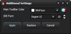
Also this new version of DITE includes a improved thumbnail generator and a option to change betweencompactandfullGUI which can be set with the options of the title bar.
Remember which starting with RAD Studio XE8, DITE allows you edit the values (color and font) of the IDEmodern theme. To use it just press the button “Additional Settings” and set values for the Main ToolBar and the IDE Font, finally press the button “Apply”. (For restore the default settings just press the buttonRestore).
You can download the DITE fromhere.
Rodrigo.
Categories:Delphi,Tools| Tags:tools|Permalink.