
湯不熱分享動畫
別問我為什麽上湯不熱(猥瑣臉),友盡!
正經事
Tumblr 分享成功會有這麽個動畫,覺得挺有意思,就扒出來看了看……
第一感覺以為是 canvas 繪制的,後來發現居然是原生DOM操作,嘿嘿,我就喜歡這種!
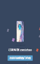
首先自然是去找 DOM 結構,Chrome 調試出來結果如下:
<div class="avatar-wrapper">
    <div class="avatar" style="background-image:url(https://78.media.tumblr.com/avatar_6fb5ef4a2436_64.pnj)"></div>
</div>
就是普通的 DOM,然後這裏有個圖片格式嚇我一跳,pnj,第一次見,Google 查了下,就這麽一段,我也不是很清楚這個格式:
PNJ檔案是主要與 Binary Data 相關的 Uncommon Files。其他類型的檔案也可能使用PNJ檔案副檔名。
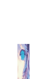
使用的動畫就兩個,具體動畫我們下面代碼,其實很簡單。
HTML
<div class="box">
  <img src="https://img.mukewang.com/5b8558e40001a7e600640064.jpg"  class="rotate">
</div>
兩層,外面負責跳動,裏面圖片負責旋轉。
方便理解跟演示,已經替換成國內可訪問的圖片源以及 img 標簽。
CSS
@keyframes jump {
  0% {
    transform: translateY(-180px) scaleY(1);
    animation-timing-function: cubic-bezier(.895,.03,.685,.22);
  }
  80% {
    transform: scaleY(2) scaleX(.6);
  }
  90% {
    transform: scaleY(.4) scaleX(1);
  }
  100% {
    transform: scaleY(.25) scaleX(2);
  }
}

.box {
  position: absolute;
  top: 200px;
  left: 50px;
  animation: jump .5s linear infinite alternate;
}

@keyframes dance {
  0% {
    transform: rotate(0deg);
  }
  21% {
    transform: rotate(0deg);
    animation-timing-function: cubic-bezier(.215,.61,.355,1);
  }
  28% {
    transform: rotate(-1turn);
  }
  71% {
    transform: rotate(-1turn);
    animation-timing-function: cubic-bezier(.215,.61,.355,1);
  }
  78% {
    transform: rotate(1turn);
  }
  100% {
    transform: rotate(1turn);
  }
}

.rotate {
  animation: dance 10s cubic-bezier(.645,.045,.355,1) .5s infinite
}
上面的源碼進行了精簡,湯不熱應該是用了類繼承導致一些這裏用不到的代碼。
其中涉及幾個問題:
animation-timing-function
cubic-bezier
rotate 延時 0.5s 的作用
animation-timing-function
這個是對動畫運行時間(或效果)的定制,一般我們都會寫到 animation 裏面,比如:linear、ease 等,對,沒錯,就這個東西。
我所知道的就是跟 cubic-bezier 一起用……擱下面一起說。
cubic-bezier
貝塞爾曲線,這個往深了說,我自己都蒙,玩 PS 的高手應該很熟悉這個東西,就是一個拉兩邊會讓直線變曲線的東西,貌似鋼筆工具有用到這個。
回到上面那個 linear,其實就是:animation-timing-function: cubic-bezier(0, 0, 1, 1) / cubic-bezier(1, 1, 0, 0);,而 ease 就是:animation-timing-function: cubic-bezier(.25, .1, .25, 1);。其他不再舉例,有興趣的可以查查,這樣就可以理解那個移動軌跡的來歷了。
所以 box 的動畫就是上下跳動,在到達底部的時候 X 軸撐開,效果就這樣,好理解的多。
而裏面圖片的滾動,講真,一開始我也看了好久才明白什麽鬼,上面截圖沒有展示出來,下面的鏈接可以看看,它的轉動兩個方向是不一樣的,很有意思。
其實看懂就很清楚了,這個轉動動畫一共花了 10s,前 28% 的時間進行了一次逆時針單圈,中間休息老久,然後後面 71% 開始到 78% 很短的時間進行了順時針的兩圈,看起來特別好玩,也很好看。
逆時針單圈

順時針兩圈
具體效果:點我看效果
rotate 延時 0.5s 的作用
為了讓動畫更自然,沒有這個延時或者延時不對會出現跳動不自然,請自行源碼嘗試……
代碼:
<!DOCTYPE html>
<html lang="en">
<head>
  <meta charset="UTF-8">
  <meta name="viewport" content="width=device-width, initial-scale=1.0">
  <meta http-equiv="X-UA-Compatible" content="ie=edge">
  <title>Jump Tumblr</title>
  <style>
    html, body {
      height: 100%;
    }
    body {
      display: flex;
      justify-content: center;
      align-items: center;
    }
    @keyframes jump {
      0% {
        transform: translateY(-180px) scaleY(1);
        animation-timing-function: cubic-bezier(.895,.03,.685,.22);
      }
      80% {
        transform: scaleY(2) scaleX(.6);
      }
      90% {
        transform: scaleY(.4) scaleX(1);
      }
      100% {
        transform: scaleY(.25) scaleX(2);
      }
    }

    .box {
      animation: jump .5s linear infinite alternate;
    }

    @keyframes dance {
      0% {
        transform: rotate(0deg);
      }
      21% {
        transform: rotate(0deg);
        animation-timing-function: cubic-bezier(.215,.61,.355,1);
      }
      28% {
        transform: rotate(-1turn);
      }
      71% {
        transform: rotate(-1turn);
        animation-timing-function: cubic-bezier(.215,.61,.355,1);
      }
      78% {
        transform: rotate(1turn);
      }
      100% {
        transform: rotate(1turn);
      }
    }

    .rotate {
      animation: dance 10s cubic-bezier(.645,.045,.355,1) .5s infinite
    }
  </style>
</head>
<body>
  <div class="box">
    <img src="https://img.mukewang.com/5b8558e40001a7e600640064.jpg"  class="rotate">
  </div>
</body>
</html>
好了,這裏基本說完了……
但是,像我這種神經病會這樣簡單的結束嗎?
哼哼哼……
腦殘版
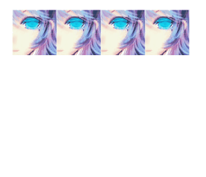
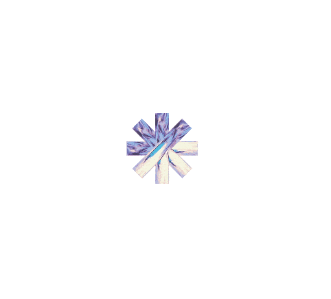
終極版
代碼:
<!DOCTYPE html>
<html lang="en">

<head>
  <meta charset="UTF-8">
  <meta name="viewport" content="width=device-width, initial-scale=1.0">
  <meta http-equiv="X-UA-Compatible" content="ie=edge">
  <title>Jump Tumblr</title>
  <style>
    html, body {
      height: 100%;
      overflow: hidden;
    }
    @keyframes jump {
      0% {
        transform: translateY(-140px) scaleY(1);
        animation-timing-function: cubic-bezier(.895, .03, .685, .22);
      }
      80% {
        transform: scaleY(2) scaleX(.6);
      }
      90% {
        transform: scaleY(.4) scaleX(1);
      }
      100% {
        transform: scaleY(.25) scaleX(2);
      }
    }

    .box {
      animation: jump .5s linear infinite alternate;
    }

    @keyframes dance {
      0% {
        transform: rotate(0deg);
      }
      21% {
        transform: rotate(0deg);
        animation-timing-function: cubic-bezier(.215, .61, .355, 1);
      }
      28% {
        transform: rotate(-1turn);
      }
      71% {
        transform: rotate(-1turn);
        animation-timing-function: cubic-bezier(.215, .61, .355, 1);
      }
      78% {
        transform: rotate(1turn);
      }
      100% {
        transform: rotate(1turn);
      }
    }

    .rotate {
      animation: dance 10s cubic-bezier(.645, .045, .355, 1) .5s infinite
    }

    .container {
      position: absolute;
      left: 0;
      top: 0;
      display: flex;
      justify-content: center;
      align-items: center;
      width: 100%;
      height: 100%;
    }

    .container:nth-child(2) {
      transform: rotateZ(45deg);
    }
    .container:nth-child(3) {
      transform: rotateZ(90deg);
    }
    .container:nth-child(4) {
      transform: rotateZ(135deg);
    }
    .container:nth-child(5) {
      transform: rotateZ(180deg);
    }
    .container:nth-child(6) {
      transform: rotateZ(225deg);
    }
    .container:nth-child(7) {
      transform: rotateZ(270deg);
    }
    .container:nth-child(8) {
      transform: rotateZ(315deg);
    }
  </style>
</head>

<body>
  <div class="container">
    <div class="box">
      <img src="https://img.mukewang.com/5b8558e40001a7e600640064.jpg"  class="rotate">
    </div>
  </div>

  <div class="container">
    <div class="box">
      <img src="https://img.mukewang.com/5b8558e40001a7e600640064.jpg"  class="rotate">
    </div>
  </div>

  <div class="container">
    <div class="box">
      <img src="https://img.mukewang.com/5b8558e40001a7e600640064.jpg"  class="rotate">
    </div>
  </div>

  <div class="container">
    <div class="box">
      <img src="https://img.mukewang.com/5b8558e40001a7e600640064.jpg"  class="rotate">
    </div>
  </div>

  <div class="container">
      <div class="box">
        <img src="https://img.mukewang.com/5b8558e40001a7e600640064.jpg"  class="rotate">
      </div>
    </div>

    <div class="container">
      <div class="box">
        <img src="https://img.mukewang.com/5b8558e40001a7e600640064.jpg"  class="rotate">
      </div>
    </div>

    <div class="container">
      <div class="box">
        <img src="https://img.mukewang.com/5b8558e40001a7e600640064.jpg"  class="rotate">
      </div>
    </div>

    <div class="container">
      <div class="box">
        <img src="https://img.mukewang.com/5b8558e40001a7e600640064.jpg"  class="rotate">
      </div>
    </div>

</body>

</html>
具體效果:點我看效果
告誡廣大前端小夥伴,這個東西不要自己盲目創作,你懂的。如有必要,請甩鍋給設計大大,實在不行,找對應的動畫生成器去……
恩,目測湯不熱的是動畫生成器生成的沒跑了。
對了,別問我後面的撒花效果,那是canvas,自己找庫去,大把大把的有。DOM 動畫才是真愛。
Github
喜歡請點個 star,謝謝。
湯不熱分享動畫