
機器學習之路--seaborn
seaborn是基於plt的封裝好的庫。有很強的作圖功能。
1、佈局風格設定(圖形的style)and 細節設定
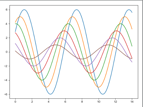
用matplotlib作圖:

import numpy as np
import matplotlib as mpl
import matplotlib.pyplot as plt
x = np.linspace(0, 14, 100)
for i in range(1, 7):
    plt.plot(x, np.sin(x + i * .5) * (7 - i))
plt.show()
輸出:

用seaborn的預設系統風格:
import seaborn as sns
import numpy as np
import matplotlib as mpl
import matplotlib.pyplot as plt
# def sinplot(flip=1):
x = np.linspace(0, 14, 100)
for i in range(1, 7):
    plt.plot(x, np.sin(x + i * .5) * (7 - i))
sns.set()
plt.show()
輸出:
下面介紹seaborn的五種作圖風格:
- darkgrid
- whitegrid
- dark
- white
- ticks
下面介紹常用的一種,其他可用程式碼自行檢視
whitegrid
import seaborn as sns
import numpy as np
import matplotlib as mpl
import matplotlib.pyplot as plt

sns.set_style("whitegrid")     #設定風格
data = np.random.normal(size=(20, 6)) + np.arange(6) / 2    #建立資料
sns.boxplot(data=data)       #製作盒圖
plt.show()
輸出:
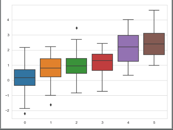
此風格可以清晰看到資料的值與對應關係,也很簡約,建議用此圖。
指定軸線距離:
#f, ax = plt.subplots()
sns.violinplot(data)
sns.despine(offset=10)
offset的值為軸線距離
將左邊的軸隱藏起來:(單個軸顯示問題)
sns.despine(left=True)
用兩種主題做圖:
import seaborn as sns
import numpy as np
import matplotlib as mpl
import matplotlib.pyplot as plt
sns.set_style("whitegrid")
data = np.random.normal(size=(20, 6)) + np.arange(6) / 2
with sns.axes_style("darkgrid"):
    sns.boxplot(data=data)
    plt.show()
sns.boxplot(data=data)
plt.show()
with裡面的是一種風格,外邊是另一種
畫圖的頁面佈局:
import seaborn as sns
import numpy as np
import matplotlib as mpl
import matplotlib.pyplot as plt

sns.set_context("paper")     #除了paper還有別的佈局,help檢視
plt.figure(figsize=(8, 6))      #大小
sns.set()
x = np.linspace(0, 14, 100)
for i in range(1, 7):
    plt.plot(x, np.sin(x + i * .5) * (7 - i))
plt.show()
2、調色盤
- 顏色很重要
- color_palette()能傳入任何Matplotlib所支援的顏色
- color_palette()不寫引數則預設顏色
- set_palette()設定所有圖的顏色
6個預設的顏色迴圈主題: deep, muted, pastel, bright, dark, colorblind
圓形畫板****
當你有六個以上的分類要區分時,最簡單的方法就是在一個圓形的顏色空間中畫出均勻間隔的顏色(這樣的色調會保持亮度和飽和度不變)。這是大多數的當他們需要使用比當前預設顏色迴圈中設定的顏色更多時的預設方案。
最常用的方法是使用hls的顏色空間,這是RGB值的一個簡單轉換。
import seaborn as sns
import numpy as np
import matplotlib as mpl
import matplotlib.pyplot as plt
sns.palplot(sns.color_palette("hls", 8))
plt.show()
輸出:

import seaborn as sns
import numpy as np
import matplotlib as mpl
import matplotlib.pyplot as plt
data = np.random.normal(size=(20, 8)) + np.arange(8) / 2
sns.boxplot(data=data,palette=sns.color_palette("hls", 8))
plt.show()
hls_palette()函式來控制顏色的亮度和飽和
- l-亮度 lightness
- s-飽和 saturation
sns.palplot(sns.hls_palette(8, l=.7, s=.9))
使用xkcd命名顏色
連續色板
色彩隨資料變換,比如資料越來越重要則顏色越來越深
sns.palplot(sns.color_palette("Blues"))
輸出:

如果想要翻轉漸變,可以在面板名稱中新增一個_r字尾:
sns.palplot(sns.color_palette("BuGn_r"))
色調線性變換(飽和度和亮度)
sns.palplot(sns.cubehelix_palette(8, start=.75, rot=-.150))
light_palette() 和dark_palette()呼叫定製連續調色盤
sns.palplot(sns.light_palette("green"))
上面是由淺變深
下面是由深變暗:
sns.palplot(sns.light_palette("navy", reverse=True))
x, y = np.random.multivariate_normal([0, 0], [[1, -.5], [-.5, 1]], size=300).T
pal = sns.dark_palette("green", as_cmap=True)
sns.kdeplot(x, y, cmap=pal);
輸出:

3、單變數分析繪圖
%matplotlib inline
import numpy as np
import pandas as pd
from scipy import stats, integrate
import matplotlib.pyplot as plt

import seaborn as sns
sns.set(color_codes=True)
np.random.seed(sum(map(ord, "distributions")))
首先匯入庫,指定一個高斯分佈的圖
然後繪製出一個直方圖:
x = np.random.normal(size=100)
sns.distplot(x,kde=False)
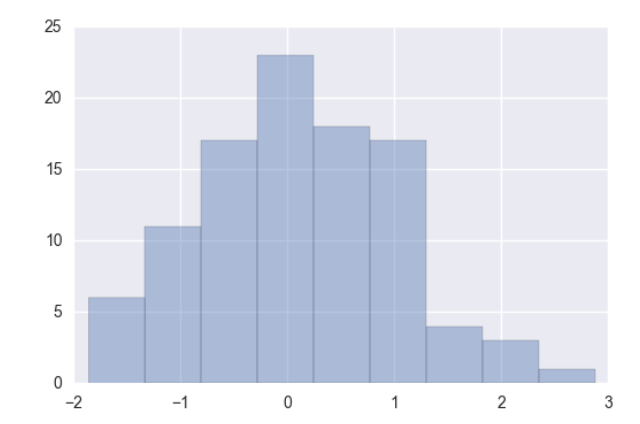
sns.distplot(x, bins=20, kde=False) #bins指定直方圖的寬度
如果要畫出一個數據的分佈情況,可以:
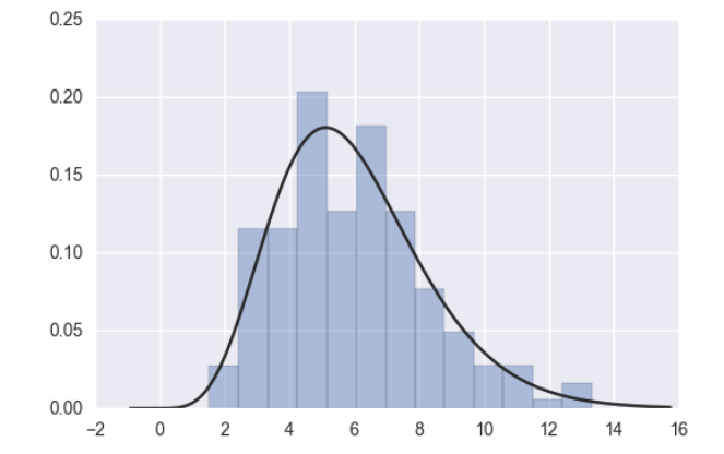
x = np.random.gamma(6, size=200)
sns.distplot(x, kde=False, fit=stats.gamma)
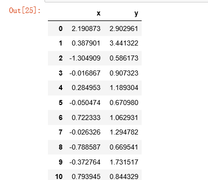
根據均值和協方差生成資料
mean, cov = [0, 1], [(1, .5), (.5, 1)]      #mean為均值,cov協方差
data = np.random.multivariate_normal(mean, cov, 200)    #生成200組資料
df = pd.DataFrame(data, columns=["x", "y"])    #資料型別為panda的dataframe
df  #輸出
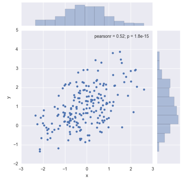
觀察兩個變數之間的分佈情況:(散點圖)
sns.jointplot(x="x", y="y", data=df);
輸出:
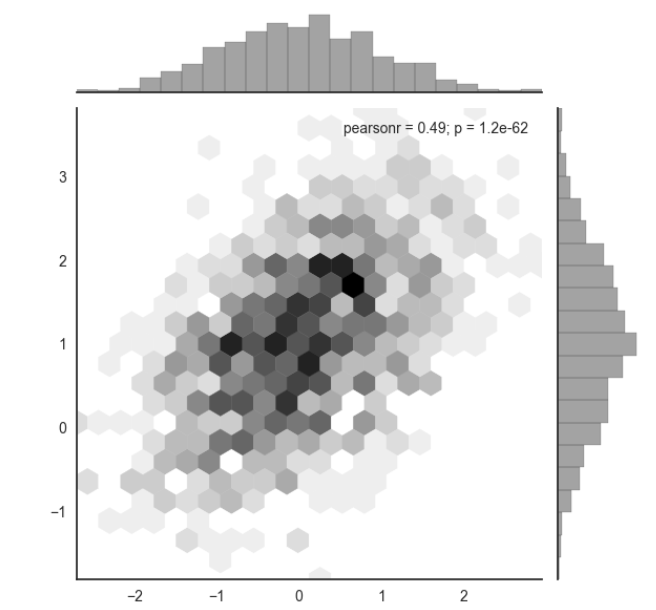
如果資料太多,點太過密集又想看分佈情況:
x, y = np.random.multivariate_normal(mean, cov, 1000).T
with sns.axes_style("white"):    #指定繪圖風格
    sns.jointplot(x=x, y=y, kind="hex", color="k")     #kind=hex
4、多變數分析繪圖
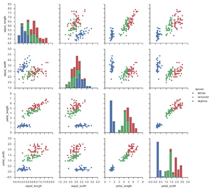
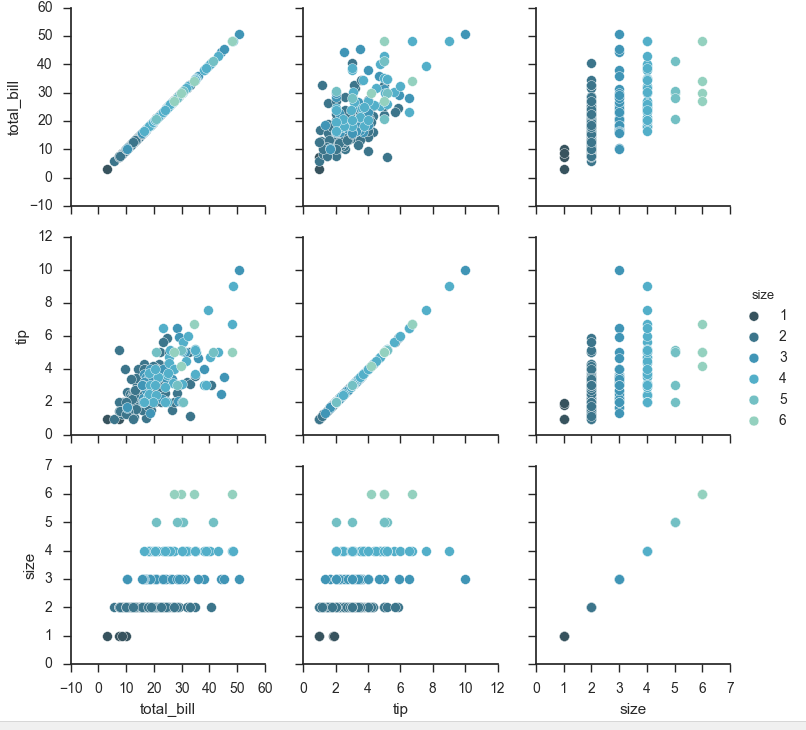
iris = sns.load_dataset("iris")    #傳入資料
sns.pairplot(iris)
輸出:

一共是四組資料,對角線因為是單個數據所以是單個數據的直方圖,散點圖都是由兩組資料得來的。
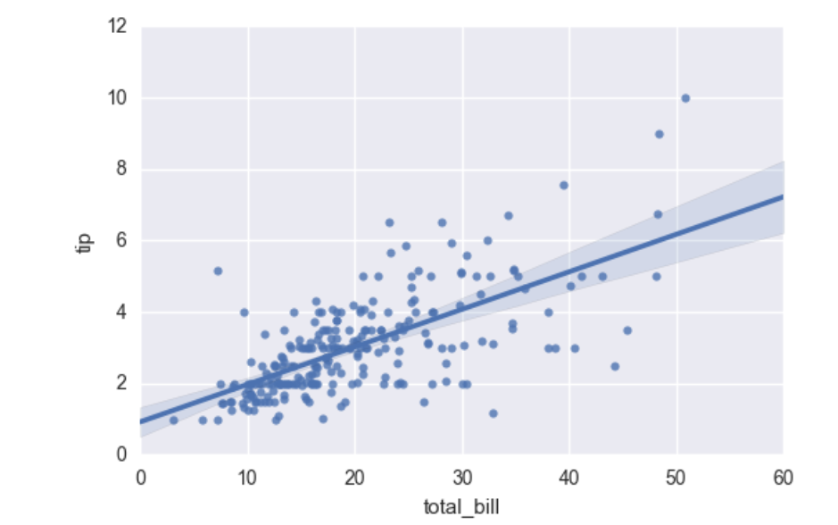
regplot()和lmplot()都可以繪製迴歸關係,推薦regplot()
sns.regplot(x="total_bill", y="tip", data=tips)
輸出:
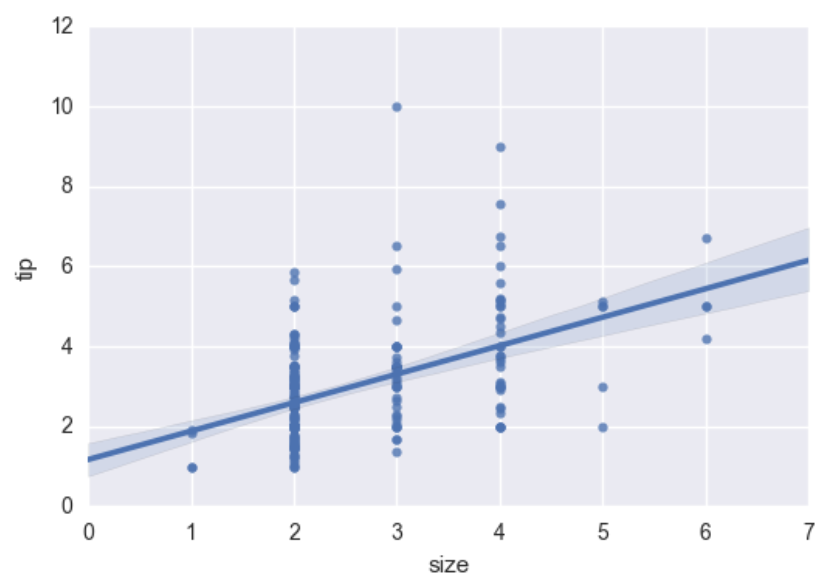
如果值為整數,不適合建立迴歸模型,如:
sns.regplot(data=tips,x="size",y="tip")
輸出:
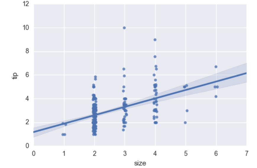
我們可以給它加上一個小範圍的浮動:
sns.regplot(x="size", y="tip", data=tips, x_jitter=.05)
輸出:
離群點
小提琴圖
先匯入資料:
import numpy as np
import pandas as pd
import matplotlib as mpl
import matplotlib.pyplot as plt
import seaborn as sns
sns.set(style="whitegrid", color_codes=True)

np.random.seed(sum(map(ord, "categorical")))
titanic = sns.load_dataset("titanic")
tips = sns.load_dataset("tips")
iris = sns.load_dataset("iris")
正常作圖:
sns.stripplot(x="day", y="total_bill", data=tips);
輸出:
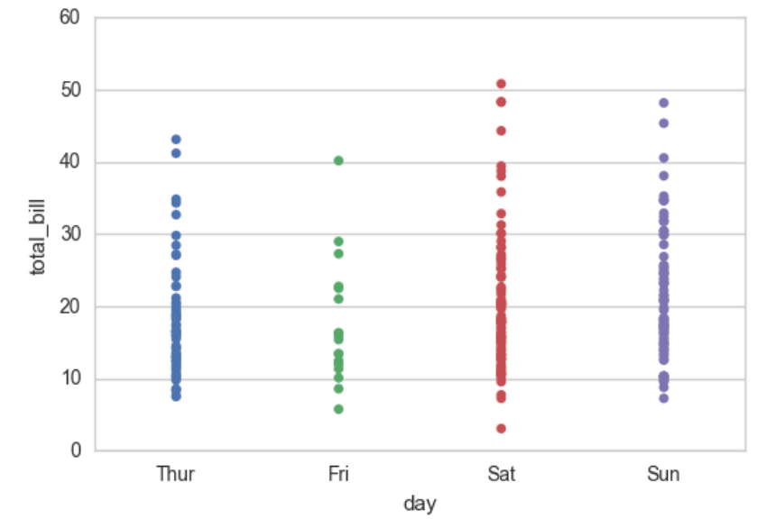
這樣會導致資料重疊,影響觀察。
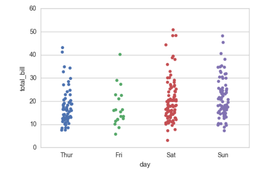
可以新增:
sns.stripplot(x="day", y="total_bill", data=tips, jitter=True) #jitter=True
輸出:
不太好看,所以我們也可以:
sns.swarmplot(x="day", y="total_bill", data=tips)
這樣輸出的圖是左右均勻的:
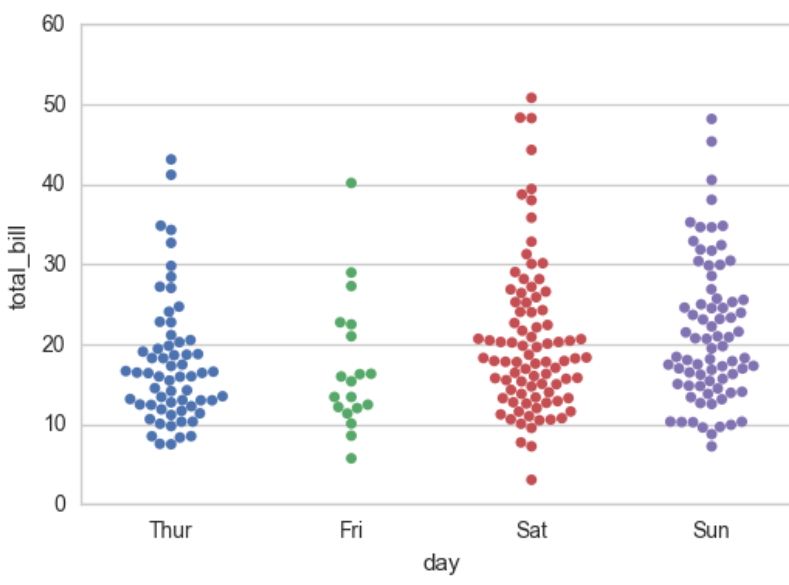
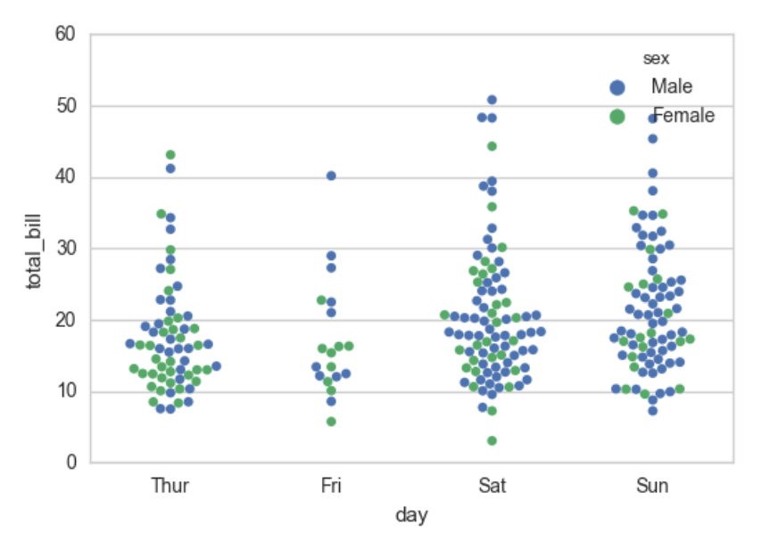
還可以在圖中加一個分類的特徵:
sns.swarmplot(x="day", y="total_bill", hue="sex",data=tips)
輸出:
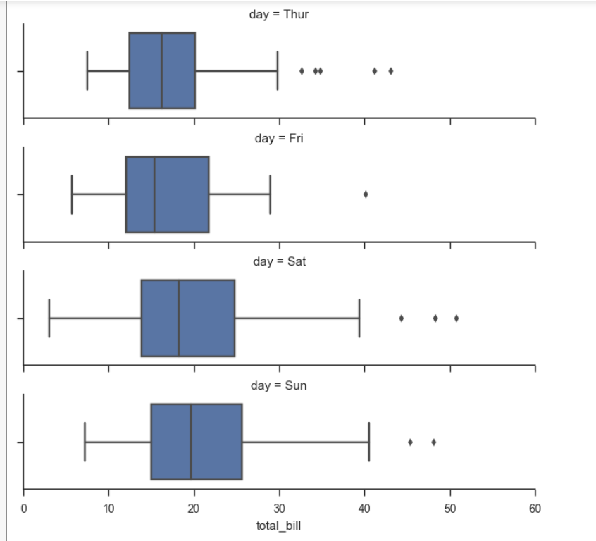
盒圖
- IQR即統計學概念四分位距,第一/四分位與第三/四分位之間的距離
- N = 1.5IQR 如果一個值>Q3+N或 < Q1-N,則為離群點
sns.boxplot(x="day", y="total_bill", hue="time", data=tips);
輸出:
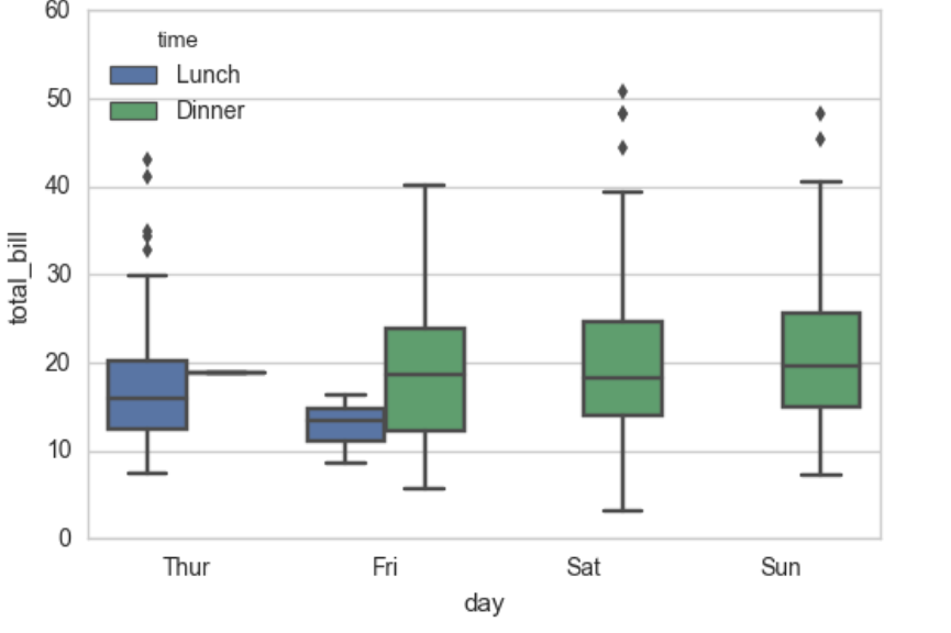
上面的點是離群點
小提琴圖:(反映分佈情況)
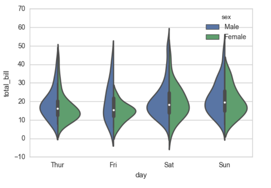
sns.violinplot(x="total_bill", y="day", hue="time", data=tips);
輸出:
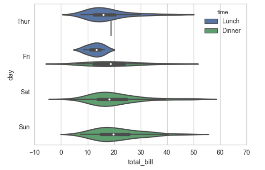
對time分類後不直觀也不好看,我們可以:
sns.violinplot(x="day", y="total_bill", hue="sex", data=tips, split=True);
讓spilt = True,使得直觀好看:
顯示值的集中趨勢可以用條形圖
sns.barplot(x="sex", y="survived", hue="class", data=titanic);
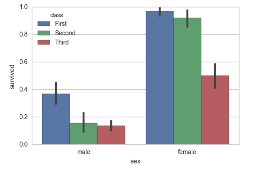
點圖可以更好的描述變化差異
sns.pointplot(x="sex", y="survived", hue="class", data=titanic) #hue表示指標

對於點圖,還可以將圖畫的好看一點,設定一些引數
sns.pointplot(x="class", y="survived", hue="sex", data=titanic,
              palette={"male": "g", "female": "m"},
              markers=["^", "o"], linestyles=["-", "--"]);
輸出:

寬型資料
sns.boxplot(data=iris,orient="h")
orient = "h"將圖弄成橫著的
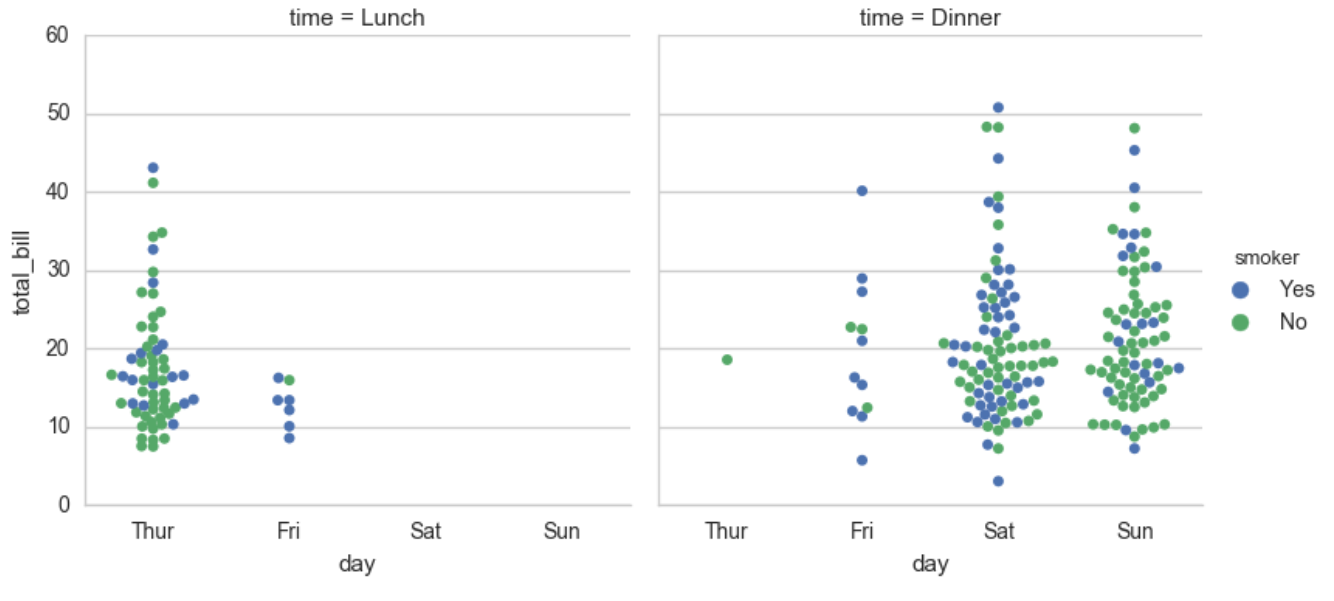
****多層面板分類圖
這個將之前的幾種整合到一起,將圖的型別作為引數傳入
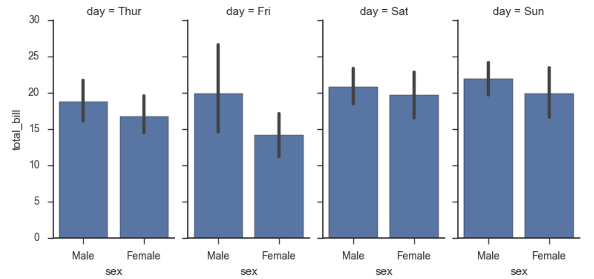
sns.factorplot(x="day", y="total_bill", hue="smoker", data=tips)
sns.factorplot(x="day", y="total_bill", hue="smoker", data=tips, kind="bar") #kind為圖的型別
sns.factorplot(x="day", y="total_bill", hue="smoker",
               col="time", data=tips, kind="swarm")
輸出:
sns.factorplot(x="time", y="total_bill", hue="smoker",
               col="day", data=tips, kind="box", size=4, aspect=.5) #指定寬度和大小
關於factorplot
seaborn.factorplot(x=None, y=None, hue=None, data=None, row=None, col=None, col_wrap=None, estimator=, ci=95, n_boot=1000, units=None, order=None, hue_order=None, row_order=None, col_order=None, kind='point', size=4, aspect=1, orient=None, color=None, palette=None, legend=True, legend_out=True, sharex=True, sharey=True, margin_titles=False, facet_kws=None, **kwargs)

Parameters:
•x,y,hue 資料集變數 變數名
•date 資料集 資料集名
•row,col 更多分類變數進行平鋪顯示 變數名
•col_wrap 每行的最高平鋪數 整數
•estimator 在每個分類中進行向量到標量的對映 向量
•ci 置信區間 浮點數或None
•n_boot 計算置信區間時使用的引導迭代次數 整數
•units 取樣單元的識別符號,用於執行多級引導和重複測量設計 資料變數或向量資料
•order, hue_order 對應排序列表 字串列表
•row_order, col_order 對應排序列表 字串列表
•kind : 可選:point 預設, bar 柱形圖, count 頻次, box 箱體, violin 提琴, strip 散點,swarm 分散點 size 每個面的高度(英寸) 標量 aspect 縱橫比 標量 orient 方向 "v"/"h" color 顏色 matplotlib顏色 palette 調色盤 seaborn顏色色板或字典 legend hue的資訊面板 True/False legend_out 是否擴充套件圖形,並將資訊框繪製在中心右邊 True/False share{x,y} 共享軸線 True/False
5、facetgrid使用方法及繪製多變數
先匯入:
import numpy as np
import pandas as pd
import seaborn as sns
from scipy import stats
import matplotlib as mpl
import matplotlib.pyplot as plt

sns.set(style="ticks")
np.random.seed(sum(map(ord, "axis_grids")))
先看看資料:
tips = sns.load_dataset("tips")
tips.head()
將圖先例項化出來:
g = sns.FacetGrid(tips, col="time")
g = sns.FacetGrid(tips, col="time")
g.map(plt.hist, "tip")   #條形圖,tip為x軸
g = sns.FacetGrid(tips, col="sex", hue="smoker")   #
g.map(plt.scatter, "total_bill", "tip", alpha=.7)   #alpha為透明度
g.add_legend()     #加入圖例(最右邊的)

g = sns.FacetGrid(tips, row="smoker", col="time", margin_titles=True)
g.map(sns.regplot, "size", "total_bill", color=".1", fit_reg=False, x_jitter=.1)   #fit_reg 表示迴歸的直線要不要畫出來, x_jitter表示抖動區間

g = sns.FacetGrid(tips, col="day", size=4, aspect=.5)    #寬度和大小
g.map(sns.barplot, "sex", "total_bill")    #先x後y
如果想指定圖的順序:
from pandas import Categorical
ordered_days = tips.day.value_counts().index
print (ordered_days)            #CategoricalIndex(['Sat', 'Sun', 'Thur', 'Fri']
ordered_days = Categorical(['Thur', 'Fri', 'Sat', 'Sun'])    #指定順序
g = sns.FacetGrid(tips, row="day", row_order=ordered_days,
                  size=1.7, aspect=4,)
g.map(sns.boxplot, "total_bill")
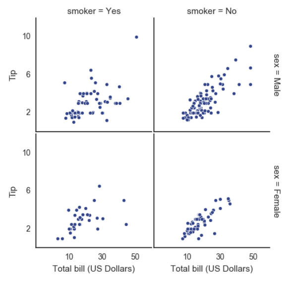
pal = dict(Lunch="seagreen", Dinner="gray")
g = sns.FacetGrid(tips, hue="time", palette=pal, size=5)      #palette表示調色盤
g.map(plt.scatter, "total_bill", "tip", s=50, alpha=.7, linewidth=.5, edgecolor="white")   #s表示點的大小
g.add_legend()
g = sns.FacetGrid(tips, hue="sex", palette="Set1", size=5, hue_kws={"marker": ["^", "v"]})    #點的形狀
g.map(plt.scatter, "total_bill", "tip", s=100, linewidth=.5, edgecolor="white")
g.add_legend();
with sns.axes_style("white"):
    g = sns.FacetGrid(tips, row="sex", col="smoker", margin_titles=True, size=2.5)    #指定風格
g.map(plt.scatter, "total_bill", "tip", color="#334488", edgecolor="white", lw=.5);
g.set_axis_labels("Total bill (US Dollars)", "Tip");     #橫軸與縱軸的名稱
g.set(xticks=[10, 30, 50], yticks=[2, 6, 10]);     #橫軸與縱軸要表現的值
g.fig.subplots_adjust(wspace=.02, hspace=.02);      #子圖之間的距離
iris = sns.load_dataset("iris")
g = sns.PairGrid(iris)      #繪製多變數
g.map(plt.scatter);
g = sns.PairGrid(iris)
g.map_diag(plt.hist)    #指定對角線圖的型別
g.map_offdiag(plt.scatter)          #指定非對角線圖的型別
g = sns.PairGrid(iris, hue="species")
g.map_diag(plt.hist)
g.map_offdiag(plt.scatter)
g.add_legend();
如果不想把所有特徵都弄出來,可以
g = sns.PairGrid(iris, vars=["sepal_length", "sepal_width"], hue="species")   #指定需要的特徵
g.map(plt.scatter);
g = sns.PairGrid(tips, hue="size", palette="GnBu_d")   #將顏色弄成漸變色
g.map(plt.scatter, s=50, edgecolor="white")
g.add_legend();
6、熱度圖繪製
先匯入庫:
%matplotlib inline
import matplotlib.pyplot as plt
import numpy as np;
np.random.seed(0)
import seaborn as sns;
sns.set()
用random提供隨機的資料:
uniform_data = np.random.rand(3, 3)
"""
[[ 0.0187898   0.6176355   0.61209572]
 [ 0.616934    0.94374808  0.6818203 ]
 [ 0.3595079   0.43703195  0.6976312 ]]
"""
heatmap = sns.heatmap(uniform_data)
輸出: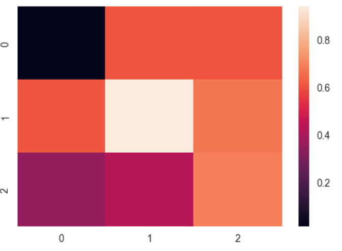
ax = sns.heatmap(uniform_data, vmin=0.2, vmax=0.5) #設定調色盤上下限
normal_data = np.random.randn(3, 3)    #隨機數有負數
print (normal_data)
ax = sns.heatmap(normal_data, center=0)     #讓調色盤的中心為0
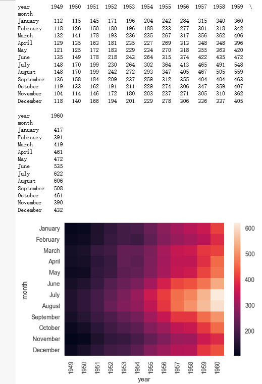
flights = sns.load_dataset("flights")    #庫提供的資料
flights.head()
flights = flights.pivot("month", "year", "passengers")
print (flights)
ax = sns.heatmap(flights)
輸出:
如果要讓數字顯示出來:
ax = sns.heatmap(flights, annot=True,fmt="d") #annot顯示數字 fmt設定數字格式
讓圖中資料更明顯:
ax = sns.heatmap(flights, linewidths=.5) #設定小格寬度
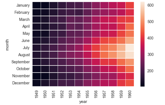
自定義顏色:
ax = sns.heatmap(flights, cmap="YlGnBu")