
前端基礎語法
文章目錄
- HTML
- 表單
- CSS
HTML
段落
<p></p>
標題
<h1></h1>
空格
&nbsp;
回車
<br />
大於號
>
小於號
<
div
塊元素,表示一塊內容,沒有具體語義,可以巢狀
span
行內元素,表示一行中的一小段內容,沒有具體語義
能使文字傾斜或加粗的標籤
<em></em> 行內元素,表示語氣中的強調詞 文字傾斜
<i></i> 行內元素,表示專業詞彙 文字傾斜
<b></b> 行內元素,表示文件中的關鍵字或產品名 加粗
<strong></strong> 行內元素,表示非常重要的內容 加粗
圖片標籤
<img src = "./images.jpeg" alt = "這是圖片"></img>
scr:圖片位置
alt:圖片描述
跳轉連結標籤
<a href = "http://www.baidu.com" title = "跳轉到百度" target = "_bank"><img src = "./images.jpeg"></img></a>
href:跳轉網址
title:滑鼠放上去的提示
target:預設是_self,替換當前頁,_bank開啟新的標籤
<a href = "#" >預設預設連結</a>跳轉到網頁頭部
有序列表/無序列表
		<ol>
			<li>有序列表1</li>
			<li>有序列表2</li>
			<li>有序列表3</li>
			<li>有序列表4</li>
			<li>有序列表5</li>
		</ol>

		<ul>
			<li>無序列表1</li>
			<li>無序列表2</li>
			<li>無序列表3</li>
			<li>無序列表4</li>
			<li>無序列表5</li>
		</ul>
定義列表
		<dl>
			<dt>html</dt>
			<dd>htmlhtml</dd>
			<dt>css</dt>
			<dd>csscss</dd>
			<dt>js</dt>
			<dd>jsjs</dd>
		</dl>
表格
		<table border = "1" width = "700" height = "300" align = "center">

			<tr>
				<td colspan = "5" height = "100%"></td>
			</tr>


			<tr>
				<td width = "15%"></td>
				<td width = "25%" ></td>
				<td width = "15%" ></td>
				<td width = "25%" ></td>
				<td width = "20%" rowspan = "5">
					<img src = "./images.jpeg"></img>
				</td>
			</tr>


			<tr>
				<td ></td>
				<td></td>
				<td></td>
				<td></td>
			</tr>


			<tr>
				<td></td>
				<td></td>
				<td></td>
				<td></td>
			</tr>

			<tr>
				<td></td>
				<td></td>
				<td></td>
				<td></td>
			</tr>

			<tr>
				<td></td>
				<td></td>
				<td></td>
				<td></td>
			</tr>
		</table>

<table border = "1" cellpadding = "20" cellspacing = "20">
			<tr>
				<td>1</td>
				<td>2</td>
				<td>3</td>
				<td>4</td>
				<td>5</td>
			</tr>
		</table>

佈局
使用表格佈局
<!DOCTYPE html>
<html>

	<head>
		<meta charset = "UTF-8">
		<title>個人簡歷</title>
	</head>

	<body>
		<table border = "0" cellpadding = "0" cellspacing = "0" align = "center" width = "800" height = "800">

			<tr>
				<td width = "260" valign = "top" bgcolor = "#f2f2f2">

					<table align ="right" border = "0" cellpadding = "0" cellspacing = "0">
						<tr height = "100"></tr>
						<tr>
							<td ><img src = "./wuyanzu.jpeg"></img></td>
							<td width = "15"></td>
						</tr>
						<tr>
							<td align = "right">吳彥祖本人</td>
							<td width = "15"></td>
						</tr>
						<tr>
							<td align = "right">XXXX</td>
							<td width = "15"></td>
						</tr>
						<tr>
							<td align = "right">[email protected]</td>
							<td width = "15"></td>
						</tr>
					</table>

				</td>
				<td width = "30"></td>
				<td width = "480"  valign = "top">
					<table width = "480" border = "0" cellpadding = "0" cellspacing = "0" >
						<tr height = "50"><td></td></tr>
						<tr >
							<td align = "right"><img src = "./images.jpeg"></img></td>
						</tr>
					</table>

					<br />
					<hr />
					<br />

					<table width = "480" height = "200" border = "0" cellpadding = "0" cellspacing = "0" >
						<tr>
							<td colspan = "2"><b>個人基本情況</b></td>
						</tr>

						<tr>
							<td><b>姓名:</b>XXX</td>
							<td><b>籍貫:</b>XXX</td>
						</tr>

						<tr>
							<td><b>性別:</b>男</td>
							<td><b>身高:</b>177cm</td>
						</tr>

						<tr>
							<td><b>民族:</b>漢</td>
							<td><b>體重:</b>75kg</td>
						</tr>

						<tr>
							<td><b>出生日期:</b>XXXX/XX/XX</td>
							<td><b>電話:</b>XXXXXXXXX</td>
						</tr>

						<tr>
							<td><b>現居住地:</b>XXX</td>
							<td><b>專業:</b>XXX</td>
						</tr>
					</table>
				</td>
				<td width = "30"></td>
			</tr>
		</table>
	</body>

</html>

表單
<!DOCTYPE html>
<html>
<head>
<meta charset = "UTF-8">
<title>表單</title>
</head>
<body>
<!-- action不寫,預設提交到本地 -->
<form action = "" method = "get">
<div>
<!-- label的for標籤,當用戶滑鼠點選賬號文字時,輸入框自動獲得焦點,但是輸入框需要設定id屬性 -->
<!-- 要想讓提交後,在位址列上有顯示例如:username = "tom" 需要設定name欄位 -->
<label for = "username">賬 號:</label>
<input type = "text" name = "username" id = "username"></input><br /
<label>密 碼:</label>
<input type = "password" name = "password"></input><br /
</div>
<div>
<label>性 別:</label>
<input type = "radio" name = "gender" value = "0">男</input>
<input type = "radio" name = "gender" value = "1">女</input>
</div>
<div>
<label>愛 好:</label>
<input type = "checkbox" name = "like" value = "football">足球</input>
<input type = "checkbox" name = "like" value = "basketball">籃球</input>
<input type = "checkbox" name = "like" value = "volleyball">排球</input>
</div>
<div>
<label>照 片:</label>
<input type = "file"></input>
</div>
<br />
<div>
<label>個人介紹:</label>
<textarea name = "introduce"></textarea>
</div>
<label>籍 貫:</label>
<select name = "site">
<option value = "0">北京</option>
<option value = "1">上海</option>
<option value = "2">廣州</option>
<option value = "3">深圳</option>
</select>
<div>
<input type = "submit" name = "" value = "提交"></input>
<input type = "reset" name = "" value = "重置"></input>
</div>
<!-- 不在頁面上顯示,用於存值 -->
<div>
<input type = "hidden" name = "hid01" value = "12"></input>
</div>
<!--
使用圖片提交的方式可能會提交兩次的情況出現
<div>
<input type = "image" src = "images.jpeg" name = ""></input>
</div>
-->
</form>
</body>
</html>
CSS
css引入方式
外聯式,通過href標籤引入
在目錄下面建立一個main.css檔案
div{
	font-size:28px;
	color:red;
}
建立一個html,再程式碼中引入
<!DOCTYPE html>
<html>

	<head>
		<meta charset = "UTF-8">
		<title>學習css</title>
		<link rel = "stylesheet" type = "text/css" href = "./css/main.css">
	</head>

	<body>
		<div>這是一個div標籤</div>
	</body>

</html>
嵌入式
再head中新增style標籤
		<style>

			div{
				font-size:100px;
				color:green;
			}

		</style>
<!DOCTYPE html>
<html>

	<head>
		<meta charset = "UTF-8">
		<title>學習css</title>
		<style>

			div{
				font-size:100px;
				color:green;
			}

		</style>
	</head>

	<body>
		<div>這是一個div標籤</div>
	</body>

</html>
內聯式
將style直接寫到標籤裡面
<!DOCTYPE html>
<html>

	<head>
		<meta charset = "UTF-8">
		<title>學習css</title>
	</head>

	<body>
		<div style = "font-size:100px;color:gold;">這是一個div標籤</div>
	</body>

</html>
設定文字字型
front-family:'Microsoft yahei'
設定字型是否傾斜
front-style:'italic'
設定文字是否加粗
front-weight:'bold'
設定文字的行高
line-height:24px
設定文字居中
text-align:center
標籤預設是整個網頁寬度,設定之後p標籤會居中 標籤預設是字型的寬度,設定之後a標籤不會居中
CSS選擇器
標籤選擇器
可以理解成嵌入式
*號選擇器
適用於所有標籤
<!DOCTYPE html>
<html>

	<head>
		<meta charset = "UTF-8">
		<title>css選擇器</title>
	</head>
	<style>
		*{
			color:green;
		}
	</style>
	<body>
		<div>這是一個div標籤</div>
	</body>

</html>
id選擇器
當id和類選擇器重複作用一個標籤時,id選擇器優先
<!DOCTYPE html>
<html>

	<head>
		<meta charset = "UTF-8">
		<title>css選擇器</title>
	</head>
	<style>
		#div1{
			color:red;
		}
	</style>
	<body>
		<div id = "div1">這是一個div標籤</div>
	</body>

</html>
類選擇器
當id和類選擇器重複作用一個標籤時,id選擇器優先
<!DOCTYPE html>
<html>

	<head>
		<meta charset = "UTF-8">
		<title>css選擇器</title>
	</head>
	<style>
		.green{
			color:green;
		}
		.big{
			font-size:40px;
		}
	</style>
	<body>
		<div class="green big">這是一個div標籤</div>
	</body>

</html>
層級選擇器
<!DOCTYPE html>
<html>

	<head>
		<meta charset = "UTF-8">
		<title>css選擇器</title>
	</head>
	<style>
		.box .span{
			color:red;
		}

		.box .span em{
			color:green;
		}
	</style>
	<body>
		<div class = "box">

			對此,僱主已經釋放出了一些<span class = "span"><em>信</em>號</span>,並適當為 95 後們引流。比如,位元組跳動的 HR 就公開表示:移動端方向仍有大量空缺,甚至開出了「入職滿一年即可獲得 3 個月工資」的簽約金獎勵福利,鼓勵候選人投遞移動端崗位。

		</div>
	</body>

</html>
組選擇器
<!DOCTYPE html>
<html>

	<head>
		<meta charset = "UTF-8">
		<title>css選擇器</title>
	</head>
	<style>
		<!-- 將.box1,.box2,.box3分成一組,設定同樣的屬性 -->
		.box1,.box2,.box3{
			font-size:60px;
		}
		.box1{
			color:red;
		}
		.box2{
			color:green;
		}
		.box3{
			color:gold;
		}
	</style>
	<body>
		<div class = "box1">box1</div>
		<div class = "box2">box2</div>
		<div class = "box3">box3</div>
	</body>

</html>
偽元素選擇器
hover
<!DOCTYPE html>
<html>

	<head>
		<meta charset = "UTF-8">
		<title>css選擇器</title>
	</head>
	<style>
		.link:hover{
			font-size:40px;
			color:red;
		}

	</style>
	<body>
		<a href = "www.baidu.com" class = "link">百度</a>
	</body>

</html>
before
<!DOCTYPE html>
<html>

	<head>
		<meta charset = "UTF-8">
		<title>css選擇器</title>
	</head>
	<style>

		.link:before{

			content:"~";
			color:red;
		}

	</style>
	<body>
		<!-- 在前面加上文字,但是文字不可選 -->
		<div class = "link">aaaa</div>
	</body>

</html>
after
<!DOCTYPE html>
<html>

	<head>
		<meta charset = "UTF-8">
		<title>css選擇器</title>
	</head>
	<style>

		.link:after{
			content:"~";
			color:red;
		}

	</style>
	<body>

		<div class = "link">aaaa</div>
	</body>

</html>
CSS 盒子模型
<!DOCTYPE html>
<html>

	<head>
		<meta charset = "UTF-8">
		<title>盒子模型</title>
	</head>
	<style>
		.box{
			width : 200px;
			height : 200px;
			background-color : gold;
			/* 方法1 */
			/* border-top-color:#000;
			border-top-width : 10px;*/
			/* 實線 : solid 虛線 : dashed 點線 : dotted */
			/*border-top-style : solid;*/
			/* 方法2 */
			/*border-top:10px solid #000;
			border-left:10px dotted #000;
			border-right:10px dashed #000;
			border-bottom:10px solid #000;*/
			/* 方法3 */
			border : 10px dotted #000;
		}
	</style>
	<body>

		<div class = "box">為什麼要編寫這個教程?因為我在學習Git的過程中,買過書,也在網上Google了一堆Git相關的文章和教程,但令人失望的是,這些教程不是難得令人髮指,就是簡單得一筆帶過,或者,只支離破碎地介紹Git的某幾個命令,還有直接從Git手冊貼上幫助文件的,總之,初學者很難找到一個由淺入深,學完後能立刻上手的Git教程。</div>
	</body>

</html>
CSS Padding
<!DOCTYPE html>
<html>

	<head>
		<meta charset = "UTF-8">
		<title>padding</title>
	</head>
	<style>
		.box{
			width : 200px;
			height : 300px;
			background-color : gold;

			/*padding-top:40px;
			padding-right:20px;
			padding-bottom:20px;
			padding-left:20px;*/

			/*padding:50px 60px 70px 80px;*/
			/* 設定上 左右 下 */
			/* padding:20px 80px 100px */

			/* 設定上下 左右 */
			padding:20px 100px;

			/* 設定上下左右 */
			padding:20px;
		}
	</style>
	<body>

		<div class = "box">為什麼要編寫這個教程?因為我在學習Git的過程中,買過書,也在網上Google了一堆Git相關的文章和教程,但令人失望的是,這些教程不是難得令人髮指,就是簡單得一筆帶過,或者,只支離破碎地介紹Git的某幾個命令,還有直接從Git手冊貼上幫助文件的,總之,初學者很難找到一個由淺入深,學完後能立刻上手的Git教程。</div>
	</body>

</html>
CSS Margin
跟Padding同理
Margin使用技巧
居中
<!DOCTYPE html>
<html>

	<head>
		<meta charset = "UTF-8">
		<title>margin</title>
	</head>
	<style>
		.box{
			width : 200px;
			height : 200px;
			background : green;
			/* 設定居中,只能設定左右居中,不能設定上下居中 */
			margin : 50px auto 50px;
		}
	</style>
	<body>

		<div class = "box"></div>
	</body>

</html>
Margin可以設定負值
<!DOCTYPE html>
<html>

	<head>
		<meta charset = "UTF-8">
		<title>為margin設定負值</title>
	</head>
	<style>

		body{
			/* 因為瀏覽器預設會在body中加入margin:8px */
			margin:0px;
		}

		.box{
			width : 200px;
			height : 200px;
			background : green;
			/* 設定居中,只能設定左右居中,不能設定上下居中 */
			margin-left: -100px;
		}
	</style>
	<body>

		<div class = "box"></div>
	</body>

</html>
Margin 注意事項
外邊距合併
外邊距合併指的是,當兩個垂直外邊距相遇時,它們將形成一個外邊距。合併後的外邊距的高度等於兩個發生合併的外邊距的高度中的較大者。
<!DOCTYPE html>
<html>

	<head>
		<meta charset = "UTF-8">
		<title>外邊距合併</title>
	</head>
	<style>

		body{
			margin:0px;
		}

		.box1,.box2{
			width : 200px;
			height : 200px;
		}

		.box1{
			margin-bottom : 20px;
			background : green;
		}

		.box2{
			margin-top : 20px;
			background : gold;
		}
	</style>
	 <body>

		<div class = "box1">1</div>
		<div class = "box2">2</div>
	</body>

</html>
MariginTop塌陷

<!DOCTYPE html>
<html>

	<head>
		<meta charset = "UTF-8">
		<title>margin塌陷</title>
	</head>
	<style>

		body{
			margin:0px;
		}

		.box1{
			width:300px;
			height:300px;
			background-color:green;
		}

		.box2{
			width:200px;
			height:100px;
			background-color:gold;
			margin-top:100px;
		}

	</style>
	 <body>

		<div class = "box1">

			<div class = "box2"></div>

		</div>

	</body>

</html>
解決方案
- 在外面設定邊框
.box1{
			width:300px;
			height:300px;
			background-color:green;
			border:1px solid #000;
		}

- overflow:hidden
.box1{
			width:300px;
			height:300px;
			background-color:green;
			overflow:hidden;
		}
-
clearfix
<head>
	<meta charset = "UTF-8">
	<title>margin塌陷</title>
</head>
<style>

	.clearfix:before{
		content:"";
		display:table;
	}

	body{
		margin:0px;
	}

	.box1{
		width:300px;
		height:300px;
		background-color:green;

	}

	.box2{
		width:200px;
		height:100px;
		background-color:gold;
		margin-top:100px;
	}

</style>
 <body>

	<div class = "box1 clearfix">

		<div class = "box2"></div>

	</div>

</body>
溢位
<!DOCTYPE html>
<html>

	<head>
		<meta charset = "UTF-8">
		<title>margin塌陷</title>
	</head>
	<style>

		.box{
			width:100px;
			height:100px;
			background-color:gold;
		}

	</style>
	 <body>

		<div class = "box">
		為什麼要編寫這個教程?因為我在學習Git的過程中,買過書,也在網上Google了一堆Git相關的文章和教程,但令人失望的是,這些教程不是難得令人髮指,就是簡單得一筆帶過,或者,只支離破碎地介紹Git的某幾個命令,還有直接從Git手冊貼上幫助文件的,總之,初學者很難找到一個由淺入深,學完後能立刻上手的Git教程。

		</div>

	</body>

</html>

- overflow:hidden;

- overflow:scroll;
會出現滾動條 - overflow:aoto;
自動增加滾動條 溢位的時候產生滾動條,不溢位不產生
塊元素
塊元素,也可以稱為行元素,佈局中常用的標籤如:div p il li h1-h6 dl dt dd
- 支援全部的樣式
- 如果沒有設定寬度,預設寬度為父級寬度100%
- 盒子佔據一行,即使設定了寬度
內聯元素
稱為行內元素,標籤如a span em b strong i
- 支援部分樣式(不支援寬、高、margin上下、padding上下)
- 寬高由內容決定
- 盒子並在一行
- 程式碼換行,盒子之間會產生間距
- 子元素是內聯元素,父元素可以用text-align屬性設定元素水平對齊方式
內聯塊元素
<!DOCTYPE html>
<html>

	<head>
		<meta charset = "UTF-8">

		<title>內聯塊元素</title>
		<style>
			/*
			 * 支援全部格式
			 * 如果沒有設定寬高,寬高由內容決定
			 * 盒子並在一行
			 * 程式碼換行,盒子會產生間距
			 * 子元素是內聯塊元素,父元素可以用text-align屬性設定子元素水平對齊方式
			*/


			.box{
				width:500px;
				height:300px;
				border:1px solid #000;
				margin:50px auto 0;
				font-size:0px;
			}

			.box a{
				background-color:gold;
				width:200px;
				font-size:20px;
				padding:0 10px;
				display:inline-block;

			}

		</style>
	</head>

	<body>
		<div class = "box">
			<a href="#">連結文字一</a>
			<a href="#">連結文字一</a>
			<a href="#">連結文字一</a>
			<a href="#">連結文字一</a>
		</div>
	</body>

</html>
display屬性
- none:元素隱藏且不佔位置
- block:元素以塊元素顯示
- inline:元素以內聯元素顯示
- inlin-block:元素以內聯塊元素顯示
練習
<!DOCTYPE html>
<html>

	<head>
		<meta charset = "UTF-8">

		<title>元素型別轉換</title>
		<style>
			.menu{

			}

			.out{
				width:694px;
				height:50px;
				margin:50px auto 0px;
				font-size:0px;
			}

			.menu{
				width:98px;
				height:48px;
				text-align:center;
				display:inline-block;
				text-decoration:none;
				font-size:16px;
				line-height:48px;
				border:1px solid gold;
				margin-left:-1px;
				color:pink;
				font-family:'Microsoft Yahei';
			}
		</style>
	</head>

	<body>

		<div class = "out">
		<a class = "menu" href = "#">首頁</a>
		<a class = "menu" href = "#">公司簡介</a>
		<a class = "menu" href = "#">公司簡介</a>
		<a class = "menu" href = "#">公司簡介</a>
		<a class = "menu" href = "#">公司簡介</a>
		<a class = "menu" href = "#">公司簡介</a>
		<a class = "menu" href = "#">公司簡介</a>
		</div>
	</body>

</html>
浮動
- 浮動元素有左浮動和右浮動兩種
- 浮動的元素會向左或向右浮動,碰到父元素邊界,其他元素才停下來
- 相鄰浮動的塊元素可以並在一行,超出父級寬度就換行
- 浮動讓行內元素或塊元素自動換化為行內塊元素(此時不會有行內塊元素間隙問題)
<!DOCTYPE html>
<html>

	<head>
		<meta charset = "UTF-8">

		<title>元素型別轉換</title>
		<style>
			.menu{

			}

			.out{
				width:694px;
				height:400px;
				margin:50px auto 0px;
				border:1px solid green;
			}

			.out div{
				width:100px;
				height:100px;
				background:gold;
				border:1px solid red;
				float:left;
				margin:15px;
			}
		</style>
	</head>

	<body>

		<div class = "out">
			<div class = "box">1</div>
			<div class = "box">1</div>
			<div class = "box">1</div>
			<div class = "box">1</div>
			<div class = "box">1</div>
			<div class = "box">1</div>
			<div class = "box">1</div>
		</div>
	</body>

</html>
文字環繞
浮動元素後面沒有浮動的元素會佔據浮動元素的位置,沒有浮動的元素內的文字會避開浮動的元素,形成文字環繞圖效果。
<!DOCTYPE html>
<html>

	<head>
		<meta charset = "UTF-8">

		<title>文字包裹圖片</title>
		<style>
			.menu{

			}

			.out{
				width:694px;
				height:400px;
				margin:50px auto 0px;
				border:1px solid green;
			}

			.out .box{
				width:100px;
				height:100px;
				background:gold;
				border:1px solid red;
				float:left;
				margin:15px;
			}

		</style>
	</head>

	<body>

		<div class = "out">
			<div class = "box"></div>
			<div class = "text">浮動元素有左浮動和右浮動兩種
浮動的元素會向左或向右浮動,碰到父元素邊界,其他元素才停下來
相鄰浮動的塊元素可以並在一行,超出父級寬度就換行
浮動讓行內元素或塊元素自動換化為行內塊元素(此時不會有行內塊元素間隙問題)浮動元素有左浮動和右浮動兩種
浮動的元素會向左或向右浮動,碰到父元素邊界,其他元素才停下來
相鄰浮動的塊元素可以並在一行,超出父級寬度就換行
浮動讓行內元素或塊元素自動換化為行內塊元素(此時不會有行內塊元素間隙問題)浮動元素有左浮動和右浮動兩種
浮動的元素會向左或向右浮動,碰到父元素邊界,其他元素才停下來
相鄰浮動的塊元素可以並在一行,超出父級寬度就換行
浮動讓行內元素或塊元素自動換化為行內塊元素(此時不會有行內塊元素間隙問題)</div>

		</div>
	</body>

</html>

清除浮動
<!DOCTYPE html>
<html>

	<head>
		<meta charset = "UTF-8">

		<title>清除浮動</title>
		<style>
			.menu{

			}

			.out{
				width:694px;

				margin:50px auto 0px;
				border:1px solid green;
			}

			.out div{
				width:100px;
				height:100px;
				background:gold;
				border:1px solid red;
				float:left;
				margin:15px;
			}
		</style>
	</head>

	<body>

		<div class = "out">
			<div class = "box">1</div>
			<div class = "box">1</div>
			<div class = "box">1</div>
			<div class = "box">1</div>
			<div class = "box">1</div>
			<div class = "box">1</div>
			<div class = "box">1</div>
		</div>
	</body>

</html>
當不設定高度的時候會出現問題

外邊框不見了
解決方案
<!DOCTYPE html>
<html>

	<head>
		<meta charset = "UTF-8">

		<title>清除浮動</title>
		<style>

			.clearfix:before,.clearfix:after{
				content:"";
				display:table;
			}

			.clearfix:after{
				clear:both;
			}
			/* 做相容 */
			.clearfix{
				zoom:1;
			}

			.out{
				width:694px;
				margin:50px auto 0px;
				border:1px solid green;
			}

			.out div{
				width:100px;
				height:100px;
				background:gold;
				border:1px solid red;
				float:left;
				margin:15px;
			}
		</style>
	</head>

	<body>

		<div class = "out clearfix">
			<div class = "box">1</div>
			<div class = "box">1</div>
			<div class = "box">1</div>
			<div class = "box">1</div>
			<div class = "box">1</div>
			<div class = "box">1</div>
			<div class = "box">1</div>
		</div>
	</body>

</html>
定位
定位元素特性
絕對定位和固定定位的塊元素和行內元素會自動轉化為行內塊元素
相對定位
<!DOCTYPE html>
<html>

	<head>
		<meta charset = "UTF-8">
		<!-- relative 生成相對定位元素,元素所佔據的文件流的位置保留,元素相對自身原位置進行偏移 -->
		<title>相對定位</title>
		<style>

			.con{
				width:694px;
				height:500px;
				margin:50px auto 0px;
				border:1px solid green;
			}
			.con div{
				width:300px;
				height:100px;

				border:1px solid red;
				margin:15px;
			}
			.box1{
				background-color:green;
				position:relative;
				left:50px;
				top:50px;
			}
			.box2{
				background-color:red;
			}

		</style>
	</head>

	<body>

		<div class = "con">
			<div class = "box1">1</div>
			<div class = "box2">2</div>
		</div>
	</body>

</html>
絕對定位
<!DOCTYPE html>
<html>

	<head>
		<meta charset = "UTF-8">
		<!-- absolute
			生成絕對定位元素,元素脫離文件流,不佔據文件流的位置
			可以理解為漂浮在文件流的上方,相對於上一個設定了定位的父元素來進行定位
			如果找不到,則相對於body元素進行定位-->
		<title>絕對定位</title>
		<style>

			.con{
				width:694px;
				height:500px;
				margin:50px auto 0px;
				border:1px solid green;
				position:relative;
			}
			.con div{
				width:300px;
				height:100px;

				border:1px solid red;
				margin:15px;
			}
			.box1{
				background-color:green;
				/* 針對父級,沒有父級為body */
				position:absolute;
				left:50px;
				top:50px;
			}
			.box2{
				background-color:red;
			}

		</style>
	</head>

	<body>

		<div class = "con">
			<div class = "box1">1</div>
			<div class = "box2">2</div>
		</div>
	</body>

</html>
固定定位
<!DOCTYPE html>
<html>

	<head>
		<meta charset = "UTF-8">
		<!-- fixed
			生成固定定位元素,元素脫離文件流,不佔據文件流位置,可以理解為漂浮在文件流的上方,相對於瀏覽器視窗進行定位 -->
		<title>固定定位</title>
		<style>

			.con{
				width:694px;
				height:500px;
				margin:50px auto 0px;
				border:1px solid green;
			}
			.con div{
				width:300px;
				height:100px;

				border:1px solid red;
				margin:15px;
			}
			.box1{
				background-color:green;
				position:fixed;
				left:50px;
				top:50px;
			}
			.box2{
				background-color:red;
			}

		</style>
	</head>

	<body>

		<div class = "con">
			<div class = "box1">1</div>
			<div class = "box2">2</div>
		</div>
	</body>

</html>
static預設值
inherit從父元素繼承position屬性的值
定位層級
<!DOCTYPE html>
<html>

	<head>
		<meta charset = "UTF-8">

		<title>定位層級</title>
		<style>

			.con{
				width:694px;
				height:500px;
				margin:50px auto 0px;
				border:1px solid green;
				position:relative;
			}
			.con div{
				width:300px;
				height:100px;
				position:absolute;
			}
			.box1{
				background-color:green;
				left:20px;
				top:20px;
				z-index:10;
			}
			.box2{
				background-color:red;
				left:40px;
				top:40px;
				z-index:11;
			}
			.box3{
				background-color:pink;

				left:60px;
				top:60px;
			}
			.box4{
				background-color: gold;

				left:80px;
				top:80px;
			}
		</style>
	</head>

	<body>

		<div class = "con">
			<div class = "box1">1</div>
			<div class = "box2">2</div>
			<div class = "box3">3</div>
			<div class = "box4">4</div>
		</div>
	</body>

</html>
定位練習
練習1
<!DOCTYPE html>
<html>

	<head>
		<meta charset = "UTF-8">

		<title>定位練習</title>
		<style>
			.con{
				background-color:green;
				width:100px;
				height:100px;
				margin:50px auto 0px;
				position:relative;
				border-radius:14px;
			}

			.box{
				width:28px;
				height:28px;
				color:white;
				background-color:red;
				text-align:center;
				line-height:28px;
				position:absolute;
				left:86px;
				top:-14px;
				border-radius:14px;
			}
		</style>
	</head>


	<body>

		<div class = "con">

			<div class = "box">1</div>

		</div>

	</body>

</html>

練習2
<!DOCTYPE html>
<html>

	<head>
		<meta charset = "UTF-8">

		<title>懸浮選單</title>
		<style>

			div{
				width:960px;
				height:100px;
				background-color:red;
				text-align:center;
				line-height:100px;
				position:fixed;
				top:0px;
				left:50%;
				margin-left:-480px;
			}

			p{
				text-align:center;
			}

		</style>
	</head>


	<body>

		<div>這是選單</div>

		<p>測試</p>
		<br>
		<br>
		<br>
		<br>
		<br>
		<p>測試</p>
		<br>
		<br>
		<br>
		<br>
		<br>
		<p>測試</p>
		<br>
		<br>
		<br>
		<br>
		<br>
		<p>測試</p>
		<br>
		<br>
		<br>
		<br>
		<br>
		<p>測試</p>
		<br>
		<br>
		<br>
		<br>
		<br>
		<p>測試</p>
		<br>
		<br>
		<br>
		<br>
		<br>
		<p>測試</p>
		<br>
		<br>
		<br>
		<br>
		<br>
		<p>測試</p>
		<br>
		<br>
		<br>
		<br>
		<br>
		<p>測試</p>
		<br>
		<br>
		<br>
		<br>
		<br>
		<p>測試</p>
		<br>
		<br>
		<br>
		<br>
		<br>
		<p>測試</p>
		<br>
		<br>
		<br>
		<br>
		<br>
		<p>測試</p>
		<br>
		<br>
		<br>
		<br>
		<br>
		<p>測試</p>
		<br>
		<br>
		<br>
		<br>
		<br>

	</body>

</html>
background屬性
<!DOCTYPE html>
<html>

	<head>
		<meta charset = "UTF-8">

		<title>設定圖片</title>
		<style>

			.box{
				width:900px;
				height:900px;
				border:5px solid #000;
				margin:50px auto 0;
				background-image:url(./bg.jpg);
				/*
				repeat-x:只平鋪X軸方向
				repeat-Y:只平鋪Y軸方向
				no-repeat:只平鋪一次
				repeat:預設值,平鋪所有的
				 */
				background-repeat:no-repeat;
				/*
				水平方向:left center right
				垂直方向:top center bottom
				數值 可以有負值
				*/
				background-position:10 10;

				background-color:cyan;


			}


		</style>
	</head>


	<body>

		<div class = "box">

		</div>

	</body>

</html>
製作雪碧圖
<!DOCTYPE html>
<html>

	<head>
		<meta charset = "UTF-8">

		<title>雪碧圖製作</title>
		<style>
			.list{
				margin:50px auto 0px;
				list-style:none;
				padding:0px;
				background-color:gold;
				width:300px;
				height:305px;
			}

			.list li{
				height:60px;
				line-height:60px;
				border-bottom:1px dotted #000;
				text-indent:50px;
				background:url(./css/biaoqing1.png) left -44px no-repeat;
			}

			.list .icon2{
				background-position:left -194px;
			}
		</style>
	</head>


	<body>

		<ul class="list">
			<li>無序列表1</li>
			<li class="icon2">無序列表2</li>
			<li class="icon3">無序列表3</li>
			<li class="icon4">無序列表4</li>
			<li class="icon5">無序列表5</li>
		</ul>

	</body>

</html>
佈局練習
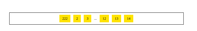
<!DOCTYPE html>
<html>

	<head>
		<meta charset = "UTF-8">

		<title>雪碧圖製作</title>
		<style>
			.pagenation{
				list-style:none;
				margin:50px auto 0px;
				padding:0px;
				width:600px;
				height:40px;
				border:1px solid #000;
				font-size:0px;
				text-align:center;
			}

			.pagenation li{
				display:inline-block;

				font-size:12px;
				margin:7px 5px 0px;
				height:26px;
			}
			.pagenation li a{
				background:gold;
				display:block;
				height:26px;
				line-height:26px;
				padding:0 10px;
				font:normal 12px/26px 'Microsoft Yahei';
				color:#000;
				text-decoration:none;
			}
		</style>
	</head>


	<body>

		<ul class="pagenation">
			<li><a href="#">222</a></li>
			<li><a href="#">2</a></li>
			<li><a href="#">3</a></li>
			<li><span>...</span></li>
			<li><a href="#">12</a></li>
			<li><a href="#">13</a></li>
			<li><a href="#">14</a></li>
		</ul>

	</body>

</html>