
總結佈局用法
<style>
.child{width:800px;height:300px; margin: 0 auto;
background-color: red}
</style>
<div class="child">222</div>
浮動佈局:
dom文件
<div class="container"> <div class="wrap clearfix"> <div class="box1"></div> <div class="box2"></div> </div> </div>
1:
固定佈局:
實現如圖
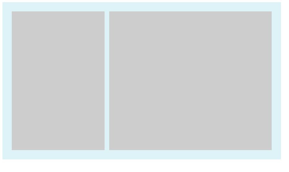
樣式:
<style> .container{ width: 600px; background-color: #DDF3F7; } .wrap{ padding:20px; overflow: hidden; } .box1{ float: left; width: 200px; height:300px; background-color: #ccc; } .box2{ float: right; width: 350px; height:300px; background-color: #ccc; } .clearfix:after{ clear: both; display:table; } </style>
關鍵點:box1 和box2設定固定width,浮動,
2:流體佈局
<style> .container{ width: 600px; background-color: #DDF3F7; } .wrap{ padding:20px; overflow: hidden; } .box1{ float: left; width: 200px; height:300px; background-color: #ccc; } .box2{ margin-left:220px; height:300px; background-color: #ccc; } .clearfix:after{ clear: both; display:table; } .clearfix{ *zoom:1; } </style>
和固定佈局對比:
box1 float left 設定width
box2: marign-left 為box1.width (效果和固定效果一樣,不截圖了)
3:浮動與兩側皆自適應的流體佈局
樣式
<style>
.container{
    width: 600px;
    background-color: #DDF3F7;
}
.wrap{
    padding:20px;
    overflow: hidden;
}
.box1{
     float: left;
     margin-right:20px;
     height:300px;
     background-color: #ccc;
}
.box2{
     display:table-cell;
     width:auto;
     height:300px;
     background-color: #ccc;
}

.clearfix:after{
    content:'';
    clear: both;
    display:table;

}
 .clearfix{
     *zoom:1;
 }

</style>
注意點:1、box1 float left
2、margin-right:某px;
box2 width auto, display:table-cell;
3、 box1和box2 必須有內容。
效果如圖
4.右浮動,改變dom位置的流體佈局:
樣式:
<style>
.container{
    width: 600px;
    background-color: #DDF3F7;
}
.wrap{
    padding:20px;
    overflow: hidden;
}
.box1{
     float: right;
     width:100px;
     height:300px;
     background-color: #ccc;
}
.box2{
     margin-right:120px;
     height:300px;
     background-color: #ccc;
}

.clearfix:after{
    content:'';
    clear: both;
    display:table;

}
 .clearfix{
     *zoom:1;
 }

</style>
box1設定width float right
box2 margin-right:box1.width;
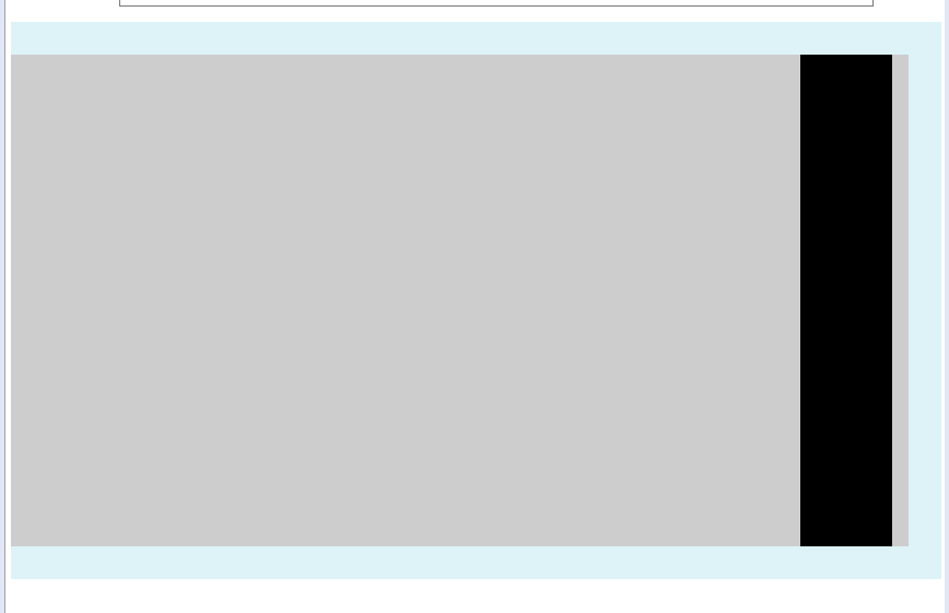
5.左浮動,不改變dom位置的流體佈局寫法
樣式
<style>
.container{
    width: 600px;
    background-color: #DDF3F7;
}
.wrap{
    padding:20px;
    overflow: hidden;
}
.box1{

     width: 100%;
     float:left;
     height: 300px;
     background-color: #ccc;
}
.box2{

     width: 56px;
     float:left;
     margin-left:-56px;
     height:300px;
     background-color: #000;
}

.clearfix:after{
    content:'';
    clear: both;
    display:table;

}
 .clearfix{
     *zoom:1;
 }

</style>
關鍵點:box1 width 100% float left
box2 float left width 某px margin-leftf 某px
如下圖
彈性佈局
對於下面html
<div>
        <p>榴蓮披薩榴蓮披薩榴蓮披薩榴蓮披薩榴蓮披薩榴蓮披薩榴蓮披薩榴蓮披薩榴蓮披薩榴蓮披薩榴蓮披薩榴蓮披薩</p>
        <p>榴蓮披薩榴蓮披薩榴蓮披薩榴蓮披薩榴蓮披薩榴蓮披薩榴蓮披薩榴蓮披薩榴蓮披薩榴蓮披薩榴蓮披薩榴蓮披薩</p>
        <p>榴蓮披薩榴蓮披薩榴蓮披薩榴蓮披薩榴蓮披薩榴蓮披薩榴蓮披薩榴蓮披薩榴蓮披薩榴蓮披薩榴蓮披薩榴蓮披薩</p>
</div>
一個div 加三個p的塊級元素
加些基本樣式
p{
    width:150px;
    border:3px solid lightblue;
    background:lightgreen;
    padding:5px;
    margin:5px;
}
顯示如下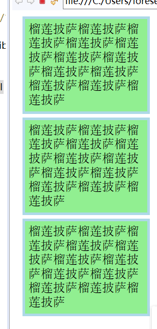
給外層div加個樣式就變成
div{
    display:-webkit-box;
    display:flex;
}

現在每一個p元素都變成一個box了
這種彈性佈局還能
justify-content:flex-end 類似的 對齊方式樣式 不詳述。
補充:
使用flex九宮格佈局:
<div class="parent">
	<div class="row">
	    <div class="item"></div>
	    <div class="item"></div>
	    <div class="item"></div>
	</div>
	<div class="row">
	    <div class="item"></div>
	    <div class="item"></div>
	    <div class="item"></div>
	</div>
	<div class="row">
	    <div class="item"></div>
	    <div class="item"></div>
	    <div class="item"></div>
	</div>
</div>
樣式:
.parent{display: flex; flex-direction: column;width: 300px;}
.row{height: 100px; display: flex;border: 1px solid red;}
.item{width: 100px; background-color: #ccc;border: 1px solid red;}
使用table九宮格佈局:
樣式
.parent{display: table; table-layout: fixed; width: 100%;}
.row{display: table-row;}
.item{display: table-cell; width: 33.3%; height: 200px; border: 1px solid red;}
結果截圖

提供一種更加有效的方式來對一個容器中的條目進行排列、對齊和分配空白空間。
響應式佈局:
佈局特點:每個螢幕解析度下面會有一個佈局樣式,即元素位置和大小都會變
設計方法:媒體查詢加流式佈局
通常使用 @media 媒體查詢 和網格系統 (Grid System) 配合相對佈局單位進行佈局,實際上就是綜合響應式、流動等上述技術通過 CSS 給單一網頁不同裝置返回不同樣式的技術統稱。
單列布局:(最常見的佈局)
<style>
.child{width:800px;height:300px; margin: 0 auto;
background-color: red}
</style>
<div class="child">222</div>
下面用四種方法實現水平居中
1、
使用margin:0 auto來實現
.child{width:800px; margin: 0 auto;}
優勢是 相容性好,但是需要設定寬度。
2、
.child{display: table; margin: 0 auto;}
優勢:不需要父容器parent,只需要對自身進行設定
3.
<style>
.child{width:800px;
       display: inline-block;
        background-color: red
      }
.parent{background-color: green;
        text-align: center;

       }
</style>
<div class="parent">2222
    <div class="child">22222222</div>
</div>
相容性好,但是需要設定父子容器
4、利用絕對定位
<style>
.child{
        background-color: red;
        position: absolute;
        left: 50%;

      }
.parent{background-color: green;
       position: relative;

       }
</style>
<div class="parent">2222
    <div class="child">22222222</div>
</div>
5 flex佈局也有兩種方法 水平居中
a.父容器
display: flex; justify-content: center;
b.
 父容器display: flex
子容器中使用margin: 0 auto
<style>
.parent{background-color: green;
      display: flex; justify-content: center;
       }
.child{
        background-color: red;
        position: absolute;
        left: 50%;
        transform: translateX(-50%);}
      }

</style>
<div class="parent">2222
    <div class="child">22222222</div>
</div>
垂直居中
這裡說的是子容器相對於父容器的上下垂直居中。
1 利用table table-cell實現
<style>
 .parent{display: table-cell;
         background-color: green;
         vertical-align: middle;
         height: 400px;

       }
.child{
        background-color: red;
       }

</style>
<div class="parent">2222
    <div class="child">22222222</div>
</div>
2 flex來實現
<style>
 .parent{
       background-color: green;
       display: flex;
       align-items: center;
       height: 50px;

       }
.child{
        background-color: red;
        }

</style>
<div class="parent">
    <div class="child">22222222</div>
</div>
3 絕對定位來實現
<style>
 .parent{
       background-color: green;
       position: relative;
       height:50px;

       }
.child{
        background-color: red;
        position: absolute;
        top: 50%;
        transform: translateY(-50%);
       }

</style>
<div class="parent">
    <div class="child">22222222</div>
</div>
多列等分佈局
1、 flex實現
<style>
 .parent{
       background-color: green;
       display: flex;
       height: 80px;
       width: 160px;

       }
.column{
        background-color: red;
        flex: 1;
        }
 .column + .column{
   margin-left:15px;
 }

</style>
<div class="parent">
    <div class="column">1</div>
    <div class="column">2</div>
    <div class="column">3</div>
    <div class="column">4</div>
</div>
2、table實現
.parent{display: table; table-layout: fixed; width: 100%;}
.column{display: table-cell; padding-left: 20px;}
例子(padding間距沒了?有點問題)
<style>
 .parent{
       background-color: green;
       display: table;
       table-layout:fixed;
       width: 100%;

       }
.column{
        background-color: red;
        display: table-cell;
        padding-left:20px;

        }

</style>
<div class="parent">
    <div class="column">1</div>
    <div class="column">2</div>
    <div class="column">3</div>
    <div class="column">4</div>
</div>
3、float table
<style>
 .parent{
       background-color: green;
       height: 70px;
       width: 290px;

       }
.column{
        background-color: red;
        float: left;
        width: 25%;
        padding-left: 20px;
        box-sizing: border-box;

        }
</style>
<div class="parent">
    <div class="column">1</div>
    <div class="column">2</div>
    <div class="column">3</div>
    <div class="column">4</div>
</div>
全屏佈局
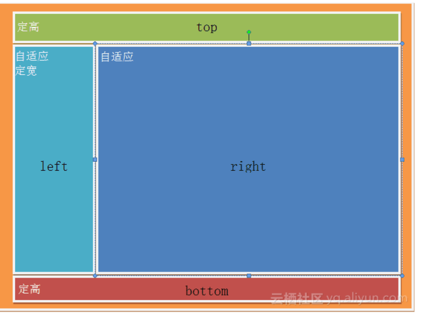
利用絕對定位實現
<style>
     html,body,.parent{height: 100%; overflow: hidden;}
    .top{position: absolute; top: 0; left: 0; right: 0; height: 0; background-color: black; height: 100px;}
    .left{position: absolute; top: 100px; left: 0;bottom: 50px; width: 200px; background-color: orange;}
    .right{position: absolute; top: 100px; left: 200px; right: 0; bottom: 50px; background-color: grey; overflow: hidden;}
    .bottom{position: absolute; left: 0; right: 0; bottom: 0; height: 50px; background-color: pink;}
</style>
<div class="top"></div>
<div class="left"></div>
<div class="right"></div>
<div class="bottom"></div>
差不多都在這了 ~ ^_^