
沉澱再出發:用python畫各種圖表
阿新 • • 發佈:2018-11-26
畫座標系沉澱再出發:用python畫各種圖表
一、前言
最近需要用python來做一些統計和畫圖,因此做一些筆記。
二、python畫各種圖表
2.1、使用turtle來畫圖
1 import turtle as t #turtle庫是python的內部庫,直接import使用即可 2 import time 3 4 def draw_diamond(turt): 5 for i in range(1,3): 6 turt.forward(100) #向前走100步 7 turt.right(45) #海龜頭向右轉45度 8 turt.forward(100) #繼續向前走100步 9 turt.right(135) #海龜頭再向右轉135度 10 11 12 def draw_art(): 13 window = t.Screen() #建立畫布 14 window.bgcolor("green") #設定畫布顏色 15 brad = t.Turtle() #建立一個Turtle的例項 16 brad.shape('turtle') #形狀是一個海歸turtle,也可以是圓圈circle,箭頭(預設)等等 1718 brad.color("red") #海龜的顏色是紅色red,橙色orange等 19 brad.speed('fast') #海龜畫圖的速度是快速fast,或者slow等 20 21 for i in range(1,37): #迴圈36次 22 draw_diamond(brad) #海龜畫一個形狀/花瓣,也就是菱形 23 brad.right(10) #後海龜頭向右旋轉10度 24 25 brad.right(90) #當圖形畫完一圈後,把海龜頭向右轉90度 26 brad.forward(300) #畫一根長線/海龜往前走300步 27 28 window.exitonclick() #點選螢幕退出 29 30 draw_art() #呼叫函式開始畫圖 31 32 33 34 t.color("red", "yellow") 35 t.speed(10) 36 t.begin_fill() 37 for _ in range(50): 38 t.forward(200) 39 t.left(170) 40 end_fill() 41 time.sleep(1)

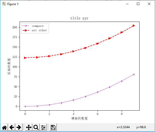
2.2、畫座標系
 1 import sys
 2 import math
 3 import random
 4 import matplotlib.pyplot as plt
 5 import pylab as pl
 6 import numpy as np
 7
 8 pl.mpl.rcParams['font.sans-serif'] = ['FangSong'] # 指定預設字型
 9 pl.mpl.rcParams['axes.unicode_minus'] = False # 解決儲存影象是負號'-'顯示為方塊的問題
10
11 x = range(10)  # 橫軸的資料
12 y = [i*i for i in x]  # 縱軸的資料
13 y1 = [i*i+123 for i in x]  # 縱軸的資料
14 pl.title('title zyr')
15 pl.plot(x, y, '1m:', label=u'compare')  # 加上label引數新增圖例
16 pl.plot(x, y1, '>r--', label=u'set other')  # 加上label引數新增圖例
17 pl.xlabel(u"橫軸的資料")
18 pl.ylabel(u"縱軸的資料")
19 pl.legend()  # 讓圖例生效
20 pl.show()  # 顯示繪製出的圖
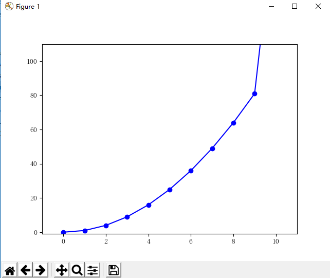
import sys
import math
import random
import matplotlib.pyplot as plt
import pylab as pl
import numpy as np

pl.mpl.rcParams['font.sans-serif'] = ['FangSong'] # 指定預設字型
pl.mpl.rcParams['axes.unicode_minus'] = False # 解決儲存影象是負號'-'顯示為方塊的問題

x = list(range(10))+[100]
y = [i*i for i in x]
pl.plot(x, y, 'ob-', label=u'y=x^2')
pl.xlim(-1, 11)  # 限定橫軸的範圍
pl.ylim(-1, 110)  # 限定縱軸的範圍

pl.show()  # 顯示繪製出的圖
 1 顏色(color 簡寫為 c):
 2 # 藍色: 'b' (blue)
 3 # 綠色: 'g' (green)
 4 # 紅色: 'r' (red)
 5 # 藍綠色(墨綠色): 'c' (cyan)
 6 # 紅紫色(洋紅): 'm' (magenta)
 7 # 黃色: 'y' (yellow)
 8 # 黑色: 'k' (black)
 9 # 白色: 'w' (white)
10
11 # 線型(linestyle 簡寫為 ls):
12 # 實線: '-'
13 # 虛線: '--'
14 # 虛點線: '-.'
15 # 點線: ':'
16 # 點: '.'
17
18 # 點型(標記marker):
19 # 畫素: ','
20 # 圓形: 'o'
21 # 上三角: '^'
22 # 下三角: 'v'
23 # 左三角: '<'
24 # 右三角: '>'
25 # 方形: 's'
26 # 加號: '+'
27 # 叉形: 'x'
28 # 稜形: 'D'
29 # 細稜形: 'd'
30 # 三腳架朝下: '1'(像'丫')
31 # 三腳架朝上: '2'
32 # 三腳架朝左: '3'
33 # 三腳架朝右: '4'
34 # 六角形: 'h'
35 # 旋轉六角形: 'H'
36 # 五角形: 'p'
37 # 垂直線: '|'
38 # 水平線: '_'
2.3、柱狀圖
 1 import numpy as np
 2 import matplotlib.animation as animation
 3 import time
 4
 5 mpl.rcParams['font.sans-serif'] = ['FangSong'] # 指定預設字型
 6 mpl.rcParams['axes.unicode_minus'] = False # 解決儲存影象是負號'-'顯示為方塊的問題
 7
 8 source_data = {'mock_verify': 369, 'mock_notify': 192, 'mock_sale': 517}  # 設定原始資料
 9
10 for a, b in source_data.items():
11     plt.text(a, b + 0.05, '%.0f' % b, ha='center', va='bottom', fontsize=11)  # ha 文字指定在柱體中間, va指定文字位置 fontsize指定文字型大小
12
13 # 設定X軸Y軸資料,兩者都可以是list或者tuple
14 x_axis = tuple(source_data.keys())
15 y_axis = tuple(source_data.values())
16 plt.bar(x_axis, y_axis, color='rg')  # 如果不指定color,所有的柱體都會是一個顏色
17
18 plt.xlabel(u"渠道名")  # 指定x軸描述資訊
19 plt.ylabel(u"訪問量")  # 指定y軸描述資訊
20 plt.title("渠道訪問量統計表")  # 指定圖表描述資訊
21 plt.ylim(0, 600)  # 指定Y軸的高度
22 # plt.savefig('{}.png'.format(time.strftime('%Y%m%d%H%M%S')))  # 儲存為圖片
23 plt.show()

2.4、扇形圖
 1 import matplotlib.pyplot as plt
 2 import time
 3 from pylab import mpl
 4 import numpy as np
 5 import matplotlib.animation as animation
 6 import time
 7
 8 mpl.rcParams['font.sans-serif'] = ['FangSong'] # 指定預設字型
 9 mpl.rcParams['axes.unicode_minus'] = False # 解決儲存影象是負號'-'顯示為方塊的問題
10
11 data = {'8516464': 106, '8085460': 704, '7593813': 491, '8709362': 24, '8707829': 6, '8684658': 23, '8679301': 11,
12         '8665923': 29, '8660909': 23, '8652968': 31, '8631727': 31, '8622935': 24, '8620593': 18, '8521737': 33,
13         '8605441': 49, '8495205': 82, '8477276': 57,'8474489': 71, '8456502': 50, '8446529': 68, '8433830': 136,
14         '8254158': 103, '8176029': 88, '8081724': 58, '7922592': 185, '7850099': 62,'7617723': 61, '7615562': 90,
15         '7615052': 57, '7604151': 102, '7511294': 59,'6951654': 27, '6946388': 142, '6945373': 159, '6937716': 347,
16         '7460176': 64, '7246377': 87, '7240621': 145, '7204707': 645, '7028401': 671}
17 source_data = sorted(data.items(), key=lambda x: x[1], reverse=True)
18 print(source_data)
19 labels = [source_data[i][0][:4] for i in range(len(source_data))]  # 設定標籤
20 fracs = [source_data[i][1] for i in range(len(source_data))]
21 explode = [x * 0.01 for x in range(len(source_data))]  # 與labels一一對應,數值越大離中心區越遠
22 plt.axes(aspect=1)  # 設定X軸 Y軸比例
23 # labeldistance標籤離中心距離  pctdistance百分百資料離中心區距離 autopct 百分比的格式 shadow陰影
24 plt.pie(x=fracs, labels=labels, explode=explode, autopct='%3.1f %%',
25         shadow=False, labeldistance=1.1, startangle=0, pctdistance=0.8, center=(-1, 0))
26 # 控制位置:bbox_to_anchor陣列中,前者控制左右移動,後者控制上下。ncol控制 圖例所列的列數。預設值為1。fancybox 圓邊
27 plt.legend(loc=7, bbox_to_anchor=(1.2, 0.80), ncol=3, fancybox=True, shadow=True, fontsize=8)
28 plt.show()

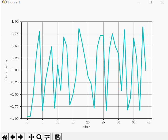
2.5、動圖
 1 import matplotlib.pyplot as plt
 2 import time
 3 from pylab import mpl
 4 import numpy as np
 5 import matplotlib.animation as animation
 6 import time
 7
 8 mpl.rcParams['font.sans-serif'] = ['FangSong'] # 指定預設字型
 9 mpl.rcParams['axes.unicode_minus'] = False # 解決儲存影象是負號'-'顯示為方塊的問題
10
11
12 # Fixing random state for reproducibility
13 np.random.seed(196)
14 # 初始資料繪圖
15 dis = np.zeros(40)
16 dis2 = dis
17 fig, ax = plt.subplots()
18 line, = ax.plot(dis)
19 ax.set_ylim(-1, 1)
20 plt.grid(True)
21 ax.set_ylabel("distance: m")
22 ax.set_xlabel("time")
23
24 def update(frame):
25     global dis
26     global dis2
27     global line
28     # 讀入模擬
29     a = np.random.rand() * 2 - 1
30     time.sleep(np.random.rand() / 10)
31     # 繪圖資料生成
32     dis[0:-1] = dis2[1:]
33     dis[-1] = a
34     dis2 = dis
35     # 繪圖
36     line.set_ydata(dis)
37     # 顏色設定
38     plt.setp(line, 'color', 'c', 'linewidth', 2.0)
39 ani = animation.FuncAnimation(fig, update, frames=None, interval=100)
40 plt.show()
2.6、畫其他圖形
 1 import matplotlib.pyplot as plt
 2 plt.rcdefaults()
 3
 4 import numpy as np
 5 import matplotlib.pyplot as plt
 6 import matplotlib.path as mpath
 7 import matplotlib.lines as mlines
 8 import matplotlib.patches as mpatches
 9 from matplotlib.collections import PatchCollection
10
11
12 def label(xy, text):
13     y = xy[1] - 0.15  # shift y-value for label so that it's below the artist
14     plt.text(xy[0], y, text, ha="center", family='sans-serif', size=14)
15
16
17 fig, ax = plt.subplots()
18 # create 3x3 grid to plot the artists
19 grid = np.mgrid[0.2:0.8:3j, 0.2:0.8:3j].reshape(2, -1).T
20
21 patches = []
22
23 # add a circle
24 circle = mpatches.Circle(grid[0], 0.1, ec="none")
25 patches.append(circle)
26 label(grid[0], "Circle")
27
28 # add a rectangle
29 rect = mpatches.Rectangle(grid[1] - [0.025, 0.05], 0.05, 0.1, ec="none")
30 patches.append(rect)
31 label(grid[1], "Rectangle")
32
33 # add a wedge
34 wedge = mpatches.Wedge(grid[2], 0.1, 30, 270, ec="none")
35 patches.append(wedge)
36 label(grid[2], "Wedge")
37
38 # add a Polygon
39 polygon = mpatches.RegularPolygon(grid[3], 5, 0.1)
40 patches.append(polygon)
41 label(grid[3], "Polygon")
42
43 # add an ellipse
44 ellipse = mpatches.Ellipse(grid[4], 0.2, 0.1)
45 patches.append(ellipse)
46 label(grid[4], "Ellipse")
47
48 # add an arrow
49 arrow = mpatches.Arrow(grid[5, 0] - 0.05, grid[5, 1] - 0.05, 0.1, 0.1, width=0.1)
50 patches.append(arrow)
51 label(grid[5], "Arrow")
52
53 # add a path patch
54 Path = mpath.Path
55 path_data = [
56     (Path.MOVETO, [0.018, -0.11]),
57     (Path.CURVE4, [-0.031, -0.051]),
58     (Path.CURVE4, [-0.115,  0.073]),
59     (Path.CURVE4, [-0.03 ,  0.073]),
60     (Path.LINETO, [-0.011,  0.039]),
61     (Path.CURVE4, [0.043,  0.121]),
62     (Path.CURVE4, [0.075, -0.005]),
63     (Path.CURVE4, [0.035, -0.027]),
64     (Path.CLOSEPOLY, [0.018, -0.11])
65     ]
66 codes, verts = zip(*path_data)
67 path = mpath.Path(verts + grid[6], codes)
68 patch = mpatches.PathPatch(path)
69 patches.append(patch)
70 label(grid[6], "PathPatch")
71
72 # add a fancy box
73 fancybox = mpatches.FancyBboxPatch(
74     grid[7] - [0.025, 0.05], 0.05, 0.1,
75     boxstyle=mpatches.BoxStyle("Round", pad=0.02))
76 patches.append(fancybox)
77 label(grid[7], "FancyBboxPatch")
78
79 # add a line
80 x, y = np.array([[-0.06, 0.0, 0.1], [0.05, -0.05, 0.05]])
81 line = mlines.Line2D(x + grid[8, 0], y + grid[8, 1], lw=5., alpha=0.3)
82 label(grid[8], "Line2D")
83
84 colors = np.linspace(0, 1, len(patches))
85 collection = PatchCollection(patches, cmap=plt.cm.hsv, alpha=0.3)
86 collection.set_array(np.array(colors))
87 ax.add_collection(collection)
88 ax.add_line(line)
89
90 plt.subplots_adjust(left=0, right=1, bottom=0, top=1)
91 plt.axis('equal')
92 plt.axis('off')
93
94 plt.show()

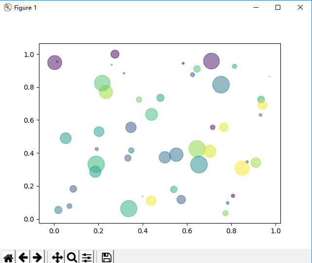
2.7、畫點圖
 1 from numpy import *;
 2 import numpy as np
 3 import matplotlib.pyplot as plt
 4
 5 N = 50
 6 x = np.random.rand(N)
 7 y = np.random.rand(N)
 8 colors = np.random.rand(N)
 9 area = np.pi * (15 * np.random.rand(N))**2
10 plt.scatter(x, y, s=area, c=colors, alpha=0.5, marker=(9, 3, 30))
11 plt.show()
三、總結
使用python中的庫,我們可以按照自己的想法來畫圖,但是需要注意一些細節上的東西,比如尺寸和刻度,比如顏色,字型,以及相應對比的資料,特別是用於資料分析上面的對比,我們需要重點掌握。