
關於Echarts修改自己碰到的 會持續更新
阿新 • • 發佈:2018-11-28
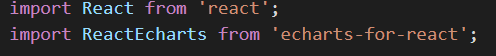
React 引入echarts
渲染 echarts

修改 X軸樣式:
xAxis: {
      type: 'category',
      data: dataArr,
      axisLabel: {
        interArrival: 0,   ---x軸全部顯示
        rotate: 30			---傾斜度
      },
      splitLine:{ show:false}   ---不顯示分割線
  },
  legend: {
      orient: 'vertical',   --- 縱向顯示,預設橫向
      show: true,
      data: ['BadIP', 'BadSrc', 'BadDst'],
      x: 'right',
      textStyle: {
        color: '#C0C1C4'
      }
  },
  series: [{
      data: valArr,
      type: 'bar',
      barWidth: '30%',     ---柱子寬度
      itemStyle: {
        normal: {
          color: '#06BAE9'   ---柱子顏色
        }
      }
  }]

  textStyle: {
    color: '#C0C1C4'   -- 字型顏色
  },


//  和series中 itemStyle 一樣  適用多種顏色同時渲染
 itemStyle: {
	//每個柱子的顏色即為colorList數組裡的每一項,如果柱子數目多於colorList的長度,則柱子顏色迴圈使用該陣列
            normal:{

                color: function (params){
                    var colorList = ['#56B25C','#F32A2C','#028AF4','#F25614','#0E365C'];
                    return colorList[params.dataIndex];
                }
            },
            // //滑鼠懸停時:
            // emphasis: {
            //         shadowBlur: 10,
            //         shadowOffsetX: 0,
            //         shadowColor: 'rgba(0, 0, 0, 0.5)'
            // }
        },

 //自定義圖示樣式
 toolbox: {
    top: 'top',
    feature: {
      magicType: { type: ['line', 'bar'] },
      restore: {   //配置還原
        show: true
      },
      saveAsImage: {   //儲存為圖片
        show: true
      }
    }
  },
  // 滑鼠進入顯示資料
  tooltip : {
      trigger: 'axis',
      axisPointer : {            // 座標軸指示器,座標軸觸發有效
          type : 'shadow'        // 預設為直線,可選為:'line' | 'shadow'
      }
  },
echarts的pie圖中,各區塊顏色的調整
參考原文 https://www.cnblogs.com/kumu/p/9515169.html