
幾個實用的CSS程式碼段總結
阿新 • • 發佈:2018-12-06
廢話不多說,直接上程式碼,希望能幫到有需要的小夥伴
①:遮罩
   position: fixed;
    background: rgba(0, 0, 0, .4);
    top: 0;
    left: 0;
    right: 0;
    bottom: 0;
    z-index: 99;
    width: 100%;
    height: 100%;
②:三角(下面三角的程式碼按照下圖上右下左的順序排列)
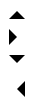
   width: 0;
    height: 0;
    border-width: 8px;
    border-style: solid;
    border-color: transparent transparent #000 transparent;
  width: 0;
   height: 0;
   border-width: 8px;
   border-style: solid;
   border-color: #000 transparent transparent transparent;
  width: 0;
   height: 0;
   border-width: 8px;
   border-style: solid;
   border-color: transparent #000 transparent transparent;
  width: 0;
   height: 0;
   border-width: 8px;
   border-style: solid;
   border-color: transparent #000 transparent transparent;
③:圓

   display: inline-block;
   width: 10px;
   height: 10px;
   border-radius: 50%;
   background-color: #f6ad03;
④:圖示

  width: 24px;
   box-shadow: 0 10px 0 2px #999, 0 20px 0 2px #999, 0 30px 0 2px #999;
⑤:超出隱藏
  width: 180px;
  overflow: hidden;
  text-overflow: ellipsis;
  white-space: nowrap;
6:垂直居中
  position: fixed;
   top: 0;
   right: 0;
   bottom: 0;
   left: 0;
   margin: auto;
注:針對元素有固定寬高的情況
   position: fixed;
    top: 50%;
    left: 50%;
    z-index: 999;
    transform: translate(-50%,-50%);
注:針對元素無固定寬高的情況