
【移動端】使用REM進行的響應式佈局
工具ViewtoREM:PX轉換到REM(自動預處理)
REM的定義:
rem是相對於根元素<html>來設定字型大小的,這樣就意味著,我們只需要在根元素確定一個參考值,在根元素中設定多大的字型,這完全可以根據您自己的需求。
REM與EM、PX的區別:
PX:畫素,比較精確的單位,但不好做響應式佈局
EM:以父節點font-size大小為參考點,標準不統一,容易造成混亂
REM支援的瀏覽器:
支援的瀏覽器還是蠻多的,比如:Mozilla Firefox 3.6+、Apple Safari 5+、Google Chrome、IE9+和Opera11+。只是可憐的IE6-8無法支援。
REM使用方法示例:
1.html中預設的 font-size:16px; 也就是 1rem = 16px
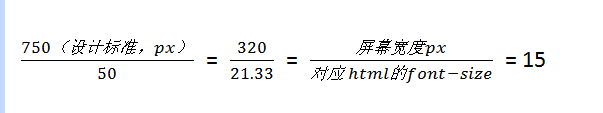
2.以設計寬度為750px為例,那麼定義 font-size:50px; 那麼 1rem = 50px,比例為:750/50=15
3.定義頁面中的尺寸,就是: 寬度/50 rem(比例為15)。例如:設計稿中dom(20px)的尺寸為:20px/50=0.4rem
4.針對不同螢幕尺寸,按同比例設定font-size(比例仍為15)。相當於1rem 變成對應大小(font-size變小多少,1rem就同比例變小多少)。
5.例如:
螢幕寬度為750px,則html設定的font-size為:750/15 = 50,設計稿中dom(20px)的尺寸為:20px/50=0.4rem,1rem = 50px
螢幕寬度為320px,則html設定的font-size為:320/15 = 21.33….,設計稿中dom(20px)的尺寸依然為:20px/50=0.4rem,1rem = 320/750*50px
如下比例關係:
JS動態設定width:
<script>
(function (doc, win) {
var docEl = doc.documentElement,
resizeEvt = 'orientationchange' in window ? 'orientationchange' : 'resize',
recalc = function () {
var clientWidth = docEl.clientWidth;
if CSS固定樣式:以下場景包含了移動端裝置絕大多數螢幕尺寸。
html{font-size:50px;}
body{font-size:24px;}
@media screen and (min-width:320px){
    html{font-size:21.333333333333332px;}
    body{font-size:12px;}
}
@media screen and (min-width:360px){
    html{font-size:24px;}
    body{font-size:12px;}
}
@media screen and (min-width:375px){
    html{font-size:25px;}
    body{font-size:12px;}
}
@media screen and (min-width:384px){
    html{font-size:25.6px;}
    body{font-size:14px;}
}
@media screen and (min-width:400px){
    html{font-size:26.666666666666668px;}
    body{font-size:14px;}
}
@media screen and (min-width:414px){
    html{font-size:27.6px;}
    body{font-size:14px;}
}
@media screen and (min-width:424px){
    html{font-size:28.266666666666667px;}
    body{font-size:14px;}
}
@media screen and (min-width:480px){
    html{font-size:32px;}
    body{font-size:15.36px;}
}
@media screen and (min-width:540px){
    html{font-size:36px;}
    body{font-size:17.28px;}
}
@media screen and (min-width:720px){
    html{font-size:48px;}
    body{font-size:23.04px;}
}
@media screen and (min-width:750px){
    html{font-size:50px;}
    body{font-size:24px;}
}
詳細:字型rem的使用:
http://www.w3cplus.com/css3/define-font-size-with-css3-rem
http://ued.taobao.org/blog/2013/05/rem-font-size/
詳細:結合Media Query和REM實現響應式佈局:
http://isux.tencent.com/web-app-rem.html
範例:
http://m.dx.com/