
RadioButtn單選按鈕詳解
阿新 • • 發佈:2018-12-15
RadioButtn單選按鈕,常用UI控制元件之一,當需要多選一的時候就需要用到RadioButtn了,通常系統自帶的樣式不能直接使用,大部分都是需要自定義樣式,下面詳細介紹一下如何使用及如何自定義樣式
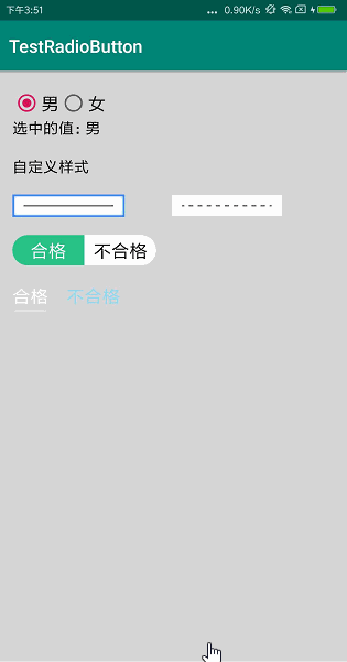
預覽
基本使用
RadioButtn需要放在RadioGroup中
xml檔案
<RadioGroup
android:layout_width="wrap_content"
android:layout_height="wrap_content"
android: 重要屬性介紹:
android:orientation=" " horizontal | vertical水平或垂直顯示android:checked=" "設定預設選中android:button=" "
修改自帶圖片的樣式。如果只是單純的圖片,可以直接新增drawable,如果帶文字效果,建議設定為@null並使用android:background或android:drawableandroid:background=" "設定背景android:drawableTop=" "|android:drawableBottom=" "|android:drawableLeft=" "|android:drawableRight=" "
這四個分別對應顯示在文字的上下左右android:drawablePadding=" "文字距離圖片的距離
圖片切換的selector.xml,放到res/drawable下
<?xml version="1.0" encoding="utf-8"?>
<selector xmlns:android="http://schemas.android.com/apk/res/android">
    <item android:state_pressed="true" android:drawable="@mipmap/rb_left_select"/>
    <item android:state_selected="true" android:drawable="@mipmap/rb_left_select"/>
    <item android:state_checked="true" android:drawable="@mipmap/rb_left_select"/>
    <item android:drawable="@mipmap/rb_left"/>
</selector>
文字顏色切換的selector.xml,這個放到res/color下,如果沒有color請新建
<?xml version="1.0" encoding="utf-8"?>
<selector xmlns:android="http://schemas.android.com/apk/res/android">
    <item android:state_checked="true" android:color="#ffffff"/>
    <item android:state_pressed="true" android:color="#ffffff"/>
    <item android:state_selected="true" android:color="#ffffff"/>
    <item android:color="#000000"/>
</selector>
監聽事件
        rg.setOnCheckedChangeListener(new RadioGroup.OnCheckedChangeListener() {
            @Override
            public void onCheckedChanged(RadioGroup group, int checkedId) {
                // 判斷選中哪個
                switch (checkedId) {
                    case R.id.rb_man:
                        Log.e(TAG, "rb_left");
                        break;
                    case R.id.rb_woman:
                        Log.e(TAG, "rb_right");
                        break;
                    default:
                        break;
                }
            }
        });

    //  獲取選中的值
    RadioButton radioButton = (RadioButton)findViewById(rg.getCheckedRadioButtonId());
    tv.setText(radioButton.getText().toString());
注意事項:
- 選擇時如果點選沒有切換,都為選中狀態,請為每個radiobutton設定id
- 使用
android:background或android:drawable時需要設定android:button="@null" - 如果三個或三個以上選項時,選擇的時候出現兩個同時選中的狀態,在程式碼中設定選中
rg.check(R.id.rb_left);
Demo下載地址:TestRadioButton