CSS中形形色色的畫圖
CSS border 屬性
定義和用法
border 簡寫屬性在一個宣告設定所有的邊框屬性。
可以按順序設定如下屬性:
- border-width
- border-style
- border-color
如果不設定其中的某個值,也不會出問題,比如 border:solid #ff0000; 也是允許的。
| 預設值: | not specified |
|---|---|
| 繼承性: | no |
| 版本: | CSS1 |
| JavaScript 語法: | object.style.border="3px solid blue" |
可能的值
| 值 | 描述 |
|---|---|
| border-width | |
| border-style | |
| border-color | |
| inherit | 規定應該從父元素繼承 border 屬性的設定。 |
CSS border-width 屬性
定義和用法
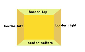
border-width 簡寫屬性為元素的所有邊框設定寬度,或者單獨地為各邊邊框設定寬度。
只有當邊框樣式不是 none 時才起作用。如果邊框樣式是 none,邊框寬度實際上會重置為 0。不允許指定負長度值。
可能的值
| 值 | 描述 |
|---|---|
| thin | 定義細的邊框。 |
| medium | 預設。定義中等的邊框。 |
| thick | 定義粗的邊框。 |
| length | 允許您自定義邊框的寬度。 |
| inherit | 規定應該從父元素繼承邊框寬度。 |
CSS border-style 屬性
定義和用法
border-style 屬性用於設定元素所有邊框的樣式,或者單獨地為各邊設定邊框樣式。
只有當這個值不是 none 時邊框才可能出現。
可能的值
| 值 | 描述 |
|---|---|
| none | 定義無邊框。 |
| hidden | 與 "none" 相同。不過應用於表時除外,對於表,hidden 用於解決邊框衝突。 |
| dotted | 定義點狀邊框。在大多數瀏覽器中呈現為實線。 |
| dashed | 定義虛線。在大多數瀏覽器中呈現為實線。 |
| solid | 定義實線。 |
| double | 定義雙線。雙線的寬度等於 border-width 的值。 |
| groove | 定義 3D 凹槽邊框。其效果取決於 border-color 的值。 |
| ridge | 定義 3D 壟狀邊框。其效果取決於 border-color 的值。 |
| inset | 定義 3D inset 邊框。其效果取決於 border-color 的值。 |
| outset | 定義 3D outset 邊框。其效果取決於 border-color 的值。 |
| inherit | 規定應該從父元素繼承邊框樣式。 |
CSS border-color 屬性
定義和用法
border-color 屬性設定四條邊框的顏色。此屬性可設定 1 到 4 種顏色。
border-color 屬性是一個簡寫屬性,可設定一個元素的所有邊框中可見部分的顏色,或者為 4 個邊分別設定不同的顏色。
可能的值
| 值 | 描述 |
|---|---|
| color_name | 規定顏色值為顏色名稱的邊框顏色(比如 red)。 |
| hex_number | 規定顏色值為十六進位制值的邊框顏色(比如 #ff0000)。 |
| rgb_number | 規定顏色值為 rgb 程式碼的邊框顏色(比如 rgb(255,0,0))。 |
| transparent | 預設值。邊框顏色為透明。 |
| inherit | 規定應該從父元素繼承邊框顏色。 |
利用css畫圖形,是個有利有弊的寫法,好處是不用畫圖,且節省了一些流量,壞處是要寫長串的css樣式,而且有可能流量並沒有減少,用與否視情況而定,個人選擇。
下面是我做測試的一些圖形,也是參考了一些網站,簡單的註解一下和歸納了一下,其中並沒涉及到複雜的css畫圖形。
其中用了css3.0的一些屬性,所以這裡宣告:請用支援css3.0的瀏覽器看此文章!
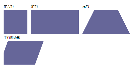
上面這幾個相對比較簡單,沒什麼可解釋的,看下面原始碼:

/*正方形*/
.Square { width: 100px; height: 100px; background: #669; }
/*矩形*/
.rectangle { width: 200px; height: 100px; background: #669; }
/*梯形*/
.trapezoid {
border-bottom: 100px solid #669;
border-left: 50px solid transparent;
border-right: 50px solid transparent;
height: 0;
width: 100px; }
/*平行四邊形*/
.parallelogram {
width: 150px;
height: 100px;
-webkit-transform: skew(-20deg);
-moz-transform: skew(-20deg);
-o-transform: skew(-20deg);
background: #669;
margin-left:20px; }

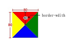
上面這些三角,其實也很常見,主要原理是利用了相鄰兩個邊框的接壤處分配原則,如果沒有寬度和高度的話,其實應該是四個三角形接成的矩形,下面是上面圖形的原始碼:
/*三角形*/
.triangle-up {
width: 0;
height: 0;
border-left: 50px solid transparent;
border-right: 50px solid transparent;
border-bottom: 100px solid #669; }
/*向下三角*/.triangle-down {
width: 0;
height: 0;
border-left: 50px solid transparent;
border-right: 50px solid transparent;
border-top: 100px solid #669; }
/*向左三角*/.triangle-left {
width: 0;
height: 0;
border-top: 50px solid transparent;
border-right: 100px solid #669;
border-bottom: 50px solid transparent; }
/*向右三角*/.triangle-right {
width: 0;
height: 0;
border-top: 50px solid transparent;
border-left: 100px solid #669;
border-bottom: 50px solid transparent; }
/*上下三角*/.triangle-updown {
width: 0;
height: 0;
border-left: 50px solid transparent;
border-right: 50px solid transparent;
border-bottom: 100px solid #669;
position:relative;
margin-bottom:50px}
.triangle-updown:after {
content:" ";
width: 0;
height: 0;
border-left: 50px solid transparent;
border-right: 50px solid transparent;
border-top: 100px solid #669;
position:absolute;
top:50px;
left:-50px;}
/*左上三角*/.triangle-topleft {
width: 0; height: 0;
border-top: 100px solid #669;
border-right: 100px solid transparent; }
/*右上三角*/.triangle-topright {
width: 0; height: 0;
border-top: 100px solid #669;
border-left: 100px solid transparent; }
/*左下三角*/.triangle-bottomleft {
width: 0; height: 0;
border-bottom: 100px solid #669;
border-right: 100px solid transparent; }
/*右下三角*/.triangle-bottomright {
width: 0; height: 0;
border-bottom: 100px solid #669;
border-left: 100px solid transparent; }
看下面例子,清楚的標明瞭,四個邊的情況,上面的三角形都是利用了這個原理,讓不想顯示的邊框透明transparent:
<div style="border-left:50px solid #060;border-right:50px solid #600;border-bottom:50px solid #f00;border-top:50px solid #00f;width:0px;height:0px;"></div>
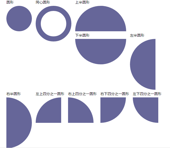
其實這個跟上面畫三角形的原理很相似,都是利用相鄰邊框接壤的配原則。另還主要利用了css3.0的圓角屬性 border-radius 適當的調整大小會有不同的效果!結合border-width調整,可以得到不同的圖形。
當然適當的調整角度和組合,可以得到更多的圖形。
/*圓形 主要利用了css3.0的圓角屬性 border-radius 適當的調整大小會有不同的效果*/
.circle {
width: 100px;
height: 100px;
background: #669;
-moz-border-radius: 50px;
-webkit-border-radius: 50px;
border-radius: 50px; }
.circle-circle {
width: 100px;
height: 100px;
border:20px solid #669;
background: #fff;
-moz-border-radius: 100px;
-webkit-border-radius: 100px;
border-radius: 100px; }
.circle-up {
width: 100px;
height: 0px;
border:0 solid transparent;
border-top:100px solid #669;
border-right:100px solid #669;
-moz-border-radius: 100px 100px 0 0;
-webkit-border-radius: 100px 100px 0 0;
border-radius: 100px 100px 0 0; }
.circle-down {
width: 100px;
height: 0px;
border:0 solid transparent;
border-bottom:100px solid #669;
border-right:100px solid #669;
-moz-border-radius:0 0 100px 100px;
-webkit-border-radius:0 0 100px 100px;
border-radius:0 0 100px 100px; }
.circle-left {
width: 100px;
height: 0px;
border:0 solid transparent;
border-bottom:100px solid #669;
border-top:100px solid #669;
-moz-border-radius:100px 0 0 100px;
-webkit-border-radius:100px 0 0 100px;
border-radius:100px 0 0 100px; }
.circle-right {
width: 100px;
height: 0px;
border:0 solid transparent;
border-bottom:100px solid #669;
border-top:100px solid #669;
-moz-border-radius:0 100px 100px 0;
-webkit-border-radius:0 100px 100px 0;
border-radius:0 100px 100px 0; }

.circle-lefttop {
width: 100px;
height: 0px;
border:0 solid transparent;
border-top:100px solid #669;
-moz-border-radius:0 100px 100px 0;
-webkit-border-radius:0 100px 100px 0;
border-radius:100px 0 0 0; }
.circle-righttop {
width: 100px;
height: 0px;
border:0 solid transparent;
border-top:100px solid #669;
-moz-border-radius:0 100px 0 0;
-webkit-border-radius:0 100px 0 0;
border-radius:0 100px 0 0; }
.circle-rightbottom {
width: 100px;
height: 0px;
border:0 solid transparent;
border-bottom:100px solid #669;
-moz-border-radius:0 0 100px 0;
-webkit-border-radius:0 0 100px 0;
border-radius:0 0 100px 0; }
.circle-leftbottom {
width: 100px;
height: 0px;
border:0 solid transparent;
border-bottom:100px solid #669;
-moz-border-radius:0 0 0 100px;
-webkit-border-radius:0 0 0 100px;
border-radius:0 0 0 100px; }
下面是適當的調整邊框寬度和圓角得到的效果:
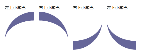
/*適當的調整邊框寬度和圓角得到的效果*/
.tail-lefttop{
border: 0 solid transparent;
border-top:30px solid #669;
-moz-border-radius:100px 0 0 0;
-webkit-border-radius:100px 0 0 0;
border-radius:100px 0 0 0;
width:100px;
height:100px;}
.tail-righttop{
border: 0 solid transparent;
border-top:30px solid #669;
-moz-border-radius:0 100px 0 0;
-webkit-border-radius:0 100px 0 0;
border-radius:0 100px 0 0;
width:100px;
height:100px;}
.tail-rightbottom{
border: 0 solid transparent;
border-bottom:30px solid #669;
-moz-border-radius:0 0 100px 0;
-webkit-border-radius:0 0 100px 0;
border-radius:0 0 100px 0;
width:100px;
height:100px;;}
.tail-leftbottom{
border: 0 solid transparent;
border-bottom:30px solid #669;
-moz-border-radius:0 0 0 100px;
-webkit-border-radius:0 0 0 100px;
border-radius:0 0 0 100px;
width:100px;
height:100px;}
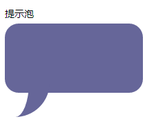
當然可以通過上面延伸畫出更多的效果比如:提示泡
先看效果:
.pop{
width:200px;
height:100px;
-moz-border-radius:20px;
-webkit-border-radius:20px;
border-radius:20px;
background:#669;
margin-top:20px;
position:relative}
.pop:after{
content: "";
border: 0 solid transparent;
border-bottom:30px solid #669;
-moz-border-radius:0 0 0 200px;
-webkit-border-radius:0 0 0 200px;
border-radius:0 0 0 200px;
width:50px;
height:50px;
position:relative;
margin-top:20px;
-webkit-transform: rotate(-90deg);
-moz-transform: rotate(-90deg); -ms-transform: rotate(-90deg);
-o-transform: rotate(-90deg);
position:absolute;
top:50px;}
上面是css實現程式碼,基本原理又多了一項,就是利用了:after偽類,小尾巴上面已經介紹過了,這裡又利用了一個css3.0的屬性transform:rotate旋轉了一個角度,
同時還實現了另外的一個圖形--圓角矩形,這是最基本radius的用法,沒什麼可講的。當然這裡也可以延伸出另一個偽類:before畫出第二個小尾巴,當然也不僅限於小尾巴,上面的圓角矩形也可以換成橢圓。
下面給出實現程式碼:
.oval-pop{
width: 200px;
height: 100px;
background: #669;
-moz-border-radius: 100px / 50px;
-webkit-border-radius: 100px / 50px;
border-radius: 100px / 50px;
margin-bottom:50px;
position:relative}
.oval-pop:after{
content: "";
border: 0 solid transparent;
border-bottom:30px solid #669;
-moz-border-radius:0 0 0 200px;
-webkit-border-radius:0 0 0 200px;
border-radius:0 0 0 200px;
width:50px;
height:50px;
position:relative;
margin-top:20px;
-webkit-transform: rotate(-90deg);
-moz-transform: rotate(-90deg);
-ms-transform: rotate(-90deg);
-o-transform: rotate(-90deg);
position:absolute;
top:50px;
left:20px}
效果如下:
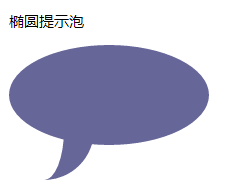
同時,也給出了橢圓的實現程式碼。 其中 border-radius: 100px / 50px; 中有一個“/” 這個符號是很少出現在css樣式中的。
因為,圓角有水平方向也有垂直方向,所以"/"前面代表水平方向,後面代表垂直方向。
於是我們又多了一個屬性,又多了一個發揮的方向。突然間我們發現css畫圖形其實就是對屬性的組合創造。多試幾次,相信每個人都很好的掌握這個技能!
下面再看一個屬性,其實是對上面講過的屬性的一個擴充套件。
可以說是畫圓的擴充套件也可以說是對圓角矩形的擴充套件---膠囊形:
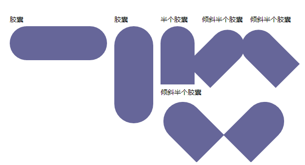
下面是實現程式碼,基本屬性上面我們都利用過,只是稍做調整:
.capsule{
border: 0 solid transparent;
-moz-border-radius:100px;
-webkit-border-radius:100px;
border-radius:100px;
width:200px;
height:70px;
background:#669;}
.v-capsule{
border: 0 solid transparent;
-moz-border-radius:100px;
-webkit-border-radius:100px;
border-radius:100px;
width:80px;
height:200px;
background:#669}
.up-capsule{
border: 0 solid transparent;
-moz-border-radius:100px;
-webkit-border-radius:100px;
border-radius:100px 100px 0 0;
width:70px;
height:120px;
background:#669;}
.r45-capsule{
border: 0 solid transparent;
-moz-border-radius:100px;
-webkit-border-radius:100px;
border-radius:100px 100px 0 0;
width:70px;
height:120px;
background:#669;
-moz-transform: rotate(45deg);
-ms-transform: rotate(45deg);
-o-transform: rotate(45deg);
-webkit-transform: rotate(45deg);
margin-left:20px;}
.l45-capsule{
border: 0 solid transparent;
-moz-border-radius:100px;
-webkit-border-radius:100px;
border-radius:100px 100px 0 0;
width:70px;
height:120px;
background:#669;
-moz-transform: rotate(-45deg);
-ms-transform: rotate(-45deg);
-o-transform: rotate(-45deg);
-webkit-transform: rotate(-45deg);
margin-left:20px;}
.lr45-capsule{
width:160px;
height:130px;
position:relative}
.lr45-capsule:before{
content:" ";
border: 0 solid transparent;
-moz-border-radius:100px;
-webkit-border-radius:100px;
border-radius:100px 100px 0 0;
width:80px;
height:120px;
background:#669;
-moz-transform: rotate(-45deg);
-ms-transform: rotate(-45deg);
-o-transform: rotate(-45deg);
-webkit-transform: rotate(-45deg);
position:absolute;
left:20px;}
.lr45-capsule:after{
content:" ";
border: 0 solid transparent;
-moz-border-radius:100px;
-webkit-border-radius:100px;
border-radius:100px 100px 0 0;
width:80px;
height:120px;
background:#669;
-moz-transform: rotate(45deg);
-ms-transform: rotate(45deg);
-o-transform: rotate(45deg);
-webkit-transform: rotate(45deg);
position:absolute;
left:160px;
top:00px;}
細觀察一下最後兩個圖形如果合在一起好像能組成一個心形,其實就是一個心形:
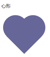
.heart{
width:160px;
height:200px;
position:relative}
.heart:before{
content:" ";
border: 0 solid transparent;
-moz-border-radius:100px;
-webkit-border-radius:100px;
border-radius:100px 100px 0 0;
width:80px;
height:120px;
background:#669;
-moz-transform: rotate(-45deg);
-ms-transform: rotate(-45deg);
-o-transform: rotate(-45deg);
-webkit-transform: rotate(-45deg);position:absolute;
left:20px;}
.heart:after{
content:" ";
border: 0 solid transparent;
-moz-border-radius:100px;
-webkit-border-radius:100px;
border-radius:100px 100px 0 0;
width:80px;
height:120px;
background:#669;
-moz-transform: rotate(45deg);
-ms-transform: rotate(45deg);
-o-transform: rotate(45deg);
-webkit-transform: rotate(45deg);
position:absolute;
left:48px;
top:0px;}
上面講的只是對css畫圖形的初步認識,基本上所有的實現都是對邊框的角度的調整及組合。