
會呼吸的圖片,文字閃爍發光
阿新 • • 發佈:2018-12-21
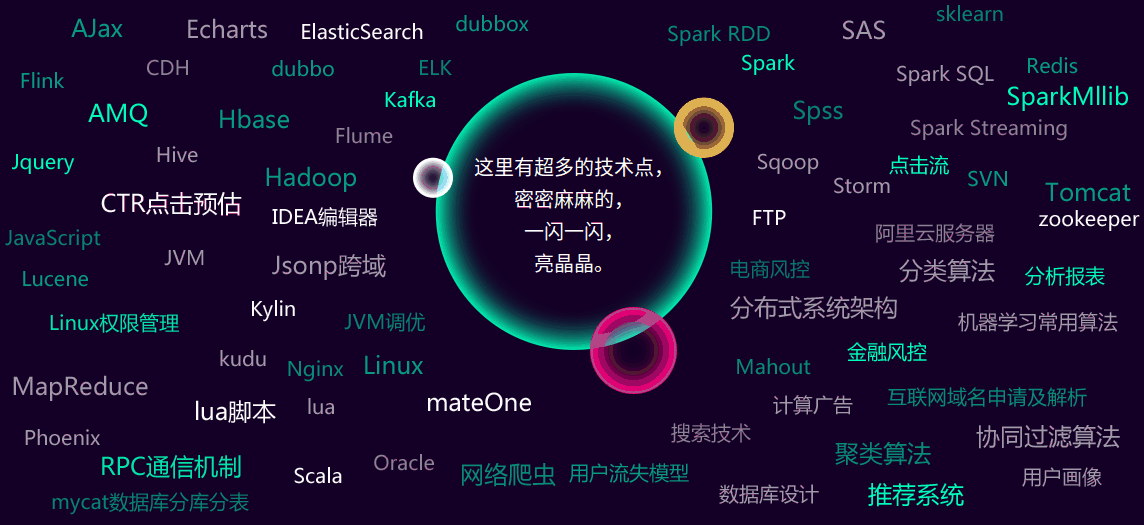
最近瀏覽一些培訓學校的網站,想找一些視訊或者資料充充電。偶爾看到了,這張效果圖。PS:看下面的效果展示
因為本人前端比較小白,所以就運用了大家都會的F12解決了一下問題(手動滑稽)!
最後查了一下,是用到了Css3 @keyframes規則造成的簡單的動畫效果。所以就扒了下來,自己記錄一下,方便自己以後拿來主義嘛~
一. HTML頁面
1 <body> 2 <div class="box4"> 3 <div class="box_In"> 4 <div class="b" id="box5"> 5 <div class="small_hd wow slideInDown"> 6 <p>二、不斷新增的新/熱技術點</p> 7 </div> 8 <div class="con"> 9 <div class="b_con"> 10 <p>這裡有超多的技術點,<br />密密麻麻的,<br />一閃一閃,<br />亮晶晶。</p> 11 </div> 12 <img class="b2" src="image/box4_b2.png"/> 13 <img class="b3" src="image/box4_b3.png"/> 14 <img class="b4" src="image/box4_b4.png"/> 15 <img class="b5" src="image/box4_b5.png"/> 16 </div> 17 </div> 18 </div> 19 </div> 20 </body>
二. CSS程式碼
 1 body{background: #140026;}
 2 .box_In{width: 1200px;margin: 0 auto;position: relative;}
 3
 4 /*box4*/
 5 .box4 .small_hd{background: url(../images/box4_s1.jpg) no-repeat center; width: 945px;height: 35px;margin: 0 auto;line-height: 26px;}
 6 .box4 .small_hd p{font-size: 24px;color: #fff;text-align: center;letter-spacing:5px;}
 7
 8 .box4 .b{padding-bottom: 80px;}
 9 .box4 .b .small_hd{background: url(../images/box4_s2.jpg) no-repeat center; width: 967px;}
10 .box4 .b .con{width: 1157px;height: 539px;position: relative;margin: 50px auto 0;overflow: hidden;}
11 .box4 .b .b_con{background: url(../image/box4_b1.png) no-repeat center;width: 322px;height: 323px;margin:80px auto 0;}
12 .box4 .b .b_con p{font-size: 20px;color: #fff;text-align: center;padding-top: 80px;line-height: 32px;}
13 .box4 .b .con img{position: absolute;top: 0;left: 0;}
14 .box4 .b .con .b2{animation:bing2 5s  infinite;-webkit-animation:bing2 5.5s  infinite;-moz-animation:bing2 5.5s infinite;-o-animation:bing2 5.5s  infinite;}
15 .box4 .b .con .b3{animation:bing2 3s  infinite;-webkit-animation:bing2 3s  infinite;-moz-animation:bing2 3s infinite;-o-animation:bing2 3s infinite;}
16 .box4 .b .con .b4{animation:bing1 4s  infinite;-webkit-animation:bing1 4s  infinite;-moz-animation:bing1 4s infinite;-o-animation:bing1 4s  infinite;}
17 .box4 .b .con .b5{animation:bing3 2s  infinite;-webkit-animation:bing3 2.5s  infinite;-moz-animation:bing3 2.5s infinite;-o-animation:bing3 2.5s  infinite;}
18
19 @keyframes bing2
20 { 0%{opacity: .1;}   50%{opacity: 1;}  100%{opacity: .1;}}
21 @-moz-keyframes bing2
22 { 0%{opacity: .1;}   50%{opacity: 1;}  100%{opacity: .1;}}
23 @-webkit-keyframes bing2
24 { 0%{opacity: .1;}   50%{opacity: 1;}  100%{opacity: .1;}}
25 @-o-keyframes bing2
26 { 0%{opacity: .1;}   50%{opacity: 1;}  100%{opacity: .1;}}
27
28 @keyframes bing3
29 { 0%{opacity: .5;}   50%{opacity: 1;}  100%{opacity: .5;}}
30 @-moz-keyframes bing1
31 { 0%{opacity: .5;}   50%{opacity: 1;}  100%{opacity: .5;}}
32 @-webkit-keyframes bing1
33 { 0%{opacity: .5;}   50%{opacity: 1;}  100%{opacity: .5;}}
34 @-o-keyframes bing1
35 { 0%{opacity: .5;}   50%{opacity: 1;}  100%{opacity: .5;}}
三. 用到image
1.

2.

3.

4.

5.

四. 效果展示
好啦!這就是做出這個效果圖所要用的全部東西啦。有需要的小夥伴請直接享用吧!不用客氣~