
QML小效果學習筆記
阿新 • • 發佈:2018-12-21
參考網上一些QML效果的小例子在此做下記錄,程式碼大多由網路各大神提供,自己編譯執行,從中對自己不知道的部分,查閱資料後,添加註釋,積累經驗,望提高。
持續更新...
目錄
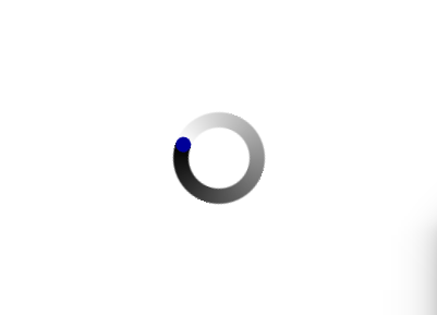
1.BusyIndicator [等待指示器]
程式碼
//main.qml
import QtQuick 2.7
import QtQuick.Controls 2.0
import QtQuick.Layouts 1.0

ApplicationWindow {
    visible: true
    width: 400
    height: 300
    title: qsTr("Qml自定義等待指示器")

    BusyIndicator {
        id: busyIndicator
        anchors.centerIn: parent
        implicitWidth: 96
        implicitHeight: 96
        opacity: running ? 0.0 : 1.0
        contentItem: QmlBusyIndicator{}
    }

    MouseArea{
        anchors.fill: parent
        onClicked: busyIndicator.running = !busyIndicator.running
    }
}

//QmlBusyIndicator.qml
import QtQuick 2.7
import QtGraphicalEffects 1.0

Item {
    //圓形
    Rectangle {
        id: rect
        width: parent.width
        height: parent.height
        color: Qt.rgba(0, 0, 0, 0)
        radius: width / 2
        border.width: width / 6 //為width時表示整個圓,小於width可以切成圓環
        visible: false
    }

    //漸變色
    ConicalGradient {
        width: rect.width
        height: rect.height
        gradient: Gradient {
            GradientStop { position: 0.0; color: "white" }
            GradientStop { position: 1.0; color: "black" }
        }
        source: rect //漸變色作用範圍
        //在圓環頂部的小圓形,使其轉圈時是個圓頭
        Rectangle {
            anchors.top: parent.top
            anchors.horizontalCenter: parent.horizontalCenter
            width: rect.border.width
            height: width
            radius: width / 2
            color: "#000099"
        }

        RotationAnimation on rotation {
            from: 0
            to: 360
            duration: 800
            loops: Animation.Infinite
        }
    }
}
2.任意選擇表情
實現方法:gridview/listview 排列表情圖片,onEntered事件定位滑鼠懸停位置,states狀態列表控制選擇效果
import QtQuick 2.7
import QtQuick.Controls 2.0
import QtQuick.Layouts 1.0

ApplicationWindow {
    visible: true
    height: gridView.cellHeight+4*2
    width: gridView.cellWidth*12+4*2

    ListModel {
        id: listModel
    }

    Component{
        id: baseListDelegate

        Item {
            id: delegateItem
            height: gridView.cellHeight
            width: gridView.cellWidth

            Rectangle{
                id: delegateItemBack
                anchors.fill: parent
                color : "#AAAAAA"

                MouseArea {
                    anchors.fill: parent
                    hoverEnabled: true  //設定進入mouserarea就發enterd訊號
                    onEntered: {
                        console.log("onEntered.",model.index)
                        delegateItem.GridView.view.currentIndex = model.index; //設定currentIndex以改變選中表情的背景色
                    }
                }

                Image {
                    id: image
                    anchors.centerIn: parent
                    source: face
                    width: 32
                    height: 32
                    MouseArea{
                        anchors.fill: parent
                        onClicked: {
                            console.debug(qsTr("選擇的名稱: ") + face)
                            close()
                        }
                    }
                }
            }
            //delegateItemBack的狀態物件列表 when為true時,執行PropertyChanges內容
            states: [
                State {
                    name: "isCurrentItem"
                    when: delegateItem.GridView.isCurrentItem
                    PropertyChanges {
                        target: delegateItemBack; color : "#AAAAAA";
                    }
                },
                State {
                    name: "isNotCurrentItem"
                    when: !delegateItem.GridView.isCurrentItem
                    PropertyChanges {
                        target: delegateItemBack; color : "black";
                    }
                }
            ]
        }
    }

    GridView {
        id: gridView
        anchors.margins: 4
        anchors.fill: parent
        clip: true
        cellWidth: 40
        cellHeight: 40
        model: listModel
        delegate: baseListDelegate
        boundsBehavior: Flickable.StopAtBounds

        Component.onCompleted: {
            listModel.append({"face" : "emoji/Face_(0).png"})
            listModel.append({"face" : "emoji/Face_(1).png"})
            listModel.append({"face" : "emoji/Face_(2).png"})
            listModel.append({"face" : "emoji/Face_(3).png"})
            listModel.append({"face" : "emoji/Face_(4).png"})
            listModel.append({"face" : "emoji/Face_(5).png"})
            listModel.append({"face" : "emoji/Face_(6).png"})
            listModel.append({"face" : "emoji/Face_(7).png"})
            listModel.append({"face" : "emoji/Face_(8).png"})
            listModel.append({"face" : "emoji/Face_(9).png"})
            listModel.append({"face" : "emoji/Face_(10).png"})
            listModel.append({"face" : "emoji/Face_(11).png"})
        }
    }
}
3.圖片切成任意形狀顯示
原圖


效果圖

實現:OpacityMask
import QtQuick 2.7
import QtQuick.Controls 2.0
import QtGraphicalEffects 1.0

ApplicationWindow {
    id:mainWidnow
    width: 400
    height: 300
    color: "grey"
    visible: true

    Item {
        width: 96
        height: 96
        anchors.centerIn: parent
        Image {
            id: sourceimage
            source: "qrc:/qt.png"
            sourceSize: Qt.size(parent.width, parent.height)
            smooth: true
            visible: false
        }

//切圓形
//        Rectangle {
//            id: mask
//            width: parent.width
//            height:parent.height
//            radius: height/2
//            color:"red"
//            visible: false
//        }
        Image {
            id: mask
            sourceSize: Qt.size(parent.width, parent.height)
            source: "qrc:/11.png"
            visible: false
        }

        OpacityMask {
            anchors.fill: sourceimage
            source: sourceimage
            maskSource: mask
        }
    }
}