
Android 主題設計全解析
Android主題設計!有點亂?
初學Android的時候對Android的主題設計都是處在一種模糊的認知狀態,為啥呢?
自定義時候的attr,普通view的style屬性,activity以及application的theme屬性,theme與style定義的一致性以及theme的眾多可選性,系統預置的style屬性的繼承與使用等等……
OK,先不管這些亂七八糟的,如果你對Android的主題設計依舊存在某些疑問,請看完這篇文章。
Theme、Style、Attr的基本概念
Attr:屬性,風格樣式的最小單元;
Style:風格,它是一系列Attr的集合用以定義一個View的樣式,比如height、width、padding等;
Theme:主題,它與Style作用一樣,不同於Style作用於個一個單獨View,而它是作用於Activity上或是整個應用,並具有向下的覆蓋特性
Theme
Theme的概念驗證
好吧,為了清晰的驗證上面的說法,我這裡舉個例子
新建一個moudle,在styles.xml中有如下內容
<resources> <!-- Base application theme. --> <style name="AppTheme" parent="Theme.AppCompat.Light.DarkActionBar"> <!-- Customize - 1
- 2
- 3
- 4
- 5
- 6
- 7
- 8
- 9
- 10
- 11
可以看到該style定義了該主題下共享的三個顏色屬性,以及繼承了一個父主題
那麼來看一下該主題應用的程式碼
<application android:allowBackup="true" android:icon="@mipmap/ic_launcher" android:label="@string/app_name" android:supportsRtl="true" android:theme="@style/AppTheme"> <activity android:name=".MainActivity"> <intent-filter> <action android:name="android.intent.action.MAIN" /> <category android:name="android.intent.category.LAUNCHER" /> </intent-filter> </activity> </application>- 1
- 2
- 3
- 4
- 5
- 6
- 7
- 8
- 9
- 10
- 11
- 12
- 13
此時 ,這個預設主題應用在了Application下,我們啟動模擬器觀看主題效果
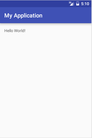
普普通通沒啥特別的,我們為前面的主題新增兩個屬性
<item name="windowActionBar">false</item> <item name="windowNoTitle">true</item>- 1
- 2
重新啟動模擬器,你看到了什麼
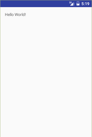
Activity的ActionBar被隱藏了,
是的,正如我前面所說,Theme一般應用於Application和Activity層級,並會繼續向下覆蓋,這裡我們雖然只是設定了Application的theme屬性,其下的所有Activity都會使用該主題。
Theme的定義
Theme的定義基本是一致的,主要是外部由一個一對style標籤,內部通過item指明所定義的各個屬性,下面的Theme就是一個標準的樣例,
<style name="AppTheme" parent="Theme.AppCompat.Light.DarkActionBar"> <!-- Customize your theme here. --> <item name="colorPrimary">@color/colorPrimary</item> <item name="colorPrimaryDark">@color/colorPrimaryDark</item> <item name="colorAccent">@color/colorAccent</item> </style>- 1
- 2
- 3
- 4
- 5
- 6
Theme的繼承
1)通過parent屬性進行系統主題的繼承
<style name="AppTheme" parent="Theme.AppCompat.Light.DarkActionBar"> <!-- Customize your theme here. --> <item name="colorPrimary">@color/colorPrimary</item> <item name="colorPrimaryDark">@color/colorPrimaryDark</item> <item name="colorAccent">@color/colorAccent</item> </style>- 1
- 2
- 3
- 4
- 5
- 6
2)通過“.”進行自定義主題的繼承
<style name="AppTheme.NoActionbar"> <item name="windowActionBar">false</item> <item name="windowNoTitle">true</item> </style>- 1
- 2
- 3
- 4
“.”前面是我們自定義的主題name,後面那就隨意了,怎麼寫都可以了
style的繼承與Theme一致,如果你原來不明白別人為何這樣寫,那麼現在你肯定是知道了
Theme和Style的區別
- 定義上的區別:無太大區別,主要是屬性不同,寫法上基本一致
- 使用上的區別:
對於單個控制元件通過style進行引入(此時style不會向下覆蓋);
對於Activity、Application等視窗級向下應用的通過theme進行引入;
使用系統預置的style
<!-- 使用系統預製style --><activity android:theme="@android:style/Theme.Dialog"><!-- 使用系統預製但區域性修改的style --><activity android:theme="@style/CustomTheme"><color name="custom_theme_color">#b0b0ff</color><style name="CustomTheme" parent="android:Theme.Light"> <item name="android:windowBackground">@color/custom_theme_color</item> <item name="android:colorBackground">@color/custom_theme_color</item></style>- 1
- 2
- 3
- 4
- 5
- 6
- 7
- 8
- 9
- 10
- 11
- 12
使用Android系統內建的style,請務必加上“android:”
ThemeOverlays
在所有可用的主題中,我們可以發現一個名字帶有 ThemeOverlay 的系列:
ThemeOverlay
ThemeOverlay.Light
ThemeOverlay.ActionBar.Light
ThemeOverlay.ActionBar.Dark
這些主題又是做什麼的呢?答案是 僅用於為特定的用途定義必要的屬性。
如果你不清楚,請看測試
我們首先建立兩個toolbar的style
<style name="AppTheme.AppBar1" parent="ThemeOverlay.AppCompat.Light"/> <style name="AppTheme.AppBar2" parent="ThemeOverlay.AppCompat.Dark"/>- 1
- 2
新增toolbar進行測試
<android.support.v7.widget.Toolbar android:id="@+id/toolbar" android:layout_width="match_parent" android:layout_height="?attr/actionBarSize" app:theme="@style/AppTheme.AppBar1" android:background="@color/colorPrimary"/>- 1
- 2
- 3
- 4
- 5
- 6
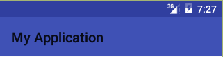
修改為第二個
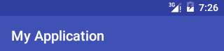
通過改變主題我們可以很輕鬆的實現介面的View的樣式變換,是不是會很方便。
Theme的選用
其是很簡單,在MD設計(也就是5.0)被推出之後,google推出了幾個material的主題,但你不必去使用這些主題,因為有更好的替代方案
Theme.AppCompat
Theme.AppCompat.Light,
Theme.AppCompat.NoActionBar等等
這些主題既保證了向下的相容又兼顧了material的主題設計,並與materiial的各個主題一一對應,你在選擇的時候使用以Theme.AppCompat開頭的主題準是沒錯。
那就有人問了,為毛線這麼幹,其他亂七八糟的主題又是啥呢?
Attr
首先以layout_width為例分析自定義屬性
<declare-styleable name="ViewGroup_Layout"> <attr name="layout_width" format="dimension"> <enum name="fill_parent" value="-1" /> <enum name="match_parent" value="-1" /> <enum name="wrap_content" value="-2" /> </attr></declare-styleable>- 1
- 2
- 3
- 4
- 5
- 6
- 7
declare-styleable代表自定屬性組,attr則是代表屬性,name是屬性的標識,format是該屬性的值型別,內部為enum表示值是唯一的,只可選其一。
再來看一下text的style
<attr name="textStyle"> <flag name="normal" value="0" /> <flag name="bold" value="1" /> <flag name="italic" value="2" /></attr>- 1
- 2
- 3
- 4
- 5
此時attr的內部是flag,代指屬性值是可疊加使用的,比如textStyle = bold|italic則是加粗和斜體的疊加。
format屬性的可選值如下 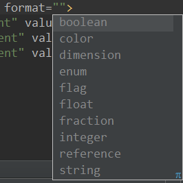
其中,reference代表引用,我們常用的@drawable/myImage、@color/myColor等都是這麼幹的。
ok,attr內部也只有enum和flag兩種型別的屬性,看完這個相信你可以自行定義屬性了。
特別注意,當你的format選擇錯誤的時候,填入對應的值AS並不會報錯,所以具體實踐時請留心
Attr的獲得方法
有些情況下,我們可能需要使用theme中的屬性值,比如下面我們想讓一個TextView直接顯示dogName這個屬性的內容,並且使用系統字型的顏色,則可以如下做:
<TextView android:layout_width="wrap_content" android:layout_height="wrap_content" android:textColor="?android:textColorSecondary" android:text="?attr/dogName"/>- 1
- 2
- 3
- 4
- 5
獲得一個Attr的方法,不同於普通資源使用@符號獲得的方式,而是需要使用?符號來獲得屬性,整體的表達方式如下:
?[:][/]
如果是本應用中的attr使用,則可以省去<package_name>部分。
此處的textColor使用當前主題的android:textColorSecondary屬性內容。因為資源工具知道此處是一個屬性,所以省去了attr (完整寫法:?android:attr/textColorSecondary)。
Attr的使用優先順序:View的Style>Activity的Theme>Application的Theme,所以說你可以定義整個應用的總體風格,但區域性風格你也可以做出自己的調整。
最近做了下反思,與其製造網路垃圾不如不去寫文章,所以準備大幅度降低寫作速度並致力於提升文章的質量,未來計劃在自己進步的同時分享進步的乾貨並不斷去刪除原文,以保證整個部落格的文章質量和可用性。
如果你對本文有什麼問題和看法請及時告知,送人玫瑰手有餘香,謝謝支援。