
Machine Learning for Visualization
Data visualization is about exposing patterns to the eye.
We are always seeking ways to tap into deeper patterns.
Patterns that feel distinctly human


Patterns we humans can recognize but can’t articulate to a computer


And patterns we didn’t even think to look for

When exploring a new dataset we have various tools in our analysis and visualization toolkit. These tools include things like averages and summary statistics, line charts and histograms, as well as an ever expanding

Now I want to direct your attention to a relatively new set of tools that can change the way we explore large datasets.

These tools use Machine Learning to pull out patterns for us and give us new ways to navigate our data.
I’d like to demonstrate these techniques on my favorite dataset, Quick, Draw!
If you haven’t had a chance to play the game, the rules of Quick, Draw! are pretty simple. The game asks you to draw a word, and you try to get an AI to guess the word from your drawing.


When the Google Creative Lab built Quick, Draw!, they had the foresight to save anonymized copies of the drawings, altering the course of my life forever. At this point millions of people across the globe have played and Google has open sourced 50 million of the drawings they created. This means we have on average more than 100,000 drawings for each of the 300 words in the game to explore.

The Data
Let’s take a close look at the data, what it is and isn’t.


This dataset makes for a great demonstration, because its so fun but it is also representative of so many serious datasets. It has categorical data, such as which word is being drawn and which country the drawing originated from. We also have a few time related dimensions, such as how long the drawing took to draw (duration), a timestamp of when the drawing was made.


We also have the sequence of points that make up the drawing. It is this sequence of pen strokes that carries most of the meaning in this dataset, they capture the way we as humans represent abstract concepts across the globe.
They are also the most difficult to dissect with traditional data visualization techniques.
Data Visualization
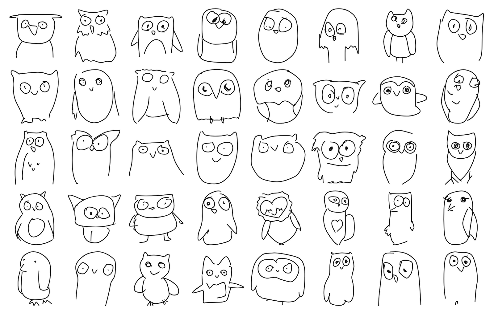
Just because something is difficult, doesn’t mean it can’t be done. Since the dataset was released several amazing projects applied various techniques to surface interesting patterns in the data.
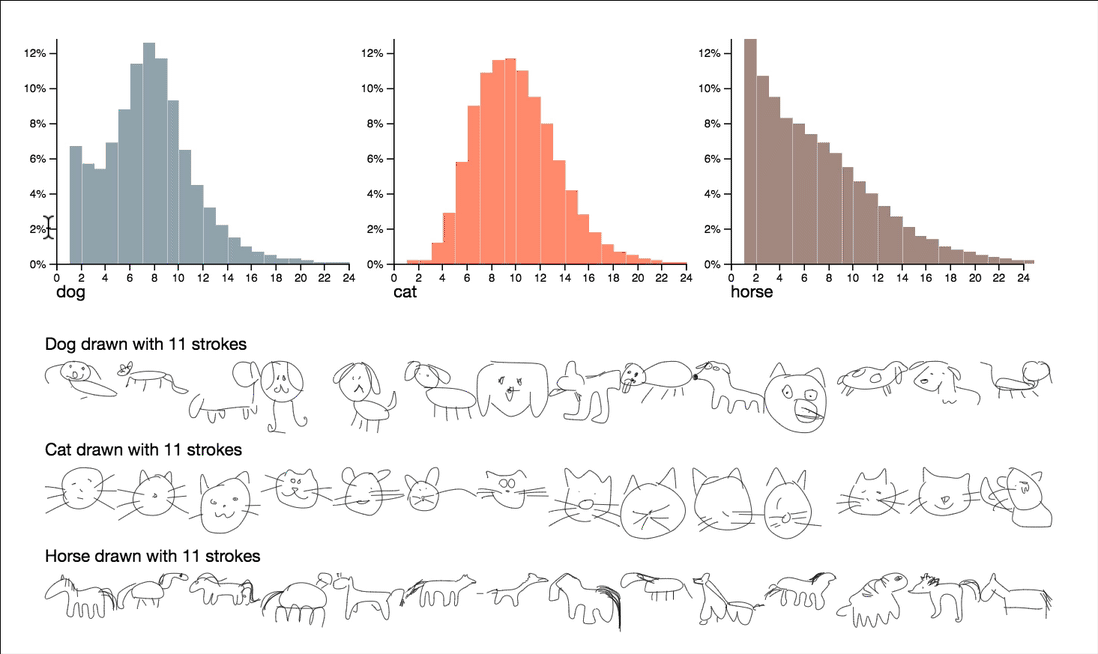

This project explores questions around complexity and quality by utilizing stroke counts and drawing durations. Some quite interesting observations can be surfaced by interactively browsing the summary statistics of these attributes.


Note that the dimensions visualized here are the count of strokes and the duration of the drawing, both reduce the sequence of strokes to a single number. These numbers give us a manageable way to peek into the data, but can’t capture all of the features of the drawings by themselves.

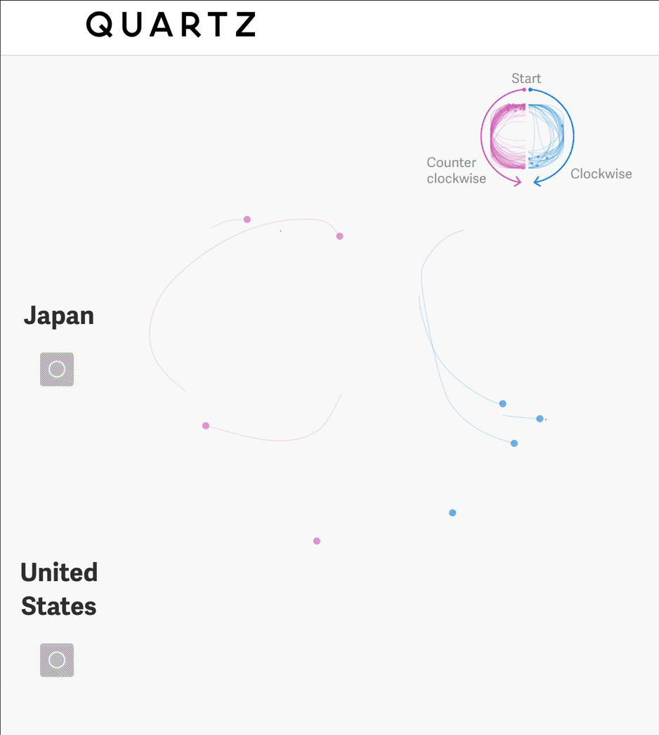
This article takes a deep dive into simple shapes, they determine whether each circle is drawn clockwise or counter clockwise, allowing them to count this feature in the dataset.

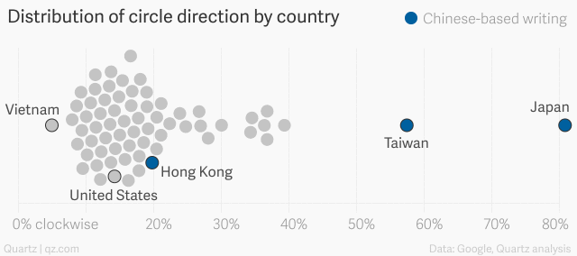
They can then visualize this feature to communicate some understanding about cultural differences across the world.
“There are countless ways that we subtly, unconsciously carry our cultures with us: the way we draw, count on our fingers, and imitate real-world sounds, to name a few. That’s the delight at the heart of this massive dataset.”
Forma Fluens by Visual AI Lab @ IBM Research


This project takes a number of interesting approaches to visualize the data. One in particular is the use of visual averages to highlight cultural patterns.

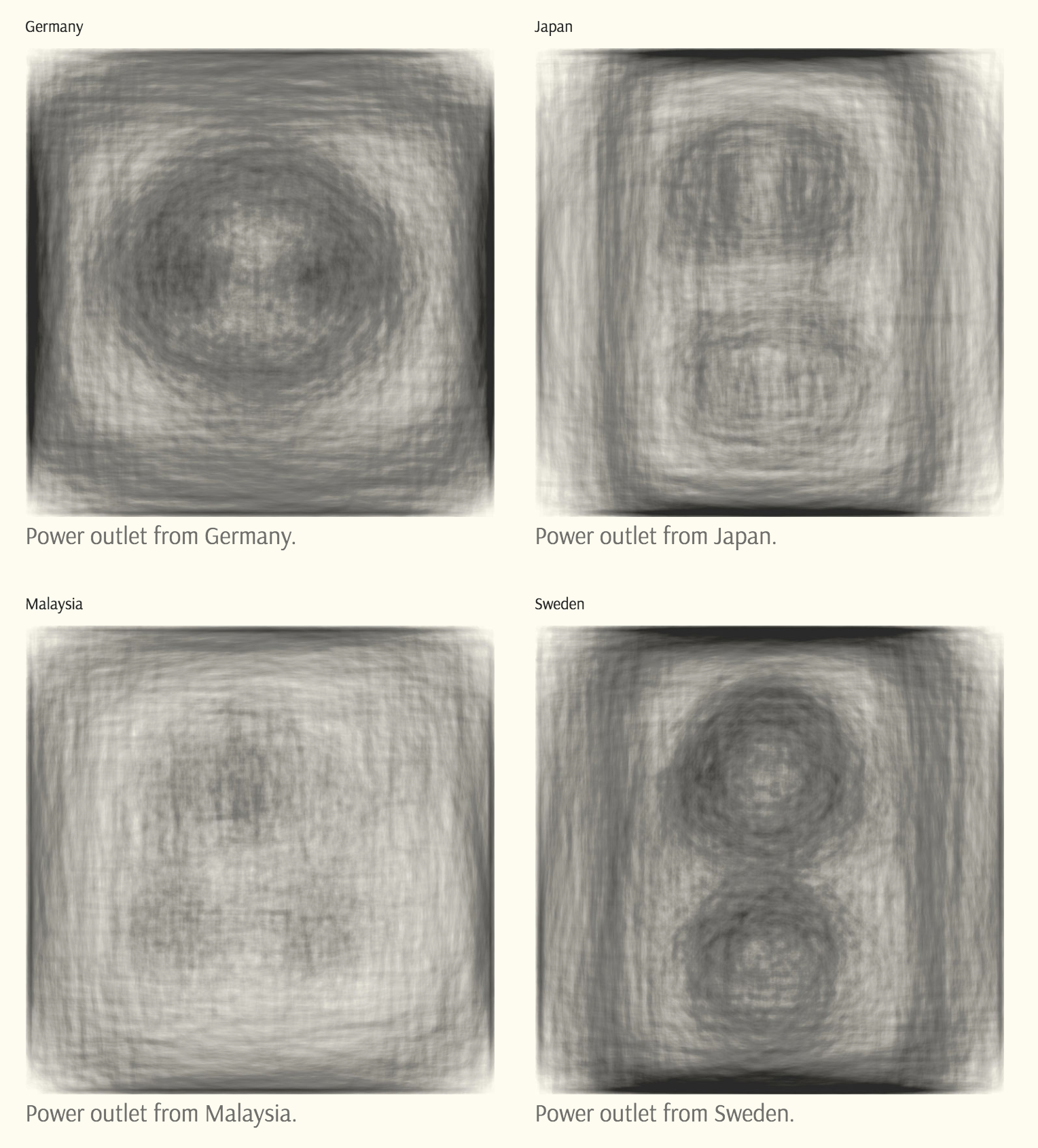
Visual averages work by drawing thousands of faint transparent drawings on top of each other, surfacing the dominant patterns. This works especially well when we filter drawings by country where cultural patterns can emerge.
Kyle McDonald took the concept of visual averages to an extreme in this epic tweetstorm.

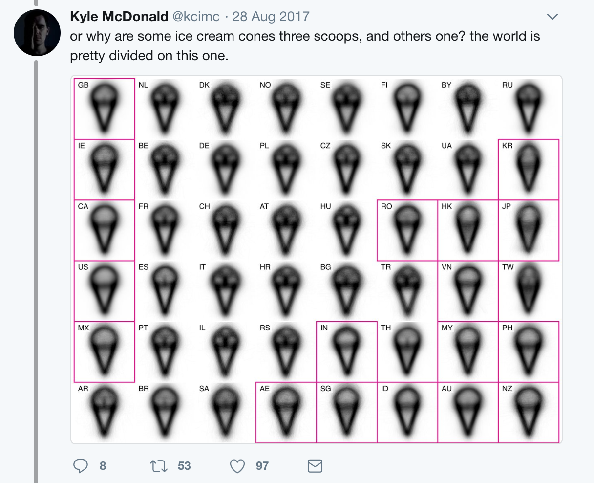
He makes excellent use of small multiples to compare patterns across several categories.

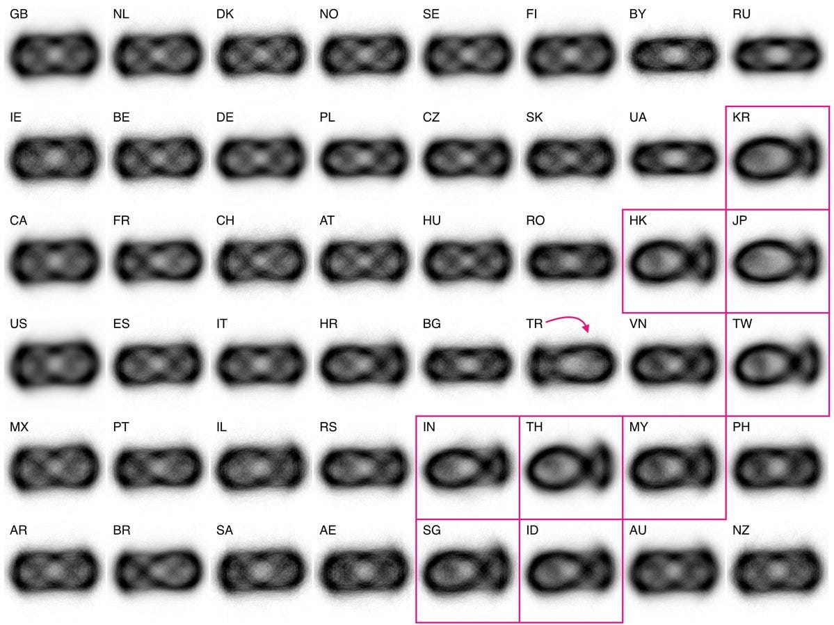
These certainly give us some interesting points to reflect on, but it’s hard to dig deeper since all of the nuanced patterns get washed out by the averaging.


So what if we had a way to capture the nuance lost by averages, to automatically find the interesting features in the strokes and dissect the data by more than one dimension at a time?
Machine Learning
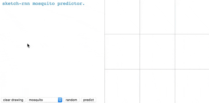
Enter Deep Neural Networks. These aren’t magic, but they do have some amazing capabilities and as it turns out, we have just such a network trained on the Quick, Draw! dataset. It’s called sketch-rnn.

While it’s super fun to play with the network and come up with creative applications for a drawing machine, what’s exciting for us as data visualizers is the patterns its had to encode in order to generate its drawings.
So how do we get at these patterns?
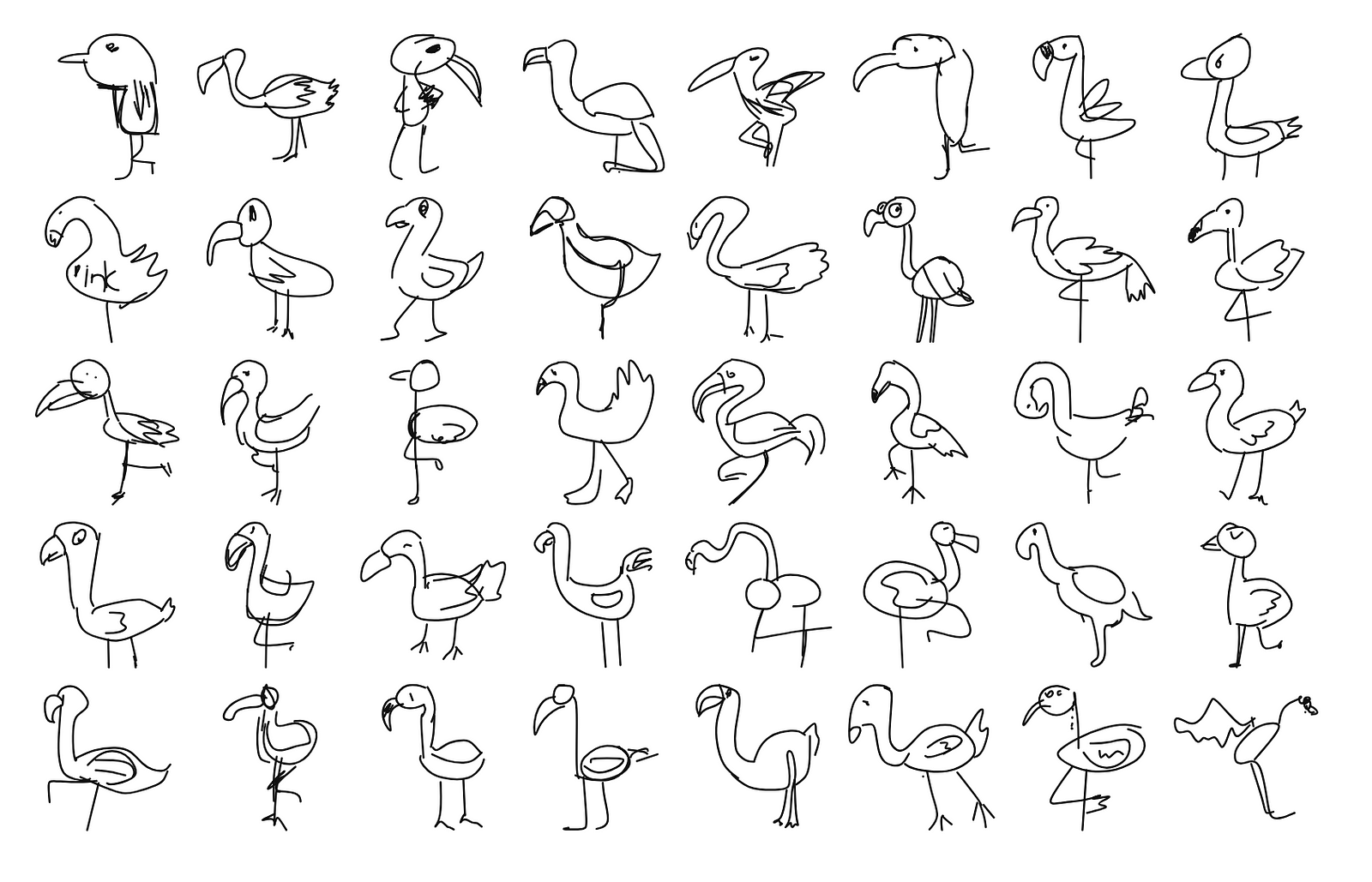
One way to do it is to ask the network how probable it thinks a given input drawing is, as Colin Morris did in his Bad Flamingos article.

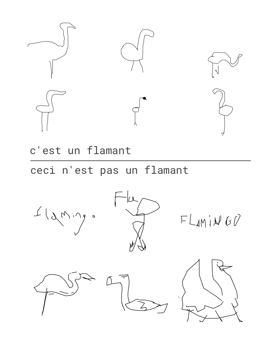
On top we see flamingos the network thinks are highly likely and on the bottom are flamingos it thinks are very unlikely. This gives us an interesting lens to look at the data through, but it still reduces all of the data to a single dimension. That’s a problem because some of the most interesting depictions of flamingos are mixed in with words that are clearly not a flamingo.

We would like a broader view of the data, and we can get one once we understand a little bit more about how the network operates. Sketch-rnn belongs to a family of neural networks called auto-encoders which find ways to “compress” input data into a smaller representation that can then be used to generate new output.

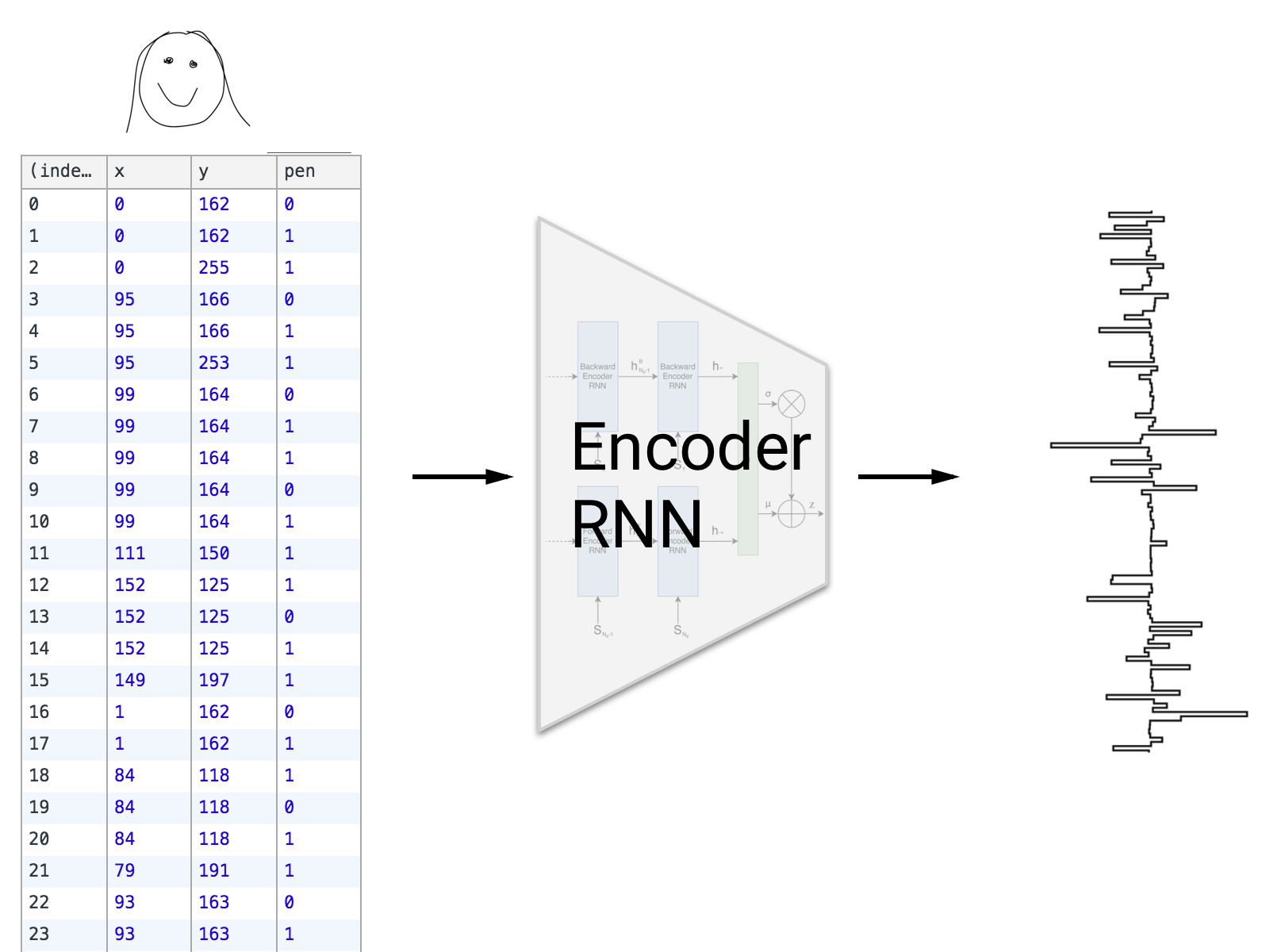
The network is composed of two parts, an encoder network that tries to find a way to represent the data in much fewer dimensions than the input, and a decoder network that tries to accurately reconstruct the original data using only the encoded data.


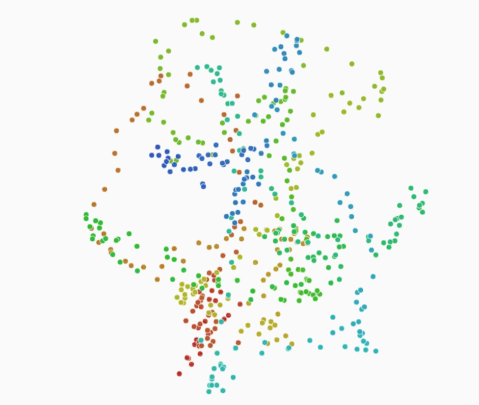
We call the encoded data a latent vector, and it’s the key to unlocking our technique.


We can extract the latent vector for each drawing from the network, which gives us a way to compare the drawings numerically.

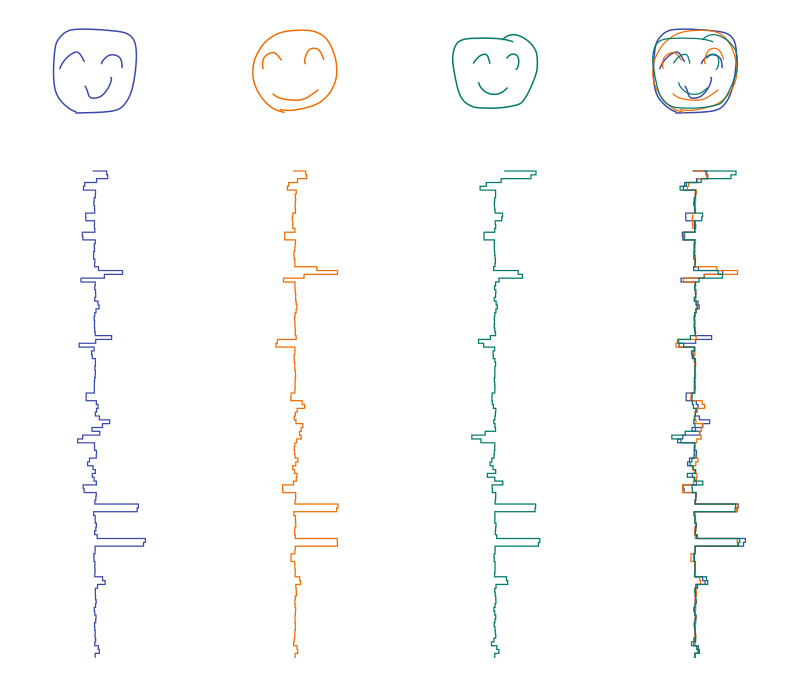
When we compare them we see that similar latent vectors mean similar drawings. In our network, a latent vector is 128 numbers, which is still kind of a lot to deal with. So we need a way to compare a lot of high-dimensional data points with each other.

Luckily there is a wonderful algorithm called t-SNE which is very helpful for visualizing similarities in high-dimensional data. It isn’t a silver bullet, but it offers us a very interesting way to explore our data. Here each drawing is represented by a small translucent yellow dot, the algorithm places similar drawings close to each other to create this two dimensional map.

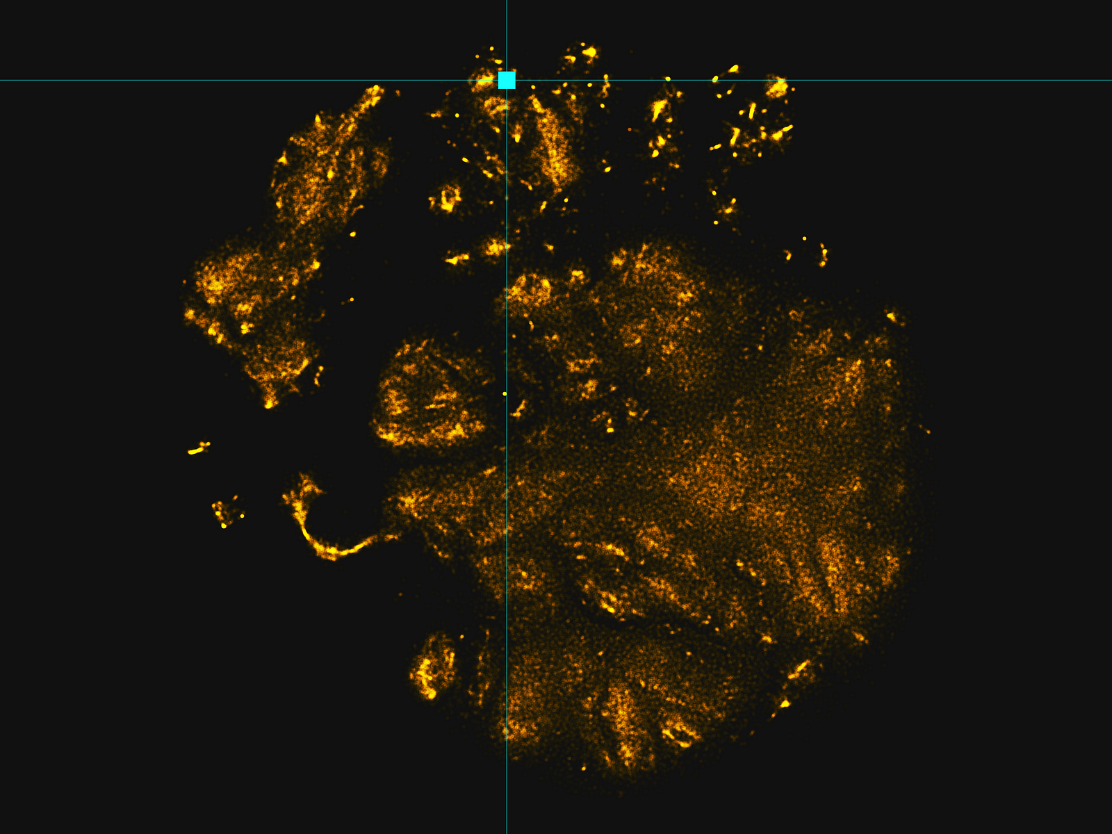
We can zoom in on a small piece of this map, and see a group of similar drawings.

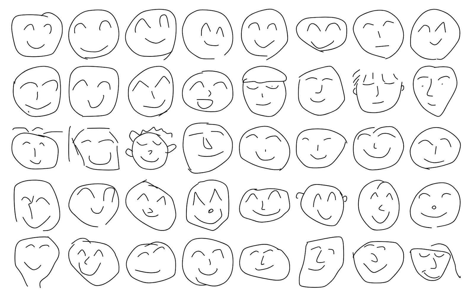
As humans using our eyes, the patterns here are fairly clear, namely the eyes and smile.


Let’s look at an entirely different cluster.


We can see that this cluster highlights a pretty different pattern, which is kind of sad.