What is humane product design, really?
What is humane product design, really?
We now live in a world of technology pervasively vying for our attention. This is causing increased levels of anxiety, lowered productivity and in some cases, causing real, unhealthy addictions to digital constructs like apps and games. While I don’t suffer from any of the above extremisms, as a single guy in his late 20’s with a full time job, a side business and a social life, the stresses of society certainly seem unbearable at times–the little things like notifications and outfit decisions add up. So with the rise of awareness about technology’s impact on our wellbeing, I dug a little deeper into the issue and stumbled upon the “Time Well Spent” movement.
The movement is led by ex-Google Design Ethicist, Tristian Harris, and provokes companies to practice “humane design.” He also outlines a series of actions one can take to be a bit more intentional about their technology use. There have always been apps to help, but we’re finally seeing Apple come out with time monitoring controls, and Facebook and Instagram, the 2nd biggest attention driven businesses, develop features that make their customers more aware of their engagement. But is that enough?
To satiate my curiosity on what “humane design” is, about a month ago I decided to follow Tristian Harris’ recommended actions and, as product person, see how it would change my perspective on ethical product and business design, particularly regarding the incredibly profitable businesses of attention.
Let’s start with the actions I took and how they affected me:
Turning off all notifications that aren’t from people. Most importantly NO MORE RED DOTS.

This was the most impactful and best thing on the list. The sudden absence of summonings by the apps on my phone for unimportant reminders, notifications, special offers etc. really made me aware of the power my phone had to pull me in. This tactic enabled me to build a completely self-initiated relationship with my device, making every phone engagement intentional. Even if I still habitually pull it from my pocket and land on the home screen now and then (more on this in a moment). I’ve maintained this practice since I ended the experiment.
Going greyscale.

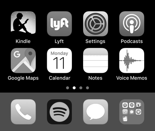
The reason is to gain a bit more control over the moments you find yourself simply staring at your home screen unsure of how you ended up there–be it after a finished task on your device or a habitual unlock while waiting for the elevator. The colorful icons give your brain micro-rewards and calls into the app every time you unlock your phone and are designed to draw a user in. This was definitely effective, although it made some utilitarian apps like my my workout apps, shopping apps finance apps, a bit less effective and much more boring so I found myself toggling it off quite often. I won’t be keeping this adjustment as part of my normal routine.
Keep the home screen to tools only

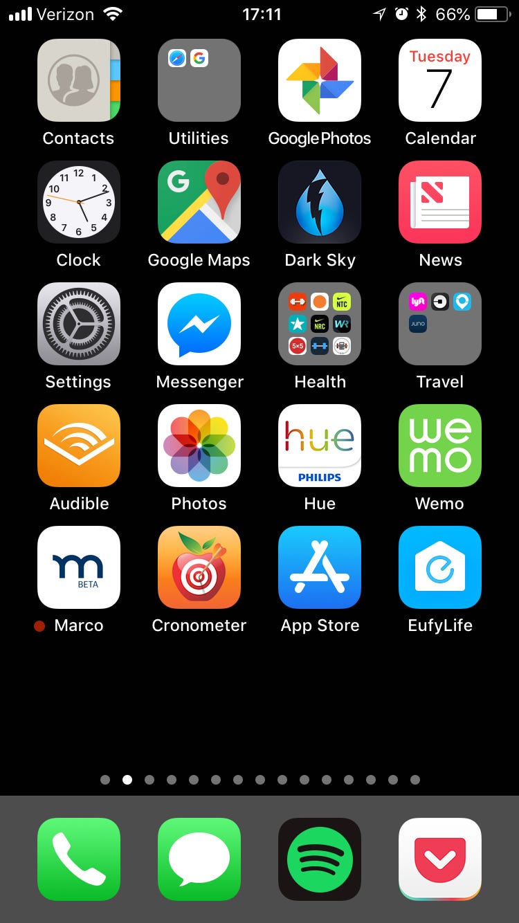
So basically maps, workout apps, alarm, messages, hue lights… things like that. This is because we habitually open our phone and tap our social apps and games. Since re-downloading Instagram and Reddit, I’ve actually found I have to bury it several screens to the right, in a folder, in order to really create enough friction that I don’t open it thoughtlessly. This one may sound like a minute detail, but I found around the 2nd or 3rd interaction to get into one of these apps (second swipe or tap) I start to catch myself and ask “is this really what I want to be doing right now?”
Remove Siri Suggestions


So now that your apps aren’t on the first page, it becomes easier to launch apps by typing. This adds a bit of purposeful friction to make you more mindful about the apps you do engage with. This brings in the 2–3 interactions I mentioned above and really makes me intentional about the apps I use.
Charge your device outside of your bedroom.

This way you have to get out of bed before you get sucked into your phone. I also didn’t abide by this one, as it just takes a small amount of willpower to not get on Instagram until my coffee is made.
Remove social media.

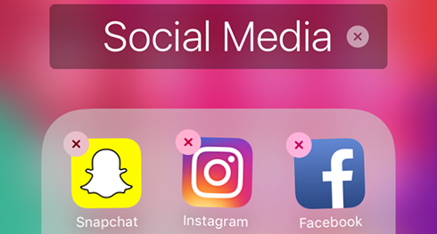
This is really more for those people who want to spend less time on their phone, not necessarily if you just want to change your relationship with it. I did this for the first week, but as I noticed the behavior changes with other apps on my phone, I brought back social media, but treated the apps with the same guidelines as above. I feel like I have a much healthier relationship with Instagram and Tinder now without it calling me back in to see the latest.
Send audio notes instead of text messages.

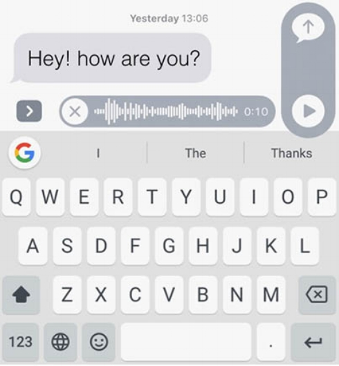
This just pissed off all my friends on day one, so I stopped. They also suggest using “quick reactions” to messages, but that can come across as disengaged to the recipient in certain circumstances. This was a bit too far.
Changing my Relationship with Technology.
As someone without an impairing “technology addiction” problem, I was surprised to report that the experiment actually had a significant impact on my relationship with technology. It’s an impact that after a month of getting used to, just feels normal, like everyone should do this. No longer do I fall into my phone after Instagram notifies me that 3 people liked my photo or that so-and-so went live. I don’t open the apps to get rid of red dots, or find myself going from watching a TV show or reading a book to suddenly scrolling through a feed. I never considered the impact of all these things on my life because it wasn’t that disruptive. Now, I remember moments more clearly, I recall TV show plot lines better, hangouts with friends are more vivid. All because there’s no longer a few lines of code reminding me to give it attention while you and I have a conversation. On top of all that, I’m less stressed because there’s a lot of microscopic actions removed from my schedule.
It also made me realize which products were actually designed humanely. Slack, for example, famously doesn’t send push notifications between certain time frames because they don’t think people should feel pressured to work or receive messages outside of business hours. That seems humane.
Designed for Human Behavior, or Human Vulnerability?
But many products that make money off of our human nature; desire for connection, response to variable reward, loss aversion (the list goes on), are tapping into these very natures to bring many of us joy and utility. That’s why Candy Crush is fun, Duolingo get’s us to learn new languages and Instagram helps us get inspired creatively and connect with friends. But for the addicted, there are external reasons influences, like lack of human connection or personal fulfillment in life. These products offer them little doses of escapism and entertainment, distracting from the real issues. And to some, what might be a user experience enhancement that eliminates the need to pick up a remote to watch the next episode of a series, might be a behavioral trap to others that sucks a person into watching a series way past their bedtime.
But these very dopamine triggers, and ability to make people happy is exactly why I love products–why I have the job that I do. Making things people love is the dream. And as humans, we love the dopamine hits, the rewards, the scarcity and the seamlessness.
So how do we use all those triggers that are part of our human nature, maximize profit, while making our product design or business humane? It depends on your product, of course.
Content Feed Businesses are Inhumane
Let’s address the elephant in the room: how could Snapchat, Facebook, Reddit, all the companies whose revenue model correlates with the time you spend using their product, possibly profit off of helping you spend less time on the product? The fact of the matter is feeds, while they may be a fantastic business model, may not be the most humane. Therefore, I don’t believe it’s possible to maximize shareholder profit with a product like this and build a humane product at the same time.
The controls Facebook and Instagram have added recently are a step in the right direction, and probably the best they can do to be as humane as possible while not (or minimally) affecting revenue. So, the conclusion for feeds is when you have an inhumane product, it becomes your responsibility to add humane controls. In the end of the day, attention is a zero sum game, and a company that makes money off of your attention wants all of it–or as much as possible. But if your customers are demanding a more humane product, giving them the controls to manage their time is better than them deleting the product altogether, as Tristan Harris thinks we should. In the case where the market demands humanity out of design, it actually becomes in the best interest of shareholders to enable people to spend less time on the product.
Intention Setting
Speaking of humane controls, what does a company do when the best UX is also inhumane? Subscription services like Netflix already have a users money each month, in fact they have just about the lowest churn rates the industry has seen, but in order to retain users effectively their shows are designed with cliffhangers to keep people engaged in series’. And to make it easier to keep watching, the subsequent episodes autoplay.
Netflix doesn’t see another dime if a user watches an entire show in a night, weekend or month. So how can they solve this user experience challenge? By starting with intention gathering. We’re in an age of smarter product design that responds what we want and like and when we want and like it. So what about consumption settings that might stop a user if they have a bedtime set for 10:00 PM? Onboarding experiences like like Nike’s running app Nike Run club, will send a user notifications when it’s time to work out, however when a users builds their training program in the beginning, they opt-in to the frequency that they would like to engage in the product.
When subscription services build products designed for the already subscribed, it’s wise to build intention settings in place to provide the optimal experience which can reduce churn.
The Positive Manipulation
Let’s address the products who minimally face these ethical dilemmas, like your 401k that have penalties for early withdrawal built in, or your Headspace app that uses gamification practices like streaks and rewards to keep you practicing a healthy habit. These products can utilize these tactics because their product has utility. And users can place a value on that utility because they feel like they receive something in return. The more they use the product, the further their dollar goes, and the further return they get on that dollar. There’s not much of an humane dilemma here. Use human nature and the very technology challenging our humanity to make us better humans. Checks the box for me.
Paying for Humane Design
Then there’s the companies with hybrid business models that make money both on subscriptions and Ads: Tinder makes money off your attention in the free version, but also has a utility that they can charge for. The vast majority of users don’t pay, because the product is designed to be what is basically a broken search field that they call “browsing” and users can pay for features to make that search more efficient. In the context of a game, they can pay to cheat and the variable reward system that keeps users coming back, can be bought to decrease the time spent searching for the reward. This can be viewed two ways, (a) its ethical because customers can pay to have a bit of their time back or (b) customers are being manipulated to pay a bit more just like the slot machines. My conclusion is option A as it’s a purchase for service enhancement, just like one would pay for a personal trainer at the gym. So the free product is designed as inhumane, with a business model that requires a user to buy their humanity back.
Creating an End
A lot of gaming companies and gamified products have a tactic where they dangle unlockable content that can be attained through a certain amount of play, or if a user is willing to cut corners, a purchase. While in most cases this could be considered inhumane, another carrot at the end of the stick no matter how far you go, it can be overcome, and still profitable by setting a limit. Fortnite makes their money enabling users to purchase aesthetic modifications to their characters. Many of these enhancements can also be unlocked by achieving a certain rank. However, the weekly challenges that Fortnite releases to earn users XP to level up are exactly that, weekly, meaning that once they are completed, the user is done for the week. This “catch and release” style of engagement helps users self regulate rewards so they know that they can take a break and not be missing out on anything. A step further, they do have daily challenges as well, but even these can be executed in a reasonable amount of game time each day. What they’ve done here is decided that it’s humane to bring users back daily, but in moderation by only giving them one daily challenge.
Humane has an emotional value
So we live in this world where digital experiences are a part of our culture, and while the Time Well Spent Design Checklist pairs an interesting set of challenges for designers to innovate against these days, I don’t think the innovation is worth sacrificing great experiences. In the end, there’s many users who have little to no issues with the technology we face today. In fact, these “addictive” features bring many users joy and add amazing value to our lives. But by figuring out where your product falls on the list above, there’s always a way to add humanity while building a maximally profitable product.
