How New Sketch Will Steal Your Job
How New Sketch Will Steal Your Job
? Hey design folks! You’d better be ready for Christmas. Santa is coming early this year. And judging by what Sketchapp team prepared for us, we were very good boys and girls and deserved a special treat. Enough words, let’s have a look…

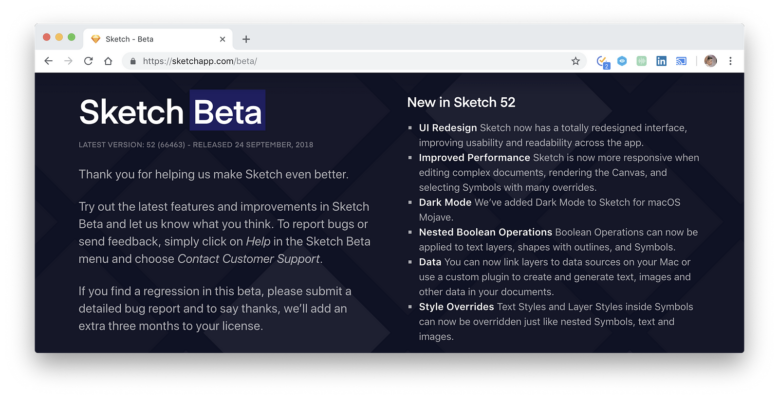
Style Overrides
A problem with old symbols
Previously when you tried to make a design system for your new project or try to use and maintain existing one there was one big problem — text overrides. Basically, we could do it by creating separate text symbols that didn’t work with an automatic element replacing that the regular text did.
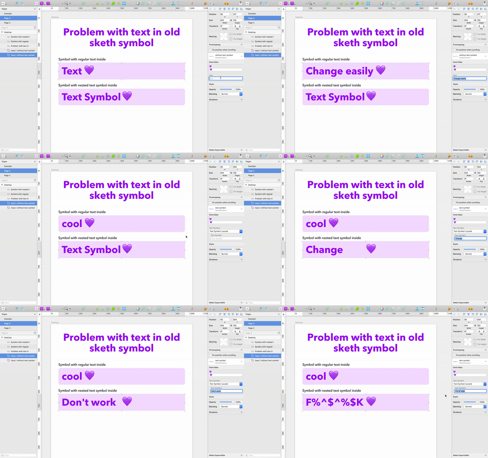

This was not the only problem with text symbols. They just made the whole project look messy. They were hard to create, change and maintain. And they were stored with all the other symbols, which made navigating inside them harder. Just look on Material Design Theme provided by Google they have hundreds of text symbols, but you can’t really use them with buttons or anything else, because the other element’s didn’t adjust to the Text Symbol Content.
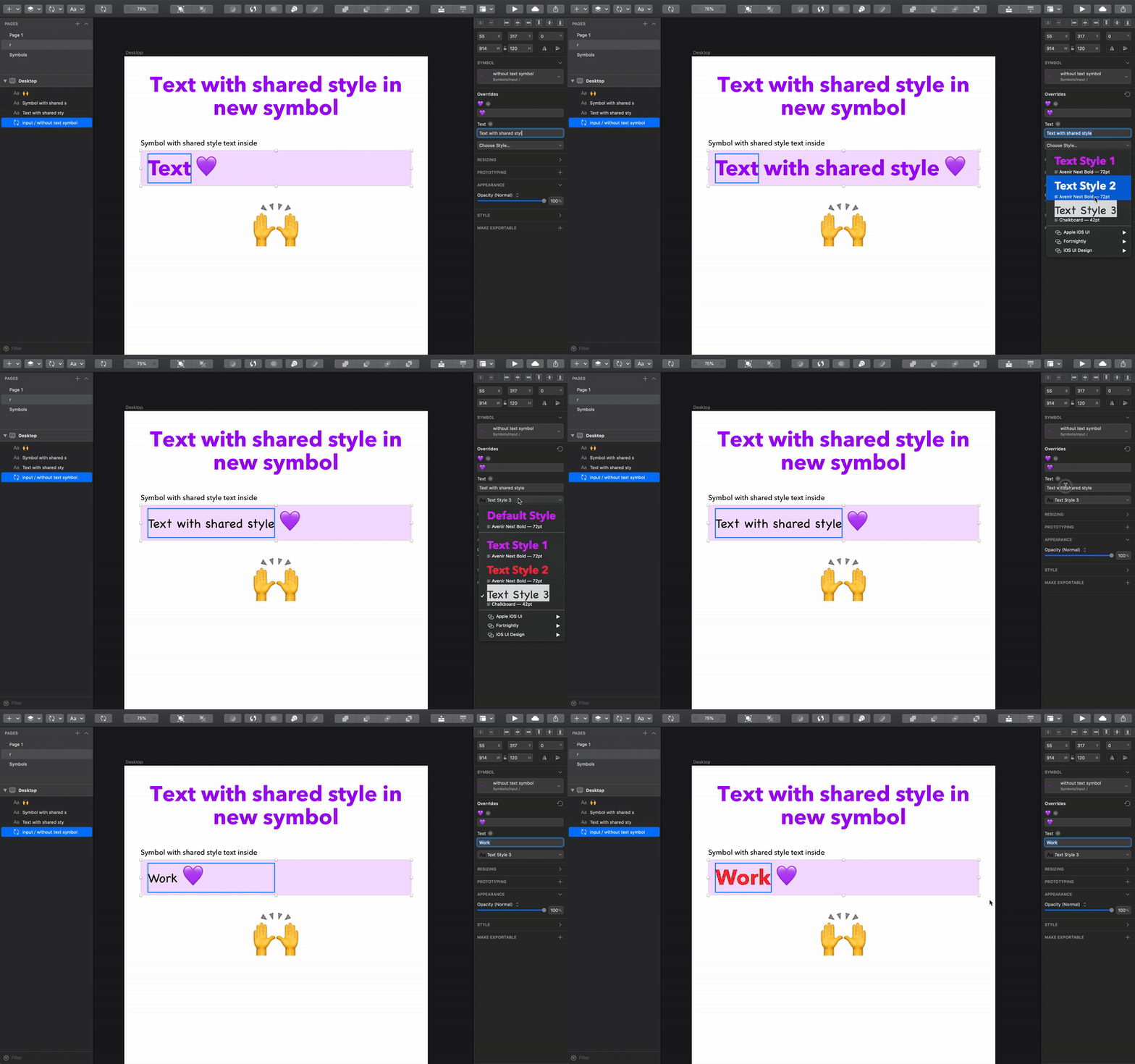

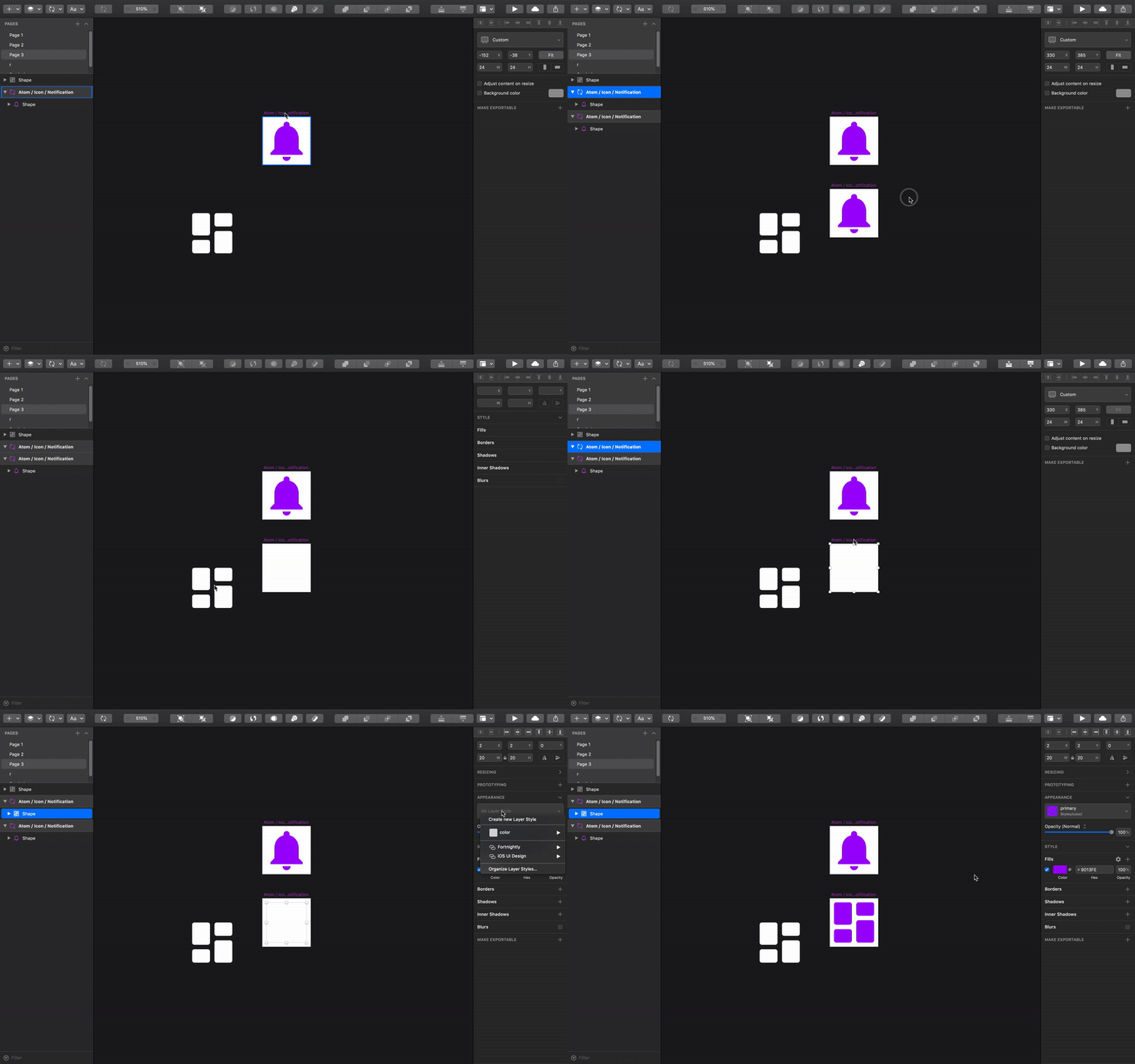
The shape styles can also be overridden in the new update. This means that it’s possible to finally get rid of the constant use of masks. Take a look at how much effort it used to take to add an icon to the existing design system.
Before (Sketch 51):1. Duplicate the artboard with an icon (Cmd+D);2. Copy the new icon (Cmd+C);3. Paste it to the duplicated artboard (Cmd+V);4. Move the new icon to the background of the artboard (Control+Option+Cmd+↓);5. Make sure that the icon doesn’t have any fills or borders;6. Apply mask to the new icon (Control+Cmd+M);7. Delete the old icon in the upper layer (Delete). Congrats, you’ve successfully added one icon! Oh, but did you check if you have the right color symbol for it to use in the actual design? And by the way, an average project involves more than 50 icons. Just sayin’.
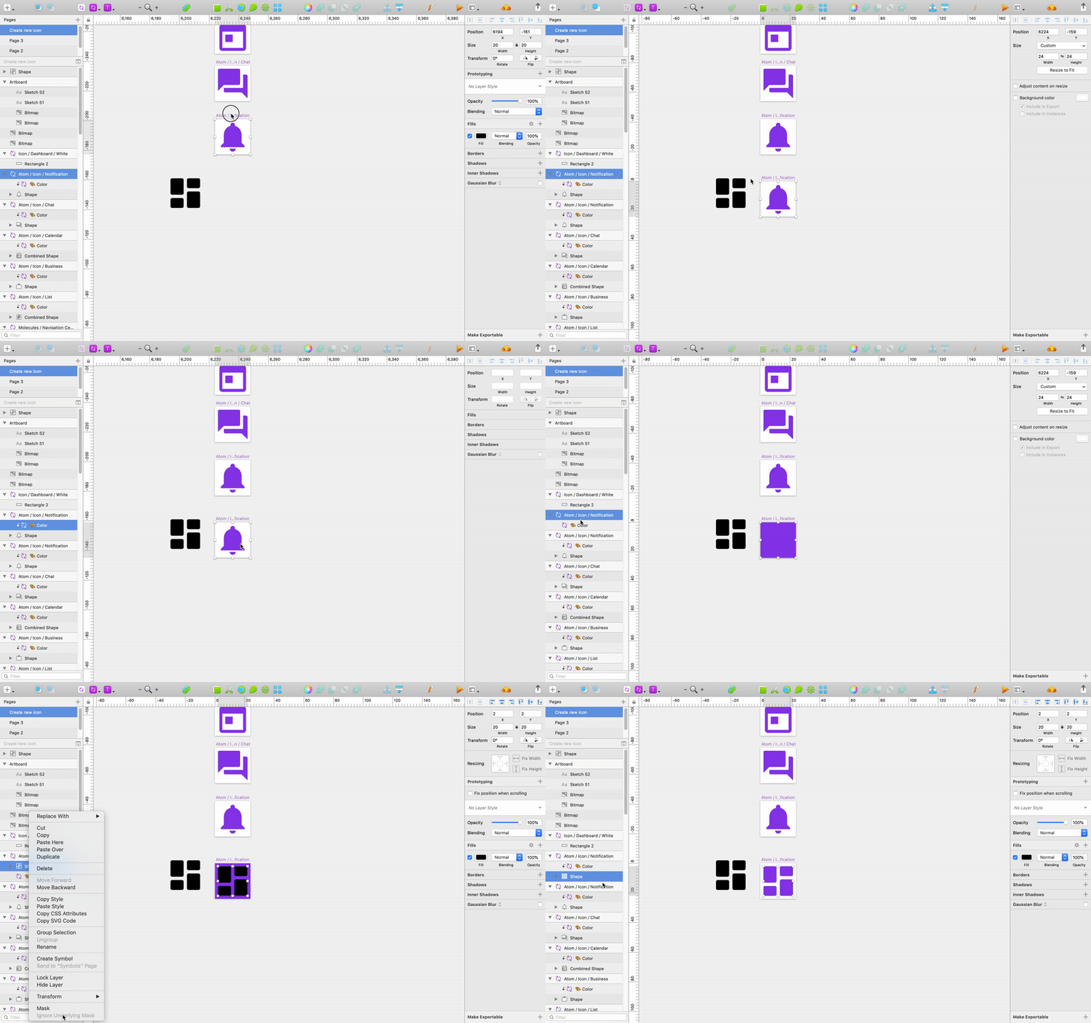

Now (Sketch 52):1. Duplicate the artboard with an icon (Cmd+D); 2. Delete the old icon (Delete); 3. Copy the new icon (Cmd+C);4. Paste it to the duplicated artboard (Cmd+V);5. Apply a style.Yep, as simple as that.

Data
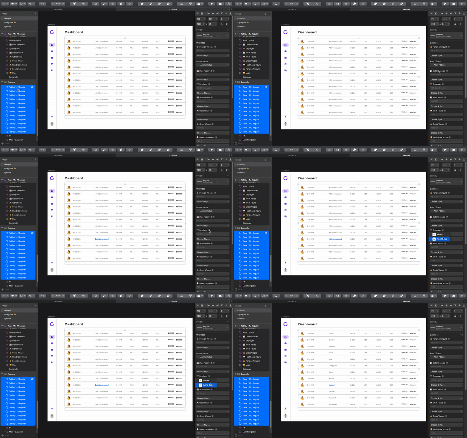
Yeah, you’ve probably seen this thing in Craft or List or some other similar plugin. This is the thing that prevents you both from spending time on low-quality copywriting and from placing stupid “Lorem Ipsum” texts. As a bonus, it allows you to test your design on the label with different lengths and all kind of images.
But there was a big problem with Craft realization — it wasn’t working properly with Symbols. You couldn’t select what data you want to change on multiple instances of a symbol. Well, just let me show you…
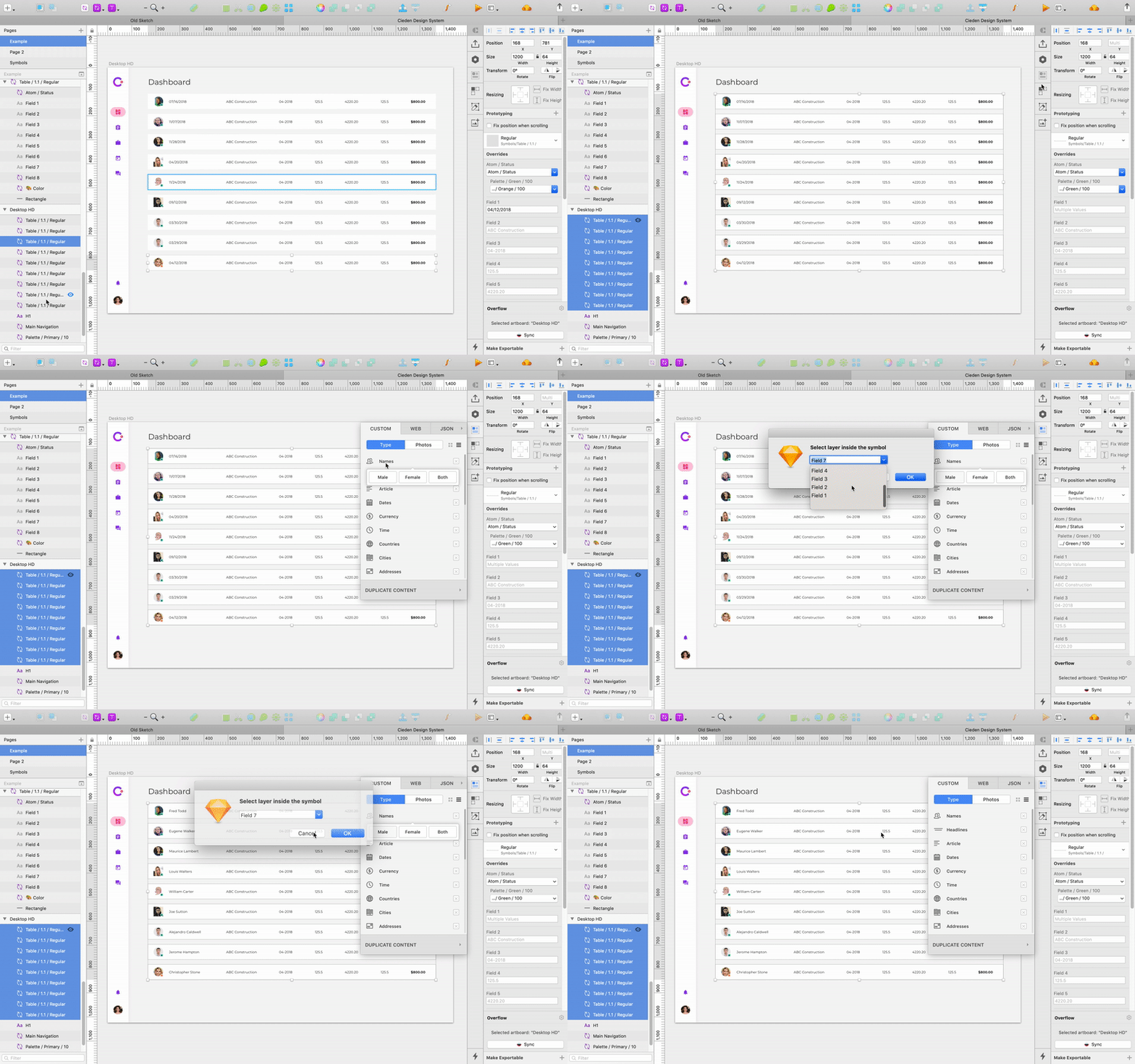

Now all Overrides have a small icon next to the label which allows you to select what kind of data you want there. And finally Sketch highlights override when you hover on it inside the right panel.

UI Redesign
The reason we love Sketch is that it lets you do the job. Sketch is simple. Think of Sketch as Tesla in the design tools universe, while Photoshop is Decepticon (really awful Transformer reference) that was designed to destroy the planet. Sketch cut out all unnecessary stuff from Photoshop and created an iconic minimalistic interface that magically made a cameo in Adobe XD, Invision Studio and a bunch of other tools.

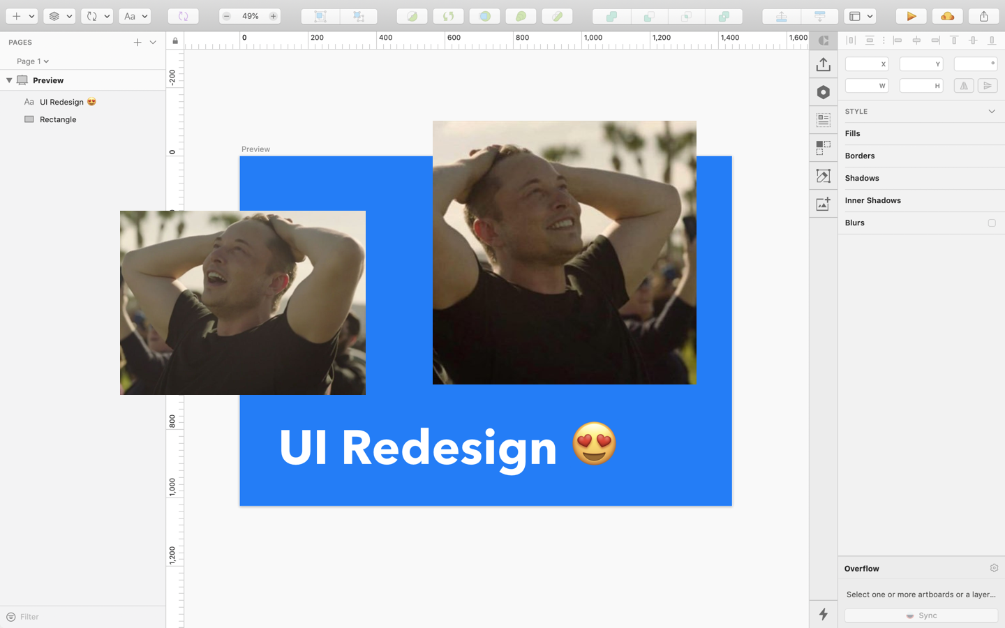
With version 52 Sketch goes even deeper into making our life easier. All icons were simplified, and the icons in the dark mode look (damn) great. The smaller rectangle is no longer in the alignment icons, which made it simpler. And the search magnifier was removed.

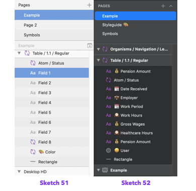
The left panel finally lets you easily find artboards which are now displayed with a canvas icon and are written in bold. Now the shared styles icon is purple just like the symbol. And furthermore there are brand new filters that let you see and look for a specific group, image or text.
The right panel consists of the collapsed tabs. At first glance, it looks like it brings the unnecessary complexity, but it actually allows you to adjust the interface to your need. When you are doing your main job — design (and not writing Medium articles about design) ou need the Style tab only. But, let’s say, you’re working on a prototype, which means there’s no need to customize styles just yet. in that case you can just hide the other bars.
Also, the resizing tab shows a preview of how the pinned object will behave. I think it’s super useful and, hopefully, more people will be encouraged to use it in their design.
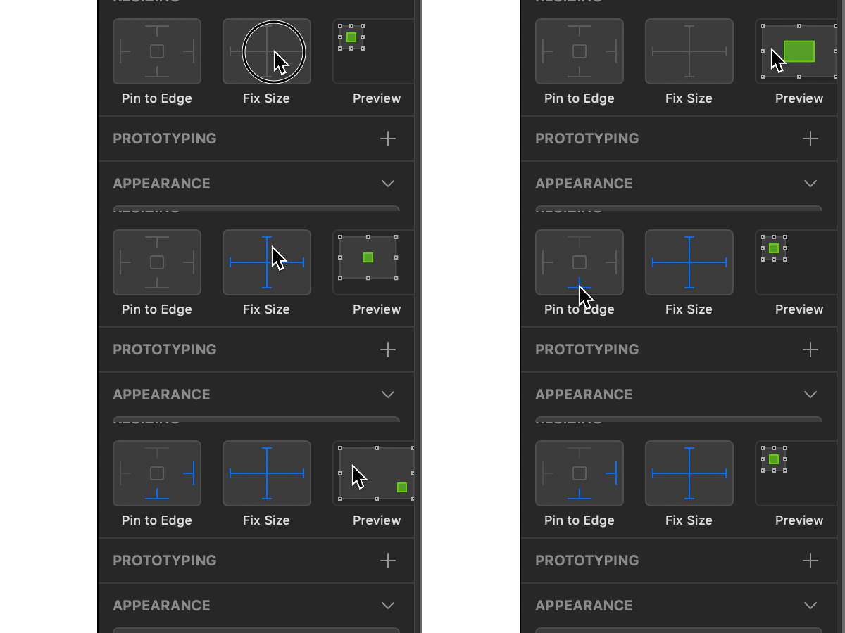

But if you want something new you should be ready to sacrifice something instead. Smooth corners and blending modes are now hidden. Extra pair of dashes was cut out completely from the new version. Meh… I never used them anyway.
Improved Performance
It’s hard to track, but it is true — large files take so long to render, that sometimes it was necessary to split one big project into a couple of smaller ones, just cause Sketch couldn’t handle it. Now guess what, I finally don’t have to slaughter my projects. Having tested a considerably large file (3,3 GB — lot’s of high-res images) in both Sketch versions, the new one works smoother.

Dark Mode

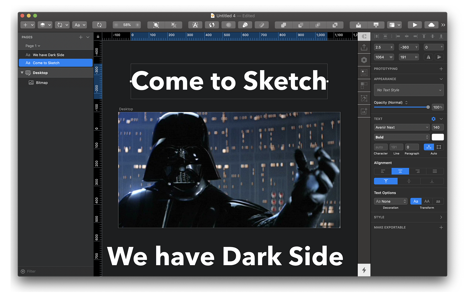
I remember the day when Invision Studio was first announced. Everybody was so excited and frankly, so was I. For years Sketch’s interface has had the same theme; no wonder we all got bored of that. It just wasn’t a good fit for the designer’s nocturnal lifestyle.
Bummer — the dark theme will only work if you switch the whole OS to the Dark theme.
Nested Boolean Operations
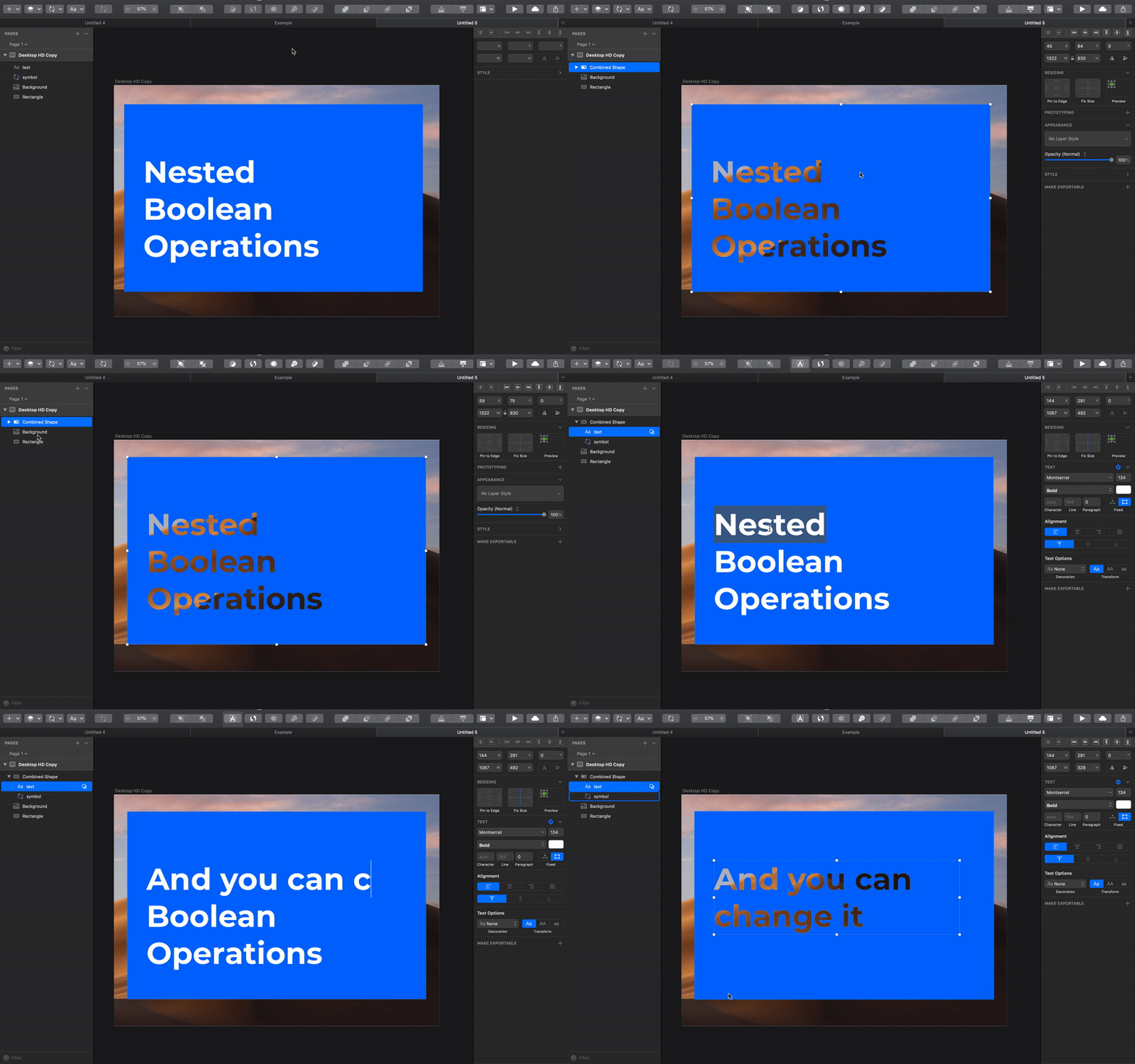
That’s a cool thing to have around, but it takes lots of imagination to make good use of it. Basically, it allows you to combine/subtract/etc everything with/from everything. Previously you couldn’t just subtract a text field from the colored shape symbol. In the old version you needed to convert your text into outlines, then detach your symbol and then subtract one from another. Way too much effort

Enhancements & Bugs Fixes
Sketch announced 20 Enhancement and fixed even more bugs. I mentioned a couple of them previously, but most of them are related to snapping objects, symbols overrides. And also the new iPhone and Apple Watch artboard presets are there waiting for you.
Hidden Bonuses
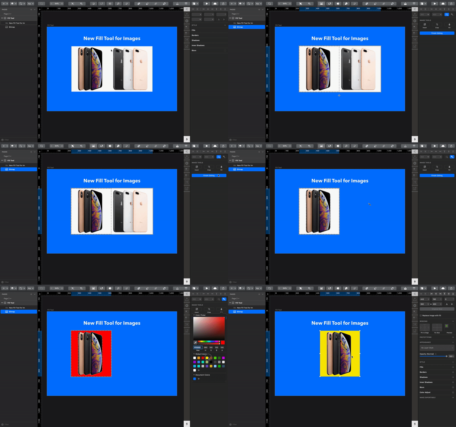
New Fill Tool for Images
First God created Photoshop for UX Design. Then he cut almost everything from it and called it Sketch. And if you missed the good old days when there were tons of photo editing features, you will like this one.

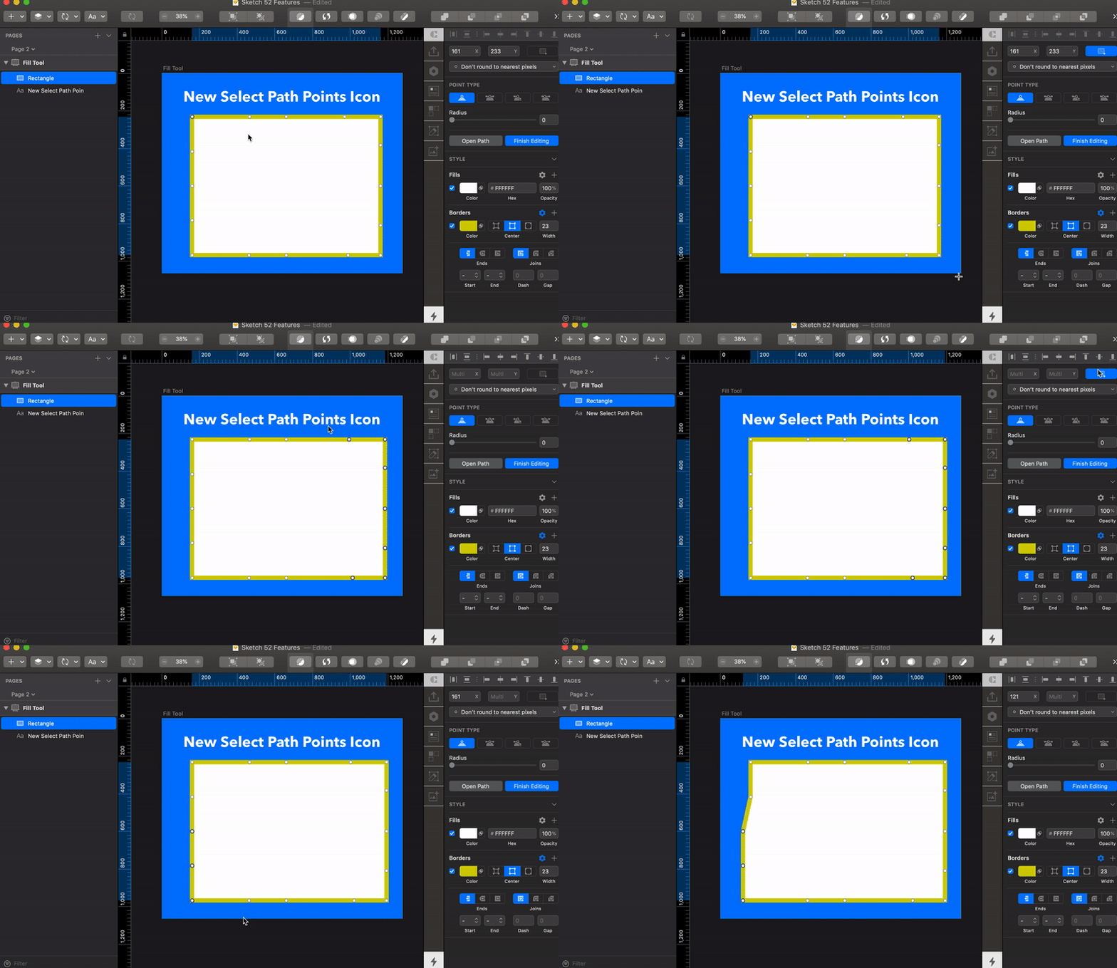
Select path points icon
“I used this feature before”. I know, I know… you can stop writing your comment. This feature was available before, but apparently not many users knew about its existence. This is the most funny button that I have ever seen. Basically, it doesn’t do anything. The only purpose of it, is just to show you that you can select multiple path point.

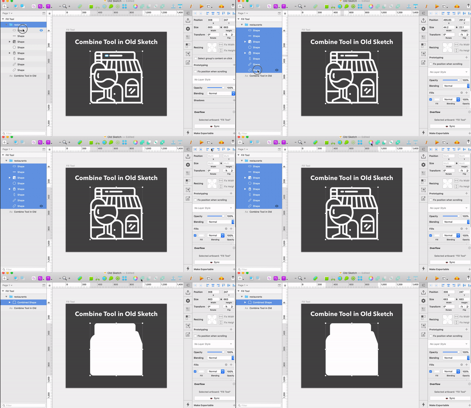
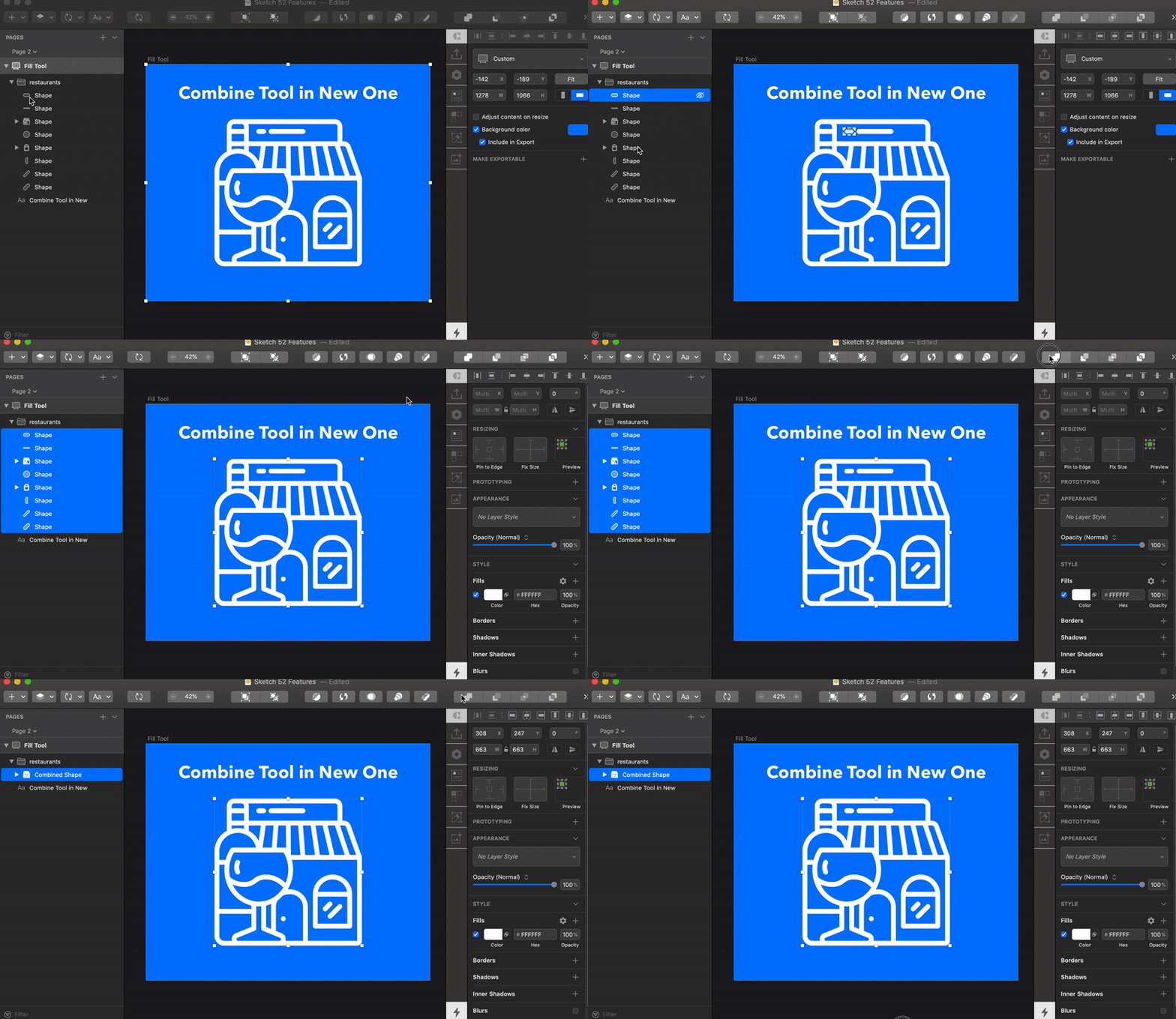
Combine tool
It probably should be on the “Enhancements & Bugs Fixes” section, but it was such a nice thing to discover, that I thought it deserves to be here or maybe even in it’s own section. One of my colleagues (Hello, Olia) has recently worked on the big project where she was working on redesigning icons and she had to manually combine more then 300 complex icons. And now it can be done with one click.


Summary
The day when robots will steal our creative jobs is far enough, so we can just keep drinking smoothies and talk about weird hipster things without worries. And now we can be even more creative because computers make general pixel-moving processes faster so we can focus on what really matters — creating best experience for our users.
What we want next?
Now Sketch team finally shaped the symbols to the way that it should work, but we still have lots of problems in our lives. Here is my waiting list for the features in the next versions:1.Real time collaboration with other designers. Working as a team allows us to do better job faster, generate more ideas and control overall quality of a project. But even Libraries can’t save you from constantly asking if your colleague is working on the master file and if they could close it “just for a sec”. 2. Fast and easy way to share & check your work with clients. I don’t remember a day, when I didn’t have a sync problem with the You-Know-What-Design-Tool: constant logouts; artboards syncs to the wrong places, hotspots from the file don’t sync to the cloud just when the client should call; no way to simply copy-paste hotspot and you can probably name even more.3. Native autolayout features. I don’t know why but when I use Autolayout plugin in my file, no one from my team can work with them. The elements just randomly move all over the artboard. And now when Sketch made separate tab for Resizing it’s only logical to wait for stack groups and content based resizing for paddings and margins.
