
What’s on — website redesign
Improving the What’s On — background user research for a website redesign
ACMI is a vibrant museum, with a lot to offer — often much more than is easily communicated to first-time visitors. We have three galleries, two cinemas and two studios for drop-in and ticketed events. Over the past couple of months, we’ve been researching how visitors plan their visit so they get the most out of our museum. The website’s What’s On needs to showcase that offer and motivate visitors to plan a full experience.
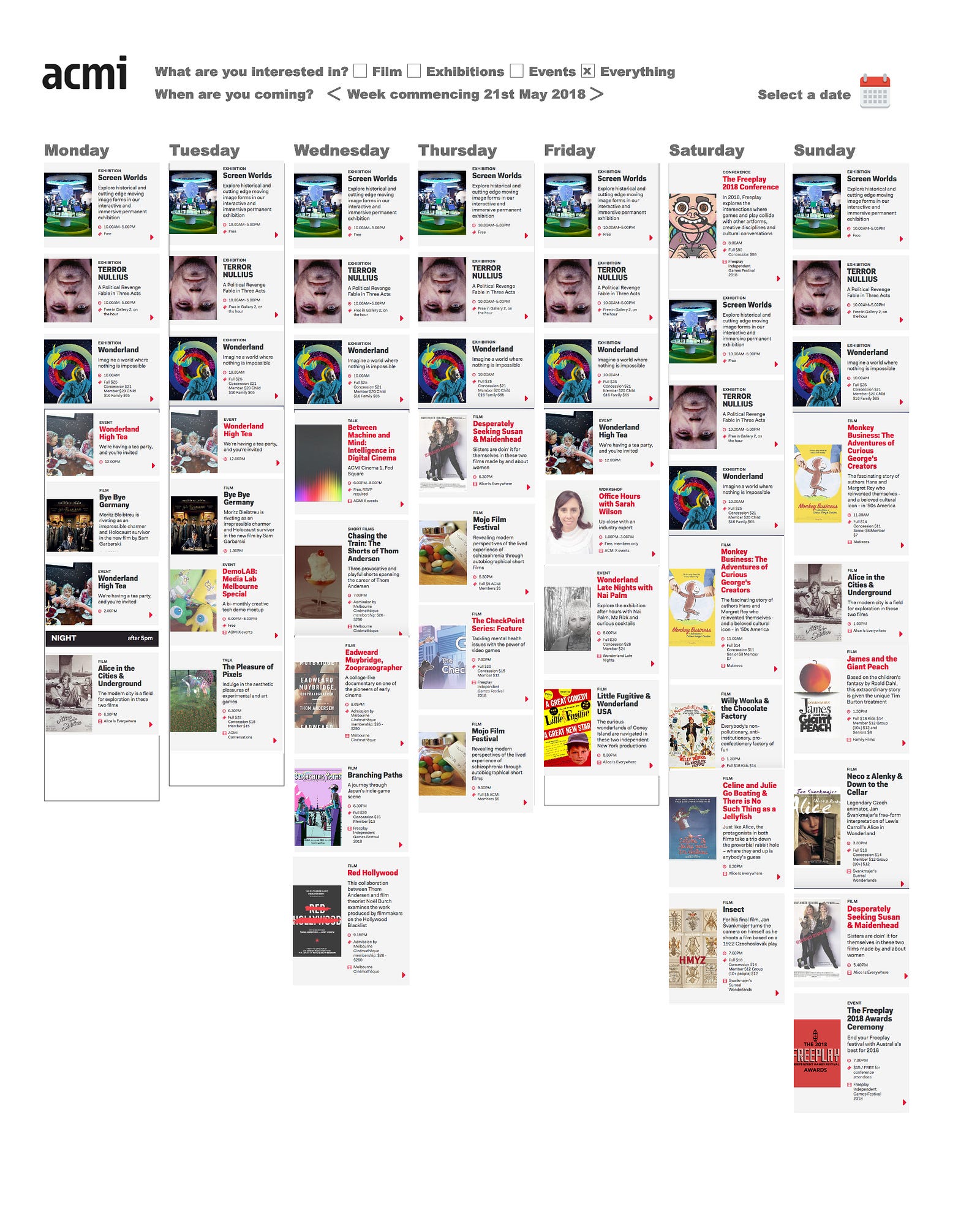
The What’s On Calendar is notoriously tricky as it has to be a one-stop shop for all of our different programs and audiences. There’s a lot of information to get on a small amount of real estate — title, description, time, pricing, recommended age and location.


When our current website was launched in 2017, the
Methodology
Our Product Manager, Lucie Paterson ran a design sprint to explore user feedback and come up with a solution to help users plan their visit to ACMI. We started by mapping users needs, journey mapping and drawing up a paper prototype each. The selected prototype below, created by our creative front-end developer Andrew Serong solved a lot of the issues raised by the feedback.


Having worked as a Visitor Services Supervisor for many years before joining the Experience & Digital Team, Andy has a deep understanding of our audience’s needs. Not only did the design give a week’s eye view of ACMI’s offer it also made clear the different programs we offer. Many visitors new to ACMI don’t realise we have cinemas and run screen-based events.
The design integrated filters on the type of program, ie ‘film’, ‘events’ or ‘all’ and day filters for the mobile version. Over two days he created a static HTML prototype and uploaded to Surge for live testing.


I started testing this prototype with visitors in the museum, especially our film audience who are the most avid users of the What’s On. Not surprisingly for our screen-savvy audience, almost all users wanted a visual cue or image of the program, event or film to give them immediate recognition.
“It needs visuals to pique my interest in what the programs are. The titles don’t mean much to me. I have no idea what the exhibitions are.”
Users also wanted more detail — a time and a title didn’t give them enough information to make a decision. They wanted to see on first click whether the event was a film, exhibition or event.
The top filters were not obvious and blended too much with the information on the page. Users didn’t click on the filters to drill down into the programming. One user suggested a friendly prompt or call to action to select a filter would help.
When I integrated this feedback into Andy’s prototype design it looked like this:

I immediately knew we had to rethink the design. Inspired by BAM’s film calendar, I changed the design back to a day view but with a more obvious navigation bar through the days of the week. I made iterations to the prototype using the much speedier prototyping tool Adobe XD and was able to whip up a multi-layered prototype in an afternoon.