
Plotting Markowitz Efficient Frontier with Python
Plotting Markowitz Efficient Frontier with Python

This article is a follow up on the article about calculating the Sharpe Ratio. After knowing how to get the Sharpe ratio, we will simulate over a few thousand possible portfolio allocations, and draw the outcomes in a chart. With this we can easily find out the best allocation for our stocks for any given level of risk we are willing to take.
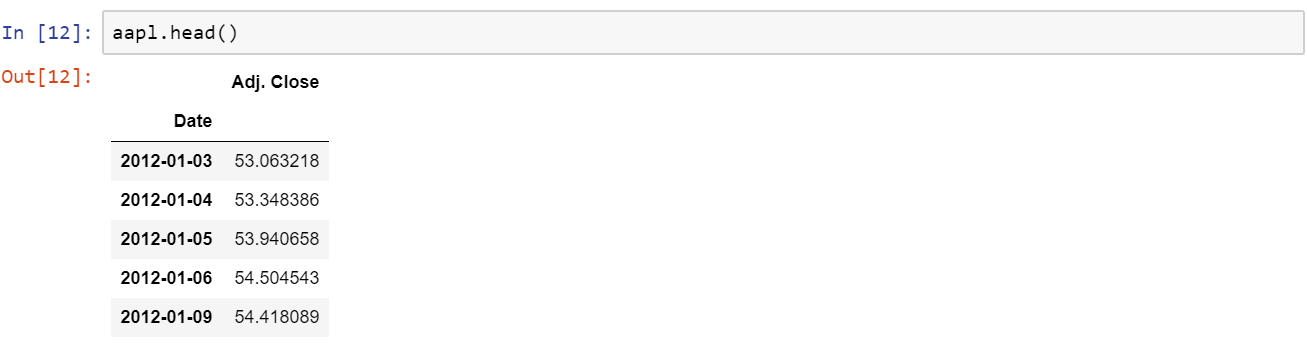
Like in the previous article, we will need to load our data. I’ll be using four simple files with two columns — a date and closing price. You can use your own data, or find something in Quandl, which is very good for this purpose. We have 4 companies — Amazon, IBM, Cisco, and Apple. Each file is loaded as amzn

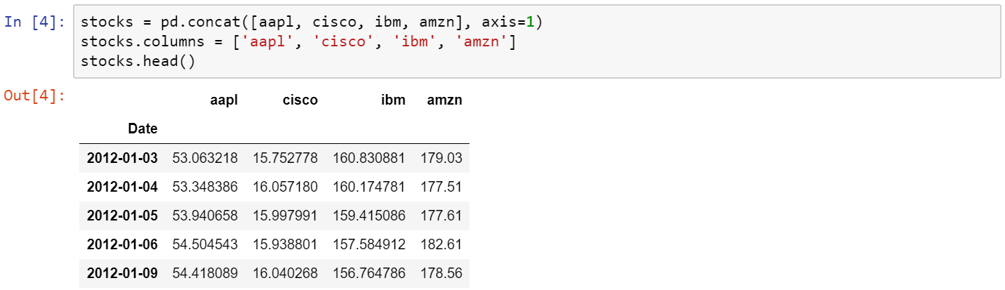
We want to merge all prices in a single dataframe called stocks, so here’s a way to do it.

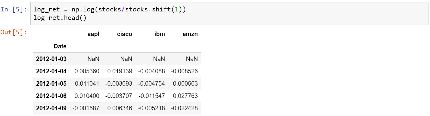
One of the things we need to do with this dataframe is to normalize the data. I’m going to use logarithmic returns, since it’s more convenient and it takes care of the normalization for the rest of the project. Converting everything to logarithmic returns is simple. Think of it as the log of an arithmetic daily return (which is obtained by dividing the price at day n, by the price at day n-1).

Things start to get interesting around this point! We need to prepare a for loop which will simulate several different combinations of the four stocks and save their Sharpe ratio. I’m going to use 6000 portfolios, but feel free to use less if your computer is too slow. The random seed at the top of the code is making sure I get the same random numbers every time for reproducibility.
From here we can get the maximum Sharpe ratio present in the simulation and the row where it occurred, so we can get the weights in it.

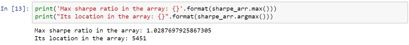
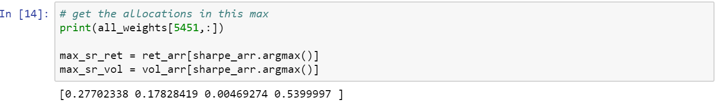
So the best portfolio is on index 5451. Let’s check the allocation weights in that index number and save the return and volatility figures to use it in the chart later.

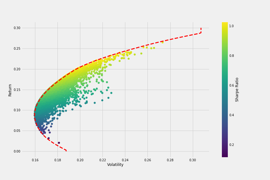
We have everything we need to plot a chart that compares all combinations in terms of volatility (or risk) and return, colored by Sharpe ratio. The red dot is obtained from the previous calculation above and it represents the return and volatility for the simulation with the maximum Sharpe ratio.

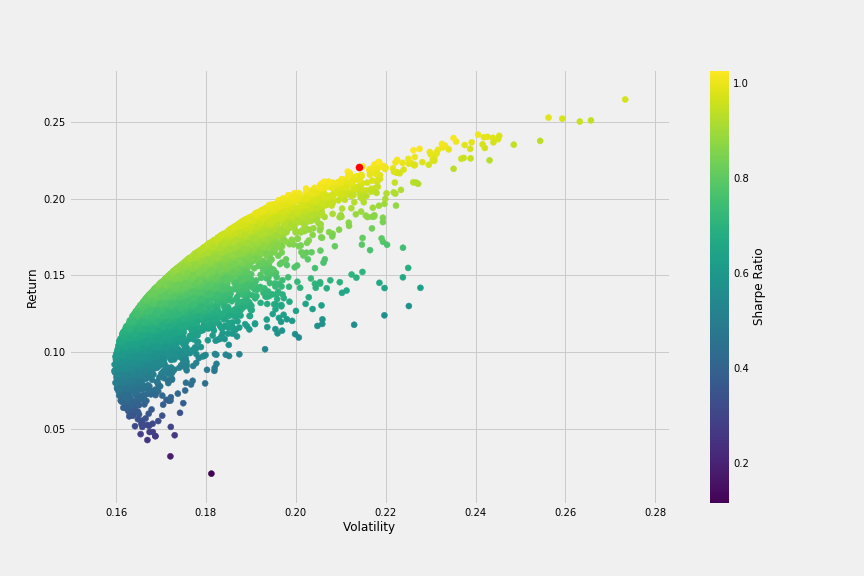
We can already see the bullet shape in the chart, which kind of outlines the efficient frontier we will plot later. To get there, we need to define a few more functions. The first function get_ret_vol_sr will return an array with: return, volatility and sharpe ratio from any given set of weights.
The second function neg_sharpe will return the negative Sharpe ratio from some weights (which we will use to minimize later).
The third function check_sum will check the sum of the weights, which has to be 1. It will return 0 (zero) if the sum is 1.
Moving on, we will need to create a variable to include our constraints like the check_sum. We’ll also define an initial guess and specific bounds, to help the minimization be faster and more efficient. Our initial guess will be 25% for each stock (or 0.25), and the bounds will be a tuple (0,1) for each stock, since the weight can range from 0 to 1.


Enter the minimize function. I chose the method ‘SLSQP’ because it’s the method used for most of the generic minimization problems. In case you are wondering, it stands for Sequential Least Squares Programming. Make sure to pass the initial method, the bounds and the constraints with the variables defined above. If we print the variable it will look like this:

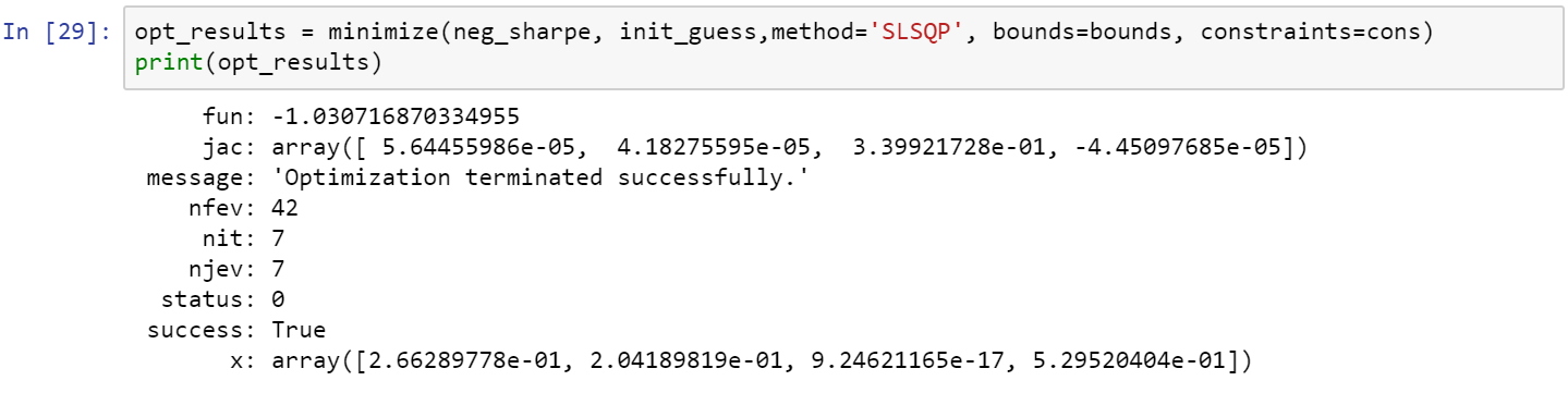
We want the key x from the dictionary, which is an array with the weights of the portfolio that has the maximum Sharpe ratio. If we use our function get_ret_vol_sr we get the return, volatility, and sharpe ratio:


So we got a better Sharpe ratio than we got with the simulation we did before (1.0307 as opposed to the previous 1.0287).