
Turning a website into a mobile app
Turning a website into a mobile app
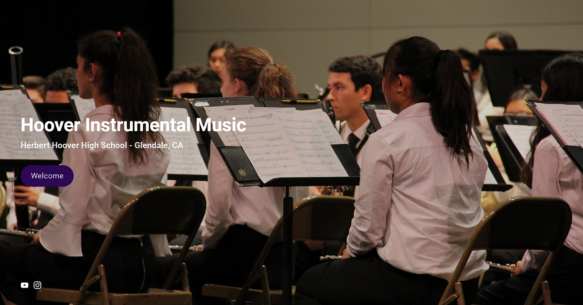
I am working with student, Luis Figueroa, to turn Herbert Hoover music program’s website (http://www.hooverband.net/home-1) into a mobile app. Specifically, I am designing the information architecture of the mobile app for a specific audience by undergoing iterations of the design process.
Initial Brainstorm
We will be using user-centered design and the double-diamond tactic to figure out where to start with the designing process.
Finding the target demographic
With user-centered design, we have to first identify our user.
We notice that the current information design of the website is catered to
- The music students participating in the music program
- Parents of these participating students
- General audience who might want to learn more about the different music programs
Let’s pick one. We decided to cater to the demographics of participating music students, the younger demographic of the rest. There are a couple of reasons why we chose this audience:
- Most of the active participants in these music ensembles are the students.
- Most high schoolers own a cellular device in this day and age.
Thus a mobile app would be ideal to reach this audience.
Finding the problem
Before we can start designing to solve problems, we need to identify the right problem in the first place. We explored all possible problems (diverging) and narrowed down the core problem to focus on (converging).
We explored all possible problems by putting ourselves in student’s shoes, walking through the website, and listing out potential problems as well as very small trivial problems. “Bad image quality” was shamefully one of them.
After we listed out the list of problems, we agreed that the main problem is the website tries to cater towards too many audiences — parents, visitors, students, and anyone. The website is sort of like a barf of information. Yes, the website has everything you’d need, but it can be organized better to fit a student’s needs.
And because the website has a wide reach, it doesn’t offer specific, useful features that satisfy a student’s needs.
For example, there is no way to alert students about last minute updates or news on the current website. There is the main calendar but it passively exists. What if a rehearsal gets canceled? The main calendar would silently change without letting anyone know.
All in all, the problem is that the website doesn’t cater to specific students, which is understandable.
Finding the solution
Now that we have the problem, we need to find the right solution. Similarly to the process of finding the problem, we will be diverging and converging. Let’s put on the thinking cap!
We thought of two main solutions given the problem that we have chosen:
- Make it a closed platform by creating a student portal like Moodle/Blackboard/Canvas so that students can access ensemble information that they need.
- Keep the platform open and informative by reorganizing useful, existing information and removing the unnecessary information.
Time to diverge and choose one. We chose the latter because we want to keep the app open and less complicated, especially since we intend the app to still be an informative, static app, similar to its website inspiration.
Defining user goals
Now that we have the target demographic, problem, and solution, we can define a list of goals that the user might have, which we will turn into features. Since I teach these students, I believe that they might be interested in the following features:
- Calendar of music events/competition/rehearsals.
- Individual pages per ensemble that contain important info (audition dates, rehearsal changes, etc).
- Access to media content.
- Access to important forms (i.e. music, itineraries, contracts, handbooks, etc)
- Important updates/notifications
- Link to pay fees
- Shopping store for ensemble shirts, marching shoes, and equipment or anything required.
While most of these features already exist, we want to rearrange them so that they are more relevant and easily accessible for our specific demographic.
Design Flow
Next step: time to start designing, building, and testing. We completed 2 iterations. This meant that we created 2 prototypes.
The first prototype is a basic wireframe that we created in Invision so that we can test and improve our user flow. Then we tested that design on a user of our target demographic for feedback.
User Testing Procedure for Prototype #1
To get feedback on our initial wireframe, we asked a Herbert Hoover student who is a part of the Percussion Ensemble to partake in a user test. We proceeded by letting her know that
- We want to test our design of the band webpage on her
- We will be giving her tasks and observing how she achieves them through the mockups
- She will need to use her imagination since the mockups aren’t interactive
- If she fails a task, then the fault is due to us, not her
- We can’t answer any questions
- She should think out loud so that we can understand her thought process
With these rules in mind, we then asked the student to complete four tasks:
- Buy a band shirt
- Find her rehearsal schedule
- Find out the audition day of other ensembles
- Access the itinerary of a potential competition
For each task, we asked her to start at the main screen wireframe and tell us what she’d do next (i.e. “I’m going to tap/slide/hold this”). Based on that, we presented her the corresponding wireframe. When she completed the task, we let her know, asked for feedback, and then moved on to the next task
Using those feedbacks, we then created a high-fidelity prototype using Powerpoint to be tested again (we didn’t have time to incorporate it into Invision). We were supposed to then conduct a second user test, but we weren’t able to completely finish it to incorporate in the deliverables.
I will be walking through the design journey of each page and include relevant information from the user testing feedback.

Splash Page
To the left, you’ll see the website’s splash page. We initially didn’t include a splash page for Prototype #1 (hence why you don’t see it) because I personally thought that the website splash page was annoying. I didn’t like how I am required to click “Welcome” to get to the home page.

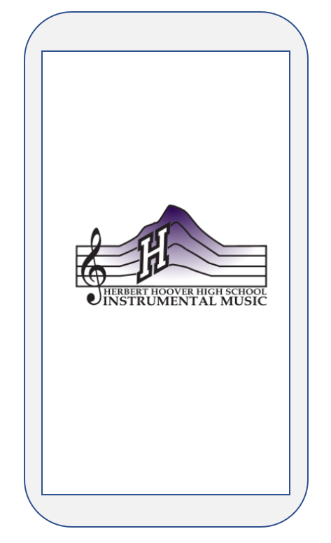
However, I realized that a splash pages are great for branding, and if used correctly, doesn’t have to be an annoying UI/UX feature. So, if we use the splash screen as a mobile loading screen, then we can both preserve the brand and implement a smooth transition into the app without annoying people like me. To the left, you can find the splash screen from Prototype #2.
Tab Menu


Next, we’ll look at the tab menus so that you are aware of the resources that the page offers.
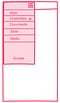
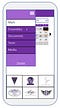
Above, you’ll see the website’s tab menu options. To the left, you’ll find our wireframe of the mobile’s tab menu. The difference is that we removed the “Welcome” tab since it is an unnecessary splash image page. We also removed “Boosters”, “Sponsors”, and “About” because we believe that these tabs might be irrelevant for these students.
We also turned the menu into a hamburger menu to follow the mobile UI standards.
The “Donate” button is link for students to pay their fees. We call it “Donate” because schools can’t force students to pay.
The “+” of ensemble is supposed to signify that ensemble has subitems, which are accessible by tapping on “Ensembles”.
Prototype #2
Nothing has changed from the wireframe to this prototype because the user from user test #1 had no trouble tapping on the hamburger menu icon to find more available information. This intuition to tap on hamburger menu is not a a surprise to us!
We incorporated purple into the menu because Hoover’s school color is purple. We also wanted to signify the user of the current active activity by highlighting the tab as white.

Main page
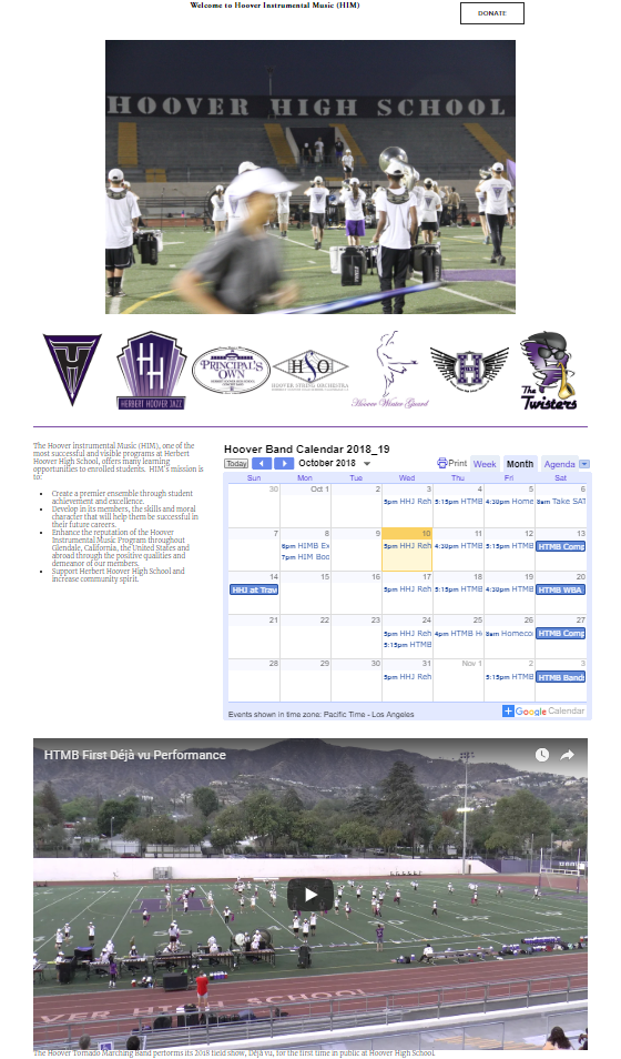
Website
To the left is the website’s main page. It is cluttered with elements. The clutterness might suffice for a webpage since there is more area to cover, but we had to be careful with including relevant information on a tiny mobile screen.
We decided that we wanted to remove the long informative paragraph about the entire music program. (Kids don’t like to read anyways). We also decided to remove the media to declutter the mobile screen and make room for announcements.

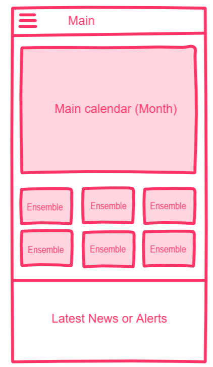
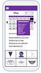
Prototype #1
This is our initial wireframe for the main page.
We included the main calendar since it is a useful tool for students to see what other ensembles are up to and when their own practices take place.
Below the main calendar are links to individual ensemble pages. We kept the ensemble logos as a way to signify the ensemble components as well as preserve the brand of each ensemble.
Below the ensembles are the announcements that require attention. This feature does not exist! Test user #1 really like this idea when she saw it.
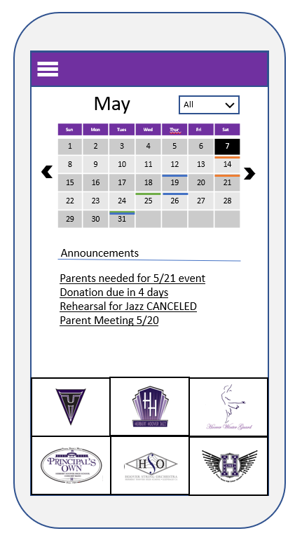
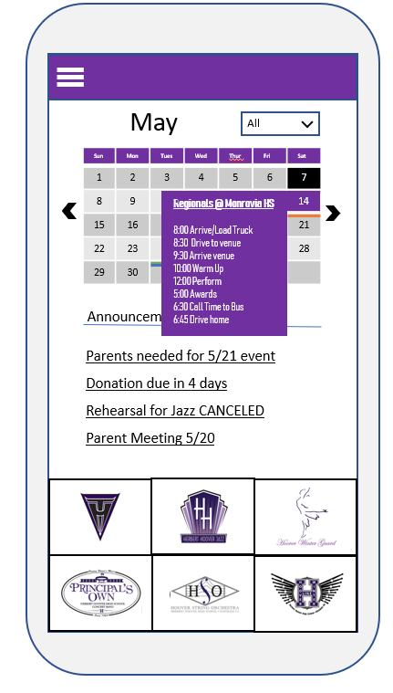
Prototype #2
We kept the announcements but put it in the middle for UI reasons. Keeping the boxes in the middle looked weird.
We created a new feature, the main calendar filter, after analyzing the results of user testing #1. When we asked the user to find the audition days of other ensembles, we intended for the user to check out the individual ensemble pages to access the ensemble weekly calendar view, a new feature not included in the website. Instead, she believed that she completed her task by “looking through” the main calendar. Although technically correct, she didn’t go through our intended user flow. This is probably because she is so accustomed to the website’s main calendar, the only calendar, that it was not intuitive for her to explore the ensemble pages. We were left with two choices: make more improvements to guide users towards what we want them to do, or improve the main calendar so that they get the benefit of better design without any battle what they’re conditioned to do. We chose the latter and added color-coded filters to the main calendar. They can filter the ensemble activities conveniently in the main page!
We also thought about incorporating event itineraries into the calendar view (see left) in conjunction to having the itinerary live in the Documents tab, like the website version. This way, users can access everything that they need from an event through intuitive actions of tapping on eventful days, cued by the colored filters.
We moved the ensemble links to the bottom so that users can easily reach them. This was something that we thought about that was not influenced by the user testing as they didn’t interact it on a mobile device.
All in all, we realized that we can make the main page a one-stop-shop in itself.

Ensemble Page
To the left, you’ll see the website version of the Orchestra ensemble page. The page is cluttered with unimportant information for students besides the media.
We attempt to reorganize the page so that the page contains more information while maintaining a neat look.
Prototype #1
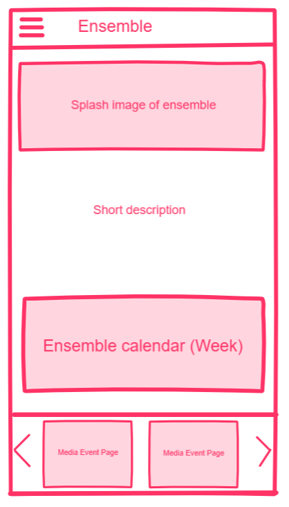
We liked the idea of topping the page with a splace image of the ensemble so that users know what the ensemble entails. We also wanted to add a short bio about the ensemble so that interested students can learn more about the ensemble.
Below the short bio is a weekly view of this ensemble’s activities. The purpose of including a weekly calendar in addition to the main calendar is to make the ensemble page a one-stop-shop for participating students. It is also another way for students to declutter if they choose not to deal with the chaos from the main calendar.
Below the calendar view would be media links to events of the ensemble. This helps make the ensemble page a one-stop-shop! The arrows indicate that the user can interact with the list to navigate through the options.


Prototype #2
After testing on user #1, we were content with our original ideas. Although the user didn’t initially proceed towards the ensemble page to complete the tasks, we figured that was not a design flaw but more of a user being conditioned of navigating through information a certain way. That is fine. We focused on figuring out how to add ensemble content without cluttering space. Therefore, we decided to include the “About Us”, “Schedule”, and “Get Involved” tabs rather than barf out the information as the website did.
We added a scroll bar at the bottom of the Media segment in hopes that the young user would know to swipe horizontally. We included the arrows to help navigate the list as well.

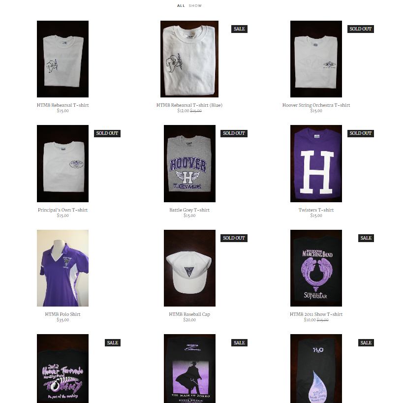
Store
To the left, you’ll see the website version of the store. It is basic and clean.
Prototype #1
What we noticed is that there are only two filters: All and Show. Instead, we want to highlight the general items that students might need (i.e. required rehearsal shirts, hats, marching gloves, etc) in the top section.


In the section below, we wanted to give users the chance to display filtered items. This gives the student the ability to sift through items that are relevant to them, which saves them the stress if there are many items in the inventory.
In the wireframe, the items are in a black box with zero information on how a user would add to the cart, but the wireframe assumes that the user can add an item on the same page. What we notice from the website is that you have to tap on the product to access the form to buy the item, which is an extra step that we wanted to avoid

Prototype #2
User from user test #1 suggested to us that we should include a “sale” option as a filter since the website store has items on sale. Therefore, we included the “sale” UI and (although not pictured) imagined that “sale” would be one of the filter options.
Building the high-fidelity model forced us to really think about how the user interacts with the page, something that we didn’t give much thought throughout Prototype #1 and even user test #1.
Therefore, we changed and added several things. First, we removed the separate “general items” component and instead have it display as default filter. Less screen space is wasted that way.
We also removed the top right arrow to be next to the subtotal because user’s thumb will be closer to the bottom than to the top of the screen. We are unsure if users will know to tap the bottom bar though. Websites have the hover effect to signify users if something is clickable; mobile interactions don’t include hovering (yet).
The “V” arrow of each drop down indicates a drop-down menu for users, and the cart icon is intuitive to understand, especially if the subtotal updates instantly to users adding/removing items.

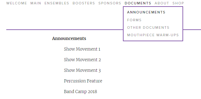
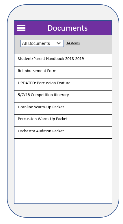
Documents
You know the drill! The website has a “Documents” tab that has a dropdown menu to categories of documents. That was confusing for us.
We believe students would want to see documents that are relevant to them and their ensemble while being aware of general documents that can apply to them. And so we built our prototype #1 around that idea.
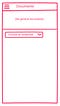
Prototype #1
The top section should list all general documents that are relevant to every student in Hoover’s music program so that they’re always in view. Below, the user can display specific documents by using the filter dropdown.
The user from user test #1 was fine with this wireframe because it resembles the website version, except it has an extra feature of filter option by ensemble rather than by broad categories. She thought it was a neat idea.
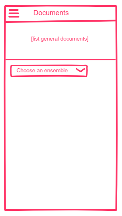
We decided to scratch it for Prototype #2 though…
Prototype #2
We figured that requiring a general list to be on top would take up a lot of top space, forcing users to scroll down to access potential relevant documents if they have no use for the general documents. So instead, we decided to include “General documents” as a filter option and make it the default one. Also with this fix, the filter option isn’t awkwardly in the middle of the screen.
Takeaways
We know that we didn’t include the bottom system menu bar that most phones now have, but the current mobile design allows the user to navigate to any page via the hanburger menu. Future steps would be to think about next wireframes (i.e. when user taps on a document or tries to buy something) and how the UI/UX should flow.
We also rely a lot on the user knowing about mobile conventions, such as accessing the hamburger menu for more information and knowing which menus are drop down and clickable due to the “v” arrow.
We also notice that some of the sizing dimensiond of clickable elements might be too small if used on a mobile screen. This would be fixable if we figured out how to use Invision’s prototype tool in time, but we tried our best to think about the mobile user experience as we created the high fidelity wireframes (i.e. move around clickable elements to the bottom).
As far as why the hamburger menu is on the left side given that more general users are right handed than left, we built it by experience. Hamburger menu of Android devices are usually on the left side. Perhaps next time, we should explore placing the menu on the right side.
Conclusion
Although we weren’t able to finish out user test #2 on our high-fidelity prototypes, we learned a lot about the design process and how all-over-the-place it can get. Sometimes, we’d form a new feature through studying the user testing feedback such as adding filters in the main calendar. Sometimes, a new idea for a feature popped in our heads during the redesign process such as adding the new tabs in the ensemble pages. With every new feature and every improvement requires user testing. The endless design cycle can either be fun or excruciating. Luckily for me, I had fun, especially since I’ve always thought about improving Hoover’s website….