Simpson’s Paradox: How to Prove Opposite Arguments with the Same Data
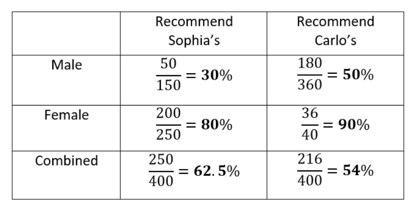
Simpson’s Paradox occurs when trends that appear when a dataset is separated into groups reverse when the data are aggregated. In the restaurant recommendation example, it really is possible for Carlo’s to be recommended by a higher percentage of both men and women than Sophia’s but to be recommended by a lower percentage of


The data clearly show that Carlo’s is preferred when the data are separated, but Sophia’s is preferred when the data are combined!
How is this possible? The problem here is that looking only at the percentages in the separate data ignores the sample size, the number of respondents answering the question. Each fraction shows the number of users who would recommend the restaurant out of the number asked. Carlo’s has far more responses from men than from women while the reverse is true for Sophia’s. Since men tend to approve of restaurants at a lower rate, this results in a lower average rating for Carlo’s when the data are combined and hence a paradox.
To answer the question of which restaurant we should go to, we need to decide if the data can be combined or if we should look at separately. Whether or not we should aggregate the data depends on the process generating the data — that is, the causal model of the data. We’ll cover what this means and how to resolve Simpson’s Paradox after we see another example.
Correlation Reversal
Another intriguing version of Simpson’s Paradox occurs when a correlation that points in one direction in stratified groups becomes a correlation in the opposite direction when aggregated for the population. Let’s take a look at a simplified example. Say we have data on the number of hours of exercise per week versus the risk of developing a disease for two sets of patients, those below the age of 50 and those over the age of 50. Here are individual plots showing the relationship between exercise and probability of disease.
