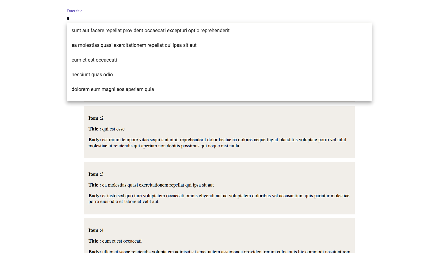
Search bar with autocomplete using Angular 5 and Angular material
Search bar with autocomplete using Angular 5 and Angular material


While trying to build an Angular project, I have search a lot for any possible tutorial to build a search bar having auto-suggest using angular material, but haven’t found any. So I came up with a solution of my own. Its one of the many ways to build a search bar in angular. The reason behind using angular material is, it makes our life lot easier while tinkering with Observable and design elements. We will be needing Angular 5, Angular material, a fake REST API from
The GitHub code is available here.
Step 1. Lets get started
Well, I am assuming, if you have reached here, you might as well be comfortable with getting started with Angular CLI and npm. If not, I would suggest you to go through this link, for a detail view.
Considering, you have your angular CLI and npm installed, browse through the desired folder location where you would like to keep your project. Once inside the location, lets create an angular project and install angular material using following set of instruction
> cd Desktop/angular-projects/> ng new search-bar> npm install --save @angular/material @angular/cdk @angular/animationsWe will be needing two components in this project. One is to show all the data, other is the search bar component. The reason behind keeping search bar in different component is to make it a reusable component. First browse inside our project and lets create our components :
> cd search-bar> ng g c component/home-page --spec=false> ng g c component/search-bar --spec=false
If you want to generate the spec files , you can remove the command “— spec=false” from the above command.
we will also be needing a service to share data between components. Lets generate a service file.
> ng g s data --spec=false
The file name with the above command will come up as data.service.ts . Import the service file in app.module.ts file and add it to providers :
Lastly open style.css file and import an angular material theme along with material icons :
@import '[email protected]/material/prebuilt-themes/deeppurple-amber.css';
@import url( 'https://fonts.googleapis.com/css?family=Roboto:400,700|Material+Icons');
Step 2. Import all the modules
Since we have created our project and all its components, its time to import all the installed component modules in our app.module.ts file. The components we have generated using angular CLI (home-page, search-bar) will be automatically imported to app.module.ts file. But we need to import angular material components. Since we are using only BrowserAnimationsModule, MatAutocompleteModule, MatChipsModule, MatFormFieldModule, MatIconModule and MatInputModule.
lets import these components:
App.module.ts till this point :
Step 3. Get the data from API
Since we will be using a fake REST API, its time to bring the data to our application. We will be using a service to get our desired data. In this case, it will be handled by the data.service.ts file that we have generated above. Before getting the data from the API, let’s first declare an interface corresponding to the data that we will be using. Create a new file called post.ts:
Now we are ready to get the data. The service file data.service.ts will look like this at this point:
Remember to include HttpClientModule in app.module.ts
import { HttpClientModule } from '@angular/common/http';imports: [HttpClientModule]
Data is now ready to be viewed in the app.
Step 4. Build the app view and search bar
We have to display our data and home page is going to display the data as well as hold the search bar component. I have kept the CSS very basic.
home-page.component.html
home-page.component.ts
There might off course be better ways to get the data on load, but lets keep it beyond the scope of this article. Now, lets design the search bar. Note: whenever we select an option from auto-suggest list, we will be showing that option inside a chip. That’s the reason of using mat-chip. The HTML for search bar ( search-bar.component.html) will be something like this:
Now lets edit the search-bar.component.ts file where most of the autocomplete logic will go.
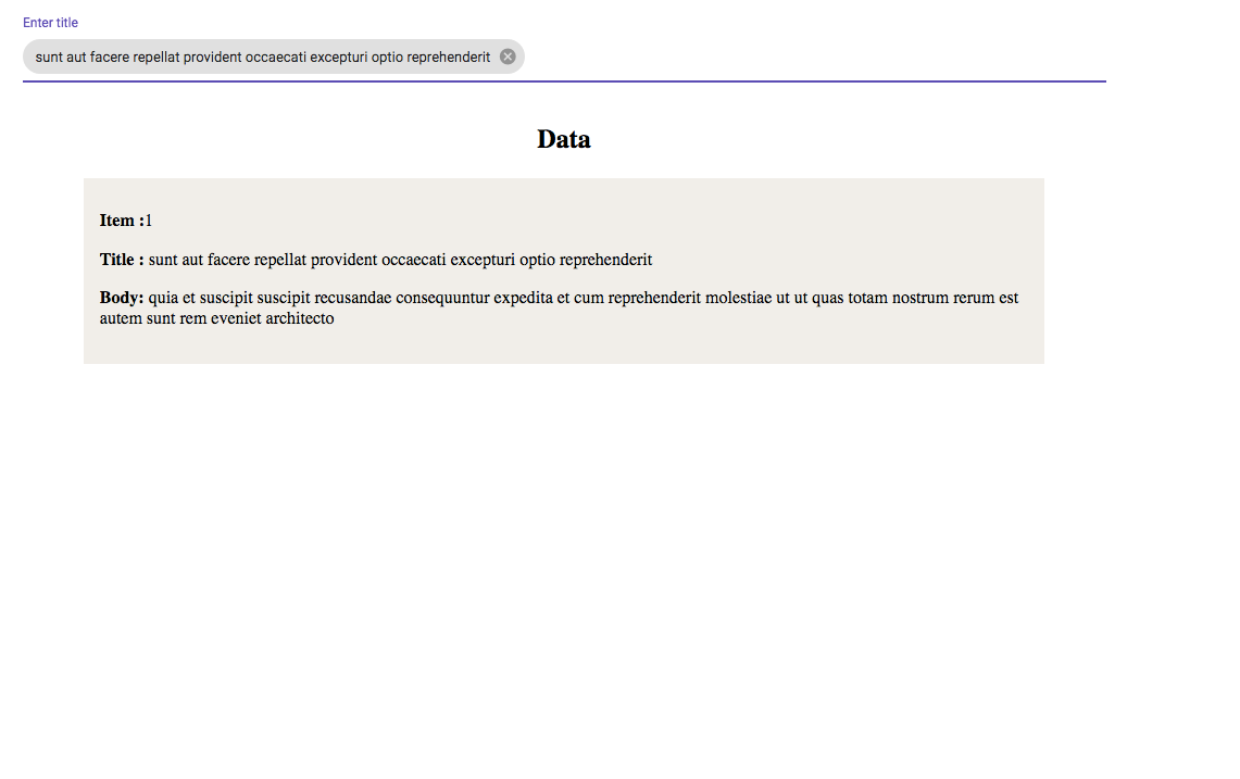
Till here, we have completed our auto-suggest feature of our application. On selecting an option filterPostList() function will run and the option will be pushed to an array. On removing the option from input, removeOption() will trigger and will remove that particular option from the array. It will look something like this.


Important thing to note is whatever option we are selecting from the auto-suggest, we are pushing that value inside an array called dataService.searchOption as seen inside the function filterPostList(). It will help us to filter the post list in correspondence with the selected options. The reason behind keeping the array in service is that we might need it in different component.
Step 5. Trigger the search
Now we have a decision to make in front of us. When user selects any option from auto-suggest list how do we trigger the search event ? One option is to give a button. In that case user will select an option and click the button to create an event that will filter his search. But in this example , we will take a different approach to this problem. We will use Angular EventEmitter.
Now we will import Output and EventEmitter inside search-bar.component.ts
import { EventEmitter, Output } from '@angular/core';export class SearchBarComponent implements OnInit {@Output() onSelectedOption = new EventEmitter();
}
The idea behind this is whenever user select any option from the auto-suggest list, we will emit the array that is holding the option. In this case this.dataService.searchOption is holding the selected options and this.onSelectedOption is emitting it as:
this.onSelectedOption.emit(this.dataService.searchOption)
Add onSelectedOption as inputto the home-page.component.html as:
<app-search-bar (onSelectedOption)="onSelectedFilter($event)"></app-search-bar>
Now lets define the function onSelectedFilter() in home-page.component.ts. We need to change the array which is responsible for showing the data in home component as soon as any option is selected in search bar component. The home-page.component.ts file will look like this:
According to above code, if we select any option from auto-suggest, array dataService.searchOption will replace the array post and in the view we will see the results matching the selected option.
Now , Its time for the final step and that is to write the search logic.
Step 6. Search logic
For the sake of simplicity we will search all the posts based on title. Since we will be calling search logic from different components , its necessary to write the logic in a service, In this case, data.service.ts file so that we can inject in any component. The function filteredListOptions() will hold up the search logic and return an array filteredPostsList which has the filtered result we need. The file will now look like this:
Conclusion


Now we have completed our auto complete filter project. Here is the link to the code in GitHub. Its my first ever article online. I would appreciate any feedback to improve further.
