A lightbulb is not an idea!
A lightbulb is not an idea!
How images support your text

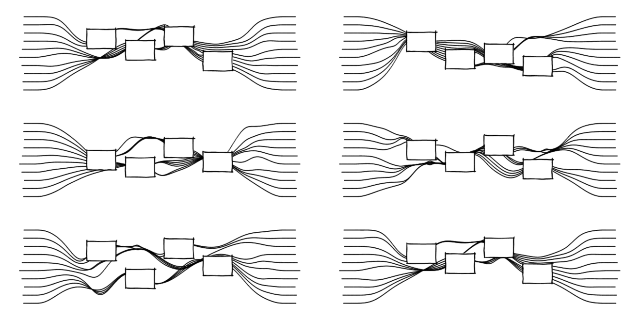
Why do some images support a text better than others? Let’s start with a quick example:
Illustration of an idea
Creativity is the ability to imagine something that isn’t there — yet. Its core ingredient are ideas. An idea is a new thought that springs up from existing knowledge. Thoughts collide and form — something “clicks” in our mind.


If you want more ideas, it helps to have more knowledge. We first immerse ourselves in a topic and learn about a subject as much as possible. The more thoughts we have on what is, the likelier it is that some of them combine to an image of what could be.


The typical creative cycle has two parts: to take in knowledge and then let your mind do its associative magic. Creative work is basically like breathing. We take in information and emit new ideas.


Now let’s get back to what makes a good illustration! How did the images above help me make my point? How did they support the text?
Images are always there.
If we want to know what a text means then we actually have to read it — from beginning to end. And once we have done that, the words quickly vanish in a grey texture again. It is easy to forget them. Text is only present while you are reading it,

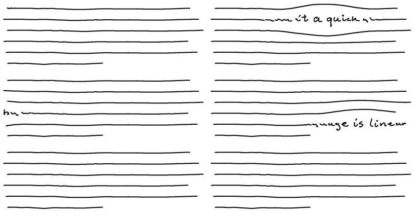
Images are structures in space. They are always right there and can be recognised immediately. These anchors in space amidst the flow of words in time help us remember what the text is about.
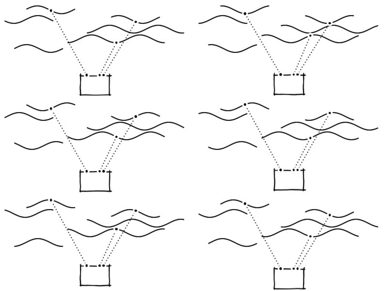

They do this particularly well if they are specific and unconventional.
Drawings are specific.
When I ask you to imagine “a tree”, every reader will have a different image in mind. The word “tree” is a placeholder for any tree. A drawing on the other hand shows a particular tree.

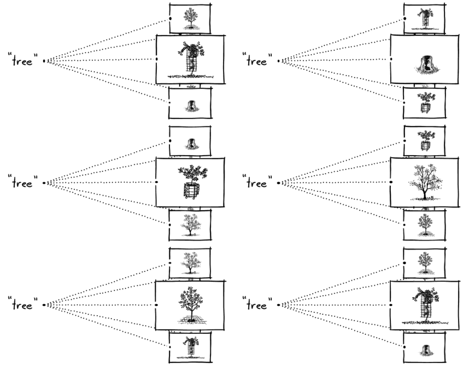
Words are conventions, abstract placeholders. Unconventional drawings on the other hand are more specific. They form a bridge between the actual experience of a tree and the conventional word.

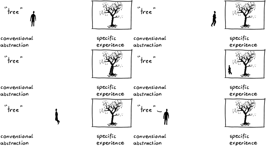
With conventional placeholders, such as words, we can describe patterns for a large number of situations. On the other hand it is easy to fool yourself (and others) with words, since you can avoid to be specific. Any business meeting can confirm this.
When you draw something you are forced to be specific — and honest.
Our illustration of an “idea” from above is unconventional in the sense that it conveys specific original thoughts of what an idea is. It adds value to the words.

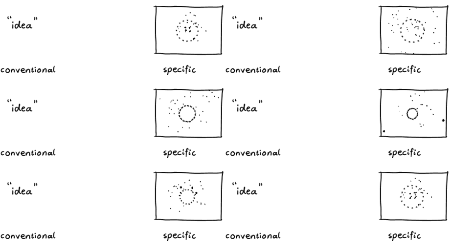
And that is the catch: The drawing must be unconventional to support the conventional words. We have to make sure not to use “words in disguise”. Take a common illustration for “idea” for example, which haunts flip charts all over the world: the lightbulb.

The lightbulb image works on a purely symbolic level, it only replaces the word “idea”. This image of a household item contains no original thought about what an idea is. While symbols like these work well as international replacements for words or icons to indicate a light switch for instance, they convey no nutritional value as illustrations — they are empty.

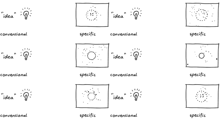
Words and symbols are both results of convention, original drawings complement text. Unconventional illustrations require the effort to be original and expose our thoughts.
What do you think? Let’s start a conversation in the comments section!
If you enjoyed this article, please hit those little ? below (you can “clap” multiple times!), share the story with your friends, and subscribe to my mailing list. You can find an overview of my articles here.
