Why it is time to start A Horror Vacui (design trend 3/5)
What’s going on?
Our web is so white. It’s clean. It’s safe. It’s minimal. I’ve seen it a thousand times. What happened to the joy of life depicted in Art Nouveau aesthetics? Or to the colours of the sixties? Where are the cheerful ornaments from the baroque?
The on-going trend of minimalism and whitespace has been leading for quite some time. Minimalism and sobriety are linked to the high-class and design aesthetics. In UX minimalism is a tool to improve the user experience, crate visual hierarchy, and lead users’ eyes towards relevant content. Then there are pop-magazines and yellow pages associated with cheaper and lower-class design even though they are so vivid and lively. Just like our pictures and stories, social media is a platform for self-expression and emotions — it is so colourful and expressive.
However, it is worth mentioning that visual aesthetics vary between different cultures. The notion of minimalism is particularly strong in the western culture. While in China, for example, whitespace is considered as something negative and unwanted. Instead, showing as much information as possible on a screen represents quality, functionality and effectiveness.
It seems that in a way we have forgotten that we can learn from these seemingly unfamiliar aesthetics to differentiate and celebrate individualism. Looking at clean minimal lines and surfaces is like facing an arrogant bourgeois. The beauty in minimalism comes from the bourgeois attitude of control and restraint where emotion and expression of individuality are tuned down.
Yet, the Maximalism trend in interior design and the Gucci Fall Winter 2018/2019 Fashion Show are examples where expression of emotion and individuality can be equally beautiful and clean. Thus, isn’t it about time to break out of the usual and start a new trend that celebrates the unusual and the chaotic?
The trend
It’s time to set Horror Vacui, the fear of empty space, as a design principle. Horror Vacui is a term associated with the feeling of meticulously filling empty spaces with detail. It can also be observed in the interior designs of the Victorian age or in objects from the Migration period.
Let’s get rid of functional white. Let’s make place for joy and opulence. Prepare your eyes for excitement and inspiration! “Make everything bigger” should be the main design slogan. Let’s fill up the space with details, ornaments and big text, until the viewport is full. Pictures are now side by side without any white gutters.
“Nature abhors a vacuum”* (a quote by Aristotle)
*Empty goes against the law of physics. Nature hates empty.
In fact, nature also teaches us that there are no white, blank spaces. Instead nature is filled with patterns, repetition, textures and relief. Geometry is the key. Everything goes according to a pattern, even though everything is unique. Take a look at Greek pottery. Think on how motifs and patterns can add a second level of narration in the web page.


Brand
In an attempt to fit in within the trend of whitespace and minimalism, brand websites end up looking the same. It’s safe. It’s impersonal. I have seen it before. It is neither reflecting the brand identity nor evoking any emotion.
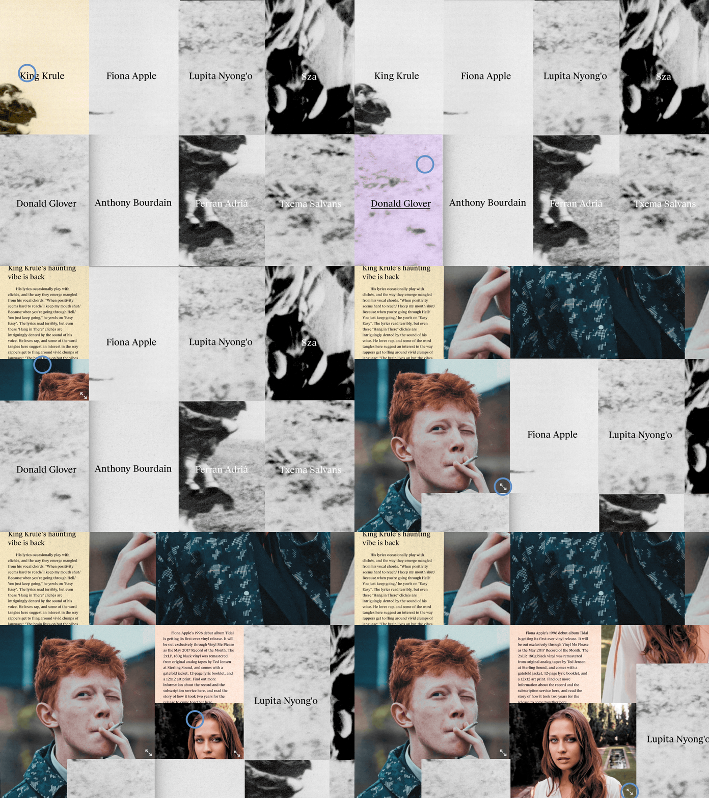
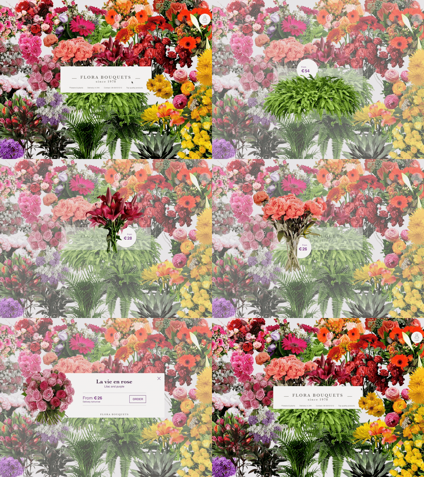
A brand has its own temperament and within an online version that should arise throughout the layout, grid, rhythm, colours, and typography. They are all a part of the identity. Exaggerating these elements as a methodology can help to communicate the uniqueness, the right emotion and the connotation. The beautiful website of Marsell brand uses their products as the navigation pattern while keeping a focus on the assortment. This approach creates a memorable experience, just like standing in front of store window. Letters-inc, for example, uses decoration as a narrative while it is also a part of the brand. Exaggerating these elements offers a lot of possibilities to build a brand without scarifying the quality of the design.
Contemplation
Do you feel the same level of excitement when visiting the Ikea store than when searching for items on the Ikea website?
Web design shouldn’t always be about finding the right information immediately. Just like visiting a museum for inspiration, a web page should be contemplated. Why not get lost in the assortment of beautiful products of an online store? It’s good to take time in life. It’s like hunting for antiques. Everything catches the eye.


