How to look like a checkbox but sound like a switch
Here at Airtasker, we’re always looking for ways to build an inclusive, educational and empowering community marketplace — including users dependant on accessibility features and ensuring our product is built fit for purpose.
Recently, while working on our new ‘must-haves’ feature, (a functionality that allows posters to specify things that absolutely must be done on a task) we introduced a new UI component on our iOS app — a seemingly harmless checkbox.

For the moment, let’s put aside the argument on the usage of a checkbox vs UISwitch when building a binary selection. :)
In this particular instance, we were working towards a solution while trying to keep in mind the diversity of our user base. Because we aim to provide a best-in-class application and experience for our users, we wanted to make sure that all our components support
If you’re anything like me, the first thing to do before starting on anything new is to google what the best practices are. There were a lot of solutions out there, however none of them were built with accessibility in mind. So we decided to build it ourselves!
In this article, I’ll share our journey on building a checkbox with VoiceOver support.
Phase 1: Prototyping
Oliver, our product designer, did a mockup of all the different states. The challenge was starting with this as the blueprint….


…and ending up with this as the final result:

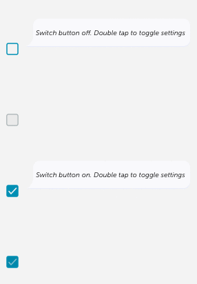
* the speech bubble represents the voiceover
Phase 2: The initial build
Building the component is relatively straight forward.
- We extend UIControl, the base class for controls in iOS
- We ensure the component is not too big, but has enough tappable area. Apple recommends an area of 44pt x 44pt as a minimum tappable area for all controls.
Then you end up with something that looks like this:


So now the checkbox looks ready, but it’s not complete until we incorporate VoiceOver.
Phase 3: Adding the VoiceOver
This is where it actually starts to get tricky.
? TAKE 1
At first we thought we wanted it to behave similar to how other components sound on the iOS. Like below:

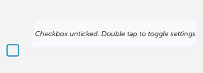
But we found that it wasn’t possible, because iOS only has a limited number of accessibility traits.
? TAKE 2
The closest trait for our purpose was the “button” trait.
So I tried the following settings:
Voiceover: “Button unticked. Double tap to toggle settings”

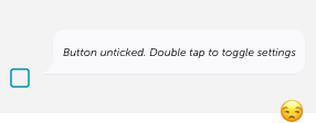
It’s pretty close right? But this is a pretty confusing string of words. The expected behaviour for a button is to switch on and off, but a button that’s unticked? It wasn’t an intuitive solution.
? TAKE 3
We decided to look at how a UISwitch works from a VoiceOver point of view. It has a different visual presentation from our checkbox, but from a functionality point of view it works the same: a binary option that can be toggled on or off.

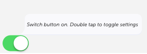
That looked like what we wanted from our checkbox, so the first thing we did was to look at the UISwitch settings in the storyboard and compared it with our settings.

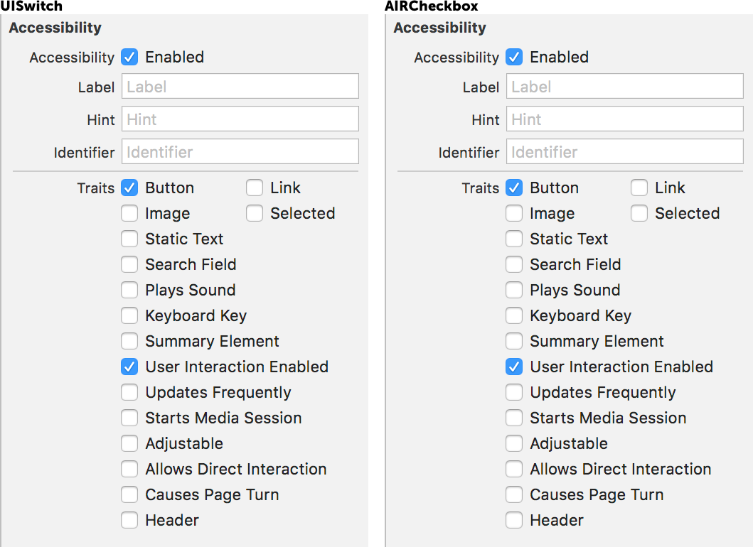


? TAKE 4
After a bit of help / timely rescue from my colleague, Anthony, we found that the UISwitch was using more than just the button traits.
As you might be aware, accessibility traits in IOS works with a bitwise operation, means you can join multiple bits together to get a combination effects
We were working backwards to get the bitwise bits and found some undocumented traits.
So it was:button traits | 1 << 53
It looked something like this:
Voiceover: “Switch button on. Double tap to toggle settings”
As soon as we replicated those settings into our checkbox it worked like magic!
Phase 4: Safety guard
As these were undocumented traits, we wanted to make sure that it would still apply in the next iOS releases.
We tried to put a unit test in place that compared the UISwitch accessibility traits to ours. However for some strange reason, it only worked locally, but not in our continuous integration pipeline.
So as a workaround we added an @available annotation.
This ensures that when we make the decision not to support iOS 11, this functionality will actually fail. We think this is good measure, as it would at least enforce us to make sure it worked properly before upgrading.
