Becoming a Data Aware Designer
Like many designers, my primary methods of information collection up to this point were qualitative: heuristic and competitive analyses, interviews, and usability tests. Thanks to my team at Paperless, I have since expanded that repertoire and become more fluent in using data as a key part of my design process. I also owe this book and its authors,
At first I was skeptical of the process that our data and marketing departments outlined: endless A/B tests on relatively small tweaks seemed liked the most boring and ineffective way to improve our users’ experience. Thanks to King et al., I was eventually able to understand and articulate my concern with data driven


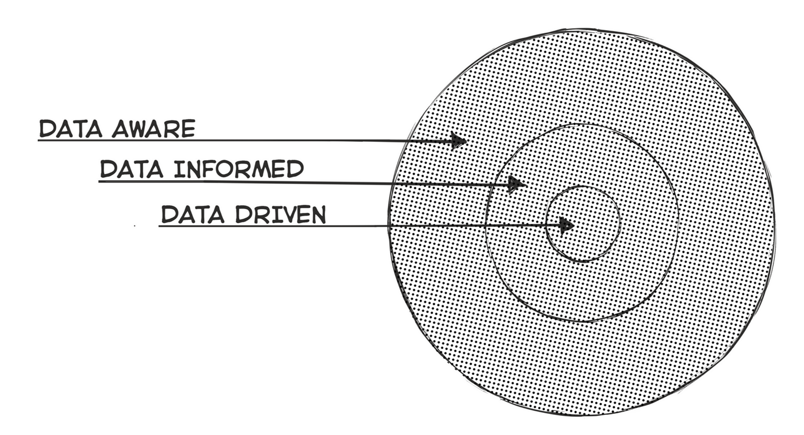
Being data driven is to stay focused on one narrow path, focusing on pure optimizations and efficiencies along the way. Performance improvements and testing shades of blue might fall into this category.
Being data informed means you are not necessarily on one narrow path, and that you are working with input beyond quantitative data, such as experience or instinct. A/B testing different experiences or structured usability tests may fall in this category.
Being data aware means you understand the wide range, and limitations, of data collection and make decisions on which methodology is best on a problem by problem basis. A data aware team might find equal value in making decisions based on output from a stakeholder workshop, a series of user interviews, or statistically significant results from an A/B test.
OK, so why is this so important?
While many businesses promote themselves as being data driven, most designers are driven by instinct, collaboration, and qualitative research methods. So where do we fit in?
I still think a designer’s greatest asset can be their intuition and willingness to move from theory to practice. Data does not tell us what the problem is, nor how to solve it. However, it can help us expose problems, provide more information about them, and evaluate the effectiveness of solutions. Designers can use this additional information to evaluate problems from more angles, and then use the results to sharpen those instincts on how to solve them.
I particularly loved this quote, from Designing with Data. It speaks to the value of data and the importance of its integration with human instinct and decision-making:
One of the things we discovered is that increasing the number of things that you measure or improving the fidelity of your measurements often actually doesn’t result in certainty. It doesn’t actually result in something that is crisp as this one is better than that. It just reveals a deeper complexity that there are actually more things involved. Then it really becomes a balance. We still have to have an intuition. We still have to make a judgment about what’s important and what isn’t.Jon Wiley, Director of Immersive Design at Google
Bringing it back to the 3-circle diagram above, I think it is critical for designers to champion a data-aware approach to problem solving. The ability to be a productive member of a data-informed team will also help designers to become respected business partners within an organization. While perhaps we don’t all need to be (nor should we be) completely data driven, the ability to speak fluently across a range of data gathering methods will help us communicate in a way that everyone can listen and respond to.
A framework


King et al. outline a framework for running experiments with a data-aware mindset, which I have found helpful in organizing my work. Remember that data here can mean any information point, qualitative or quantitative. It’s only the result that should truly be objective.
1 — The goal
Establishing goals is outside the scope of this article, but it need not be hyper-specific. For example, one of my team’s goals was to increase revenue without relying on new heavy feature-sets. Broad, but still a goal with real metrics and straightforward business value. Of course, any goal like this should be tempered with a baseline of ethics and honest design practices, but that too is a conversation for another day.
2 — The Problem/Opportunity Area
There are likely many areas where you could try to achieve your goal. But we need to start somewhere. What information do we have to narrow down our options? Do you have data on where users drop out of the funnel? An idea of how “power users” use the site? Tagged customer support tickets? Surveys? User Research?
Ideally, some combination of all of these, and more. There are countless resources out there dedicated to finding the right area to home in on, from more traditional sources like HBR and those more targeted at design professionals like this workshop outline from IDEO or these activities from the now ubiquitous Google Design Sprint Toolkit.
At Paperless, my team had both qualitative (customer support tickets, anecdotal stories, personal instincts) and quantitative (high-volume surveys, conversion drop-off points) indicating that our pricing structure was a blocker for customers checking out. So we defined a problem/opportunity area around improving the user experience of our pricing mechanisms, with the goal of increasing revenue for the company.
3 — The hypothesis
With some broad agreement on the problem to be solved, it’s time to create a testable and verifiable solution — a hypothesis.
One of the most fundamental and challenging aspects to having a data-aware mindset is crafting a good hypothesis. We can’t say that “this interaction will be a better user experience” or “users will feel more confident with this layout”. These are not good hypotheses: they have no clear metric to be evaluated, and no clear path to a measurable result.
A hypothesis should clearly state and include:
- The segment of users to be evaluated [user group]
- The change we are making [change]
- What we believe the result will be [effect]
- Why we think that result will take place [rationale]
- And finally, the measurable result we expect to observe [measure]
King et al. suggests a format like the following:
For [user group(s)], if [change] then [effect] because [rationale], which will impact [measure].
But even a well-structured hypothesis shouldn’t be made in isolation. It should be a part of a larger strategy that takes into account:
- What we learn if we fail and how to apply it to future thinking
- What we learn if we succeed and how that impacts next steps
- How much work is it worth putting into this test
The last point is an important and complicated one. How big of problem are we trying to solve? The best possible checkout experience imaginable? A better version of the one we have now? Understanding the implications between those two approaches is important.
For example, my team knew that the complexity of our infrastructure meant in the short-term that we could not fundamentally alter our pricing models. Essentially, we were looking to alter and improve the existing system and not change the system itself. In the diagram below we can see a visualization of what the difference between these two options implies:
- Attempting to improve an existing system is to design against local maxima
- Looking for a better system is to design against global maxima
We should be careful not to exclusively pursue local maxima, but most importantly the team must acknowledge where we are right now, and what is the best use of our time.


How to pick a hypothesis
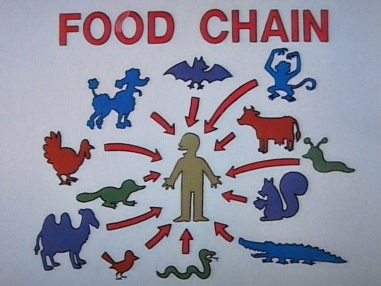
So what information do we use to choose a hypothesis? In my experiencethe best ideas come from taking information from multiple sources. Perhaps it’s a marketing survey, an internal workshop, a high-volume survey, customer support requests, results from previous A/B tests, or all of the above. King et al., refer to this as data triangulation, or the the structured utilization of different information sources to help form new hypotheses and approaches.
I can’t help but be reminded of the Simpsons food chain pyramid. Simply replace the person in the middle with “ideas” and the animal kingdom as “various data points”.


4 — The experiment
Experiments, or tests, are both opportunities to validate ideas, as well as gain more information for future design decisions. Sometimes you may even decide the point of the test is exclusively to gain information. These more exploratory tests aren’t necessarily built to be launched and rolled out to all users, but instead to gain more insight about a particular type of behavior. An evaluative test is more about validating a specific solution, likely with the intent of rolling out a version to all users.
Either way, it’s important we create an experiment where:
- We’ve controlled for variables as much as possible, making the difference between your variations clear. The more muddy your variations are, the more muddy the results will be.
- The options clearly represent the hypothesis. This is easier said than done, but worth noting that a good idea with poor execution may yield similar results as a bad idea. Internal and external usability tests have helped me with this problem.
- We don’t sacrifice organizational requirements. This could mean different things for different organizations, but often includes brand integrity and accessibility.
- The test is meaningful and ethical. Testing a giant “click me” button is probably not meaningful. Testing a hidden surcharge is not ethical.
I’d recommend picking up Designing with Data for a basic summary of statistical best practices, but there are plenty of great resources out there. This article about StackOverflow’s AB testing process is also helpful as a general summary, and you can read this in-depth review of statistical significance from Analytics-Toolkit to dig even deeper. A lot of the information out there is fairly technical, but even the least math-minded designer should understand that a higher statistical significance requirement increases the potential validity of the results, but requires more rigorous collection. We can be more certain of the results, but we will likely have to record more interactions over a longer period of time.
Of course you we want to be sure of our results, or else what’s the point? But if we don’t move fast enough to meaningfully improve the product, then what are we working towards? It’s all about working with your team and organization to understand how much risk and rigor to put into your testing. It’s up to each team to figure out what their baseline is.
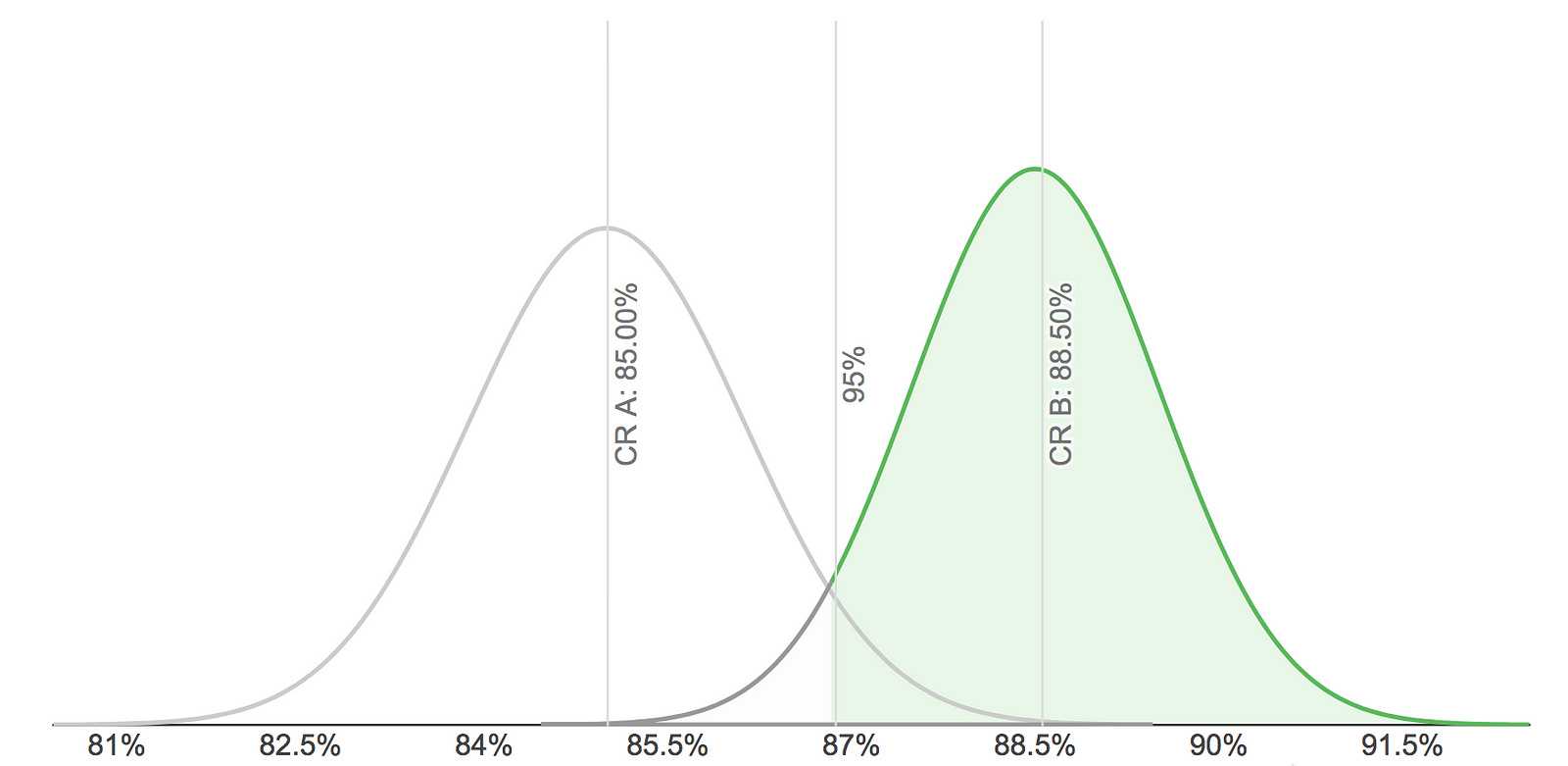
Here’s an article that goes through an example of calculating sample sizes, and below is a screenshot from an online tool that can help you determine your own sample size and experiment with win-loss scenarios.


At Paperless, we started with a p-value of 0.05, meaning we believed there to be only a 5% chance of a false-positive. With that baseline we could then calculate how many user interactions we needed to record to get statistically significant results. If it looked like a test would need to run for more than 2–4 weeks to get the required numbers, we might reconsider that hypothesis in favor of one where we could results faster.
Some examples
I’ll run through some examples of how we planned, tested, and analyzed results at Paperless. To recap, we had already established the following:
- Our goal — Increase revenue from the site using our existing feature set
- Our problem/opportunity area — Our pricing model and how to better communicate it to our customers
Which leads us to the next step…
Hypotheses
Coins are the virtual currency Paperless uses. For example, an invitation may cost 1 coin/recipient, so for 25 recipients, you pay 25 coins. We then ask customers to purchase a coin package, such as 20/40/80/150 coins, with the value increasing in higher volume purchases. Confusing, I know.
A few teammates and I spent some time researching on our own and then held a few team-wide meetings to collect and collate results. We had a long list of ideas, but there were a few we felt had strong potential:
- Reduce the number of pricing tiers
- Provide more and better options to buy coins
- Replace the concept of “coins” with real dollars
- Explain earlier in the funnel how coins work
Remember, we’re chasing local maxima (improving the current system) here, not global ones (finding a better system). That ruled out some of the options above, but we still had plenty to work with. One idea we came up with involved the second point above, providing better options to purchase coins. We came up with a hypothesis like along these lines:
Users who are ready to send will purchase larger coin packages because of the perceived value of buying more coins at once. This will result in an increase in Average Order Value, with little change in conversion, equaling overall higher revenue.
And here’s what that looked like:
