6 Lessons from Chatbot User Testing
6 Lessons from Chatbot User Testing
Bad bots — they’re easy to find, but hard to pinpoint how it went so, so wrong.
A common reason for the poor user experience is the lack of proper user testing. Observing people using the bot in a controlled environment will allow you to catch major functional errors before it is publicly released (and avoid becoming the poster child for
Here are 6 learnings to consider for your next bot:
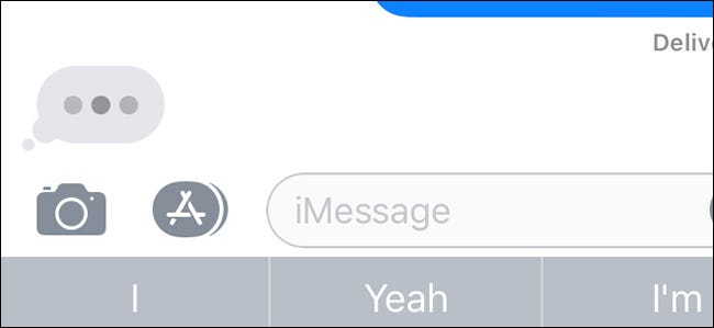
1. People want to know when it is their turn to talk, same as when you’re talking with a human.
No one likes feeling stupid for having given the wrong answer due to lack of context, or being rude by talking over. They especially don’t like it when they have to repeat their request because the other person, in this case the bot, was talking over them.
That’s why those typing indicators carry a lot of weight — and have proven to be especially useful in easing the friction in people interacting with a new chatbot.


It lets the user know not all responses are as automated as they may think.
If a task takes more than a couple seconds, the bot could say:
“Hold on for a minute while I fetch that for you…”
This way, they’re not left wondering when to interject.
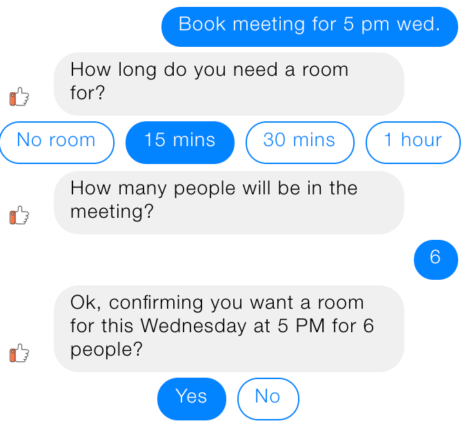
2. Use questions wisely to get to the bottom of what the user wants.
Bot designers, including me, are wary of losing the user’s attention if we ask too many questions. After all, we know most tasks should be completed in under 60 seconds.


There are exceptions to this rule of course, but it would have to be a very good reason — where doing otherwise would lead to users dropping off at a high rate, and the intended users have performed this task on another channel that requires even more time.
3. The bot must set expectations throughout the conversation, beyond onboarding.
Every person using a technology for the first time has preconceived notions about its ability. For chatbots, each user has unique set of beliefs about how their interaction will carry out based on their previous experience with messaging technology, among other factors. The bot must either confirm or correct these expectations.
“The first step is acknowledging that no one will start comes into the bot with a blank slate free of assumptions.”
Vittorio Banfi, co-founder of bot prototyping tool botsociety, describes the importance of a proactive bot:
“A well-designed bot will take initiative in guiding the users through what it can do for them. The users will inevitably have expectations of the bot’s capabilities. By guiding the user through each step of the interaction, the bot is working for the user and setting them up for success.”


Setting these expectations goes beyond a single onboarding message and menu options. After every step, you need to iterate what the bot will do for the user next.
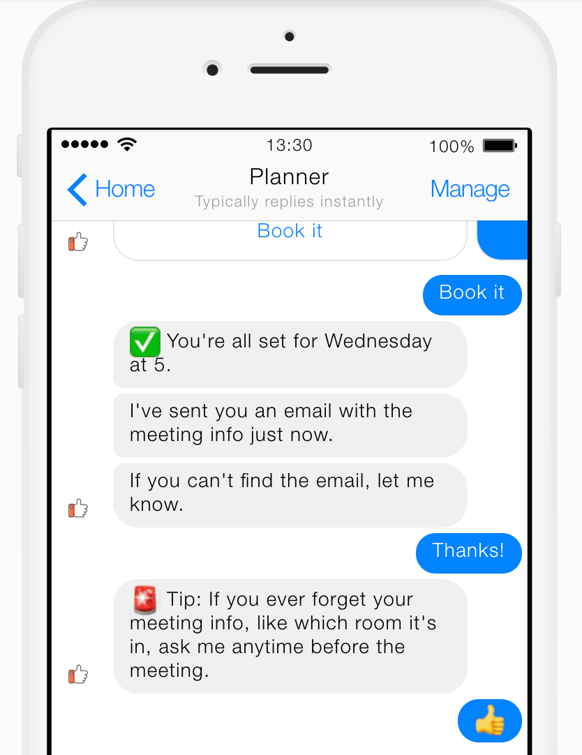
For example, let’s say the user has just created a meeting through the bot, and the bot is about to confirm that their request has been processed.
Don’t say:
“You’ll receive an email confirmation.”
The user is left wondering: When will I receive a confirmation? If I haven’t received it, what I do — assume it’s good to go, or double-check with the bot?
Instead, try this:


1. Succinctly describe the bot’s action.
“I’ve sent you an email with the meeting info just now.”
2. Then, provide an action item for the user.
“If you can’t find the email, let me know.”
3. Finally, tell the user how they can continue using the bot for a related task.
“By the way, if you ever forget your meeting info, like which room it’s in, ask me anytime before the meeting.”
4. Be transparent that the bot may provide out-of-context answers.
If the bot can’t provide contextual answers and requires double-effort from the user, be transparent about it. The only thing worse than being unable to support a task is avoiding communicating this.
Here’s a simple example:
You may ask the bot where it lives, and it’ll say “San Francisco.” Later in the conversation, you ask if it lives on an island and it says, “Yes.”


The challenge is balancing transparency with information overload that can test their attention span. Ideally, you want to do A/B testing here, where you have more in-depth explanations in one version than the other and assess the rate at which users go off-path and are unable to complete the task.
5. Be transparent (again) about what data will be stored.
Be transparent about what data the bot stores and how it will be used, and importantly, how to opt out of data retention. This allows the user to make informed decisions and avoid feeling cheated that a decision has been made for them.
You’re giving the user power over their information this way — transparency with this kind of information should be part of every bot no matter how professional or silly of a persona.
Microsoft’s bot Zo does this very well, providing clarity on a serious topic while being on-brand with its “teenager’s best friend” persona:


6. Finally….fail with grace and empathy.
No matter how many user testing sessions you run, the bot will fail… many times.
You can’t avoid the bot having errors, but you can control how it responds and the impression it leaves on the user.
If there’s a common error you’ve seen users make (like typing in the wrong date for an online order), suggest double-checking.
Then, let them know it may be a technical error of the bot and provide an appropriate call-to action, whether it be a customer service line or ideally, directions to report the error directly within bot.
*Controlled environment: There are many ways to remove bias as much as possible. For example, make sure the user is in the physical environment in which they would be using the bot(ex. at their office desk).
