
柱形圖陰影線的繪製方法
阿新 • • 發佈:2019-01-01
R語言的圖形顏色是非常豐富的,繪製出的彩色圖表美觀大方。但發表論文時如果適當選用黑白或灰度圖形,不僅可以減少一些不必要的開支,而且也可以減少印刷油墨消耗,低碳環保。在灰度模式下,R語言繪製的很多圖形都很容易設定,僅柱形圖有些困難。
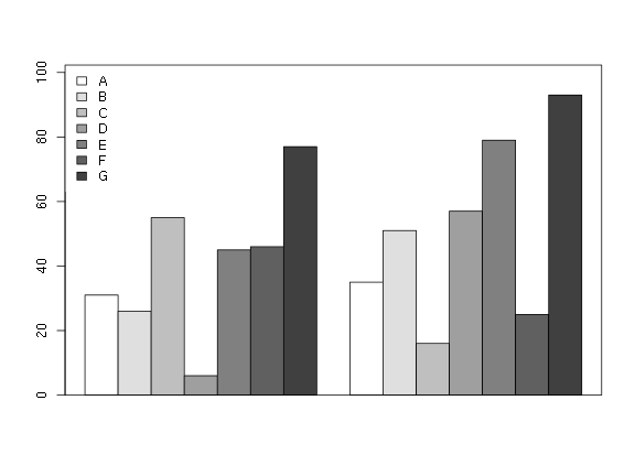
多系列柱形圖的黑白圖形可以選用兩種方式繪製。第一種方式非常簡單,直接使用灰度顏色區分不同樣品,灰度顏色直接用gray函式產生:
set.seed(100) xx <- matrix(sample(100, 14, replace = FALSE), ncol = 2) n <- nrow(xx) cols <- rev(gray(0:(n + 1)/(n+ 1)))[1:n] barplot(xx, col = cols, beside = TRUE, ylim = c(0, max(xx) * 1.1)) legend("topleft", legend = LETTERS[1:n], fill = cols, box.col = NA) box()
第二種方式是使用陰影線。barplot函式中的陰影線可用angle和density引數設定線的角度和密度(當然也可以設定顏色)。簡單改變角度和密度獲得的圖形區分度非常有限,組合兩種不同角度的線可獲得更好的效果。我們可以把這些組合編寫成函式方便使用:
bnw_barplot <-function(height, shade = 1:7, ...) { angle1 <- c(0, 45, 135, 88, 0, 45, 180)[shade] angle2 <- c(0, 45, 135, 88, 0, 135, 90)[shade] dens <- c(0, rep(10, 6))[shade] barplot(height, angle = angle1, density = dens, col = "gray40", ...) barplot(height, angle = angle2, density = dens,col = "gray40", add = TRUE, ...) box() } bnw_legend <- function(x, y = NULL, legend, shade = 1:7, ...) { angle1 <- c(0, 45, 135, 88, 0, 45, 180)[shade] angle2 <- c(0, 45, 135, 88, 0, 135, 90)[shade] dens <- c(0, rep(20, 6))[shade] legend(x, y, legend, angle = angle1, density = dens, ...) legend(x, y, legend, angle = angle2, density = dens, ...) }
需要同時設定柱形圖和圖例。看看上面函式的呼叫效果:
shade <- 1:n
bnw_barplot(xx, shade = shade, beside = TRUE, ylim = c(0, max(xx) * 1.1))
bnw_legend("topleft", legend = LETTERS[1:n], shade = shade, box.col = "NA",
    inset = 0.02)
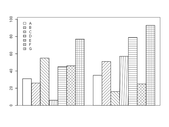
上面的函式設定了7種陰影,如果不夠用可以自行設定陰影線組合,只要區分度足夠好就沒有問題,如果還不夠用就考慮陰影和灰度顏色的組合。barplot函式不能直接組合灰度填充顏色和陰影線,需要一點小技巧,可自行嘗試。