
CSS3透明背景+漸變樣式
阿新 • • 發佈:2019-01-02
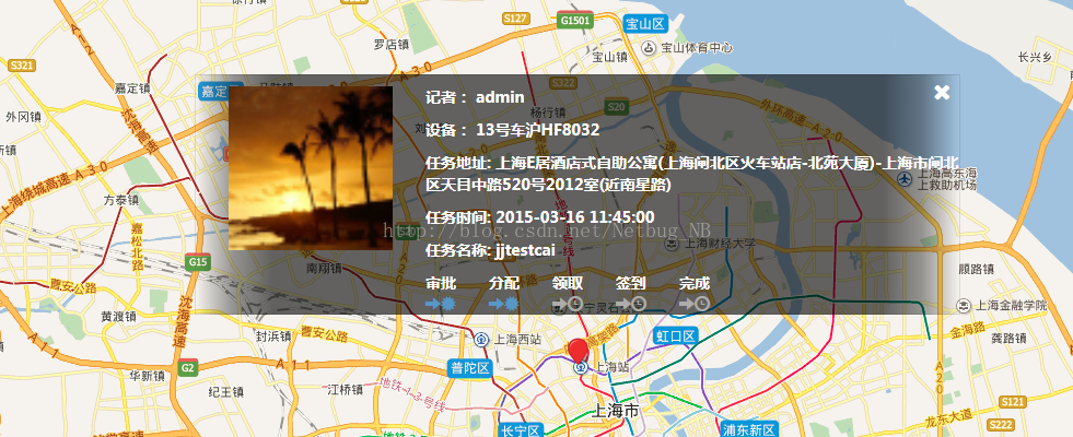
直接上效果:
核心程式碼如下:
.map-interview {
    background-image:-webkit-linear-gradient(
    to right,
    rgba(0,0,0,0) 0%,
    rgba(0,0,0,0.4) 5%,
    rgba(0,0,0,0.6) 10%,
    rgba(0,0,0,0.6) 90%,
    rgba(0,0,0,0.4) 95%,
    rgba(0,0,0,0) 100%);
  background-image: linear-gradient(
    to right,
    rgba(0,0,0,0) 0%,
    rgba(0,0,0,0.4) 5%,
    rgba(0,0,0,0.6) 10%,
    rgba(0,0,0,0.6) 90%,
    rgba(0,0,0,0.4) 95%,
    rgba(0,0,0,0) 100%);
  height: 220px;
  left: 50%;
  margin-left: -350px;
  margin-top: -110px;
  padding: 10px 0px 10px 30px;
  position: absolute;
  top: 30%;
  width: 700px;
  border: 1px solid rgba(0, 0, 0, 0.1);
}
Best Wishes For You!