
WebApp網站有關meta標籤
一、大眾機型常用meta標籤name的設定
1、name之viewport
說明:螢幕的縮放
content的幾個屬性:
width viewport的寬度[device-width | pixel_value]width如果直接設定pixel_value數值,大部分的安卓手機不支援,但是ios支援;
height – viewport 的高度 (範圍從 223 到 10,000 )
user-scalable [yes | no]是否允許縮放
initial-scale [數值] 初始化比例(範圍從 > 0 到 10)
minimum-scale [數值] 允許縮放的最小比例
maximum-scale [數值] 允許縮放的最大比例
target-densitydpi 值有以下(一般推薦設定中等響度密度或者低畫素密度,後者設定具體的值dpi_value,另外webkit核心已不準備再支援此屬性)
– dpi_value 一般是70-400//沒英寸畫素點的個數
– device-dpi裝置預設畫素密度
– high-dpi 高畫素密度
– medium-dpi 中等畫素密度
– low-dpi 低畫素密度
完整案例:
<meta name="viewport" content="width=device-width,height=device-height, user-scalable=no,initial-scale=1, minimum-scale=1, maximum-scale=1,target-densitydpi=device-dpi "> 2、name之format-detection忽略電話號碼和郵箱
說明:忽略頁面中的數字識別為電話號碼
說明:忽略頁面中的郵箱格式為郵箱
也可以寫成:
<meta name="format-detection" 3、name之設定作者姓名及聯絡方式
說明:設定作者姓名及聯絡方式
4、其他
<!-- 優先使用 IE 最新版本和 Chrome -->
<meta http-equiv="X-UA-Compatible" content="IE=edge,chrome=1"/>

<!-- 頁面描述 -->
<meta name="description" content="不超過150個字元"/>

<!-- 頁面關鍵詞 -->
<meta name="keywords" content=""/>

<!-- 搜尋引擎抓取 -->
<meta name="robots" content="index,follow"/>

<!-- 啟用360瀏覽器的極速模式(webkit) -->
<meta name="renderer" content="webkit">

<!-- 避免IE使用相容模式 -->
<meta http-equiv="X-UA-Compatible" content="IE=edge">

<!-- 不讓百度轉碼 -->
<meta http-equiv="Cache-Control" content="no-siteapp" />

<!-- 針對手持裝置優化,主要是針對一些老的不識別viewport的瀏覽器,比如黑莓 -->
<meta name="HandheldFriendly" content="true">

<!-- 微軟的老式瀏覽器 -->
<meta name="MobileOptimized" content="320">

<!-- uc強制豎屏 -->
<meta name="screen-orientation" content="portrait">
<!-- QQ強制豎屏 -->

<meta name="x5-orientation" content="portrait">
<!-- UC強制全屏 -->
<meta name="full-screen" content="yes">
<!-- QQ強制全屏 -->

<meta name="x5-fullscreen" content="true">
<!-- UC應用模式 -->
<meta name="browsermode" content="application">
<!-- QQ應用模式 -->
<meta name="x5-page-mode" content="app">


<!-- 新增 RSS 訂閱 -->
<link rel="alternate" type="application/rss+xml" title="RSS" href="/rss.xml"/>

<!-- 新增 favicon icon -->
<link rel="shortcut icon" type="image/ico" href="/favicon.ico"/>


<!-- sns 社交標籤 begin -->
    <!-- 參考微博API -->
    <meta property="og:type" content="型別" />
    <meta property="og:url" content="URL地址" />
    <meta property="og:title" content="標題" />
    <meta property="og:image" content="圖片" />
    <meta property="og:description" content="描述" />
<!-- sns 社交標籤 end -->


<!-- Windows 8 磁貼顏色 -->
<meta name="msapplication-TileColor" content="#000"/>
<!-- Windows 8 磁貼圖示 -->
<meta name="msapplication-TileImage" content="icon.png"/>

 <!-- windows phone 點選無高光 -->
<meta name="msapplication-tap-highlight" content="no">
二、ios系統的meta/link設定:
1、開啟對web app程式的支援
說明:
網站開啟對web app程式的支援,其實意思就是刪除預設的蘋果工具欄和選單欄,開啟全屏顯示
2、 改變頂部狀態條的顏色;
說明:
在 web app 應用下狀態條(螢幕頂部條)的顏色;
預設值為 default(白色),可以定為 black(黑色)和 black-translucent(灰色半透明);
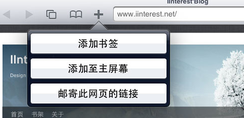
3、設定“新增到主螢幕圖示
Safari 瀏覽器有一個“新增到主螢幕”的功能,使用者可以像儲存書籤一樣把一個網站新增到主螢幕,下次使用者直接點選主螢幕上的圖示就能進入網站。
這個功能不僅方便使用者快速訪問我們的網站,而且也使我們的 WebApp 更像一個原生應用
因為 iOS 解析度,所以 icon.png 圖片的尺寸也各不相同,我們可以通過sizes屬性來分別定義,iOS 系統會自動獲取向匹配的圖片:
<span style="font-size:14px;"><!-- iOS 圖示 begin -->
        <link rel="apple-touch-icon-precomposed" href="/apple-touch-icon-57x57-precomposed.png"/>
        <!-- iPhone 和 iTouch,預設 57x57 畫素,必須有 -->
        <link rel="apple-touch-icon-precomposed" sizes="114x114" href="/apple-touch-icon-114x114-precomposed.png"/>
        <!-- Retina iPhone 和 Retina iTouch,114x114 畫素,可以沒有,但推薦有 -->
        <link rel="apple-touch-icon-precomposed" sizes="144x144" href="/apple-touch-icon-144x144-precomposed.png"/>
        <!-- Retina iPad,144x144 畫素,可以沒有,但推薦有 -->
<!-- iOS 圖示 end --></span>
4、設定桌面圖示的標題,
為了在主屏達到最好的顯示效果,title最好限制在六個中文長度內,超長的內容會被隱藏:
<meta name="apple-mobile-web-app-title" content="標題">5、設定啟動畫面
當用戶點選主屏圖示開啟 WebApp 時,系統會展示啟動畫面,在未設定情況下系統會預設顯示該網站的首頁截圖,當然這個體驗不是很好,所以我們需要通過以下程式碼來自定義啟動畫面:
<link rel="apple-touch-startup-image" href="Startup.png" /> 根據 iOS 裝置的解析度,其啟動畫面的圖片尺寸也各不相同所以:
<!-- iOS 啟動畫面 begin -->
        <link rel="apple-touch-startup-image" sizes="768x1004" href="/splash-screen-768x1004.png"/>
        <!-- iPad 豎屏 768 x 1004(標準解析度) -->
        <link rel="apple-touch-startup-image" sizes="1536x2008" href="/splash-screen-1536x2008.png"/>
        <!-- iPad 豎屏 1536x2008(Retina) -->
        <link rel="apple-touch-startup-image" sizes="1024x748" href="/Default-Portrait-1024x748.png"/>
        <!-- iPad 橫屏 1024x748(標準解析度) -->
        <link rel="apple-touch-startup-image" sizes="2048x1496" href="/splash-screen-2048x1496.png"/>
        <!-- iPad 橫屏 2048x1496(Retina) -->

        <link rel="apple-touch-startup-image" href="/splash-screen-320x480.png"/>
        <!-- iPhone/iPod Touch 豎屏 320x480 (標準解析度) -->
        <link rel="apple-touch-startup-image" sizes="640x960" href="/splash-screen-640x960.png"/>
        <!-- iPhone/iPod Touch 豎屏 640x960 (Retina) -->
        <link rel="apple-touch-startup-image" sizes="640x1136" href="/splash-screen-640x1136.png"/>
        <!-- iPhone 5/iPod Touch 5 豎屏 640x1136 (Retina) -->
    <!-- iOS 啟動畫面 end -->
或者以下程式碼,具體沒有實踐,還需考證
<!!-- iPhone SPLASHSCREEN-->
<!link href="http://wlog.cn/html/"apple-touch-startup-image-320x460.png" media="(device-width: 320px)" rel="apple-touch-startup-image" />
<!!-- iPhone (Retina) SPLASHSCREEN-->
<!link href="apple-touch-startup-image-640x920.png" media="(device-width: 320px) and (-webkit-device-pixel-ratio: 2)" rel="apple-touch-startup-image" />
<!!-- iPad (portrait) SPLASHSCREEN-->
<!link href="apple-touch-startup-image-768x1004.png" media="(device-width: 768px) and (orientation: portrait)" rel="apple-touch-startup-image" />
<!!-- iPad (landscape) SPLASHSCREEN-->
<!link href="apple-touch-startup-image-748x1024.png" media="(device-width: 768px) and (orientation: landscape)" rel="apple-touch-startup-image" />
<!!-- iPad (Retina, portrait) SPLASHSCREEN-->
<!link href="apple-touch-startup-image-1536x2008.png" media="(device-width: 1536px) and (orientation: portrait) and (-webkit-device-pixel-ratio: 2)" rel="apple-touch-startup-image" />
<!!-- iPad (Retina, landscape) SPLASHSCREEN-->
<link href="apple-touch-startup-image-1496x2048.png"media="(device-width: 1536px)  and (orientation: landscape) and (-webkit-device-pixel-ratio: 2)"rel="apple-touch-startup-image" />
6、 新增智慧 App 廣告條 Smart App Banner(iOS 6+ Safari)
<meta name="apple-itunes-app" content="app-id=myAppStoreID, affiliate-data=myAffiliateData, app-argument=myURL"> ==================
比較常用的meta
以下程式碼參考網址:view-source:三個w點adinnet點cn斜槓service斜槓3d點html
<!--[if lt IE 7 ]><html class="oldie ie ie6"> <![endif]-->
<!--[if IE 7 ]><html class="oldie ie ie7"> <![endif]-->
<!--[if IE 8 ]><html class="ie ie8"> <![endif]-->
<!--[if (gte IE 9)|!(IE)]><!--><html> <!--<![endif]-->
<head>
<meta http-equiv="Content-Type" content="text/html; charset=utf-8">
<title></title>
<meta name="keywords" content="" />
<meta name="description" content="" />
<meta name="title" content="" />
<meta name="author" content="-06" />
<meta name="Copyright" content="" />
<!-- 讓IE瀏覽器用最高階核心渲染頁面 還有用 Chrome 框架的頁面用webkit 核心
================================================== -->
<meta http-equiv="X-UA-Compatible" content="IE=edge,chrome=1">
<!-- IOS6全屏 Chrome高版本全屏
================================================== -->
<meta name="apple-mobile-web-app-capable" content="yes">
<meta name="mobile-web-app-capable" content="yes">
<!-- 讓360雙核瀏覽器用webkit核心渲染頁面
================================================== -->
<meta name="renderer" content="webkit">
<!-- Mobile Specific Metas
================================================== -->
<!-- !!!注意 minimal-ui 是IOS7.1的新屬性,最小化瀏覽器UI -->
<meta name="viewport" content="width=device-width, initial-scale=1, maximum-scale=1, user-scalable=no, minimal-ui">
<meta name="format-detection" content="telephone=no">
<!-- CSS
================================================== -->
    <link href="/css/reset.css" rel="stylesheet" type="text/css">
<link href="/css/magicwall.css" rel="stylesheet" type="text/css">
<link  href="/css/jquery.gridster.css" rel="stylesheet" type="text/css">
<link href="/css/case.css" rel="stylesheet" type="text/css">
<link href="/css/case_1280.css" rel="stylesheet" type="text/css">
<link href="/css/case_1024.css" rel="stylesheet" type="text/css">
<link href="/css/case_640.css" rel="stylesheet" type="text/css">
<link href="/css/case_320.css" rel="stylesheet" type="text/css">
<link href="/css/style_retina.css" rel="stylesheet" type="text/css">


<!--[if lt IE 9]>
        <script src="http://cdn.bootcss.com/html5shiv/r29/html5.js"></script>
<![endif]-->


<!-- Favicons
================================================== -->
<link rel="shortcut icon" href="favicon.ico" >
<!-- Android 主屏圖示
================================================== -->
<link rel="icon" sizes="196x196" href="/images/apple-touch-icon-152x152.png">
<!-- IOS 主屏圖示
================================================== -->
<link rel="apple-touch-icon-precomposed" href="/images/apple-touch-icon-76x76.png">
<link rel="apple-touch-icon-precomposed" sizes="76x76" href="/images/apple-touch-icon-76x76.png">
<link rel="apple-touch-icon-precomposed" sizes="120x120" href="/images/apple-touch-icon-120x120.png">
<link rel="apple-touch-icon-precomposed" sizes="152x152" href="/images/apple-touch-icon-152x152.png">

<link rel="apple-touch-startup-image" href="/startup-748x1024.jpg"
media="screen and (min-device-width: 481px) and (max-device-width: 1024px) and (orientation:landscape)" >
<link rel="apple-touch-startup-image" href="/startup-768x1004.jpg"
media="screen and (min-device-width: 481px) and (max-device-width: 1024px) and (orientation:portrait)" >
或者說
<!-- 啟用360瀏覽器的極速模式(webkit) -->
<meta name="renderer" content="webkit">
<!-- 避免IE使用相容模式 -->
<meta http-equiv="X-UA-Compatible" content="IE=edge">
<!-- 針對手持裝置優化,主要是針對一些老的不識別viewport的瀏覽器,比如黑莓 -->
<meta name="HandheldFriendly" content="true">
<!-- 微軟的老式瀏覽器 -->
<meta name="MobileOptimized" content="320">
<!-- uc強制豎屏 -->
<meta name="screen-orientation" content="portrait">
<!-- QQ強制豎屏 -->
<meta name="x5-orientation" content="portrait">
<!-- UC強制全屏 -->
<meta name="full-screen" content="yes">
<!-- QQ強制全屏 -->
<meta name="x5-fullscreen" content="true">
<!-- UC應用模式 -->
<meta name="browsermode" content="application">
<!-- QQ應用模式 -->
<meta name="x5-page-mode" content="app">
<!-- windows phone 點選無高光 -->
<meta name="msapplication-tap-highlight" content="no">
整理====
meta屬性在HTML中佔據了很重要的位置。如:針對搜尋引擎的SEO,文件的字元編碼,設定重新整理快取等。雖然一些網頁可能沒有使用meta,但是作為正規軍,我們還是有必要了解一些meta的屬性,並且能夠熟練使用它們。
1、宣告文件使用的字元編碼
<meta charset='utf-8'> 2、宣告文件的相容模式
<meta http-equiv="X-UA-Compatible" content="IE=edge" /> 指示IE以目前可用的最高模式顯示內容
<meta http-equiv="X-UA-Compatible" content="IE=Emulate IE7" />指示IE使用 <!DOCTYPE> 指令確定如何呈現內容。標準模式指令以IE7 標準模式顯示,而 Quirks 模式指令以 IE5 模式顯示。
3、SEO 優化
<meta name="description" content="不超過150個字元" />頁面描述
<meta name="keywords" content="html5, css3, 關鍵字"/>頁面關鍵詞
<meta name="author" content="魔法小棧" />定義網頁作者
<meta name="robots" content="index,follow" />定義網頁搜尋引擎索引方式,robotterms是一組使用英文逗號「,」分割的值,通常有如下幾種取值:none,noindex,nofollow,all,index和follow。
4、為移動裝置新增 viewport
<meta name ="viewport" content ="width=device-width, initial-scale=1, maximum-scale=1, minimum-scale=1, user-scalable=no">
    content 引數解釋:
    width       viewport 寬度(數值/device-width)
    height            viewport 高度(數值/device-height)
    initial-scale  初始縮放比例
    maximum-scale  最大縮放比例
    minimum-scale  最小縮放比例
    user-scalable  是否允許使用者縮放(yes/no)
    minimal-ui      iOS 7.1 beta 2 中新增屬性,可以在頁面載入時最小化上下狀態列。這是一個布林值,可以直接這樣寫:
<meta name="viewport" content="width=device-width, initial-scale=1, minimal-ui">
5、iOS 裝置
<meta name="apple-mobile-web-app-title" content="標題">新增到主屏後的標題(iOS 6 新增)
<meta name="apple-mobile-web-app-capable" content="yes" />是否啟用 WebApp 全屏模式
<meta name="apple-mobile-web-app-status-bar-style" content="black-translucent" />設定狀態列的背景顏色
    只有在 "apple-mobile-web-app-capable" content="yes" 時生效
    content 引數:
    default 預設值。
    black 狀態列背景是黑色。
    black-translucent 狀態列背景是黑色半透明。
    設定為 default 或 black ,網頁內容從狀態列底部開始。
    設定為 black-translucent ,網頁內容充滿整個螢幕,頂部會被狀態列遮擋。
6、iOS 圖示 rel 引數
apple-touch-icon 圖片自動處理成圓角和高光等效果。
apple-touch-icon-precomposed 禁止系統自動新增效果,直接顯示設計原圖。
<link rel="apple-touch-icon-precomposed" href="/apple-touch-icon-57x57-precomposed.png" />iPhone 和 iTouch,預設 57x57 畫素,必須有
<link rel="apple-touch-icon-precomposed" sizes="72x72" href="/apple-touch-icon-72x72-precomposed.png" />iPad,72x72 畫素,可以沒有,但推薦有
<link rel="apple-touch-icon-precomposed" sizes="114x114" href="/apple-touch-icon-114x114-precomposed.png" />Retina iPhone 和 Retina iTouch,114x114 畫素,可以沒有,但推薦有
<link rel="apple-touch-icon-precomposed" sizes="144x144" href="/apple-touch-icon-144x144-precomposed.png" />Retina iPad,144x144 畫素,可以沒有,推薦大家使用
<meta name="apple-mobile-web-app-title" content="標題">title最好限制在六個中文長度內,超長的內容會被隱藏,新增到主屏後的標題(iOS 6 新增)
7、iOS 啟動畫面
iPad 的啟動畫面是不包括狀態列區域的。
iPad 豎屏 768 x 1004(標準解析度)
<link rel="apple-touch-startup-image" sizes="768x1004" href="/splash-screen-768x1004.png" />iPad 豎屏 1536x2008(Retina)
<link rel="apple-touch-startup-image" sizes="1536x2008" href="/splash-screen-1536x2008.png" />iPad 橫屏 1024x748(標準解析度)
<link rel="apple-touch-startup-image" sizes="1024x748" href="/Default-Portrait-1024x748.png" />iPad 橫屏 2048x1496(Retina)
<link rel="apple-touch-startup-image" sizes="2048x1496" href="/splash-screen-2048x1496.png" />
iPhone 和 iPod touch 的啟動畫面是包含狀態列區域的。
iPhone/iPod Touch 豎屏 320x480 (標準解析度)
<link rel="apple-touch-startup-image" href="/splash-screen-320x480.png" />iPhone/iPod Touch 豎屏 640x960 (Retina)
<link rel="apple-touch-startup-image" sizes="640x960" href="/splash-screen-640x960.png" />iPhone 5/iPod Touch 5 豎屏 640x1136 (Retina)
<link rel="apple-touch-startup-image" sizes="640x1136" href="/splash-screen-640x1136.png" />
<link rel="apple-touch-startup-image" href="Startup.png" />  當用戶點選主屏圖示開啟 WebApp 時,系統會展示啟動畫面,在未設定情況下系統會預設顯示該網站的首頁截圖,當然這個體驗不是很好
8、Windows 8
<meta name="msapplication-TileColor" content="#000"/> Windows 8 磁貼顏色
<meta name="msapplication-TileImage" content="icon.png"/>Windows 8 磁貼圖示
9、不常用的
<link rel="alternate" type="application/rss+xml" title="RSS" href="/rss.xml" />新增 RSS 訂閱
<link rel="shortcut icon" type="image/ico" href="/favicon.ico" />新增 favicon icon
<meta name="format-detection" content="telephone=no" />禁止數字識自動別為電話號碼
<meta name="format-detection" content="email=no" />不讓android識別郵箱
<meta name="renderer" content="webkit">啟用360瀏覽器的極速模式(webkit)
<meta http-equiv="X-UA-Compatible" content="IE=edge">避免IE使用相容模式
<meta name="HandheldFriendly" content="true">針對手持裝置優化,主要是針對一些老的不識別viewport的瀏覽器,比如黑莓
<meta name="MobileOptimized" content="320">微軟的老式瀏覽器
<meta name="x5-orientation" content="portrait">QQ強制豎屏
<meta name="full-screen" content="yes">UC強制全屏
<meta name="x5-fullscreen" content="true">QQ強制全屏
<meta name="browsermode" content="application">UC應用模式
<meta name="x5-page-mode" content="app">QQ應用模式
<meta http-equiv="Cache-Control" content="no-siteapp" />禁止百度轉碼
<meta name="msapplication-tap-highlight" content="no">windows phone 點選無高光
<meta name="keywords" content="" />  關鍵字
<meta name="description" content="" />  描述
<meta name="title" content="" />  標題
<meta name="author" content="-06" />  作者
<meta name="Copyright" content="" />  公司
<meta http-equiv="X-UA-Compatible" content="IE=edge,chrome=1">   讓IE瀏覽器用最高階核心渲染頁面 還有用 Chrome 框架的頁面用webkit 核心
<meta name="apple-mobile-web-app-capable" content="yes">  IOS6全屏
<meta name="mobile-web-app-capable" content="yes">  Chrome高版本全屏
<meta name="renderer" content="webkit">  讓360雙核瀏覽器用webkit核心渲染頁面
<meta name="apple-itunes-app" content="app-id=myAppStoreID, affiliate-data=myAffiliateData, app-argument=myURL"> 新增智慧 App 廣告條 Smart App Banner(iOS 6+ Safari)
10、sns 社交標籤
參考微博API
<meta property="og:type" content="型別" />
<meta property="og:url" content="URL地址" />
<meta property="og:title" content="標題" />
<meta property="og:image" content="圖片" />
<meta property="og:description" content="描述" />