
移動端webapp自適應佈局
0.一些基礎
請看這篇:HcySunYang的blog:一篇真正教會你開發移動端頁面的文章(二)
width=device-width 這段程式碼是讓佈局視口的尺寸等於理想視口。
裝置畫素比(DPR) = 裝置畫素個數 / 理想視口畫素個數(device-width)
1.常規情況下js根據螢幕寬度動態計算
!(function(doc, win) {
var docEle = doc.documentElement,
evt = "onorientationchange" in window ? "orientationchange" : "resize" 2.媒體查詢較密集的斷點
使用css3 media query 實現;
另可以使用sass的calc()。
@media screen and (min-width: 320px) {
html {font-size: 14px;}
}
@media screen and (min-width: 360px) {
html {font-size: 16px;}
}
@media screen and (min-width: 400px) {
html {font-size: 18px;}
}
@media screen and (min-width: 440px) {
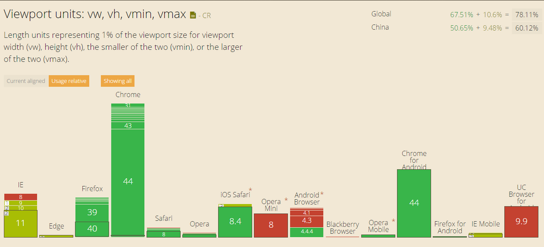
html {font-size 3.強大的單位——vw
使用單位 vw 實現動態計算。
html {
    font-size: 31.25vw; /* 表示式:100*100vw/320 */
}
首先,支援 CSS3 calc方法 和 rem、vw單位的瀏覽器下,只需要html {font-size: 15.625vw;}這樣一句就好,另外加個媒體查詢限制下。
不過考慮到國內相容性的問題,還是結合媒體查詢來使用比較好。(媒體查詢的斷點暫時是借用上面的例子)
4.令設計尺寸font-size:100px計算出rem,動態設定html font-size
1、拿到設計圖,計算出頁面的總寬,為了好計算,取100px的font-size,如果設計圖是iPhone6的那麼計算出的就是7.5rem,如果頁面是iPhone5的那麼計算出的結果就是6.4rem。
2、動態設定html標籤的font-size值:
document.documentElement.style.fontSize = document.documentElement.clientWidth / 以rem為單位的頁面總寬 + 'px';如iPhone6的設計圖就是:
document.documentElement.style.fontSize = document.documentElement.clientWidth / 7.5 + 'px';iPhone5的設計圖就是:
document.documentElement.style.fontSize = document.documentElement.clientWidth / 6.4 + 'px';3、做頁面是測量設計圖的px尺寸除以100得到rem尺寸。
4、和淘寶的做法一樣,文字字型大小不要使用rem換算,而是使用媒體查詢(???)
可為什麼不用rem呢?後來去查了一番資料,發現有一種叫做點陣字型的存在(什麼是點陣字型),也叫作點陣圖字型,點陣圖我們都知道,跟向量圖是有區別的,就是放大會模糊,所以點陣字型也是放大會模糊的,如果根據rem設定字型大小,字型會自由縮放,可能就會導致點陣字型模糊,所以需要設定使用幾種固定大小的字型。不過,在正常情況下,系統自帶的字型都是向量字型,所以使用rem為單位是沒有問題的,除非你的網頁需要用到特殊的點陣字型。
<html>
<head>
    <title></title>
    <meta charset="utf-8" />
    <meta name="viewport" content="width=device-width,initial-scale=1,maximum-scale=1,user-scalable=no" />
</head>
<body>

    <script>
    document.documentElement.style.fontSize = document.documentElement.clientWidth / 7.5 + 'px';
    </script>
</body>
</html>