
手機端切圖注意
阿新 • • 發佈:2019-01-07
一.瞭解
以iPhone6設定螢幕大小, psd設定大小為750×1334。在切圖的時候 以要螢幕的一半來切圖(無論圖片還是文字 間距 都除以2 )
1.圖片
要切2張, 一張是750×1334 螢幕下的 命名@2x; 另一張是 750×1334螢幕1.5倍的情況下 命名@3x
如:圖片在 750×1334螢幕下是44×24 [email protected] 那麼[email protected]就是66×362x 和3x 之間是1.5倍
.img{
width:22px;
height:12px;
background-image:url([email protected] 2.使用flex佈局時最好
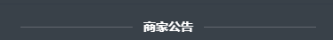
<div class="title">
	<div class="line"></div>
	<div class="text">優惠資訊</div>
	<div class="line"></div>
</div>
.title{
	display: flex;
	width: 80%;
	margin: 28px auto 24px auto;
}
.title .line{
	flex: 1;
	position: relative;
	top: -6px;
	border-bottom: 1px solid rgba(255, 255, 255, 0.2);
}
.title .text{
	padding: 0 12px;
	font-weight: 700;
	font-size: 14px;
}
3.垂直居中+border 1px
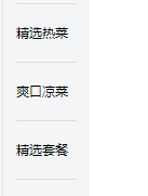
<li class="menu-item">
	<span class="text border-1px">精美熱菜</span>
</li>
<li class="menu-item">
	<span class="text border-1px">爽口冷盤</span>
</li>
<li class="menu-item">
	<span class="text border-1px">精選套餐</span>
</li>
3.1垂直居中最好的佈局是display: table;
.menu-item{
display: table;
height: 54px;
width: 56px;
padding: 0 12px;
line-height: 14px;
position: relative;
.text{
display: table-cell;
width: 56px;
vertical-align: middle;
font-size: 12px;
}
}
3.2 border 1px 畫素的相容
//border 1px 處理
@media(-webkit-min-device-pixel-ratio:1.5),(min-device-pixel-ratio:1.5){
	.border-1px{
		&:after{
			-webkit-transform:scaleY(0.7);
			transform:scaleY(0.7);
		}
	}
}

@media(-webkit-min-device-pixel-ratio:2),(min-device-pixel-ratio:2){
	.border-1px{
		&:after{
			-webkit-transform:scaleY(0.5);
			transform:scaleY(0.5);
		}
	}
}
.border-1px{
	position: relative;
	&:after{
		content:'';
		position: absolute;
		left:0;
		bottom:0;
		width:100%;
		border-top:1px solid #ccc;

	}
}
2.圖片設定
自適應的精髓在於寬度,margin/padding設定百分比彌補了元素高度無法自適應地與元素寬度保持一致的缺陷。