
React Native未來導航者:react-navigation 使用詳解(基礎篇)
剛建立的React Native 微信公眾號,歡迎微信掃描關注訂閱號,每天定期會分享react native 技術文章,移動技術乾貨,精彩文章技術推送。同時可以掃描我的微信加入react-native技術交流微信群。歡迎各位大牛,React Native技術愛好者加入交流!


上篇部落格和大家分享了關於React Native jsBundle預載入,介面啟動優化的內容,詳情可點選:
一、開源庫介紹
今年1月份,新開源的react-natvigation庫備受矚目。在短短不到3個月的時間,github上星數已達4000+。Fb推薦使用庫,並且在React Native當前最新版本0.44中將Navigator刪除。react-navigation據稱有原生般的效能體驗效果。可能會成為未來React Native導航元件的主流軍。本篇內容基於【 ^1.0.0-beta.9 】版本來介紹關於該庫的使用和實戰技巧。可以看到,雖然是beta版本,不過基本穩定,大家可放心在專案中使用。奉上
該庫包含三類元件:
(1)StackNavigator:用來跳轉頁面和傳遞引數
(3)DrawerNavigator:側滑選單導航欄,用於輕鬆設定帶抽屜導航的螢幕
二、react-navigation使用
具體內容大致分為如下:
(1)react-navigation庫屬性介紹
(2)StackNavigator、TabNavigator實現介面間跳轉,Tab切換
(3)StackNavigator介面間跳轉、傳值、取值
(4)DrawerNavigator實現抽屜導航選單
(5)DrawerNavigator擴充套件功能
1、StackNavigator屬性介紹
navigationOptions:配置StackNavigator的一些屬性。

    title:標題,如果設定了這個導航欄和標籤欄的title就會變成一樣的,不推薦使用
    header:可以設定一些導航的屬性,如果隱藏頂部導航欄只要將這個屬性設定為null
    headerTitle:設定導航欄標題,推薦
    headerBackTitle:設定跳轉頁面左側返回箭頭後面的文字,預設是上一個頁面的標題。可以自定義,也可以設定為null
    headerTruncatedBackTitle:設定當上個頁面標題不符合返回箭頭後的文字時,預設改成"返回"
    headerRight:設定導航條右側。可以是按鈕或者其他檢視控制元件
    headerLeft:設定導航條左側。可以是按鈕或者其他檢視控制元件
    headerStyle:設定導航條的樣式。背景色,寬高等
    headerTitleStyle:設定導航欄文字樣式
    headerBackTitleStyle:設定導航欄‘返回’文字樣式
    headerTintColor:設定導航欄顏色
    headerPressColorAndroid:安卓獨有的設定顏色紋理,需要安卓版本大於5.0
    gesturesEnabled:是否支援滑動返回手勢,iOS預設支援,安卓預設關閉


screen:對應介面名稱,需要填入import之後的頁面

mode:定義跳轉風格

   card:使用iOS和安卓預設的風格

   modal:iOS獨有的使螢幕從底部畫出。類似iOS的present效果

headerMode:返回上級頁面時動畫效果

   float:iOS預設的效果

   screen:滑動過程中,整個頁面都會返回

   none:無動畫

cardStyle:自定義設定跳轉效果

   transitionConfig: 自定義設定滑動返回的配置

   onTransitionStart:當轉換動畫即將開始時被呼叫的功能

   onTransitionEnd:當轉換動畫完成,將被呼叫的功能

path:路由中設定的路徑的覆蓋對映配置

initialRouteName:設定預設的頁面元件,必須是上面已註冊的頁面元件

initialRouteParams:初始路由引數
注:大家可能對於path不太理解。path屬性適用於其他app或瀏覽器使用url開啟本app並進入指定頁面。path屬性用於宣告一個介面路徑,例如:【/pages/Home】。此時我們可以在手機瀏覽器中輸入:app名稱://pages/Home來啟動該App,並進入Home介面。
2、TabNavigator屬性介紹
screen:和導航的功能是一樣的,對應介面名稱,可以在其他頁面通過這個screen傳值和跳轉。


navigationOptions:配置TabNavigator的一些屬性

title:標題,會同時設定導航條和標籤欄的title

tabBarVisible:是否隱藏標籤欄。預設不隱藏(true)

tabBarIcon:設定標籤欄的圖示。需要給每個都設定

tabBarLabel:設定標籤欄的title。推薦

導航欄配置

tabBarPosition:設定tabbar的位置,iOS預設在底部,安卓預設在頂部。(屬性值:'top','bottom')

swipeEnabled:是否允許在標籤之間進行滑動

animationEnabled:是否在更改標籤時顯示動畫

lazy:是否根據需要懶惰呈現標籤,而不是提前,意思是在app開啟的時候將底部標籤欄全部載入,預設false,推薦為true

trueinitialRouteName: 設定預設的頁面元件

backBehavior:按 back 鍵是否跳轉到第一個Tab(首頁), none 為不跳轉

tabBarOptions:配置標籤欄的一些屬性iOS屬性

activeTintColor:label和icon的前景色 活躍狀態下

activeBackgroundColor:label和icon的背景色 活躍狀態下

inactiveTintColor:label和icon的前景色 不活躍狀態下

inactiveBackgroundColor:label和icon的背景色 不活躍狀態下

showLabel:是否顯示label,預設開啟 style:tabbar的樣式

labelStyle:label的樣式安卓屬性

activeTintColor:label和icon的前景色 活躍狀態下

inactiveTintColor:label和icon的前景色 不活躍狀態下

showIcon:是否顯示圖示,預設關閉

showLabel:是否顯示label,預設開啟 style:tabbar的樣式

labelStyle:label的樣式 upperCaseLabel:是否使標籤大寫,預設為true

pressColor:material漣漪效果的顏色(安卓版本需要大於5.0)

pressOpacity:按壓標籤的透明度變化(安卓版本需要小於5.0)

scrollEnabled:是否啟用可滾動選項卡 tabStyle:tab的樣式

indicatorStyle:標籤指示器的樣式物件(選項卡底部的行)。安卓底部會多出一條線,可以將height設定為0來暫時解決這個問題

labelStyle:label的樣式

iconStyle:圖示樣式
3、DrawerNavigator屬性介紹
 DrawerNavigatorConfig

     drawerWidth - 抽屜的寬度
     drawerPosition - 選項是左或右。 預設為左側位置
     contentComponent - 用於呈現抽屜內容的元件,例如導航項。 接收抽屜的導航。 預設為DrawerItems
     contentOptions - 配置抽屜內容

     initialRouteName - 初始路由的routeName
     order - 定義抽屜專案順序的routeNames陣列。
     路徑 - 提供routeName到路徑配置的對映,它覆蓋routeConfigs中設定的路徑。
     backBehavior - 後退按鈕是否會切換到初始路由? 如果是,設定為initialRoute,否則為none。 預設為initialRoute行為

    DrawerItems的contentOptions屬性

     activeTintColor - 活動標籤的標籤和圖示顏色
     activeBackgroundColor - 活動標籤的背景顏色
     inactiveTintColor - 非活動標籤的標籤和圖示顏色
     inactiveBackgroundColor - 非活動標籤的背景顏色
     內容部分的樣式樣式物件
labelStyle - 當您的標籤是字串時,要覆蓋內容部分中的文字樣式的樣式物件4、使用StackNavigator + TabNavigator實現Tab介面切換、介面間導航
API定義:StackNavigator(RouteConfigs, StackNavigatorConfig)、TabNavigator(RouteConfigs, TabNavigatorConfig)
(1)整合 react-navigation:在終端執行 【 npm install react-navigation --save 】
(2)介面中匯入必要元件:
import {StackNavigator,TabNavigator,TabBarBottom} from 'react-navigation';
import HomeScreen from './pages/HomePage';
import MineScreen from './pages/MinePage';const Tab = TabNavigator(
{
Home:{
screen:HomeScreen,
navigationOptions:({navigation}) => ({
tabBarLabel:'首頁',
tabBarIcon:({focused,tintColor}) => (
<TabBarItem
tintColor={tintColor}
focused={focused}
normalImage={require('./imgs/[email protected]')}
selectedImage={require('./imgs/[email protected]')}
/>
)
}),
},
Mine:{
screen:MineScreen,
navigationOptions:({navigation}) => ({
tabBarLabel:'我',
tabBarIcon:({focused,tintColor}) => (
<TabBarItem
tintColor={tintColor}
focused={focused}
normalImage={require('./imgs/[email protected]')}
selectedImage={require('./imgs/[email protected]')}
/>
)
}),
},
},
{
tabBarComponent:TabBarBottom,
tabBarPosition:'bottom',
swipeEnabled:false,
animationEnabled:false,
lazy:true,
tabBarOptions:{
activeTintColor:'#06c1ae',
inactiveTintColor:'#979797',
style:{backgroundColor:'#ffffff',},
labelStyle: {
fontSize: 20, // 文字大小
},
}
}
);
import React,{Component} from 'react';
import {Image} from 'react-native';

export default class TabBarItem extends Component {

    render() {
        return(
            <Image source={ this.props.focused ? this.props.selectedImage : this.props.normalImage }
                style={ { tintColor:this.props.tintColor,width:25,height:25 } }
            />
        )
    }

}(1)第一層引數定義了要切換的介面,即【首頁】、【我】兩個介面元件,通過screen屬性指定。並且通過navigationOptions屬性設定相關屬性引數。
(2)設定導航欄的屬性引數。
TabNavigator定義好之後,需要用StackNavigator,顧名思義,StackNavigator就是以棧的方式來存放整個介面的,而TabNavigator是作為一個介面內不同子介面之間切換。所以還需要我們定義StackNavigator:
  const Navigator = StackNavigator(

    {
      Tab:{screen:Tab},
      Product:{screen:ProductScreen}
    },

    {
      navigationOptions:{
        headerBackTitle:null,
        headerTintColor:'#333333',
        showIcon:true,
       swipeEnabled:false,
       animationEnabled:false,
      },

      mode:'card',
    });
(1)指定要跳轉的介面元件。同樣是screen屬性標識介面元件,不多贅述。
(2)定義跳轉屬性引數,即頂部導航欄的一些引數設定和跳轉方式。
可以看到,我們將Tab作為一個介面設定到了StackNavigator。這樣就可以實現Tab導航和介面間跳轉的效果了。
最後就是在render中引用StackNavigator:
export default class Demo extends Component {

  render() {
        return (
          <Navigator />
        );
  }
}
5、介面間跳轉、傳值、取值
在介面元件注入到StackNavigator中時,介面元件就被賦予了navigation屬性,即在介面元件中可以通過【this.props.navigation】獲取並進行一些操作。
navigation屬性中提供了很多的函式簡化介面間操作,簡單列舉幾點:
(1)通過navigate函式實現介面之間跳轉:
this.props.navigation.navigate('Mine');// 返回上一頁
this.props.navigation.goBack();this.props.navigation.navigate('Mine',{info:'傳值過去'});(3)獲取值:
{this.props.navigation.state.params.info}以上實現完成,我們就可以愉快的玩耍啦~~ 什麼?忽然發現在Android上的效果和IOS效果不一樣。老闆要介面一致哇~ 怎麼辦?那就需要我們進行簡單的適配了。
三、DrawerNavigator實現抽屜導航
1、導航實現
API定義:DrawerNavigator(RouteConfigs,DrawerNavigatorConfig)
(1)介面中定義DrawerNavigator:
import {StackNavigator,TabNavigator,DrawerNavigator} from 'react-navigation';
import HomeScreen from './pages/HomePage';
import MineScreen from './pages/MinePage';

export default class Demo extends Component {

  render() {
        return (
          <Navigator />
        );
  }
}

const Navigator = DrawerNavigator({

    Home:{screen:HomeScreen},
    Mine:{screen:MineScreen},
});

const styles = StyleSheet.create({

    container: {
        flex: 1,
    },
});

AppRegistry.registerComponent('Demo', () => Demo);(2)HomeScreen介面和MineScreen介面:
export default class HomePage extends Component {

    static navigationOptions = {
        drawerLabel: '首頁',
        drawerIcon:({tintColor}) => (
            <Image
                source={require('./../imgs/ic_happy.png')}
                style={[styles.icon, {tintColor: tintColor}]}/>
        ),
    };

    render() {
        return(
            <View style={{flex:1}}>
                <Text onPress={this._skip.bind(this)}>點選跳轉</Text>
            </View>
        );
    }

    _skip() {
        this.props.navigation.navigate("Mine");
    }
}


export default class MinePage extends Component {

    static navigationOptions = {
        drawerLabel:'我',
         drawerIcon: ({ tintColor }) => (
            <Image
                source={require('./../imgs/ic_h.png')}
                style={[styles.icon, {tintColor: tintColor}]}
            />
        ),
    };

    render() {
        return(
            <View style={{flex:1}}>
                <Text onPress={this._skip.bind(this)}>返回上一介面</Text>
            </View>
        );
    }

    /**
     * 跳轉
     */
    _skip() {
        this.props.navigation.goBack();
    }
}2、擴充套件功能
(1)預設DrawerView不可滾動。要實現可滾動檢視,必須使用contentComponent自定義容器,如下所示:
{
  drawerWidth:200,
  抽屜位置:“對”
  contentComponent:props => <ScrollView> <DrawerItems {... props} /> </ ScrollView>
}import {DrawerItems} from 'react-navigation';
const CustomDrawerContentComponent = (props) => (
<View style = {style.container}>
<DrawerItems {... props} />
</View>
);
如果您巢狀DrawerNavigation,抽屜將顯示在父導航下方。
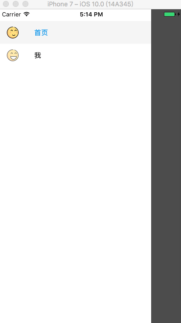
五、效果圖
抽屜導航:
以上就是我們實戰中常用的屬性和技巧。具體的操作還需要大家在實踐過程中測試體會。