
The Simplicity of Flexbox
The Simplicity of Flexbox
This simple website layout, uses five Flexbox properties only:

Flexbox can be your best friend when you want a responsive and clean layout for your website. It can be simple, using these five Flexbox properties.
Please meet display: flex , justify content, align items, flex-direction, and flex wrap. You don’t need much more.
So let’s say I want my website to include:
- Navbar
- 3 boxes with content
- 5 smaller boxes with content
- Footer
I want to use the simplest code possible. And I want it to be responsive.
Here comes Flexbox!
You only need to understand these five properties to have the basic layout.
The Basics
Let’s take a step back and talk about Flexbox. The idea of Flexbox is to set a box and define the relationship and position of the elements that are in it.
Let’s say that this is our box, and we name it wrapper:

We would like to position these 3 boxes in it, let’s call each one of them box:


We can design the boxes with this code, without
.wrapper {
  width: 34em;
  display: block;
  margin: 0 auto;
}
.box {
  width: 8em;
  height: 10em;
  background-color: #22738e;
  margin: 2em;
  display: inline-block;
}
Here we have to define the wrapper with width, display, and margin, in order to center the boxes on the page, but the result is not precise. Then we define width and height for each box, we give it a background color and margin (between boxes) and set the display as inline-block so all the boxes would be aligned in a row.
Alternatively, we can use Flexbox:
.wrapper {
  display: flex;
  justify-content: space-around;
}
.box {
  width: 8em;
  height: 10em;
  background-color: #22738e;
  margin: 2em;
}
Here we define a flex display for the wrapper, and use justify-content to center the boxes within the wrapper. Then, we design the boxes the same way as the other code, only here we don’t need to define display: inline-block as the elements in Flexbox are arranged by default in a row.
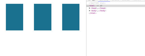
If we use a large device, as desktop, the result for both would be three boxes, aligned next to each other:


But without Flexbox, if we want to resize the screen, the width of each box would stay fixed, so the boxes would be pushed to the next row when there is not enough space for the three of them.


In contrary, with Flexbox, unless specified differently, the items would resize themselves according to the width they have, and would keep the position according to their box, in this case wrapper.

This is important when you want a responsive website.
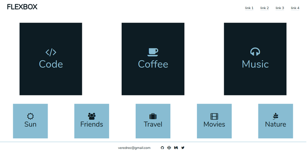
Website Layout with Flexbox
If you want to get the simple website, you can design your navbar, main content, and footer exactly in the same way.
The code:
The HTML includes the elements we would like to show on the page.
<header>
 <nav class="nav">
   <h1 class="logo"> FLEXBOX </h1>
   <ul class="menu">
    <li class="link">link 1</li>
    <li class="link">link 2</li>
    <li class="link">link 3</li>
    <li class="link">link 4</li>
   </ul>
 </nav>
</header>
<section class="main-content">
 <div class="box-main"><i class="fa fa-code"></i>Code</div>
 <div class="box-main"><i class="fa fa-coffee"></i>Coffee</div>
 <div class="box-main"><i class="fa fa-headphones"></i>Music</div>
</section>

<section class="secondary-content">
 <div class="box-second"><i class="fa fa-sun-o"></i>Sun</div>
 <div class="box-second"><i class="fa fa-users"></i>Friends</div>
 <div class="box-second"><i class="fa fa-suitcase"></i>Travel</div>
 <div class="box-second"><i class="fa fa-film"></i>Movies</div>
 <div class="box-second"><i class="fa fa-pagelines"></i>Nature</div>
</section>
<footer class="footer">
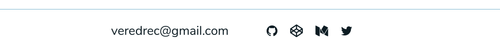
<p class="text">[email protected]</p>
<div class="social-media">
<i class="icon fa fa-github"></i>
<i class="icon fa fa-codepen"></i>
<i class="icon fa fa-medium"></i>
<i class="icon fa fa-twitter"></i>
</div>
</footer>
Our page contains a header with a navigation bar - navbar, that includes a list of links, a section with 3 containers (boxes) and another section with 5 containers, and at the bottom of the page a footer with a link and 4 icons.
For each section or part we create a wrapper that contains the items we want to position in a certain way.
CSS for Navbar:
.nav {
  display: flex;
  justify-content: space-between;
}
.logo {
  font-size: 2em;
  font-weight: bold;
  margin-left: 1em;
}
.menu {
  list-style-type: none;
  display: flex;
  justify-content: center;
  margin-right: 1em;
  flex-wrap: wrap;
}
.link {
  margin: 1em;
  border-bottom: 0.1em solid #d7e0e3;
  display: flex;
  align-items: flex-end;
}
In the navbar we have two levels of Flexbox:
- the navbar itself is a flex box with the logo and the menu as the two elements it contains

- the menu is a flex box with the links as its elements

Let’s take a look at the different Flexbox properties we have:
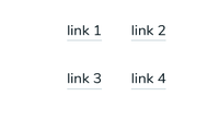
display: flex: define the wrapper as a flex box.justify-contentwould position the elements within the wrapper. The navbar isspace-between, which will position each of the two elements (logo and menu) on two different ends of the screen, horizontally. The menu itself is set tocenter, which will center all elements (four links) in the center of their wrapper (theul).flex-wrap: wrapwill push the elements to a new line when they do not have enough space in their row. This, for example, would be the result on a small screen:

align-itemswould define where the items would be positioned vertically. In this caseflex-endwould position them at the bottom of the wrapper. In the next section we will see thealign-items: centeroption.
CSS for Main content (3 boxes & 5 boxes):
.main-content {
  display: flex;
  justify-content: space-around;
  flex-wrap: wrap;
}
.secondary-content {
  display: flex;
  justify-content: space-around;
  flex-wrap: wrap;
}
.box-main {
  width: 6em;
  height: 7em;
  font-size: 3em;
  background-color: #06161d;
  color: #8ebed1;
}
.box-second {
  width: 5em;
  height: 5em;
  font-size: 2em;
  background-color: #8ebed1;
  color: #06161d;
}
.box-main,
.box-second {
  display: flex;
  justify-content: center;
  flex-direction: column;
  align-items: center;
  margin: 0.5em;
}
In the sections we have two levels of Flexbox as well:
- the section is a wrapper with the boxes as its elements


- each box is a wrapper for the content it has: title and icon


For each box we use display: flex and justify-content: center, but this time, for each box the flex-direction is column and we set align-items: center which set the position of the items, in this case the icon and the word COFFEE, to be centered vertically as well.
CSS for Footer:
.footer {
  border-top: 0.05rem solid #8ebed1;
  display: flex;
  justify-content: center;
  align-items: center;
}
.social-media {
  display: flex;
  justify-content: center;
  margin-left: 3em;
}
.icon {
  margin-right: 1em;
}
Same goes for footer. We have two levels of Flexbox here as well:
- the footer, with the link and icons as elements
- the icons are in a separate div which is a wrapper for the icons
And this is the result of it all:
Of course, there are many more properties in Flexbox, and these are only 5 of them, but they can give us a nice start for our design.
I highly recommend using this detailed guide that gives a great introduction to Flexbox and explain all properties.
If you have time I encourage you to play the fun Flexbox Froggy game which is a good start for Flexbox!
相關推薦
The Simplicity of Flexbox
The Simplicity of FlexboxThis simple website layout, uses five Flexbox properties only:Flexbox can be your best friend when you want a responsive and clean
Quick lab: No infrastructure, just code. See the simplicity of serverless
Serverless computing refers to a model where the existence of servers is entirely abstracted away. Even though servers exist, develop
Position element at the bottom of the screen using Flexbox in React Native
Position element at the bottom of the screen using Flexbox in React NativeSource: British AirwaysReact Native uses Yoga to achieve Flexbox style layout, wh
HDU 3591 The trouble of Xiaoqian(多重背包+全然背包)
給他 cas 維數 color cost 代碼 01背包 size code HDU 3591 The trouble of Xiaoqian(多重背包+全然背包) http://acm.hdu.edu.cn/showproblem.php?pid=3591 題意:
hdu 5381 The sum of gcd 2015多校聯合訓練賽#8莫隊算法
names 來看 efi nbsp span ems multipl script there The sum of gcd Time Limit: 2000/1000 MS (Java/Others) Memory Limit: 65536/65536 K
HDOJ 5381 The sum of gcd 莫隊算法
source scanf borde array size ltr d+ miss != 大神題解: http://blog.csdn.net/u014800748/article/details/47680899 The sum of gcd Time
解決:The content of element type "web-app" must match "(icon?display
內容 param match filter res ros welcome local page http://www.educity.cn/wenda/126463.html 解決:The content of element type "web-app" must ma
解決Gradle執行命令時報Could not determine the dependencies of task ':compileReleaseJava'.
內容 oid 兩個 jsb pan mpi 技術分享 android undle Could not determine the dependencies of task ‘:compileReleaseJava‘. > failed to find targe
Java compiler level does not match the version of the installed Java project facet
led epo sin eclips path tar repo alt rip 更換jdk版本時報以下問題:Description Resource Path Location TypeJava compiler level does not match the vers
POJ 2553 The Bottom of a Graph(強連通分量)
margin target 代碼 not push ret dsm ng- http POJ 2553 The Bottom of a Graph 題目鏈接 題意:給定一個有向圖,求出度為0的強連通分量 思路:縮點搞就可以 代碼: #include <
Mastering the game of Go with deep neural networks and tree search
深度 策略 參數初始化 技術 以及 -1 簡單 cpu 網絡 Silver, David, et al. "Mastering the game of Go with deep neural networks and tree search." Nature 529.758
The Bottom of a Graph
ive limit rtai assume ted can hab spa mean poj——The Bottom of a Graph
[Leetcode] remove nth node from the end of list 刪除鏈表倒數第n各節點
truct def 倒數 move col lis remove str class Given a linked list, remove the n th node from the end of list and return its head. For exampl
The Zen of Python
read sparse ever one simple -o light practical ood >>> import this The Zen of Python, by Tim Peters Beautiful is better th
leetcode-Evaluate the value of an arithmetic expression in Reverse Polish Notation
ret i++ value reverse alua style 執行 掃描 span leetcode 逆波蘭式求解 Evaluate the value of an arithmetic expression in Reverse Polish Notation. Va
The Sign of Four 2017-6-28
over all bar 似的 row ase nbsp ctu 還原 I am a Worcestershire man. …which sent me over to India. …the Indian Army rebelled against the Br
Harry Potter and the Goblet of Fire
opaque 外殼 葡萄酒 revel luna 道德 說明 剪裁 指揮 書名:Harry Potter and the Goblet of Fire 作者:J.K. Rowling 篇幅: 752頁 藍思值:880L 用時: 17天 工具:
Transfer learning & The art of using Pre-trained Models in Deep Learning
tran topic led super entire pooling file under mina 原文網址: https://www.analyticsvidhya.com/blog/2017/06/transfer-learning-the-art-of-fine
The use of servlet
sel def problem servle https col read rri rst Servlet is a java code run in the server such as Tomcat. How to create a servlet? 1.Creat
HDU 4260(The End of The World-Hanoi塔從中間狀態移動)
ctype read finish car ann bbb over lines 遞歸 The End of The World Time Limit: 2000/1000 MS (Java/Others) Memory Limit: 32768/327