
Android新元件CoordinatorLayout協調佈局的使用,結合TabLayout,結合DrawerLayout
偶爾的一次忘記是在哪裡了,看到的效果,Toolbar可以摺疊,拉下來是正常的ui,但是向上推這個正常的檢視就變為了Toolbar,看到之後自己就開始各種找,記得那時候是2015年的9月份左右,網上也沒有,搜demo也沒有,沒辦法只能自己琢磨了,還記得第一次使用的時候,各種報錯,各種檢視疊加在一起,屬實折騰了自己一段時間。之後效果做出來了,但是整個介面不能只有一個摺疊的Toolbar啊,於是開始搞各種結合使用,listview什麼的就不說了,不支援listview,換成recylerView就會沒有那麼多的衝突,我分享一下如何與DrawerLayout和TabLayout結合使用吧! 時刻記住一個點就可以了 ,要為其餘元件設定behavior就可以!
下面先簡單的介紹一下CoordinatorLayout這個元件,根據自己程式猿的翻譯,應該是譯為 協調佈局,是谷歌推出的M包裡的元件。首先,要使用CoordinatorLayout這個元件,在Android Studio中新增依賴:
compile 'com.android.support:design:23.0.1'根據API中的介紹:
它的父類是ViewGroup,是作為一個容器來使用的,有沒有小夥伴去自己的api中查詢了,是不是沒有啊!要下6.0的才會有哦!
上面的是關於它的介紹,翻譯過來的大概的意思是:
1. CoordinatorLayout是一個超級FrameLayout,這裡就可以知道它裡面裝載的childView是如何排列的了
2. 它是一個特別高階的很炫酷的app裝飾佈局
3. 可以為一個或者更多的子檢視提供相互作用,話說當時看這個我也為老美的說話邏輯感到鬧心,這都是什麼意思?但是使用之後就會明白了,作為一個協調佈局,可以為它的子檢視之間提供相互作用,來實現協調每個子檢視!
下面那一大堆xafwfawfawf大概的意思就是 Beahviors,這個最重要了,為子檢視新增行為,例如新增可滑動的行為,之後就可以摺疊滑動了,下面會介紹how to do!
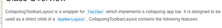
下面看一下我download下來的效果圖吧!
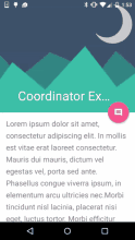
看到了效果圖,是不是也想要自己做一個呢,下面開始介紹如何使用吧!
我會詳細的說一下如何使用CoordinatorLayout,之後與TabLayout和DrawerLayout結合使用的就不多說了,其實就是如何在佈局中調整位置
CoordinatorLayout使用:
<?xml version="1.0" encoding="utf-8"?>
<android.support.design.widget.CoordinatorLayout 由於CoordinatorLayout是一個容器,所以我將它放在了最外層
之後放置了一個AppBarLayout,裝載的是Toolbar部分
之後放置了一個NestedScrollView,該元件裝載Toolbar下方的元件,這樣才可以是toolbar可以摺疊滑動!
AppbarLayout:是一個垂直的線性佈局,看它的api中的英文介紹!是不是需要我翻譯一下呢!
想要appbar可以捲動,就要使用AppbarLayout,
它的一個很重要的屬性:app:layout_scrollFlags
該屬性有4個引數,分別是:
1.scroll:可以讓view滾動出螢幕,如果沒有設定該引數,檢視滾動完畢後會停留在螢幕頂端
2.enterAlways:只要向下滑動,就可以讓view可見,用於快速滾動,只要滾動了就會快速的做出view顯示的響應
3.enterAlwaysCollapsed:使要滾動摺疊的檢視可以捲動,可以擴大
4.exitUntilCollapsed:退出螢幕,摺疊之後顯示在頂端
設定完畢後,toolbar可以滾動,摺疊完成之後顯示在頂端,向下拉可以顯示內容
之後使用了CollapsingToolbarLayout
它的父類是幀佈局,可以讓toolbar拉伸開啟時顯示的內容多樣化,設定例如imageview,textview,button之類的使內容更豐富
使用該元件主要是使用如下屬性:
1.title:當toolbar拉伸到上方時,顯示的內容
2.contentScrim:顯示在上方作為toolbar時的顏色,引數為十六進位制顏色值
我常用的就這兩個,他還有一些其餘屬性,有需要可以去api中檢視
最後,為了使toolbar可以摺疊滑動,總結一下:
1.首先,容器必須是CoordinatorLayout
2.設定屬性layout_scrollFlags
3.toolbar下方必須有支援滑動的元件,之後為其設定behavior:
@string/appbar_scrolling_view_behavior
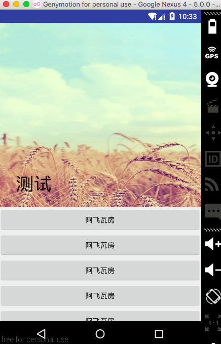
如此實現了效果如下圖所示
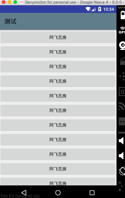
下面上傳兩個和TabLayout與抽屜結合使用的佈局:
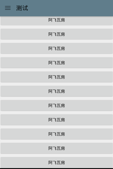
採用的是toolbar+drawerlayout的實現方法,但是始終無法實現drawerlayout不遮擋toolbar,無法讓抽屜顯示在toolbar下方,如果哪位大神看到了這句,有好辦法,請告知!非常非常感謝!
佈局如圖:
<?xml version="1.0" encoding="utf-8"?>
<LinearLayout xmlns:android="http://schemas.android.com/apk/res/android"
    xmlns:app="http://schemas.android.com/apk/res-auto"
    android:layout_width="match_parent"
    android:layout_height="match_parent"
    android:orientation="vertical">

    <android.support.v4.widget.DrawerLayout
        android:id="@+id/drawer_layout"
        android:layout_width="match_parent"
        android:layout_height="match_parent">

        <android.support.design.widget.CoordinatorLayout xmlns:android="http://schemas.android.com/apk/res/android"
            xmlns:app="http://schemas.android.com/apk/res-auto"
            android:layout_width="match_parent"
            android:layout_height="match_parent">

            <android.support.design.widget.AppBarLayout
                android:layout_width="match_parent"
                android:layout_height="wrap_content">

                <android.support.design.widget.CollapsingToolbarLayout
                    android:layout_width="match_parent"
                    android:layout_height="match_parent"
                    app:contentScrim="@color/theme_color"
                    app:layout_scrollFlags="scroll|exitUntilCollapsed"
                    app:title="測試">

                    <ImageView
                        android:layout_width="match_parent"
                        android:layout_height="350dp"
                        android:scaleType="fitXY"
                        android:src="@mipmap/tab1_pressed" />

                    <android.support.v7.widget.Toolbar
                        android:id="@+id/tool_bar"
                        android:layout_width="match_parent"
                        android:layout_height="?attr/actionBarSize"
                        app:layout_collapseMode="pin"
                        app:popupTheme="@style/ThemeOverlay.AppCompat.Light" />
                </android.support.design.widget.CollapsingToolbarLayout>
            </android.support.design.widget.AppBarLayout>

            <android.support.v4.widget.NestedScrollView
                android:layout_width="match_parent"
                android:layout_height="wrap_content"
                app:layout_behavior="@string/appbar_scrolling_view_behavior">

                <LinearLayout
                    android:layout_width="match_parent"
                    android:layout_height="wrap_content"
                    android:orientation="vertical">

                    <Button
                        android:id="@+id/open_drawer"
                        android:layout_width="match_parent"
                        android:layout_height="wrap_content"
                        android:text="阿飛瓦房" />

                    <Button
                        android:layout_width="match_parent"
                        android:layout_height="wrap_content"
                        android:text="阿飛瓦房" />

                    <Button
                        android:layout_width="match_parent"
                        android:layout_height="wrap_content"
                        android:text="阿飛瓦房" />

                    <Button
                        android:layout_width="match_parent"
                        android:layout_height="wrap_content"
                        android:text="阿飛瓦房" />

                    <Button
                        android:layout_width="match_parent"
                        android:layout_height="wrap_content"
                        android:text="阿飛瓦房" />

                    <Button
                        android:layout_width="match_parent"
                        android:layout_height="wrap_content"
                        android:text="阿飛瓦房" />

                    <Button
                        android:layout_width="match_parent"
                        android:layout_height="wrap_content"
                        android:text="阿飛瓦房" />

                    <Button
                        android:layout_width="match_parent"
                        android:layout_height="wrap_content"
                        android:text="阿飛瓦房" />

                    <Button
                        android:layout_width="match_parent"
                        android:layout_height="wrap_content"
                        android:text="阿飛瓦房" />

                    <Button
                        android:layout_width="match_parent"
                        android:layout_height="wrap_content"
                        android:text="阿飛瓦房" />

                    <Button
                        android:layout_width="match_parent"
                        android:layout_height="wrap_content"
                        android:text="阿飛瓦房" />

                    <Button
                        android:layout_width="match_parent"
                        android:layout_height="wrap_content"
                        android:text="阿飛瓦房" />

                    <Button
                        android:layout_width="match_parent"
                        android:layout_height="wrap_content"
                        android:text="阿飛瓦房" />

                    <Button
                        android:layout_width="match_parent"
                        android:layout_height="wrap_content"
                        android:text="阿飛瓦房" />

                    <Button
                        android:layout_width="match_parent"
                        android:layout_height="wrap_content"
                        android:text="阿飛瓦房" />

                    <Button
                        android:layout_width="match_parent"
                        android:layout_height="wrap_content"
                        android:text="阿飛瓦房" />
                </LinearLayout>
            </android.support.v4.widget.NestedScrollView>

        </android.support.design.widget.CoordinatorLayout>
        <!-- 抽屜內容 -->
        <LinearLayout
            android:id="@+id/drawer_view"
            android:layout_width="200dp"
            android:layout_height="match_parent"
            android:layout_gravity="left"
            android:background="@color/theme_color"
            android:orientation="vertical">

            <Button
                android:layout_width="match_parent"
                android:layout_height="wrap_content"
                android:text="測試" />

            <Button
                android:layout_width="match_parent"
                android:layout_height="wrap_content"
                android:text="測試" />
        </LinearLayout>
    </android.support.v4.widget.DrawerLayout>
</LinearLayout>
程式碼:
import android.support.v4.widget.DrawerLayout;
import android.support.v7.app.ActionBarActivity;
import android.support.v7.app.ActionBarDrawerToggle;
import android.support.v7.app.AppCompatActivity;
import android.os.Bundle;
import android.support.v7.widget.Toolbar;
import android.view.View;
import android.widget.Button;
import android.widget.LinearLayout;

public class MainActivity extends AppCompatActivity {

    private Toolbar toolbar;
    private ActionBarDrawerToggle drawerToggle;
    private DrawerLayout drawerLayout;
    private LinearLayout drawerView;

    @Override
    protected void onCreate(Bundle savedInstanceState) {
        super.onCreate(savedInstanceState);
        setContentView(R.layout.activity_main);
        drawerLayout = (DrawerLayout) findViewById(R.id.drawer_layout);
        drawerView = (LinearLayout) findViewById(R.id.drawer_view);
        toolbar = (Toolbar) findViewById(R.id.tool_bar);
        toolbar.setTitle("測試");
        setSupportActionBar(toolbar);
        // 設定返回鍵可用
        getSupportActionBar().setHomeButtonEnabled(true);
        getSupportActionBar().setDisplayHomeAsUpEnabled(true);


        drawerToggle = new ActionBarDrawerToggle(MainActivity.this, drawerLayout, toolbar, R.string.open, R.string.close);
        drawerToggle.syncState();
        drawerLayout.setDrawerListener(drawerToggle);

        Button btn = (Button) findViewById(R.id.open_drawer);
        btn.setOnClickListener(new View.OnClickListener() {
            @Override
            public void onClick(View v) {
                drawerLayout.openDrawer(drawerView);
            }
        });
    }

}
下面是結合viewpager使用的,
<?xml version="1.0" encoding="utf-8"?>
<android.support.design.widget.CoordinatorLayout xmlns:android="http://schemas.android.com/apk/res/android"
xmlns:app="http://schemas.android.com/apk/res-auto"
android:id="@+id/singer_root_view"
android:layout_width="match_parent"
android:layout_height="match_parent"
android:fitsSystemWindows="true">
<android.support.design.widget.AppBarLayout
android:id="@+id/singer_appbar"
android:layout_width="match_parent"
android:layout_height="wrap_content"
android:fitsSystemWindows="true">
<android.support.design.widget.CollapsingToolbarLayout xmlns:app="http://schemas.android.com/apk/res-auto"
android:id="@+id/singer_cool_title"
android:layout_width="match_parent"
android:layout_height="match_parent"
android:fitsSystemWindows="true"
app:contentScrim="@color/theme_bg_color"
app:expandedTitleMarginEnd="30dp"
app:expandedTitleMarginStart="30dp"
app:layout_scrollFlags="scroll|exitUntilCollapsed"
app:title="每日推薦">
<ImageView
android:id="@+id/singer_topbar_iv"
android:layout_width="match_parent"
android:layout_height="260dp"
android:fitsSystemWindows="true"
android:scaleType="fitXY"
android:src="@mipmap/b"
app:layout_collapseMode="parallax"
app:layout_collapseParallaxMultiplier="0.7" />
<android.support.v7.widget.Toolbar
android:id="@+id/toolbar"
android:layout_width="match_parent"
android:layout_height="?attr/actionBarSize"
app:layout_collapseMode="pin"
app:popupTheme="@style/ThemeOverlay.AppCompat.Light" />
</android.support.design.widget.CollapsingToolbarLayout>
<com.wu.dateba.widget.ViewPagerIndicator
android:id="@+id/singer_tablayout"
android:layout_width="match_parent"
android:layout_height="42dp"
android:orientation="horizontal"
app:item_count="2"
android:background="@drawable/player_bg_color"
app:layout_behavior="@string/appbar_scrolling_view_behavior" />
</android.support.design.widget.AppBarLayout>
<android.support.v4.view.ViewPager
android:id="@+id/singer_viewpager"
android:layout_width="match_parent"
android:layout_height="match_parent"
app:layout_behavior="@string/appbar_scrolling_view_behavior" />
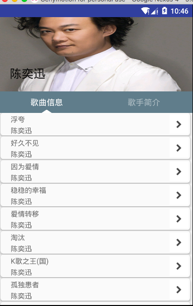
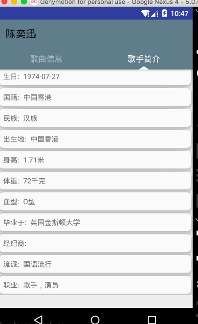
</android.support.design.widget.CoordinatorLayout>上方的viewpagerIndicator可以替換為tabLayout!實現了上方toolbar可以拉伸,下面顯示的是viewpager+tablayout
相關推薦
Android新元件CoordinatorLayout協調佈局的使用,結合TabLayout,結合DrawerLayout
偶爾的一次忘記是在哪裡了,看到的效果,Toolbar可以摺疊,拉下來是正常的ui,但是向上推這個正常的檢視就變為了Toolbar,看到之後自己就開始各種找,記得那時候是2015年的9月份左右,網上也沒有,搜demo也沒有,沒辦法只能自己琢磨了,還記得第一次使用的
深入剖析Android四大元件(九)——Activity之AppCompatActivity與toolbar的結合
對於技術類的部落格,我們永遠追尋最新API腳步,在API22之前我們使用標題欄基本都是在ActionBarActivity的Activity中處理的,而API22之後,谷歌遺棄了ActionBarActivity,推薦我們也可以說是強制我們使用AppCompatActivit
android文字元件textView屬性autolink設定為web,顯示網址的處理方法
/** 匹配網址正則表示式*/ private static final String TOP_LEVEL_DOMAIN_STR_FOR_WEB_URL = "(?:" + "(?:aero|arpa|asia|a[cdefgilmnoqrs
Android 開發 CoordinatorLayout 協調者佈局 與 ConstraintLayout約束佈局 兩者的關係
在摸索新技術是發現CoordinatorLayout 與 ConstraintLayout 會有衝突關係,所以就研究了一下他們之間的不相容,被影響的方面.其實某種程度上來說是CoordinatorLayout與其他Layout佈局之間的關係. 首先說明一下: Coor
Android之控制元件與佈局,結構知識點,基礎完結
在Android中我們常常用到很多UI控制元件,如TextView,EditText,ImageView,Button,ImageButton,ToggleButton,CheckBox,RadioButton等等這些可以自己多用就會了。 也會學到一些
MVVM架構結合阿里ARouter,打造一套Android-Databinding元件化
前言 關於Android的元件化,相信大家並不陌生,網上談論元件化的文章,多如過江之鯽,然而一篇基於MVVM模式的元件化方案卻很少。結合自身的調研和探索,在此分享一篇基於MVVMHabit框架(https://github.com/goldze/MVVMHabit )的一套Android-Dat
Android協調佈局CoordinatorLayout 印象筆記
1.題記 本篇文章簡述下常見的協調佈局CoordinatorLayout的內部view之間的關係2.正文舉個最常見的佈局例子<?xml version="1.0" encoding="utf-8"?> <android.support.design.w
Android新特性介紹,ConstraintLayout完全解析
mat 區別 界面 -s 自己 解決 match roo pre 本篇文章的主題是ConstraintLayout。其實ConstraintLayout是Android Studio 2.2中主要的新增功能之一,也是Google在去年的I/O大會上重點宣傳的一個功能。我們都
Android新佈局ConstraintLayout解析
轉載自鴻洋大神的部落格 一、概述 ConstraintLayout出現有一段時間了,不過一直沒有特別去關注,也多多少少看了一些文字介紹,多數都是對使用視覺化佈局拖拽,個人對拖拽一直不看好,直到前段時間看到該文: 解析ConstraintLayout的效能優勢 非常詳盡的介紹
Android-RecyclerView元件中setLayoutManager方法的使用,使RecyclerView更有趣
在我的部落格中有講到RecyclerView的使用,當中只是簡單的描述了一下程式碼中的setLayoutManager需要設定,那麼這個方法到底有什麼功能呢,下面我就和大家分享一下,大牛請繞過…… 原始碼是用我部落格中RecyclerView自定義佈局裡面的原始碼修改的
Android自定義控制元件----繼承ViewGroup側滑選單3,普通側滑選單,新增選單切換按鈕(完結)
專案結構: 思路: 對外暴露一個選單開啟和關閉選單的方法toggle 當開啟時this.smoothScrollTo(0, 0);滑動選單顯示 當關閉時this.smoothScrollTo(mMenuWidth, 0);選單隱藏
Android 控制元件之 RecyclerView(一)—— 載入檢視和佈局選擇
本文目錄 一、概述 二、列表檢視的處理 1. item 的佈局檔案 2. 構造 Adapter 類 3. 佈局管理器 1)LinearLayoutManager 2)GridLayoutManager
完美的HTML移動端UI框架,Framework7 v3新元件特性一覽
Toast 吐司 我在2016年開始使用Framework7,在Framework7較早的版本中,沒有吐司,只有alert,Toast需要自己實現,而吐司又是非常常用的元件,這是Framework7為數不多的欠缺的地方,不過現在這個問題久不存在了,最新版的F7裡面已經增
佈局歐洲,挺進南美,比特幣現金(BCH)再度攻下4個新市場
作為BCH的堅定支持者,比特幣耶穌Roger Ver曾多次在各種場合宣傳BCH的支付優勢,10月23日,他有發推稱,相對於委內瑞拉、阿根廷、土耳其、伊朗、衣索比亞、奈及利亞、菲律賓、巴基斯坦、墨西哥、巴西等國的法幣,BCH有著更低的通脹率。 事實也正式如此,在BCH社群
Eclipse新建android專案時候,預設佈局方式是RelativeLayout,修改為預設佈局方式為LinearLayout
SDK版本有關。2.3預設LinearLayout,4.0預設RelativeLayout。 修改%ANDROID_SDK_HOME%\tools\templates\activities\BlankActivity\root\res\layout下的activity_si
【forlong401的專欄--有問題上:http://www.androidren.com】Android and iOS Now! 多交流技術,多分享,技術只有分享,才會經久不衰。 歡迎關注新浪微博:@forlong401 。http://weibo.
Android and iOS Now! 多交流技術,多分享,技術只有分享,才會經久不衰。 歡迎關注新浪微博:@forlong401 。http://weibo.com/forlong401...
使用AutoLayout佈局適配時,如何提前獲得AutoLayout完成適配後的子控制元件的真實frame
當我們使用AutoLayout做適配時,可能會有這樣的需求,就是在想在適配完成前就取得子控制元件的真實frame,來做一些操作。比如我們想把一個正方形的UIImageView剪成一個圓形,這時候就需要這麼做 self.imageView.layer.cornerRadius
vue路由—實現經典佈局(同一個路由,對應多個元件)
要點: 1.router-view頭部,側邊欄,主體內容區域三個區域,每個有一個佔位符。 2.佔位符定義一個name屬性,跟components的第一個屬性對應,這裡component使用複數,同一個路由下匹配多個元件。 HTML程式碼: <!DOCTYPE h
Android 仿淘寶商品詳情標題欄變色,佈局層疊效果
如圖效果 思路:如圖可以將圖片中佈局分成三個部分,1標題欄透明背景,2上半部分佈局,3下半部分佈局,當我們向上拉動的時候,1佈局實現漸變,從透明變到白色,2佈局背景色漸變到白色,23佈局隨滾動條上拉,並且慢慢改變2佈局paddingtop的屬性,其中1佈局漂浮在整個scro
一個很好,很實用,學習android xml佈局檔案
用了各種佈局組合成一個漂亮的見面。新手很實用的一個例子,大家學習一下。。。。。。分享 本例用到了(相對佈局,線性佈局的各種巢狀使用) 效果圖片: <?xml version="1.0" encoding="utf-8"?> <RelativeLayout