
【資料視覺化】可放縮可拖拽畫布的力導向圖
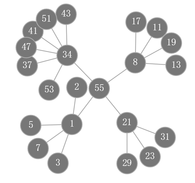
效果:
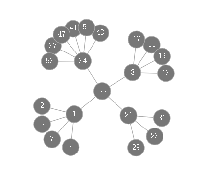
拖拽並縮小後:
1、確認主次
以力導向圖為藍本2、增加縮放控制變數
var transform = d3.zoomIdentity;3、響應放縮事件
d3.select(canvas)
    .call(
        d3.zoom()
            .scaleExtent([1/10, 10])
            .on("zoom",
                function(){
                    transform = d3.event.transform;
                    render();
                }
            )
    )
4、拖拽事件的碰撞檢測和座標轉換
// 合併兩個dragsubject()函式
function subject_from_event() {
//1、查詢物件時,事件物件的座標是螢幕座標,需要轉換成實際座標
var ex = transform.invertX(d3.event.x),
ey = transform.invertY(d3.event.y);
var node = simulation.find(ex,ey);
//2、計算滑鼠是否落在圖形內部,如果落在圖形外返回空以實現畫布的拖拽
var dx = ex - node.x,
dy = ey - node.y;
if 4、圖元渲染過程畫布的放縮和移動
// 更換ticked()為render(),渲染前進行畫布的放縮和移動
context.translate(transform.x, transform.y);
context.scale(transform.k, transform.k);
5、模組化程式碼(force_zoom_canvas.js)
function force_zoom_canvas(canvas_id){
    // TODO 內部變數
    var graph={},
        canvas = document.getElementById (canvas_id),
        context = canvas.getContext("2d"),
        width = canvas.width,
        height = canvas.height,
        transform = d3.zoomIdentity,
        distance = 47,
        radius = 13,
        simulation = d3.forceSimulation();
    // TODO 配置D3
    function initialize(nodes,links){
        graph.nodes = nodes;
        graph.links = links;
        simulation
            .force("link", d3.forceLink().distance(distance).strength(1).id(function(n) { return n.id; }))
            .force("charge", d3.forceManyBody())
            .force("center", d3.forceCenter(width / 2, height / 2))
            .nodes(graph.nodes)
            .on("tick",render);
        simulation.force("link")
            .links(graph.links);
        d3.select(canvas)
            .call(d3.drag().container(canvas).subject(subject_from_event).on("start", drag_started).on("drag", dragged).on("end", drag_ended))
            .call(d3.zoom().scaleExtent([1/10, 10]).on("zoom", function(){transform = d3.event.transform;render();}))
            .call(render);
        //TODO 圖元發現
        function subject_from_event() {
            var ex = transform.invertX(d3.event.x),
                ey = transform.invertY(d3.event.y);
            var node = simulation.find(ex,ey);
            var dx = ex - node.x,
                dy = ey - node.y;
            if(dx*dx+dy*dy <radius*radius){
                node.rx = node.x;
                node.ry = node.y;
                node.x = transform.applyX(node.rx);
                node.y = transform.applyY(node.ry);
                return node;
            }
            return null;
        }
        //TODO 圖元拖拽
        function drag_started(){
            if (!d3.event.active) simulation.alphaTarget(0.3).restart();
            d3.event.subject.fx = d3.event.subject.rx;
            d3.event.subject.fy = d3.event.subject.ry;
        }
        function dragged(){
            d3.event.subject.fx = transform.invertX(d3.event.x);
            d3.event.subject.fy = transform.invertY(d3.event.y);
        }
        function drag_ended(){
            if (!d3.event.active) simulation.alphaTarget(0);
            d3.event.subject.x = d3.event.subject.rx;
            d3.event.subject.y = d3.event.subject.ry;
            d3.event.subject.fx = null;
            d3.event.subject.fy = null;
        }
    }
    // TODO 圖元渲染
    function render(){
        context.save();
        context.clearRect(0, 0, width, height);
        context.translate(transform.x, transform.y);
        context.scale(transform.k, transform.k);
        graph.links.forEach(function(l){
            context.beginPath();
            context.moveTo(l.source.x, l.source.y);
            context.lineTo(l.target.x, l.target.y);
            context.strokeStyle = "#aaa";
            context.stroke();
        });
        graph.nodes.forEach(function(n){
            context.fillStyle= "#777";
            context.beginPath();
            context.moveTo(n.x+radius, n.y);
            context.arc(n.x, n.y,radius,0,Math.PI*2);
            context.fill();
            context.fillStyle= "#fff";
            context.stroke();
            var w = context.measureText(n.id).width;
            var h = context.measureText(n.id.substr(0,1)).width;
            context.fillText(n.id, n.x-w/2, n.y+h/2);
        });
        context.restore();
    }
    // TODO 介面
    graph = {
        "Run":initialize
    };
    return graph;
}
6、force_zoom_canvas.js呼叫方式
<!DOCTYPE html>
<html>
<head>
    <title></title>
    <script src="d3.v4.js"></script>
    <script src="force_zoom_canvas.js"></script>
    <canvas width="1280" height="720" id="force_zoom"></canvas><p/>
</head>
<body>
<script>
    var fzc = force_zoom_canvas("force_zoom");
    fzc.Run([
        {"id": "2"},{"id": "3"},{"id": "5"},{"id": "7"},{"id": "11"},{"id": "13"},{"id": "17"},{"id": "19"},{"id": "23"},{"id": "29"},{"id": "31"},{"id": "37"},{"id": "41"},{"id": "43"},{"id": "47"},{"id": "51"},{"id": "53"},{"id": "1"},{"id": "8"},{"id": "21"},{"id": "34"},{"id": "55"}
    ],[
        {"source": "55", "target": "1"},{"source": "55", "target": "8"},{"source": "55", "target": "21"},{"source": "55", "target": "34"},{"source": "1", "target": "2"},{"source": "1", "target": "3"},{"source": "1", "target": "5"},{"source": "1", "target": "7"},{"source": "8", "target": "11"},{"source": "8", "target": "13"},{"source": "8", "target": "17"},{"source": "8", "target": "19"},{"source": "21", "target": "23"},{"source": "21", "target": "29"},{"source": "21", "target": "31"},{"source": "34", "target": "37"},{"source": "34", "target": "41"},{"source": "34", "target": "43"},{"source": "34", "target": "47"},{"source": "34", "target": "51"},{"source": "34", "target": "53"}
    ]);
</script>
</body>
</html>
相關推薦
【資料視覺化】可放縮可拖拽畫布的力導向圖
效果: 拖拽並縮小後: 1、確認主次 以力導向圖為藍本 2、增加縮放控制變數 var transform = d3.zoomIdentity; 3、響應放縮事件 d3.select(canvas) .call(
【資料視覺化】25個即時改進資料視覺化設計的技巧
資料視覺化不是關於顯示資料; 它是以更容易理解的方式顯示資料 - 這就是真正的價值所在。如果你想真正“看到”我們的意思,請看一下這個快速視訊: 視訊地址:https://vimeo.com/29684853 不幸的是,很多人認為將幾張圖表放在一起意味著您正在進行資料視覺
【資料視覺化】地理資訊視覺化應用
1 地球與生存環境 人類長期以來對地球和周遭自然環境進行觀測來研究和了解自己生存的自然空間,科學家們也通過建立數學模型來模擬環境的變化。這些觀測和模擬得到的資料通常包含了地理空間中的位置資訊,因此自然需要用到地理資訊視覺化來呈現資料,最常見的是與氣象相關的資
【資料視覺化】 D3+ArcGIS 遷徙圖實現
概述 用D3和ArcGIS結合做效果已經將近一年的時間,卻一直沒有時間整理部落格,將知識分享,終於,我的第一遍部落格將迎來了。 效果圖 具體流程 1.svg疊合ArcGIS Server釋出的地圖服務疊加展示,在ArcGIS Server的地
【資料視覺化】echarts繪製帶有點選事件的圖表
<script type="text/javascript"> //基於準備好的dom,初始化echarts例項 var myChart = echart
推薦好輪子【Echarts資料視覺化】圖表外掛 相容ie6、7、8
前幾天在網上找一些圖表外掛,無意間發現的一個外掛,開源來自百度商業前端資料視覺化團隊。簡單的貼一些他的簡介:官網:http://echarts.baidu.com/echarts2/index.html介紹ppt:http://echarts.baidu.com/echart
【python 資料視覺化】pyecharts的使用
Echarts是百度出的很有名 也很叼。 Echarts 是百度開源的一個數據視覺化 JS 庫。主要用於資料視覺化。 pyecharts 是一個用於生成 Echarts 圖表的類庫。實際上就是 Echarts 與 Python 的對接。 安裝:
【coco資料視覺化】檢視影象和mask
import os import sys import cv2 import numpy as np import imgaug # Download and install the Python COCO tools from https://github.com/w
【資訊視覺化】網路輿情監控系統創意視覺化設計
Figure 1: An overview of my visualization design. Figure 2: The mouseover event of the picture on the curve.
【資訊視覺化】使用D3實現的中科院院士姓氏首字母分佈視覺化
Figure 1: The overview of the visualization. Figure 2: the distribution of the first letter in one aca
【演算法視覺化】第一章 Java GUI程式設計基礎
1.1 使用JFrame import javax.swing.*; import java.awt.*; public class Main { public static void main(String[] args) { EventQu
【python 視覺化】pyecharts + Django 使用指南
本指南按照 Django 官方教程,通過完成一個 Django 小專案來說明如何在 Django 中使用 pyecharts。如果對 Django 還不太熟悉的開發者,可仔細閱讀官方提供的最新文件。 Step 0: 使用新的 virtualenv 環境 建議
【15】視覺化:初識資料視覺化
因為csdn不支援檔案直接顯示,寫ipynb檔案有些難受,所以先把檔案託管到我的github裡面,可從github瀏覽。 首先將caffe的根目錄作為當前目錄,然後載入caffe程式自帶的小貓圖片,並顯示。 圖片大小為360x480,三通道 import numpy as np impo
【13】Caffe學習系列:資料視覺化環境(python介面)配置
caffe程式是由c++語言寫的,本身是不帶資料視覺化功能的。只能藉助其它的庫或介面,如opencv, python或matlab。更多人會使用python介面來進行視覺化,因為python出了個比較強大的東西:ipython notebook, 現在的最新版本改名叫jupyter notebook
【python學習筆記】45:認識Matplotlib和pyecharts資料視覺化
學習《Python3爬蟲、資料清洗與視覺化實戰》時自己的一些實踐。 Matplotlib資料視覺化 資料準備 import pandas as pd import matplotlib.pyplot as plt df = pd.read_csv("E:/Data/p
【原】資料視覺化之Matplotlib : pandas中的繪圖函式
Pandas有許多能夠利用DataFrame物件資料組織特點來建立標準圖表的高階繪圖方法,本文主要介紹的是pandas中的繪圖函式。 #coding:utf-8 import matplotlib.pyplot as plt import pandas as pd import numpy as np fr
【資料科學】Python資料視覺化概述
注:很早之前就打算專門寫一篇與Python資料視覺化相關的部落格,對一些基本概念和常用技巧做一個小結。今天終於有時間來完成這個計劃了! 0. Python中常用的視覺化工具 Python在資料科學中的地位,不僅僅是因為numpy, scipy, pandas, scikit-learn這些高效易用
【每週一本書】之《資料視覺化與資料探勘》:基於Tableau和SPSS Modeler圖形介面
資料猿導讀】 大資料時代正在改變著我們的生活、工作和思維,要讓大資料發揮出最大價值,最重要的手段
【HighChart教程】在機器人開發中使用資料視覺化
下載Highcharts最新版本 人們可能會認為,當構建機器人時,通常本身沒有任何螢幕,或者可能無法通過某種視覺顯示進行操作,資料視覺化不是硬體開發人員技術堆疊的自然或關鍵部分。恰恰相反。 資料視覺化是設計和分析過程的核心。這是我們如何解釋複雜系統的行為來了解他們的行為。在我們的案例中,一個好的圖
【Matplotlib】資料視覺化例項分析
作者:白寧超 2017年7月19日09:09:07 摘要:資料視覺化主要旨在藉助於圖形化手段,清晰有效地傳達與溝通訊息。但是,這並不就意味著資料視覺化就一定因為要實現其功能用途而令人感到枯燥乏味,或者是為了看上去絢麗多彩而顯得極端複雜。為了有效地傳達思想概念,美學形式與功能需要齊頭並進,通過直觀地