
(翻譯)教練標記模式(Coachmarks)
問題概述
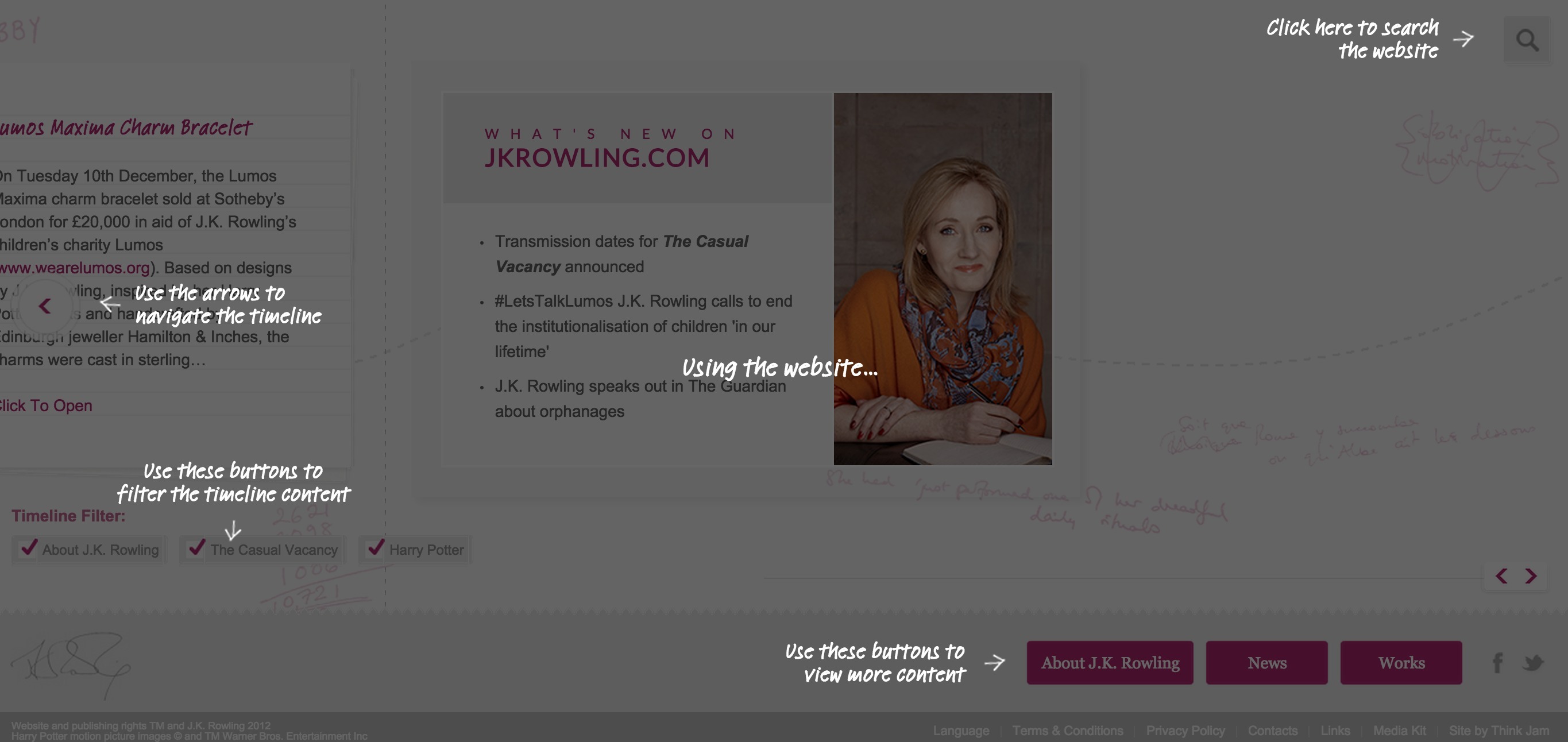
幫助使用者瞭解複雜的使用者介面。
示例
解決方案
將文字、箭頭和影象顯示在遮罩層上以便解釋使用者介面中的功能。
教練標記是指顯示在透明層上的幫助說明。應用文字、箭頭和影象,指出並說明使用者介面中的功能。
說明
教練標記向用戶解釋過於複雜或新的使用者介面,但它無助於解決介面功能組合拙劣的根本問題,使用本模式前可以考慮使用其它管理模式。[1]
討論
本模式在使用者介面中增加一種模式(或層),因而隔斷了使用者與用本模式說明的元素之間的互動。如果使用者正在任務執行過程中,則會認為教練標記是一種阻礙,他們可能看都不看就將其跳過。
上述情況使得本模式處於反模式範疇的邊緣:本模式無法解決使用者介面混亂的根本問題。增加新的複雜度,來說明原本就比較複雜的使用者介面,這樣治標不治本。[2]
進一步講,將使用者注意力從某個點轉移到整個使用者介面上。本質上不只是讓使用者知道如何解決手上的任務,還要能解決其它可能接手的任務。多種教練標記能提高認知負荷,尤其是在短期記憶方面。
首要解決根本問題
使用本模式前,先看看是否有其它方式解決問題。引入教練標記功能前,先要解決使用者介面的根本問題。考慮使用劇透模式或導遊模式,這兩者都給使用者提供無模態輔助資訊,使用者可以同被介紹的介面元素進行互動[3]。
如果一定要使用本模式,請簡化處理使用者認知負荷。人類只能同時記憶3、4件事。實現具有可讀性及易跳過的教練標記功能。不要只顯示截圖,而是嘗試將教練標記功能置於使用者介面的正常檢視之上。[4]
原文地址:http://ui-patterns.com/patterns/coachmarks
[1]原文:Coachmarks can help explain overly complicated or novel user interfaces to users, but they do not help solve the underlying problems of poorly composed interfaces. Consider other onboarding patterns before settling with coachmarks.
[2]原文:This makes the Coachmark pattern borderline an anti-pattern: they do not solve the underlying problems of a confusing user interface. Adding a new level of complexity to help explain an already complex interface is treating symptoms and not the root course.
[3]原文: Consider a Playthrough or a Guided Tour, which allow users modeless assistance where they can interact with the elements about which they are being instructed.
[4]原文:If you must use Coachmarks, be easy on the users cognitive load. We can only remember 3-4 things at a time. Lay out coachmarks in a readable and easy-to-skim way. Instead of merely displaying a screenshot, try placing the Coachmarks above the user’s normal view of the user interface.