
Android基礎知識(1)——UI程式設計
閱讀前,請瀏覽此處上方目錄。
Android UI程式設計
本章內容為個人筆記,參考書籍有:《瘋狂的android》第3版、《第一行程式碼》———————————————————————————————————————————————————
在學校裡聽老師講課,總會讓學生誤會程式設計師的主要工作不是介面美化,那都是美工做得事情。但隨著移動開發的不斷髮展,在軟體開發的過程中,介面設計和功能開發同樣重要。介面美觀的應用不僅可以大大增加使用者粘性,還可以幫我們吸引更多新使用者。如果善用UI控制元件,可以做出讓人賞心悅目的應用。
Android應用絕大部分UI元件都放在android.widget包及其子包、android.view包及其子包中,Android應用的所有UI都繼承了View類。View類還有一個重要的子類,ViewGroup,但ViewGroup通常作為其他元件其他元件的容器使用。Android的所有UI元件都是建在View、ViewGroup基礎之上,ViewGroup是View的子類,因此ViewGroup也可以被當成View使用。但由於ViewGroup
1、佈局管理器
1.1 LinearLayout 線性佈局
LinearLayout
是最常用的佈局,它會把容器裡面的元件一個挨一個的排列起來,LinearLayout 可以控制各元件橫縱向排列(通過android:orientation屬性控制)。設定排列方式可以設定為 android:orientation="vertical" (垂直排列),android:orientation="horizontal"(水平排列)。還有一個XML屬性是 android:gravity
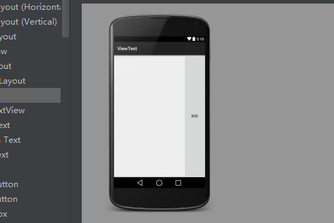
<LinearLayout
    android:layout_width="match_parent"
    android:layout_height="match_parent"
    android:gravity="right"
    android:orientation="vertical">
    <Button
        android:layout_width="wrap_content"
        android:layout_height="wrap_content"
        android:layout_weight="1"
        android:text="按鈕" />
</LinearLayout>
1.2 TableLayout 表格佈局
TableLayout繼承了LinearLayout,因此它的本質依然是線性佈局管理器。表格佈局採用行、列的形式來管理UI元件,TableLayout並不需要明確宣告包含多少行多少列,而是通過新增TableRow來控制表格的行數和列數。每次向TableLayout中新增一個TableRow,該TableRow就是一個表格行。接下來示範:
    <TableRow>
        <Button
            android:layout_width="wrap_content"
            android:layout_height="wrap_content"
            android:text="按鈕1" />
        <Button
            android:layout_width="wrap_content"
            android:layout_height="wrap_content"
            android:text="按鈕2" />
    </TableRow>
    <TableRow>
        <Button
            android:layout_width="wrap_content"
            android:layout_height="wrap_content"
            android:text="按鈕3" />
    </TableRow>
</TableLayout>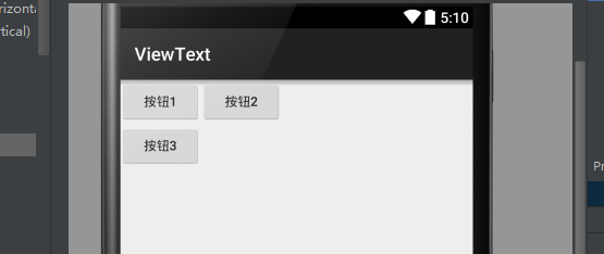
TableLayout 還有三個屬性需要認知,
- android:collapseColumns(設定需要被隱藏列序號)
- android:shrinkColumns(設定需要被收縮列序號)
- android:stretchColumns(設定需要被拉伸列序號)
1.3 FrameLayout 幀佈局
FrameLayout 相對於其他佈局管理器來說比較簡單,但應用的場景也減少。FrameLayout直接繼承了ViewGroup元件,為每個加入其中的元件建立一個空白區域,把元件一個個地疊加在一起。
 <FrameLayout
        android:layout_width="match_parent"
        android:layout_height="match_parent">
        <Button
            android:layout_width="wrap_content"
            android:layout_height="wrap_content"
            android:text="New Button"
            android:id="@+id/button" />
        <ImageButton
            android:layout_width="wrap_content"
            android:layout_height="wrap_content"
            android:src="@drawable/a4"/>
    </FrameLayout>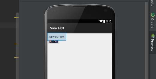
顯然兩個元件重疊在左上角,這種佈局可能用到的地方可以不多。
1.4 RelativeLayout相對佈局
RelativeLayout也是一種比較常用佈局,相對佈局容器內子元件的位置總是相對於兄弟元件、父容器來決定的,因此這種佈局方式被稱為相對佈局。
以下是隻能設為boolean值得屬性:
| android:layout_centerHorizontal |
控制該子元件是否位於佈局容器的水平居中 |
| android:layout_centerVertical |
控制該子元件是否位於佈局容器的垂直居中 |
| android:layout_centerInParent |
控制該子元件是否位於佈局容器的中央位置 |
| android:layout_alignParentTop | 控制該子元件是否與佈局容器頂端對齊 |
| android:layout_alignParentBottom | 控制該子元件是否與佈局容器低端對齊 |
| android:layout_alignParentLeft | 控制該子元件是否與佈局容器左端對齊 |
| android:layout_alignParentRight | 控制該子元件是否與佈局容器右邊對齊 |
| android:layout_above | 控制該子元件位於給出ID元件的上方 |
| android:layout_below | 控制該子元件位於給出ID元件的下方 |
| android:layout_toLeftOf | 控制該子元件位於給出ID元件的左側 |
| android:layout_toRightOf |
控制該子元件位於給出ID元件的右側 |
| android:layout_alighTop | 控制該子元件與給出ID元件的上邊界對齊 |
| android:layout_alighBottom |
控制該子元件與給出ID元件的下邊界對齊 |
| android:layout_alighLeft | 控制該子元件與給出ID元件的左邊界對齊 |
| android:layout_alighRight |
控制該子元件與給出ID元件的右邊界對齊 |
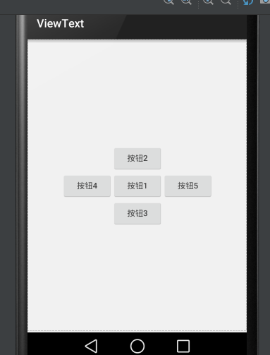
 <RelativeLayout
        android:layout_width="match_parent"
        android:layout_height="match_parent">
        <!--定義按鈕Bt1位於父容器中間-->
        <Button
            android:id="@+id/bt1"
            android:layout_width="wrap_content"
            android:layout_height="wrap_content"
            android:layout_centerInParent="true"
            android:text="按鈕1" />
        <!--定義Bt2位於按鈕Bt1上方-->
        <Button
            android:id="@+id/bt2"
            android:layout_width="wrap_content"
            android:layout_height="wrap_content"
            android:layout_above="@id/bt1"
            android:layout_alignLeft="@id/bt1"
            android:text="按鈕2" />
        <!--定義Bt3位於按鈕Bt1下方-->
        <Button
            android:id="@+id/bt3"
            android:layout_width="wrap_content"
            android:layout_height="wrap_content"
            android:layout_below="@id/bt1"
            android:layout_alignLeft="@id/bt1"
            android:text="按鈕3" />
        <!--定義Bt4位於按鈕Bt1左方-->
        <Button
            android:id="@+id/bt4"
            android:layout_width="wrap_content"
            android:layout_height="wrap_content"
            android:layout_toLeftOf="@id/bt1"
            android:layout_alignTop="@id/bt1"
            android:text="按鈕4" />
        <!--定義Bt2位於按鈕Bt1右方-->
        <Button
            android:id="@+id/bt5"
            android:layout_width="wrap_content"
            android:layout_height="wrap_content"
            android:layout_alignTop="@id/bt1"
            android:layout_toRightOf="@id/bt1"
            android:text="按鈕5" />
    </RelativeLayout>
1.5 GridLayout 網格佈局
GridLayout的作用類似於HTML中的Table標籤,它把整個容器劃分成rows*columns個網格,每個網格可以放置一個元件。除此之外也可以設定一個元件橫跨多少列、縱跨多少行。
首先要說的是GridLayout與LinearLayout佈局一樣,也分為水平和垂直兩種方式,預設是水平佈局:
| android:orientation | horizontal 水平 vertical 垂直 |
第二就是GridLayout的屬性:
| android:rowCount | 設定該網格的列數量 |
| android:columnCount | 設定該網格的行數量 |
| android:layout_rowSpan | 設定該子元件在容器縱跨幾行 |
| android:layout_columnSpan | 設定該子元件在容器橫跨幾行 |
【例項】計算器介面:
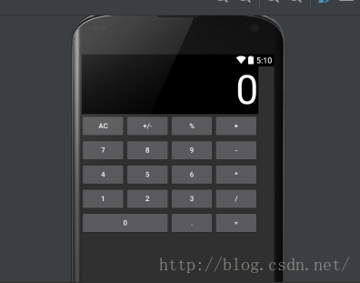
<?xml version="1.0" encoding="utf-8"?>
<GridLayout xmlns:android="http://schemas.android.com/apk/res/android"
    android:layout_width="wrap_content"
    android:layout_height="wrap_content"
    android:columnCount="4"
    android:orientation="horizontal"
    android:rowCount="6">

    <TextView
        android:layout_columnSpan="4"
        android:layout_gravity="fill"
        android:background="#000"
        android:gravity="right"
        android:text="0"
        android:textColor="#fff"
        android:textSize="80dp" />
    <Button
        android:id="@+id/bt1"
        android:text="AC" />
    <Button
        android:id="@+id/bt2"
        android:text="+/-" />
    <Button
        android:id="@+id/bt3"
        android:text="%" />
    <Button
        android:id="@+id/bt4"
        android:text="+" />
    <Button
        android:id="@+id/bt5"
        android:text="7" />
    <Button
        android:id="@+id/bt6"
        android:text="8" />
    <Button
        android:id="@+id/bt7"
        android:text="9" />
    <Button
        android:id="@+id/bt8"
        android:text=" - " />
    <Button
        android:id="@+id/bt9"
        android:text="4" />
    <Button
        android:id="@+id/bt10"
        android:text="5" />
    <Button
        android:id="@+id/bt11"
        android:text="6" />
    <Button
        android:id="@+id/bt12"
        android:text="*" />
    <Button
        android:id="@+id/bt13"
        android:text="1" />
    <Button
        android:id="@+id/bt14"
        android:text="2" />
    <Button
        android:id="@+id/bt15"
        android:text="3" />
    <Button
        android:id="@+id/bt16"
        android:text="/" />
    <Button
        android:id="@+id/bt17"
        android:layout_columnSpan="2"
        android:layout_gravity="fill"
        android:text="0" />
    <Button
        android:id="@+id/bt18"
        android:text="." />
    <Button
        android:id="@+id/bt19"
        android:text="=" />
</GridLayout> android:layout_columnSpan="2"
android:layout_gravity="fill"1.6 AbsoluteLayout絕對佈局
AbsoluteLayout絕對佈局猶如div指定了absolute屬性,用X,Y座標來指定元素的位置!
該佈局目前已經淘汰,知道就行了!
-----------------------------------------------------
2、常用控制元件的使用方法
2.1 TextView文字框
TextView是Android中最簡單的控制元件,它主要用於介面顯示一段文字資訊,有點類似Swing程式設計中的JLabel,但又比JLabel強大。還有些 樣式、文字轉換autoLink和autoText、文字超長ellipsize等等不一一多說。
<LinearLayout xmlns:android="http://schemas.android.com/apk/res/android"
    android:layout_width="match_parent"
    android:layout_height="match_parent"
    android:orientation="vertical">
    <TextView
        android:id="@+id/textView"
        android:layout_width="wrap_content"
        android:layout_height="wrap_content"
        android:text="New Text" />
</LinearLayout>
2.2 EditText編輯框
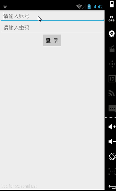
EditText 是程式中用於和使用者進行互動十分重要的控制元件,它允許使用者在控制元件裡輸入和編輯內容,應用的場景最常見就是輸入賬號密碼。
EditText 與 TextView非常相似,他甚至與TextView共用了絕大部分XML屬性和方法,他們之間最大的區別就是:EditText 可以接受使用者的輸入。
- android:hint:指定編輯框的提示資訊;
- android:inputType:指定編輯框輸入內容的型別(textPassword、numberPassword、number、date、phone、text)
【例項】簡單登入介面
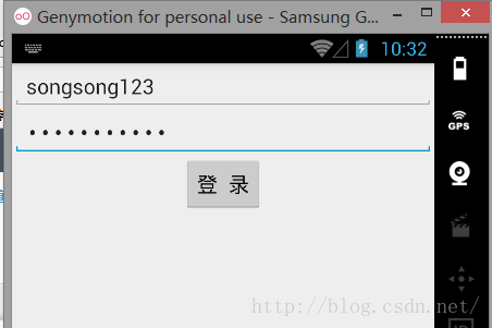
賬號密碼同樣輸入songsong123時在密碼框就會顯示點點,這是android:inputType的功能。
<LinearLayout xmlns:android="http://schemas.android.com/apk/res/android"
    android:layout_width="match_parent"
    android:layout_height="match_parent"
    android:gravity="center_horizontal"
    android:orientation="vertical">
    <EditText
        android:layout_width="match_parent"
        android:layout_height="wrap_content"
        android:hint="請輸入賬號"
        android:id="@+id/editText" />
    <EditText
        android:inputType="textPassword"
        android:layout_width="match_parent"
        android:layout_height="wrap_content"
        android:hint="請輸入密碼"
        android:id="@+id/editText2" />
    <Button
        android:layout_width="wrap_content"
        android:layout_height="wrap_content"
        android:text="登  錄"
        android:textAllCaps="false"
        android:id="@+id/button" />
</LinearLayout> android:maxLines="1"
android:maxLength="10"2.3 Button按鈕
Button是程式用於和使用者互動的一個重要控制元件,Button繼承了TextView。它主要是在UI介面上生成一個按鈕,該按鈕可以供使用者單擊,當用戶單擊按鈕時,就會觸發onClick時間。
例項依然是剛剛那個:
    <Button
        android:layout_width="wrap_content"
        android:layout_height="wrap_content"
        android:text="登  錄"
        android:textAllCaps="false"
android:id="@+id/button" />public class MainActivity extends Activity {
private Button button;
private EditText editText;
@Override
protected void onCreate(Bundle savedInstanceState) {
super.onCreate(savedInstanceState);
setContentView(R.layout.text4);
button = (Button) findViewById(R.id.button);
editText = (EditText) findViewById(R.id.editText);
button.setOnClickListener(new View.OnClickListener() {
@Override
public void onClick(View v) {
String str = editText.getText().toString();
Toast.makeText(getApplicationContext(), str, Toast.LENGTH_SHORT).show();
}
});
}
2.4 ImageView圖片
ImageView是繼承自View元件,主要功能不僅用於顯示ImageView,而且還可以顯示任何Drawable物件。
  <ImageView
        android:id="@+id/imageView"
        android:layout_width="200dp"
        android:layout_height="200dp"
android:src="@drawable/a4"/>ImageView所支援的android:scaleType屬性可指定如下屬性
- fitXY:拉伸圖片(不按比例)以填充View的寬高。
- fitStart:按比例拉伸圖片,拉伸後圖片的高度為View的高度,且顯示在View的左邊。
- fitCenter:按比例拉伸圖片,拉伸後圖片的高度為View的高度,且顯示在View的中間。
- fitEnd:按比例拉伸圖片,拉伸後圖片的高度為View的高度,且顯示在View的右邊。
- center:按原圖大小顯示圖片,但圖片寬高大於View的寬高時,截圖圖片中間部分顯示。
- centerCrop:按比例放大原圖直至等於某邊View的寬高顯示。
- centerInside:當原圖寬高或等於View的寬高時,按原圖大小居中顯示;反之將原圖縮放至View的寬高居中顯示。
【例項】圖片的動態切換:
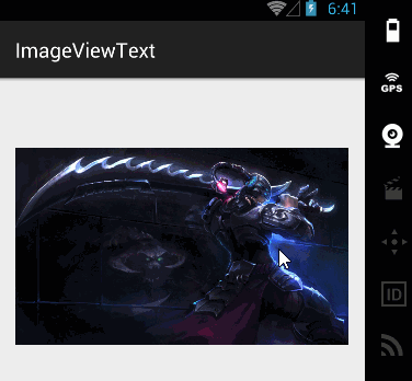
通過單擊ImageView的setImageResource()方法動態完成切換圖片:
public class MainActivity extends ActionBarActivity {

    int[] images = new int[]{
            R.drawable.img1,
            R.drawable.img2,
            R.drawable.img3,
    };
    private ImageView img1;
    int currentImg = 1;

    @Override
    protected void onCreate(Bundle savedInstanceState) {
        super.onCreate(savedInstanceState);
        setContentView(R.layout.activity_main);
        img1 = (ImageView) findViewById(R.id.img1);
        img1.setOnClickListener(new View.OnClickListener() {
            @Override
            public void onClick(View v) {
                img1.setImageResource(images[++currentImg % images.length]);
            }
        });
    }
2.5 RadioButton單選按鈕 和 CheckBox複選框
RadioButton和CheckBox是使用者介面中最普通的UI控制元件,他們都繼承了Button類,因此都可直接呼叫Button支援的各種屬性和方法。RadioButton和CheckBox和普通Button不同的是他們多了個可選中的功能android:checked屬性。RadioButton和CheckBox的不同點在於一組RadioButton只能選中一個,因此RadioButton通常要與RadioGroup一起使用,用於一組單選按鈕。
【例項】獲取使用者資訊的簡單例項:
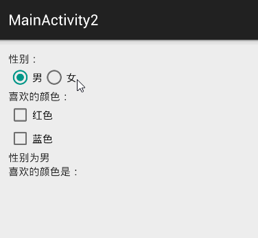
介面佈局程式碼:
<LinearLayout xmlns:android="http://schemas.android.com/apk/res/android"
    xmlns:tools="http://schemas.android.com/tools"
    android:layout_width="match_parent"
    android:layout_height="match_parent"
    android:orientation="vertical"
    tools:context="songsong.com.imageviewtext.MainActivity2">

   <TextView
        android:id="@+id/tv1"
        android:layout_width="wrap_content"
        android:layout_height="wrap_content"
        android:text="性別:" />
    <RadioGroup
        android:id="@+id/rg1"
        android:layout_width="wrap_content"
        android:layout_height="wrap_content"
        android:orientation="horizontal">
        <RadioButton
            android:id="@+id/male"
            android:layout_width="wrap_content"
            android:layout_height="wrap_content"
            android:checked="true"
            android:text="男" />
        <RadioButton
            android:id="@+id/female"
            android:layout_width="wrap_content"
            android:layout_height="wrap_content"
            android:text="女" />
    </RadioGroup>
    <TextView
        android:id="@+id/tv2"
        android:layout_width="wrap_content"
        android:layout_height="wrap_content"
        android:text="喜歡的顏色:" />
    <CheckBox
        android:id="@+id/checkBox1"
        android:layout_width="wrap_content"
        android:layout_height="wrap_content"
        android:text="紅色" />
    <CheckBox
        android:id="@+id/checkBox2"
        android:layout_width="wrap_content"
        android:layout_height="wrap_content"
        android:text="藍色" />
    <TextView
        android:id="@+id/tv3"
        android:layout_width="wrap_content"
        android:layout_height="wrap_content"
        android:text="性別為男"/>
    <TextView
        android:id="@+id/tv4"
        android:layout_width="wrap_content"
        android:layout_height="wrap_content"
        android:text="喜歡的顏色是:"/>
</LinearLayout>
public class MainActivity2 extends ActionBarActivity {

    RadioGroup radioGroup;
    TextView show;
    CheckBox checkBox1;
    CheckBox checkBox2;
    TextView showbox;

    @Override
    protected void onCreate(Bundle savedInstanceState) {
        super.onCreate(savedInstanceState);
        setContentView(R.layout.activity_main2);
        radioGroup = (RadioGroup) findViewById(R.id.rg1);
        show = (TextView) findViewById(R.id.tv3);

        checkBox1 = (CheckBox) findViewById(R.id.checkBox1);
        checkBox2 = (CheckBox) findViewById(R.id.checkBox2);
        showbox = (TextView) findViewById(R.id.tv4);

        radioGroup.setOnCheckedChangeListener(new RadioGroup.OnCheckedChangeListener() {

            @Override
            public void onCheckedChanged(RadioGroup group, int checkedId) {
                String tip = checkedId == R.id.male ? "性別為男" : "性別為女";
                show.setText(tip);
            }
        });
        checkBox1.setOnCheckedChangeListener(new CompoundButton.OnCheckedChangeListener() {
            @Override
            public void onCheckedChanged(CompoundButton buttonView, boolean isChecked) {
                if (isChecked) {
                    String str = showbox.getText().toString();
                    showbox.setText(str + checkBox1.getText().toString());
                }
            }
        });
        checkBox2.setOnCheckedChangeListener(new CompoundButton.OnCheckedChangeListener() {
            @Override
            public void onCheckedChanged(CompoundButton buttonView, boolean isChecked) {
                if (isChecked) {
                    String str = showbox.getText().toString();
                    showbox.setText(str + checkBox2.getText().toString());
                }
            }
        });

    }
}
2.6 ProgressBar進度條
進度條也是UI介面中一種非常實用的空間,通常用於向用戶顯示某些耗時操作完成的百分比。進度條可以動態顯示進度,因此避免長時間執行某個耗時操作時,讓使用者感覺程式失去了響應,從而更好提高使用者的友好性。
通過style屬性可以為ProgressBar指定風格:
- @android:style/Widget.ProgressBar.Horizontal:水平進度條
- @android:style/widget.ProgressBar.Inverse:普通大小的環形進度條
- @android:style/widget.ProgressBar.Large:大環形進度條
- @android:style/widget.ProgressBar.Large.Inverse:大環形進度條
- @android:style/widget.ProgressBar.Small:小環形進度條
- @android:style/widget.ProgressBar.Small.Inverse:小環形進度條
ProgressBar常用的XML屬性:
- android:max:設定該進度條的最大值
- style:樣式
- android:progress:設定該進度條已完成進度值
<LinearLayout xmlns:android="http://schemas.android.com/apk/res/android"
    xmlns:tools="http://schemas.android.com/tools"
    android:layout_width="match_parent"
    android:layout_height="match_parent"
    android:orientation="vertical"
    tools:context="songsong.com.imageviewtext.ProgressBarText">
    <ProgressBar
        android:layout_width="wrap_content"
        android:layout_height="wrap_content"
        android:id="@+id/progressBar" />
</LinearLayout>
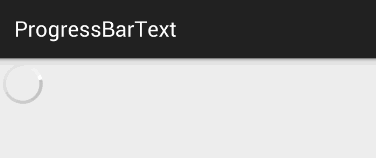
當資料載入完成時,我們就需要另外一個屬性android:visibility進行指定
- visible:可見的,這是預設值;
- invisible:不可見的,仍然佔據著原來位置和大小;