
css3基礎知識第五章實戰訓練
阿新 • • 發佈:2019-02-05
只需要css就可以達到的效果:導航欄,圖片選中透明效果,背景透明效果,自定義文字選中顏色
導航欄
水平選單
只需在縱向選單的基礎上去掉ul的寬度;li加浮動;然後改一些細節
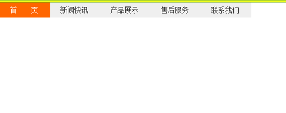
<!DOCTYPE html>
<html>
<head>
<meta http-equiv="Content-Type" content="text/html; charset=utf-8" />
<title>導航選單</title>
<style type="text/css">
*{margin:0; padding:0; font-size:14px;}
ul{ list-style:none;}
a{color:#333;text-decoration:none}
.nav li{float:left;}
.nav li a{ display:block; text-indent:20px; height:30px; line-height:30px; width:100px; background-color:#efefef; margin-bottom:1px;}
.nav li a:hover{ background-color:#F60; color:#fff}
</style>
</head>
<body>
<ul class="nav">
    <li><a href="#">首  頁</a></li>
    <li><a href="#">新聞快訊</a></li>
    <li><a href="#">產品展示</a></li>
    <li><a href="#">售後服務</a></li>
    <li><a href="#">聯絡我們</a></li>
  </ul>
</body>
</html>
效果圖:
<!DOCTYPE html>
<html>
<head>
<meta http-equiv="Content-Type" content="text/html; charset=utf-8" />
<title>導航選單</title>
<style type="text/css">
*{margin:0; padding:0; font-size:14px;}
a{color:#333;text-decoration:none}
.nav{list-style:none; height:30px; border-bottom:10px solid #F60; margin-top:20px; padding-left:50px;}
.nav li{float:left}
.nav li a{display:block; height:30px;text-align:center; line-height:30px; width:120px; background:url(http://img.mukewang.com/53846438000168f901200060.jpg); margin-left:1px;}
.nav li a.on, .nav li a:hover{ background-position:0 30px; color:#fff;}
</style>
</head>
<body>
<ul class="nav">
    <li><a class="on" href="#">首  頁</a></li>
    <li><a href="#">新聞快訊</a></li>
    <li><a href="#">產品展示</a></li>
    <li><a href="#">售後服務</a></li>
    <li><a href="#">聯絡我們</a></li>
  </ul>
</body>
</html>
效果圖:

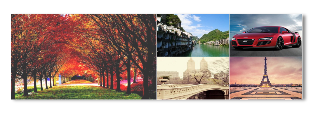
圖片選中效果
使用的是css的透明度效果
效果圖:<!doctype html> <html> <head> <meta http-equiv="Content-Type" content="text/html; charset=gbk"> <title>html模板</title> <meta name="Keywords" content="關鍵詞,關鍵詞"> <meta name="description" content=""> <!--css,js--> <style type="text/css"> *{margin:0;padding:0;} img{border:0;display:block;border-right:1px solid #fff;border-bottom:1px solid #fff;} .pic{width:999px;height:290px;margin:150px auto;box-shadow: 10px 5px 15px #888888;} .pic .pic_left{width:499px;height:290px;float:left;} .pic .pic_right{width:499px;height:290px;float:right;} .pic .pic_right a{float:left;} .pic a:hover img{opacity:0.8;filter:alpha(opacity=80) ;} </style> </head> <body> <div class="pic"> <div class="pic_left"> <span style="white-space:pre"> </span><a href="#"><img src="1.jpg" alt="" width="499" height="293"/></a> </div> <div class="pic_right"> <a href="#"><img src="2.jpg" alt="" width="248" height="146"/></a> <a href="#"><img src="3.jpg" alt="" width="248" height="146"/></a> <a href="#"><img src="4.jpg" alt="" width="248" height="146"/></a> <a href="#"><img src="5.jpg" alt="" width="248" height="146"/></a> </div> </div> </body> </html>
選中的圖片會有透明效果,圖片請親自行下載。
背景透明效果
css透明度樣式:應該有很多希望背景是透明的,而背景上的內容清晰可見,便可用下面的方法達到這個效果。
background-color: rgba(255,255,255,0.2);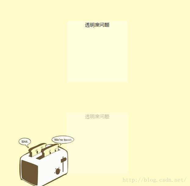
參考程式碼:
<!DOCTYPE html>
<html>
	<head>
		<title></title>
		<meta charset="UTF-8"/>
		<style type="text/css">
			body{
				text-align: center;
				background-image: url(img/bg.jpg);
				font-family: "微軟雅黑";
			}
			.opacity{
				background-color: rgba(255,255,255,0.3);
				width:200px;
				height:200px;
				margin: 100px auto;
			}
			.opacity1{
				background-color: #fff;
				opacity:0.3;
				width:200px;
				height:200px;
				margin: 100px auto;
			}
		</style>
	</head>
	<body>
		<div  class="opacity">
			<span>透明度問題</span>
		</div>
		<div  class="opacity1">
			<span>透明度問題</span>
		</div>
	</body>
</html>
自定義選中顏色
效果圖:

只需要在css程式碼中新增以下內容即可:
::selection {background:#006200; color:#fff;}還有很多例項需要一點點js程式碼,先暫時不列出來,感謝大家的閱讀。
如果內容有誤,或有什麼建議,可以留言。我會及時更正。