利用Python進行資料分析——基礎示例
import json
import numpy as np
import pandas as pd
import matplotlib.pyplot as plt
1.USA.gov Data from Bitly
此資料是美國官方網站從使用者那蒐集到的匿名資料。
path='datasets/bitly_usagov/example.txt'
data=[json.loads(line) for line in open(path)]
df=pd.DataFrame(data)df.info()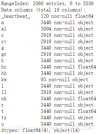
tz欄位包含的是時區資訊。
df.loc[:,'tz'].value_counts 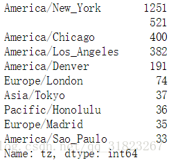
根據info()與value_counts()的返回結果來看,tz列存在缺失值與空值,首先填充缺失值,然後處理空值:
clean_tz=df.loc[:,'tz'].fillna('missing')
clean_tz.loc[clean_tz=='']='unkonwn'
clean_tz.value_counts()[:5]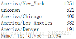
plt.clf()
subset=clean_tz.value_counts()[:10]
subset.plot.barh()
plt.show()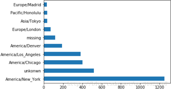
a欄位包含的是瀏覽器、裝置與應用等資訊。
df.loc[:,'a'].sample 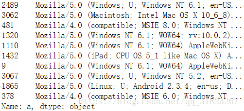
假設我們需要統計windows與非windows的相關量,我們要抓取a欄位中的’Windows’字串。因為a欄位同樣存在缺失值,這裡我們選擇丟棄缺失值:
clean_df=df[df.loc[:,'a'].notnull()]
mask=clean_df.loc[:,'tz']==''
clean_df.loc[:,'tz'].loc[mask]='unkonwn'
mask=clean_df.loc[:,'a'].str.contains('Windows')
clean_df.loc[:,'os']=np.where(mask,'Windows','not Windows' by_tz_os=clean_df.groupby(['tz','os'])
tz_os_counts=by_tz_os.size().unstack().fillna(0)
indexer=tz_os_counts.sum(axis=1).argsort() #返回排序後的索引列表
tz_os_counts_subset=tz_os_counts.take(indexer[-10:]) #取得索引列表的後十條
tz_os_counts_subset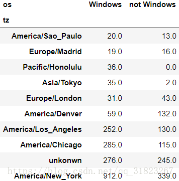
plt.clf()
tz_os_counts_subset.plot.barh()
plt.show()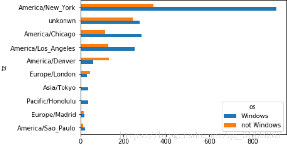
因為不同地區的數量差異懸殊,如果我們要更清楚得檢視系統差異,還需要將資料進行歸一化:
tz_os_counts_subset_norm=tz_os_counts_subset.values/tz_os_counts_subset.sum(axis=1).values.reshape(10,1)        #轉換成numpy陣列來計算百分比
tz_os_counts_subset_norm=pd.DataFrame(tz_os_counts_subset_norm,
                                      index=tz_os_counts_subset.index,
columns=tz_os_counts_subset.columns)plt.clf()
tz_os_counts_subset_norm.plot.barh()
plt.show()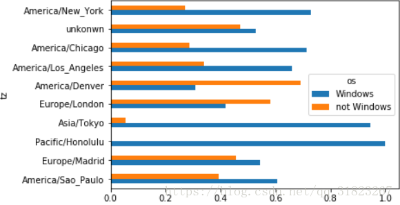
# MovieLens
rating_col=['UserID','MovieID','Rating','Timestamp']
user_col=['UserID','Gender','Age','Occupation','Zip-code']
movie_col=['MovieID','Title','Genres']
ratings=pd.read_table('datasets/movielens/ratings.dat',header=None,sep='::',names=rating_col,engine='python')
users=pd.read_table('datasets/movielens/users.dat',header=None,sep='::',names=user_col,engine='python')
movies=pd.read_table('datasets/movielens/movies.dat',header=None,sep='::',names=movie_col,engine='python')ratings.sample(3)
users.sample(3)
movies.sample(3)
data=pd.merge(pd.merge(ratings,users),movies)
data.sample(3)
data.info()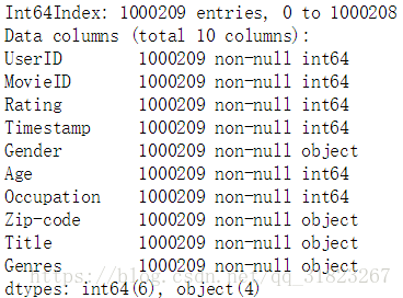
加入需要獲得不同性別對於各電影的平均打分,使用透視表就可以直接得到結果:
mean_ratings=data.pivot_table('Rating',index='Title',columns='Gender',aggfunc='mean')
mean_ratings[:5]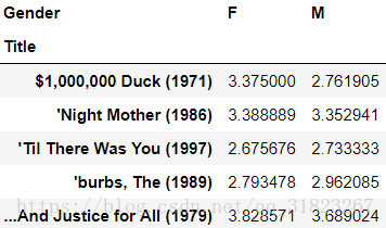
電影中會存在冷門作品,我們看一下評分資料中各電影被評價的次數都有多少:
by_title=data.groupby('Title').size()
by_title.describe()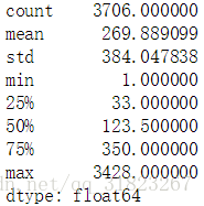
我們以二分位點為分割線,取出評分數量在二分位點之上的電影:
mask=by_title>=250        #注意by_title是一個Series
active_titles=by_title.index[mask]
mean_ratings=mean_ratings.loc[active_titles,:]
下面列出女性觀眾最喜愛的電影:
top_female_tarings=mean_ratings.sort_values(by='F',ascending=False)[:10]
top_female_tarings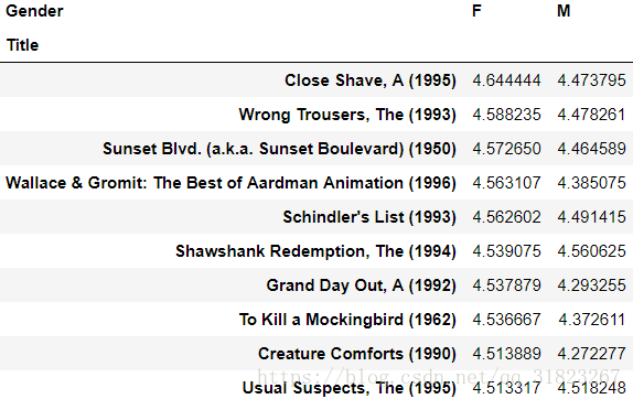
下面來看一下男女對於各影片的評分差異:
mean_ratings.loc[:,'diff']=mean_ratings.loc[:,'F']-mean_ratings.loc[:,'M']
sorted_by_diff=mean_ratings.sort_values(by='diff',ascending=False)
sorted_by_diff[:10]
sorted_by_diff[-10:]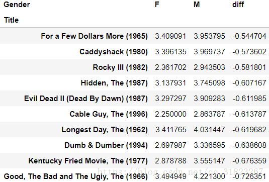
接下來我們統計那些評分爭議較大的影片,rating的方差越大說明爭議越大:
rating_std=data.pivot_table('Rating',index='Title',aggfunc='std').loc[active_titles,:]
rating_std.sort_values(by='Rating',ascending=False)[:10]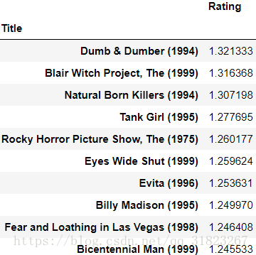
# US Baby Names
years=range(1880,2017)
subsets=[]
column=['name','gender','number']

for year in years:
    path='datasets/babynames/yob{}.txt'.format(year)
    df=pd.read_csv(path,header=None,names=column)
    df.loc[:,'year']=year        #此處注意year這一列的值為整數型別
    subsets.append(df)

names=pd.concat(subsets,ignore_index=True) #拼接多個df並重新編排行號names.info()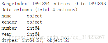
names.sample(5)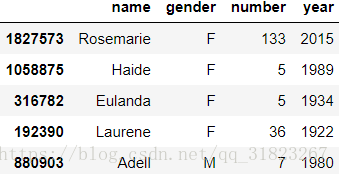
我們先根據此資料來大致觀察一下每年的男女出生情況:
birth_by_gender=pd.pivot_table(names,values='number',index='year',columns='gender',aggfunc='sum')
plt.clf()
birth_by_gender.plot(title='Total births by sex and year')
plt.show()
我們在資料中增加一個比例係數,這個比例能顯示某個名字在這一年內佔某個性別的比例:
def add_prop(group):
    group.loc[:,'prop']=group.loc[:,'number']/group.loc[:,'number'].sum()
return groupnames_with_prop=names.groupby(['year','gender']).apply(add_prop) #注意groupby與pivot_table的區別
names_with_prop.groupby(['year','gender'])['prop'].sum()[:6] #正確性檢查,注意groupby與pivot_table的區別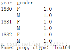
下面取出按year與gender分組後的最受歡迎的前100個名字:
def get_top(group,n=100):
return group.sort_values(by='number',ascending=False)[:n]groupby_obj=names_with_prop.groupby(['year','gender'])
top100=groupby_obj.apply(get_top)
top100.reset_index(drop=True,inplace=True) #丟棄因分組產生的行索引
top100[:5]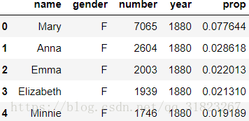
接下來我們使用這些最常見的名字來做更深入的分析:
total_birth=pd.pivot_table(top100,values='number',index='year',columns='name')
total_birth.fillna(0,inplace=True)
我們選取幾個非常具有代表性的名字,來觀察這些名字根據年份的變化趨勢:
subset=total_birth.loc[:,['John','Harry','Mary','Marilyn']]
subset.plot(subplots=True,title='Number of birth per year')
plt.show()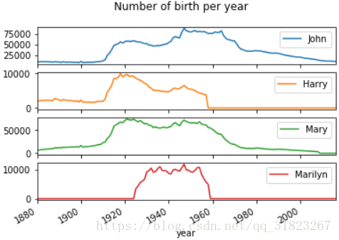
可以看出這幾個名字在特定的時期出現了井噴現象,但越靠近現在的時間段,這些名字出現的頻率越低,這可能說明家長們給寶寶起名字不再隨大流。下面來驗證這個想法:
基本思想是使用名字頻率的分位數,資料的分位數能大致體現出資料的分佈,如果資料在某一段特別密集,則某兩個分位數肯定靠的特別近,或者分位數的序號會偏離標準值非常遠。
先以男孩為例,取兩個年份來簡單驗證下以上猜想:
boys=top100[top100.loc[:,'gender']=='M']
boys[boys.loc[:,'year']==1940].sort_values(by='prop').loc[:,'prop'].describe()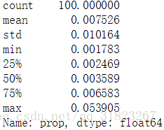
由上述資料可以看到,prop的最大值為0.05,說明最常見的名字的可觀測率為5%,而且prop的均值處於[75%,max]區間內,說明絕大多數的新生兒共享一個很小的名字池。
boys[boys.loc[:,'year']==2016].sort_values(by='prop').loc[:,'prop'].describe()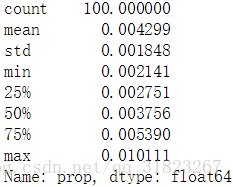
在2016年,prop的最大值降到了0.01,均值處於[50%,75%]區間內,這說明新生兒的取名更多樣化了。
下面我們來計算佔據新生兒前25%的名字數量:
def get_quantile_index(group,q=0.25):
    group=group.sort_values(by='prop',ascending=False)
    sorted_arr=group.loc[:,'prop'].cumsum().values
    index=sorted_arr.searchsorted(0.25)+1        #0為起始的索引
return indexdiversity=top100.groupby(['year','gender']).apply(get_quantile_index)
diversity=diversity.unstack()plt.clf()
diversity.plot(title='number of popular names in top 25%')
plt.show()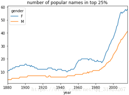
可以明顯看出時間線越靠近現在,前25%的新生兒名字數量也越多,這確實說明家長們給寶寶起名字更多樣化了。並且還注意到女孩名字的數量總是多於男孩。
下面分析名字的最後一個字母:
get_last_letter=lambda x:x[-1]
last_letters=names.loc[:,'name'].map(get_last_letter)        #返回一個Series
last_letters.name='last_letter'

letter_table=pd.pivot_table(names,values='number',index=last_letters,columns=['gender','year'],aggfunc='sum')
letter_table.fillna(0,inplace=True)
取出三個年份來進行粗略分析:
subset=letter_table.reindex(columns=[1910,1960,2010],level='year')        #重索引
subset.fillna(0,inplace=True)
letter_prop_subset=subset/subset.sum(axis=0)
plt.clf()
fig,axes=plt.subplots(2,1,figsize=(10,8))
letter_prop_subset.loc[:,'M'].plot(kind='bar',rot=0,ax=axes[0],title='Boy')
letter_prop_subset.loc[:,'F'].plot(kind='bar',rot=0,ax=axes[1],title='Girl')
plt.show()
從上面的粗略分析可以看到幾個明顯的情況:
- 在boy的資料裡,以字母n為結尾的名字在1960年後出現了爆炸式增長
- 對girl而言,字母a結尾的名字較常見,而字母e結尾的名字則越來越少
下面分別針對boy與girl挑選出最常見的名字尾字母,繪製出這些字母以隨時間的變化曲線:
letter_prop=letter_table/letter_table.sum(axis=0)

boy_letter=letter_prop.loc[['d','n','y'],'M']
boy_letter_ts=boy_letter.T

girl_letter=letter_prop.loc[['a','e','y'],'F']
girl_letter_ts=girl_letter.T
plt.clf()
fig,axes=plt.subplots(2,1,figsize=(10,8))
boy_letter_ts.plot(ax=axes[0],title='Boy')
girl_letter_ts.plot(ax=axes[1],title='Girl')
plt.show()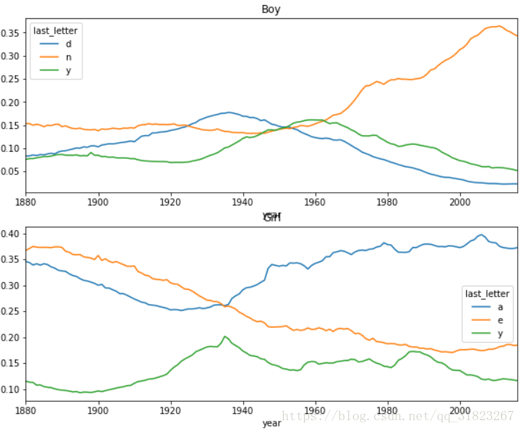
根據一個有趣的發現,表明有些男孩的名字正逐漸轉向被更多的女孩使用,比如說Lesley和Leslie,下面就篩選出包含lesl的名字來驗證這個說法:
uni_names=names.loc[:,'name'].unique()        #返回一個numpy陣列
uni_names=pd.Series(uni_names)
mask=uni_names.str.lower().str.contains('lesl')        #ser->str->ser->str-bool_ser
lesl=uni_names[mask]mask=names.loc[:,'name'].isin(lesl)
lesl_subset=names[mask]lesl_table=pd.pivot_table(lesl_subset,values='number',index='year',columns='gender',aggfunc='sum')
lesl_table.fillna(0,inplace=True)
lesl_table.loc[:,'M_prop']=lesl_table.loc[:,'M']/lesl_table.sum(axis=1)
lesl_table.loc[:,'F_prop']=lesl_table.loc[:,'F']/lesl_table.sum(axis=1)plt.clf()
lesl_table.loc[:,['M_prop','F_prop']].plot(style={'M_prop':'k-','F_prop':'k--'})
plt.show()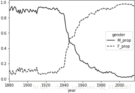
USDA Food Database
db=json.load(open('datasets/usda_food/database.json'))
len(db)
6636
db[0]這裡每個條目包含的資訊太多,不給出截圖了。
可以看到資料中每個條目包含以下資訊:
- description
- group
- id
- manufacturer
- nutrients:營養成分,字典的列表
- portions
- tags
因為nutrients項是一個字典的列表,如果將db直接轉化為dataframe的話這一項就會被歸到一個列中,非常擁擠。為了便於理解,建立兩個df,一個包含除了nutrients之外的食物資訊,而另一個包含id與nutrients資訊,然後再將兩者根據id合併。
keys=['description','group','id']
food_df=pd.DataFrame(db,columns=keys)df.info()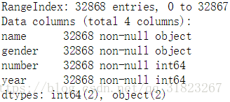
food_df.sample(5)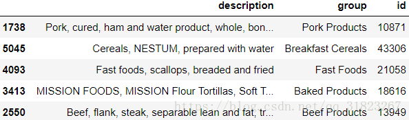
subsets=[]

for item in db:
    id=item['id']
    df=pd.DataFrame(item['nutrients'])
    df.loc[:,'id']=id
    subsets.append(df)

nutrients_df=pd.concat(subsets,ignore_index=True)
nutrients_df.drop_duplicates(inplace=True)nutrients_df.info()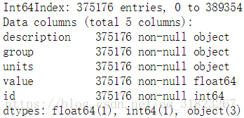
nutrients_df.head()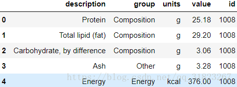
觀察到兩個表中出現了同樣的列索引,為了合併表時不出現矛盾,更改列索引名稱:
fd_col_map={
    'description':'food',
    'group':'fd_cat'
}
food_df=food_df.rename(columns=fd_col_map)

nt_col_map={
    'description':'nutrient',
    'group':'nt_cat'
}
nutrients_df=nutrients_df.rename(columns=nt_col_map)print('{}\n{}'.format(food_df.columns,nutrients_df.columns))
data=pd.merge(food_df,nutrients_df,on='id',how='outer')data.head()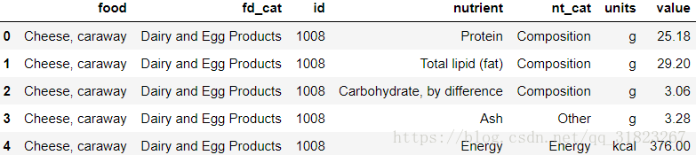
注意這個表中,唯一具有統計意義的值是value列,其餘都是描述性資訊。
假設現在需要統計哪種食物類別擁有的營養量均值,可以先將表對nutrient與fd_cat進行分組,再進行排序輸出:
nt_result=data.loc[:,'value'].groupby([data.loc[:,'nutrient'],data.loc[:,'fd_cat']]).mean()plt.clf()
nt_result.loc['Protein'].sort_values().plot(kind='barh') #按蛋白質含量均值繪製圖形
plt.show()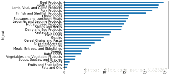
2012 Federal Election Commission Database
fec=pd.read_csv('datasets/fec/P00000001-ALL.csv',low_memory=False) #避免警告fec.info()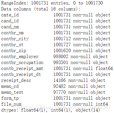
注意到資料中沒有候選人所屬的黨派這一資訊,所以可以考慮人為加上這一資訊。首先統計出資料中有多少位候選人:
fec.loc[:,'cand_nm'].unique()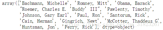
nm2pt={
    'Bachmann, Michelle': 'Republican',
    'Romney, Mitt': 'Republican',
    'Obama, Barack': 'Democrat',
    "Roemer, Charles E. 'Buddy' III": 'Republican',
    'Pawlenty, Timothy': 'Republican',
    'Johnson, Gary Earl': 'Republican',
    'Paul, Ron': 'Republican',
    'Santorum, Rick': 'Republican',
    'Cain, Herman': 'Republican',
    'Gingrich, Newt': 'Republican',
    'McCotter, Thaddeus G': 'Republican',
    'Huntsman, Jon': 'Republican',
    'Perry, Rick': 'Republican',
}
fec.loc[:,'cand_pt']=fec.loc[:,'cand_nm'].map(nm2pt)fec.loc[:,'cand_pt'].value_counts()
據說有一個現象,律師會傾向於捐給民主黨,而經濟人士會傾向於捐給共和黨,下面就來驗證這一說法:
fec.loc[:,'contbr_occupation'].value_counts()[:10]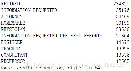
occ_map={
    'INFORMATION REQUESTED PER BEST EFFORTS':'UNKNOW',
    'INFORMATION REQUESTED':'UNKNOW',
    'C.E.O.':'CEO'        #這一條是在後面分析中發現的項
}
f=lambda x:occ_map.get(x,x) #獲取x對應的value,如果沒有對應的value則返回xfec.loc[:,'contbr_occupation']=fec.loc[:,'contbr_occupation'].map(f)
by_occupation=pd.pivot_table(fec,values='contb_receipt_amt',index='contbr_occupation',columns='cand_pt',aggfunc='sum')
by_occupation.fillna(0,inplace=True)
by_occupation.sample(5)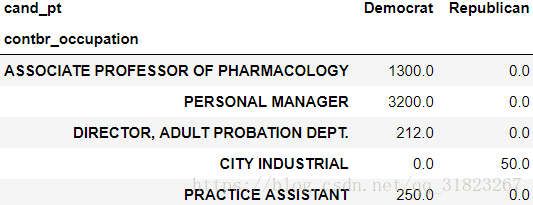
by_occupation.describe()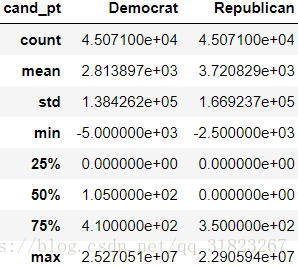
看出捐獻金額分佈的極度不平衡,我們只選出總數大於5e6的條目:
mask=by_occupation.sum(axis=1)>5e6
over5mm=by_occupation[mask]
over5mm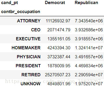
plt.clf()
over5mm.plot(kind='barh')
plt.show()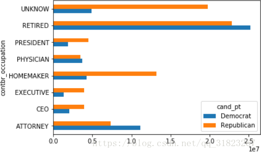
下面我們對Obama Barack與Romney Mitt的資料進行分析:
mask=fec.loc[:,'cand_nm'].isin(['Obama, Barack','Romney, Mitt'])
fec_subset=fec[mask]
假設需要分別統計出對這兩個人支援最大的各職業,可以這樣做:
def get_top(group,key,n=5):
    totals=group.groupby(key)['contb_receipt_amt'].sum()
return totals.nlargest(n)grouped=fec_subset.groupby('cand_nm')
grouped.apply(get_top,'contbr_occupation',5)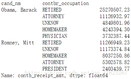
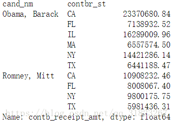
下面看各州對兩人的支援情況:
by_stat=fec_subset.groupby(['cand_nm','contbr_st'])['contb_receipt_amt'].sum(axes=0)
mask=by_stat>5e6
by_stat=by_stat[mask]
by_stat