
基於vue2.0實現音樂/視訊播放進度條元件的思路及具體實現方法+程式碼解釋
阿新 • • 發佈:2019-02-08
基於vue2.0實現音樂/視訊播放進度條元件的方法及程式碼解釋
需求分析:
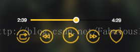
①:進度條隨著歌曲的播放延長,歌曲播放完時長度等於黑色總進度條長度;時間實時更新。
②:當滑動按鈕時,實時更新播放時間,橙色進度條長度也會隨著按鈕的滑動而改變,當滑動結束時,橙色區域停留在滑動結束的位置,歌曲從當前進度開始播放。
③:點選進度條,橙色進度條長度變為點選處至起點的長度,並從當前點開始播放歌曲。
大概思路:
①:左邊的時間可以通過audio播放時派發的timeupdate事件獲取,右邊的時間為介面獲取的當前歌曲的總時間。
②:進度條子元件的長度通過父元件傳入一個percent值計算,percent值為播放進度與總進度的比值。
③:進度條的滑動及點選結束後,需要向父元件傳遞一個percent值,使用this.$emit()像父元件派發事件,父元件中設定事件響應函式,接收percent引數值,用於改變audio中當前播放的音樂進度。
詳細實現,關鍵程式碼已經註釋:
先上元件原始碼:
<template>
  <div class="progress-bar" ref="progressBar" @click="progressClick">
    <div class="bar-inner">
      <div class="progress"  ref="progress"></div>
      <div class="progress-btn-wrapper"ref="progressBtn"
           @touchstart.prevent = "progressTouchStart"
           @touchmove.prevent = "progressTouchMove"
           @touchend = "progressTouchEnd"
      >
        <div class="progress-btn"></div>
      </div>
    </div>
  </div>
</template>

<script type="text/ecmascript-6">
  // 進度條按鈕寬度,由於style中沒有設定width,因此只能用clientWidth獲取
  export default {
    data() {
      return {
        btnWidth: {
          type: Number,
          default: 0
        },
        touchInfo: {
          initiated: false
        }
      }
    },
    props: {
      percent: {
        type: Number,
        default: 0
      }
    },
    mounted() {
      this.btnWidth = document.getElementsByClassName('progress-btn')[0].clientWidth
    },
    methods: {
      // 點選按鈕
      progressTouchStart(e) {
        // 記錄touch事件已經初始化
        this.touchInfo.initiated = true
        // 點選位置
        this.touchInfo.startX = e.touches[0].pageX
        // 點選時進度條長度
        this.touchInfo.left = this.$refs.progress.clientWidth
      },
      // 開始移動
      progressTouchMove(e) {
        if (!this.touchInfo.initiated) {
          return
        }
        // 計算移動距離
        const moveX = e.touches[0].pageX - this.touchInfo.startX
        // 設定偏移值
        const offsetWidth = Math.min(Math.max(0, this.touchInfo.left + moveX),
          this.$refs.progressBar.clientWidth - this.btnWidth)
        this._setOffset(offsetWidth)
      },
      // 移動結束
      progressTouchEnd(e) {
        this.touchInfo.initiated = false
        // 向父元件派發事件,傳遞當前百分比值
        this._triggerPercent()
      },
      // 進度條點選事件
      progressClick(e) {
        console.log('clikc')
        // 設定進度條及按鈕偏移
        this._setOffset(e.offsetX)
        // 通知父元件播放進度變化
        this._triggerPercent()
      },
      _triggerPercent() {
        const barWidth = this.$refs.progressBar.clientWidth - this.btnWidth
        const percent = Math.min(1, this.$refs.progress.clientWidth / barWidth)
        this.$emit('percentChange', percent)
      },
      // 設定偏移
      _setOffset(offsetWidth) {
        // 設定進度長度隨著百分比變化
        this.$refs.progress.style.width = `${offsetWidth}px`
        // 設定按鈕隨著百分比偏移
        this.$refs.progressBtn.style.transform = `translate3d(${offsetWidth}px, 0, 0)`
      }
    },
    watch: {
      // 監聽歌曲播放百分比變化
      percent(newPercent, oldPercent) {
        if (newPercent > 0 && !this.touchInfo.initiated) {
          // 進度條總長度
          const barWidth = this.$refs.progressBar.clientWidth - this.btnWidth
          const offsetWidth = barWidth * newPercent
          // 設定進度條及按鈕偏移
          this._setOffset(offsetWidth)
        }
      }
    }
  }
</script>

<style lang="stylus" rel="stylesheet/stylus">
  @import "~common/stylus/variable.styl"

  .progress-bar
    height 0.5rem
    .bar-inner
      position relative
      top 0.2rem
      height 0.08rem
      background rgba(0, 0, 0, 0.3)
      .progress
        position absolute
        height 100%
        background $color-theme
      .progress-btn-wrapper
        position absolute
        left -0.25rem
        top -0.25rem
        width 0.5rem
        height 0.5rem
        .progress-btn
          position relative
          top 0.12rem
          left 0.12rem
          box-sizing border-box
          width 0.32rem
          height 0.32rem
          border 0.06rem solid $color-text
          border-radius 50%
          background $color-theme
</style>
此為progerss-bar.vue元件原始碼,元件所需要父元件傳入的值只有一個“percent”,為父元件中audio當前播放時間與總時間的比值,用於計算此元件中橙色進度條的長度。
元件的使用:
首先匯入並註冊元件(在此不做解釋),隨後使用此元件,dom:
解釋:兩個span為左右兩個時間值,progress-bar為呼叫的元件,需要傳入percent值,用於子元件設定進度條長度<div class="progress-wrapper"> <span class="time time-l">{{formatTime(currentTime)}}</span> <div class="progress-bar-wrapper"> <progress-bar :percent="percent" @percentChange="setProgress"></progress-bar> </div> <span class="time time-r">{{formatTime(currentSong.duration)}}</span> </div>
percent值來自於audio的currenTime與歌曲總長度的比值:
      // 計算百分比
      percent() {
        return Math.min(1, this.currentTime / this.currentSong.duration)
      }
@percentChange為子元件中派發過來的事件,詳細請看子元件中原始碼及註釋“_triggerPercent()”部分,此事件呼叫的方法用於接收子元件傳過來的拖動按鈕、點選進度條改變歌曲播放進度後的播放百分比,用於改變父元件中audio標籤的currentTime,進而將歌曲播放進度設定為當前時間。
以下為父元件中,接收到子元件派發過來的事件後呼叫的函式。
  // 設定進度
      setProgress(percent) {
        // 根據子元件傳過來的百分比設定播放進度
        this.$refs.audio.currentTime = this.currentSong.duration * percent
        // 拖動後設置歌曲播放
        if (!this.playing) {
          this.togglePlaying()
        }
      },
樣式(本人使用stylus):
.progress-wrapper
          display flex
          .time
            font-size 0.24rem
            &.time-l
              position absolute
              bottom 1.62rem
              left 1rem
            &.time-r
              position absolute
              bottom 1.62rem
              right 1rem
          .progress-bar-wrapper
            position absolute
            bottom 1.5rem
            left 1.7rem
            width 4.2rem
至此,進度條元件的實現及使用方法均介紹完畢。