
TextInputLayout使用以及自定義顏色
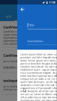
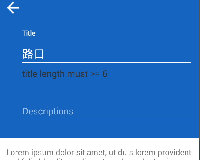
繼CoordinatorLayout之後,繼續研究 material design 的相關控制元件TextInputLayout,下面是效果圖:
1.gradle 配置
compile ‘com.android.support:design:22.2.0’
compile ‘com.android.support:appcompat-v7:22.2.0’2.xml
private android.widget.LinearLayout.LayoutParams setEditText(EditText editText, LayoutParams lp) {
if 注意點:部分原始碼中的內容 ,TextInputLayout 繼承LinearLayout 且裡面只能有一個editEditText,和scrollView 很像。下面是佈局檔案:
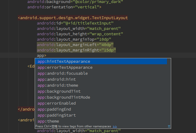
<android.support.design.widget.TextInputLayout
android:id="@+id/titleTextInput" - 3.java
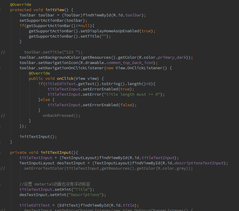
注意:不能 重寫 TextInputLayout的OnFocusChangeListener的監聽事件,因為在原始碼中定義了動畫效果和editText注入,重寫了會導致動畫失效。
設定 浮動標籤動畫效果
titleTextInput.setHint(“Title”);
if(titleEditText.getText().toString().length()<6){
   titleTextInput.setErrorEnabled(true);
   titleTextInput.setError("title length must >= 6");
}else {
   titleTextInput.setErrorEnabled(false);
}
這一部分是動態錯誤提示的相關程式碼
完成上面的,基本就可以出現TextInputLayout 的動畫效果了,但是預設的顏色不是很好看,所以我們需要自定義相關的顏色,比如 hint 字的顏色,下劃線的顏色,錯誤字型的顏色大小等,下面就是自定義顏色的部分:
谷歌把Design Support Library寫的很好。每一個控制元件的顏色都是直接通過主題顏色繪製的,在 style.xml 中指定。開啟它新增colorAccent 到主題以改變表單的顏色。在 style.xml 中修改相關的屬性
<style name="AppTheme" parent="Theme.AppCompat.Light.NoActionBar">
        <item name="colorPrimary">@color/primary</item>
        <item name="colorPrimaryDark">@color/primary_dark</item>

        <!--<item name="colorAccent">#3498db</item>-->
        <item name="android:textColorHint">@color/alpha_white</item>
        <item name="colorControlNormal">@color/alpha_white</item>
        <item name="colorControlActivated">@color/white</item>
        <item name="colorControlHighlight">@color/white</item>
        <item name="android:windowTranslucentStatus">true</item>
</style>- 2.1 colorAccent 是什麼意思,哪裡的顏色
2.2 其他相關顏色的說明
android:textColorHint 代表 hint 的顏色
colorControlNormal 代表 下劃線沒有獲取焦點的顏色
colorControlActivated,colorControlHighlight 代表了獲取焦點或者點選的時候 下劃線 的顏色2.3 錯誤提示的顏色說明:
預設的錯誤提示的顏色是紅色:在這種背景色下面,紅色不是很好看,所以需要自定義顏色

在設定佈局的時候errorTextAppearance這個屬性,自定義style 寫顏色和大小就可以了,至於另一個屬性hintTextAppearance 這個屬性修改顏色,好像沒有什麼效果,不起作用。
修改之後的效果,如下圖:有的機器上面可能沒有效果,下面提供一種解決方案:
public static void setErrorTextColor(TextInputLayout textInputLayout, int color) {
        try {
            Field fErrorView = TextInputLayout.class.getDeclaredField("mErrorView");
            fErrorView.setAccessible(true);
            TextView mErrorView = (TextView) fErrorView.get(textInputLayout);
            Field fCurTextColor = TextView.class.getDeclaredField("mCurTextColor");
            fCurTextColor.setAccessible(true);
            fCurTextColor.set(mErrorView, color);
        } catch (Exception e) {
            e.printStackTrace();
        }
    }
需要注意的是:
setErrorTextColor(titleTextInput,getResources().getColor(R.color.grey));
需要在titleTextInput.setErrorEnabled(true);之前呼叫